Scope: logo, editable social media graphics system, brand book, corporate lettering selection, promotional gadget designs, corporate color scheme, business cards, folder and letterhead design
Year: 2023



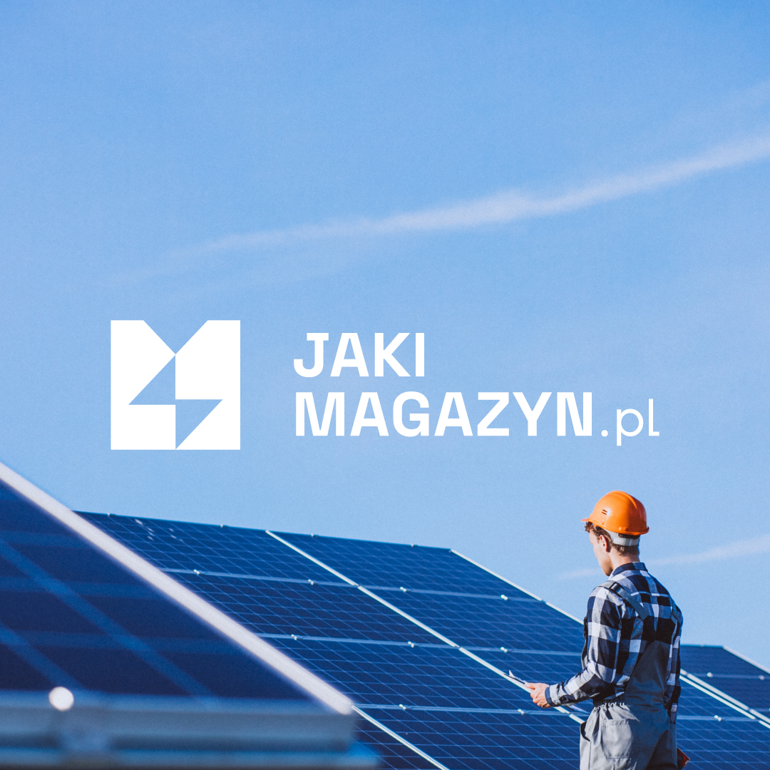
The renewable energy sector in Poland has gained double momentum in recent years and has become as competitive as ever. At the same time, the number of sites advertising their services in this industry is increasing on the Internet. What Magazine approached us for help in creating a distinctive and professional visual identity for a portal that collects and compares information on various energy storage systems. In the plethora of information, we began to value simplicity and proven sources exhaustive of a given topic. Our task was to translate this idea into a graphic canvas.
Based on our previous project for sales trainer Filip Kaszubowski and his proprietary training courses on selling renewable energy solutions, we designed a visual identity that corresponds to the graphic theme of "Energy for Sale." The logo was composed of shapes that depict the letter "M" and also refers to Filip's personal brand logo.




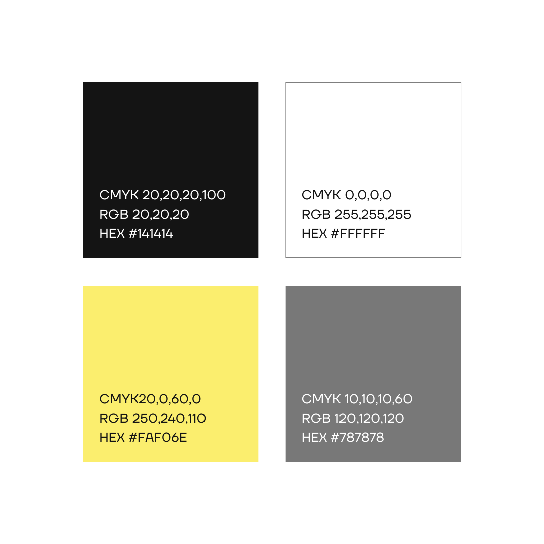
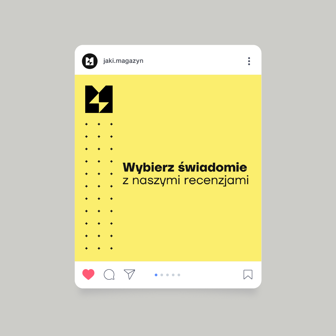
Colors carry an emotional charge and allow to attribute to a given thing, person, event the qualities associated with them. The color palette of What Magazine consists of base colors: black and white, as well as one dominant color: bright, but not pastel yellow. By minimizing the color scheme to 3 colors, we were able to evoke associations with the industry and subtly highlight the brand's origin, i.e. related products. This is one of the most important steps to consistent visual communication.
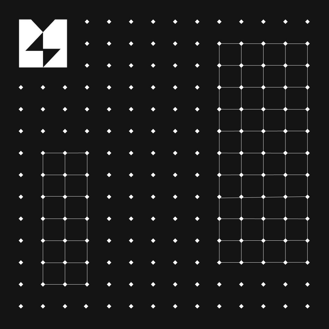
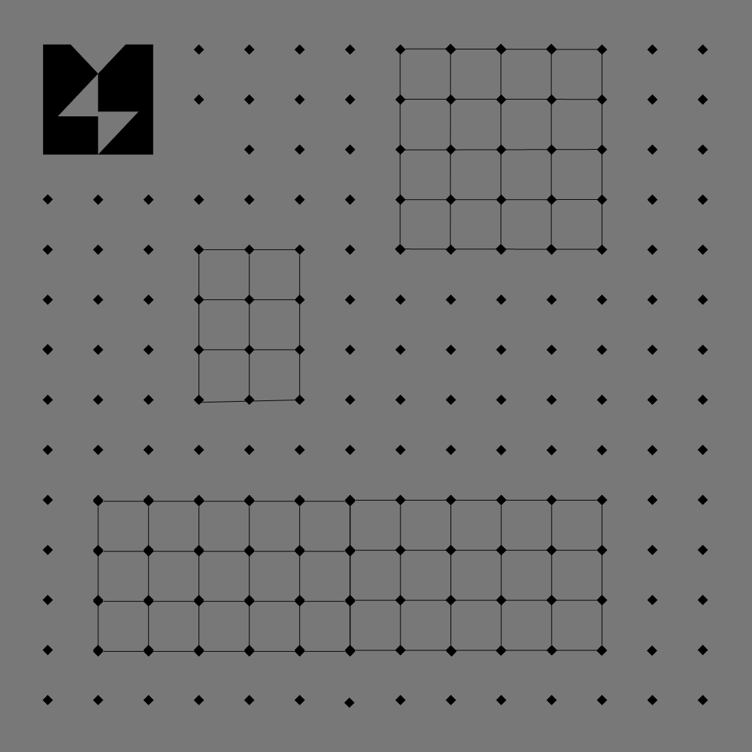
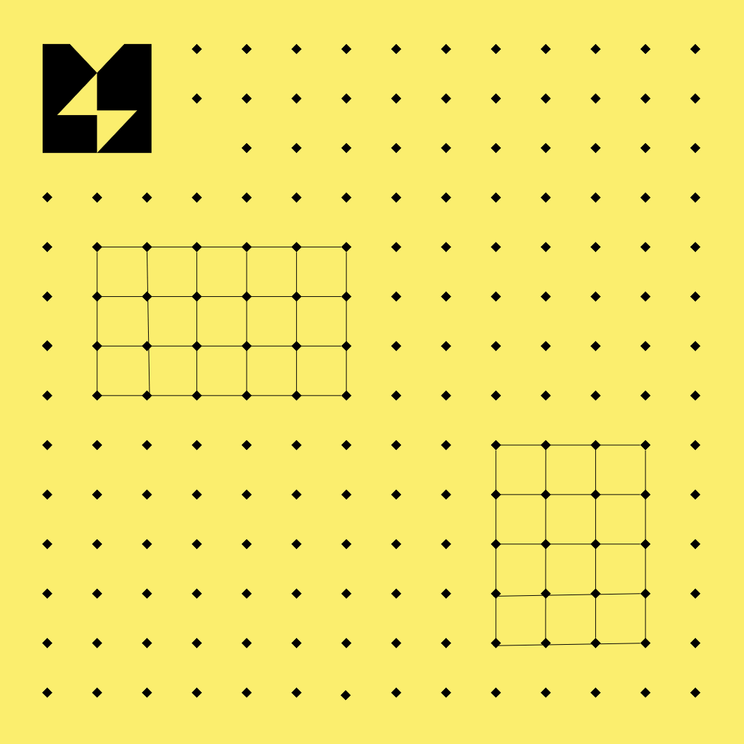
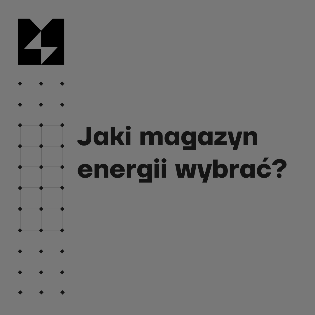
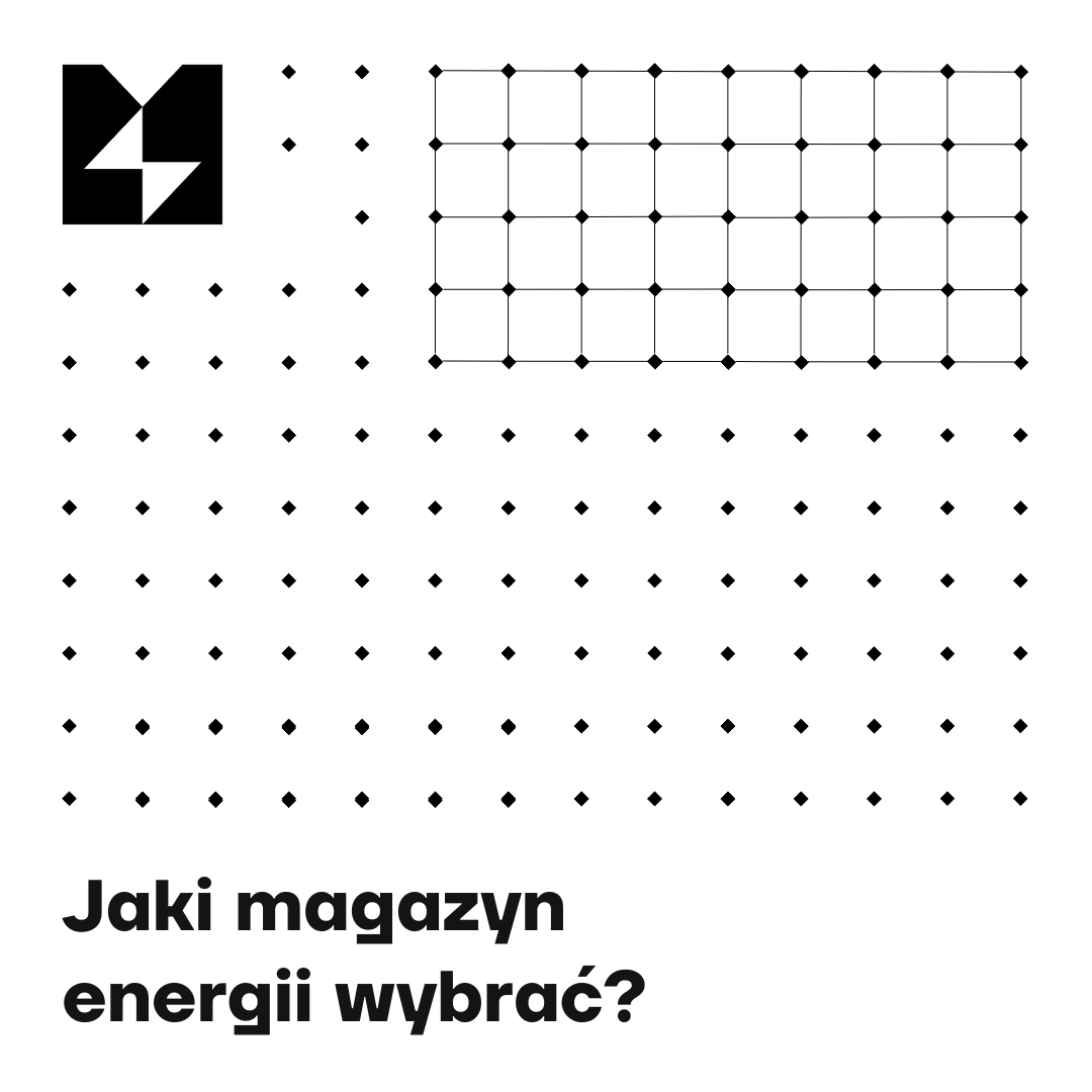
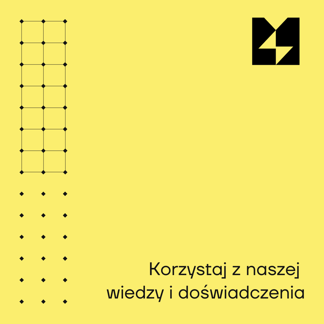
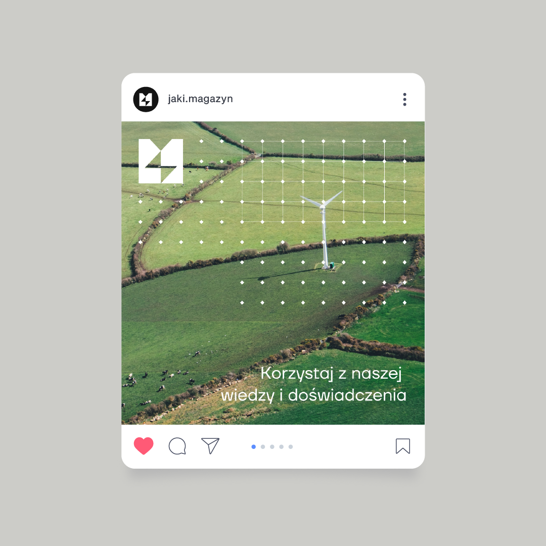
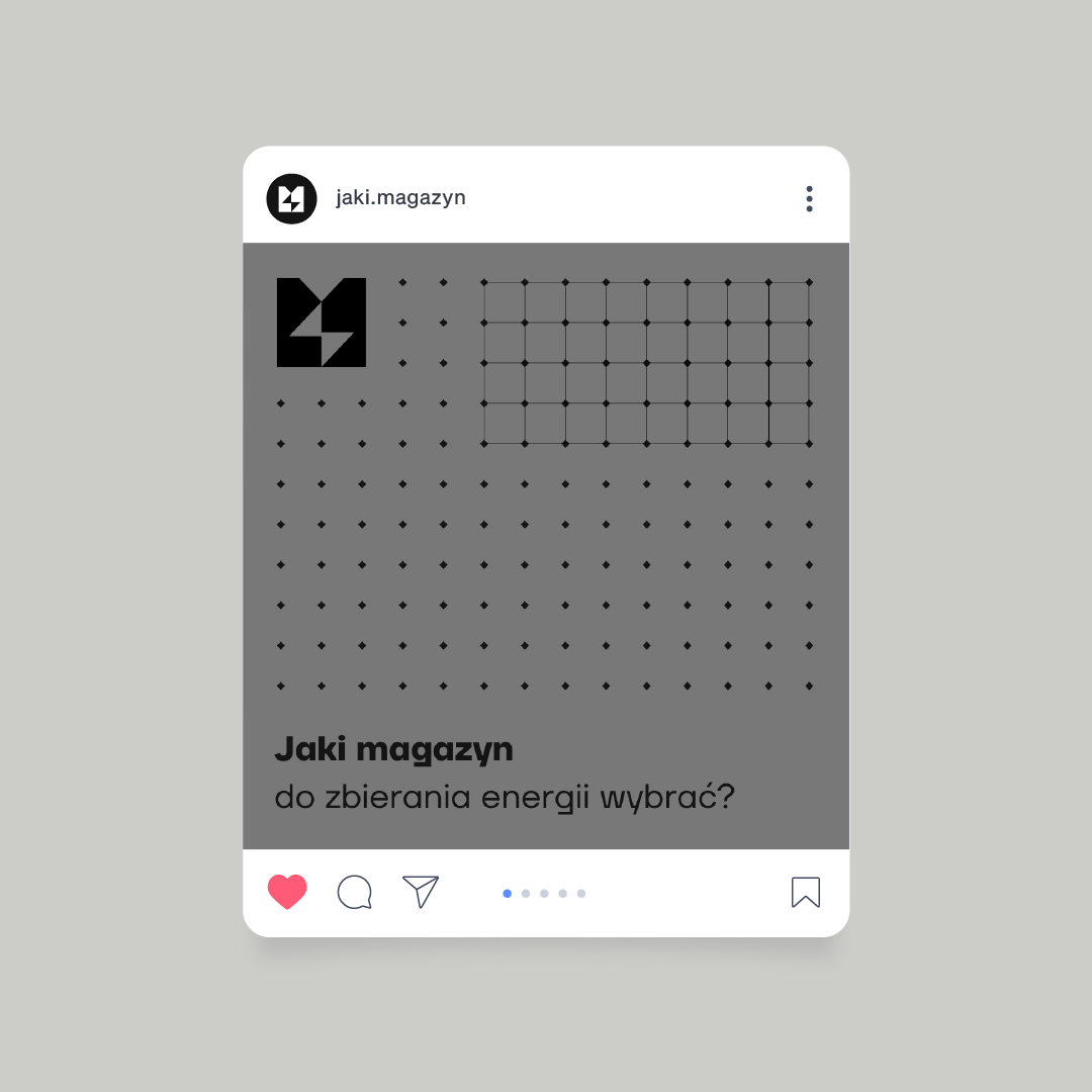
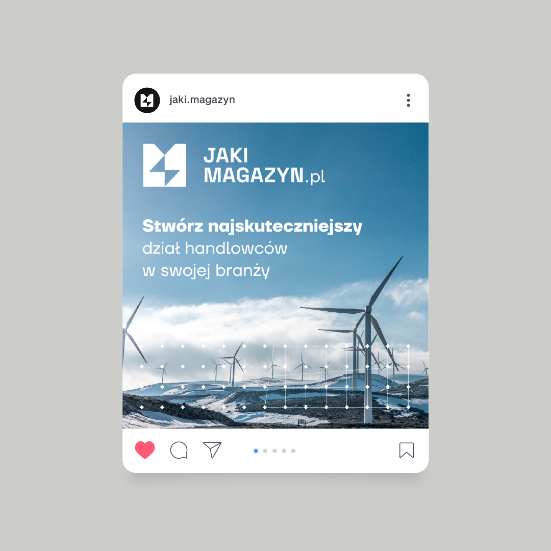
We had to combine the image of a portal with a theme closely embedded in the RES industry with the aesthetics of our client's other services. Wanting to create a coherent visual identity that meets this condition, we decided to design a pattern subtly alluding to the characteristic appearance of the grid on photovoltaic panels. We later used it in a system of graphics for social media.
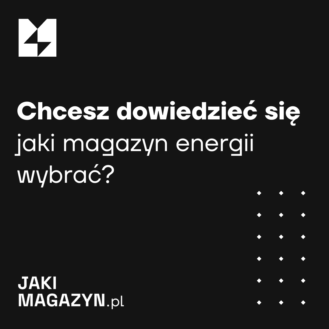
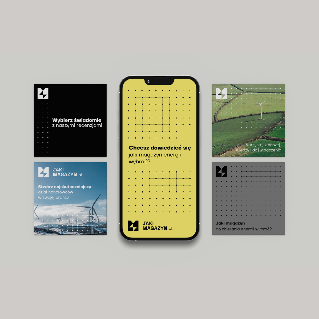
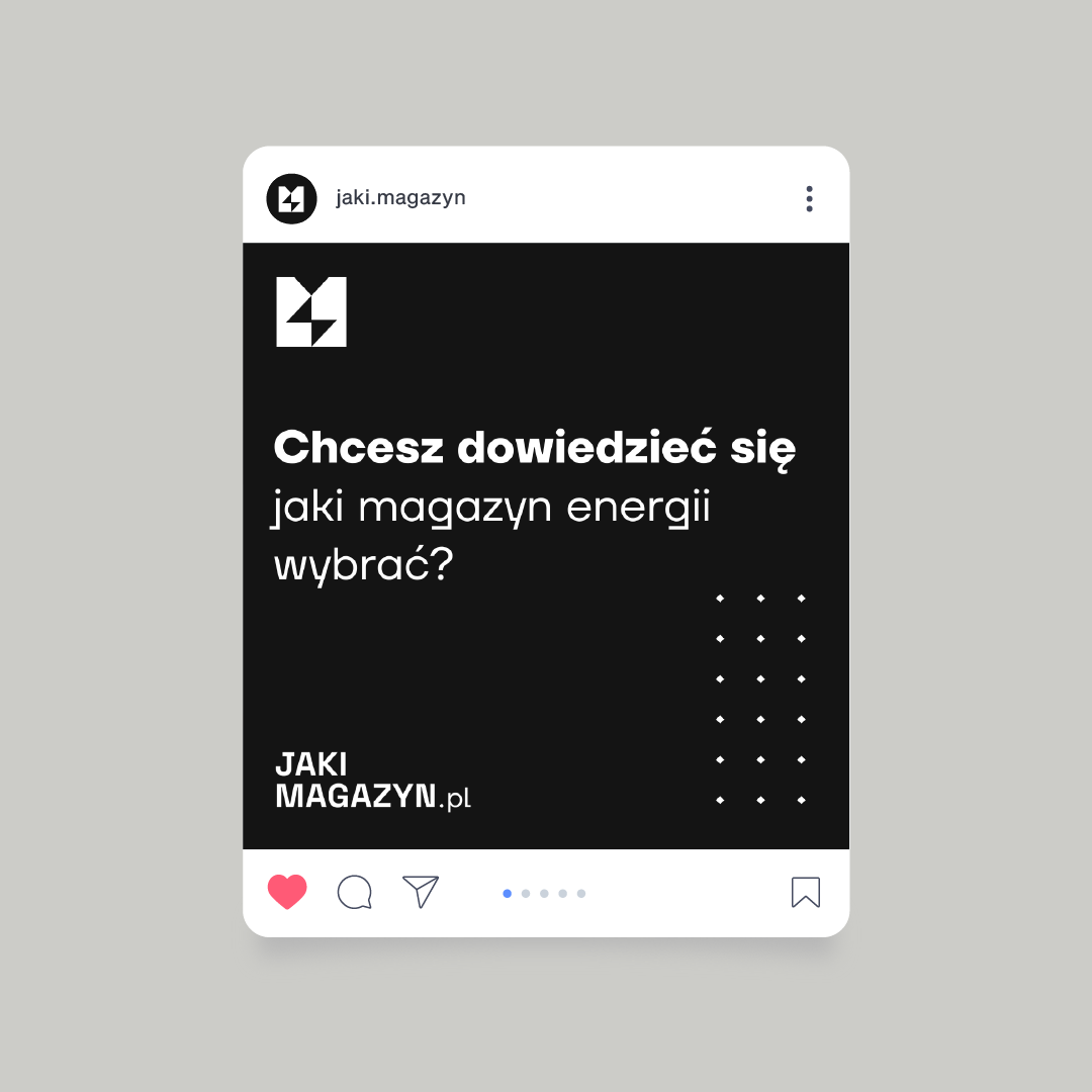
We know how important it is to save time and reduce costs when running a business, so our client received a set of fully editable posts for use on a variety of platforms. Social media is an ideal place to build relationships with your target audience, as well as to increase sales. Contrary to the common thinking that an online portal is such a place in itself, creating a strategy using dedicated platforms can prove crucial in attracting customers as well as strengthening one's position in the market.
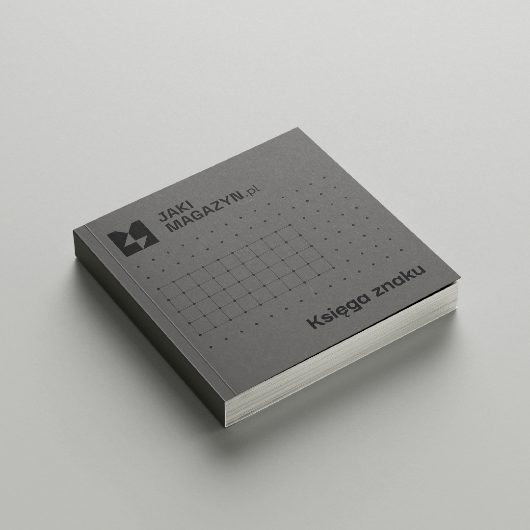
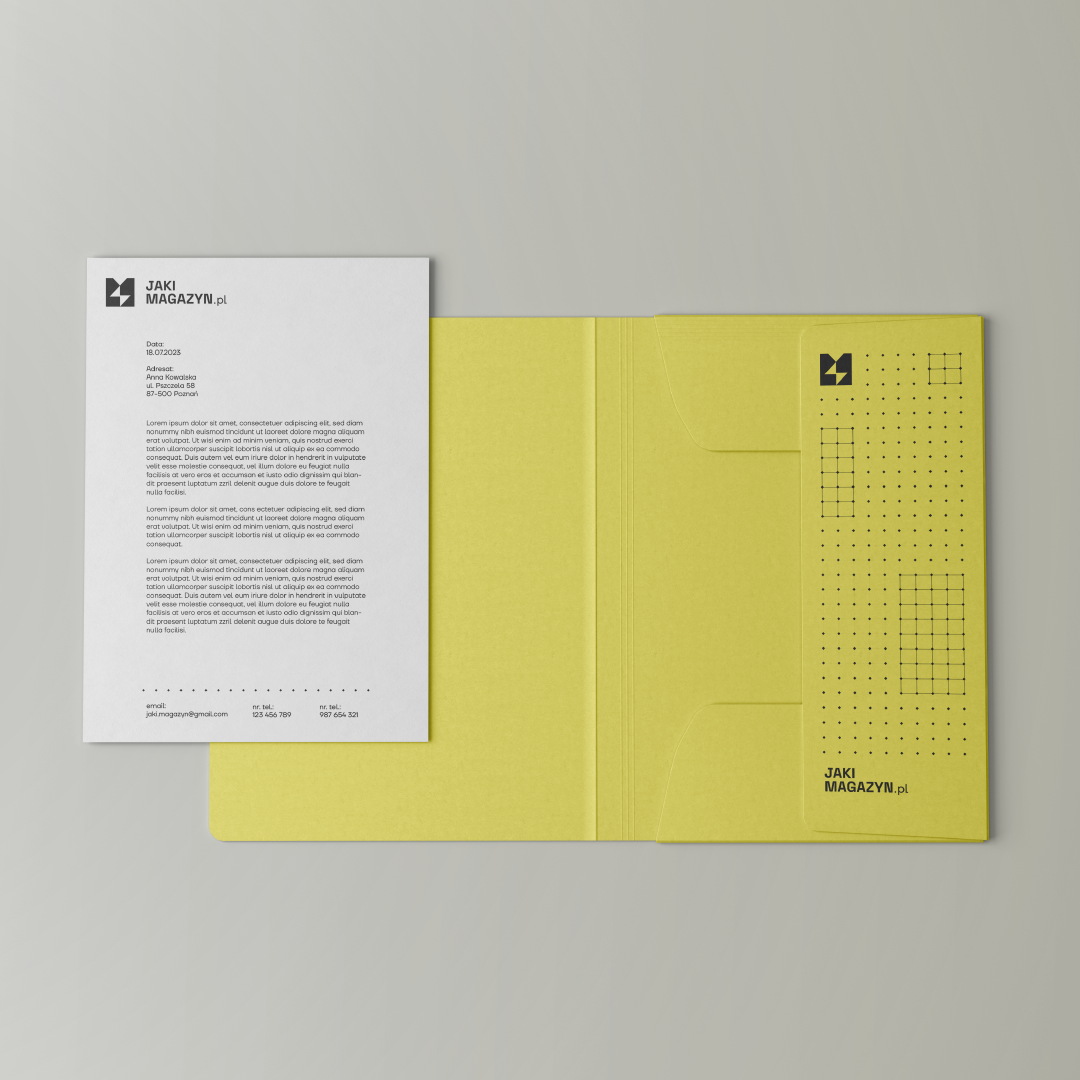
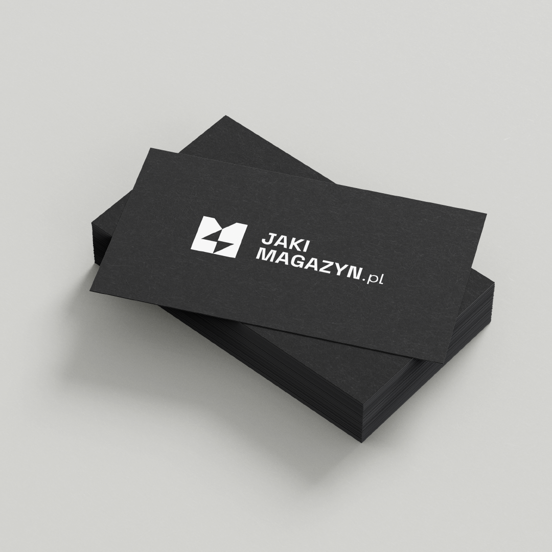
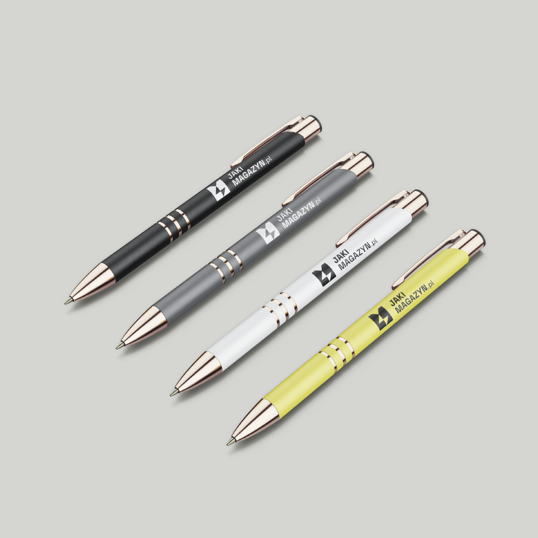
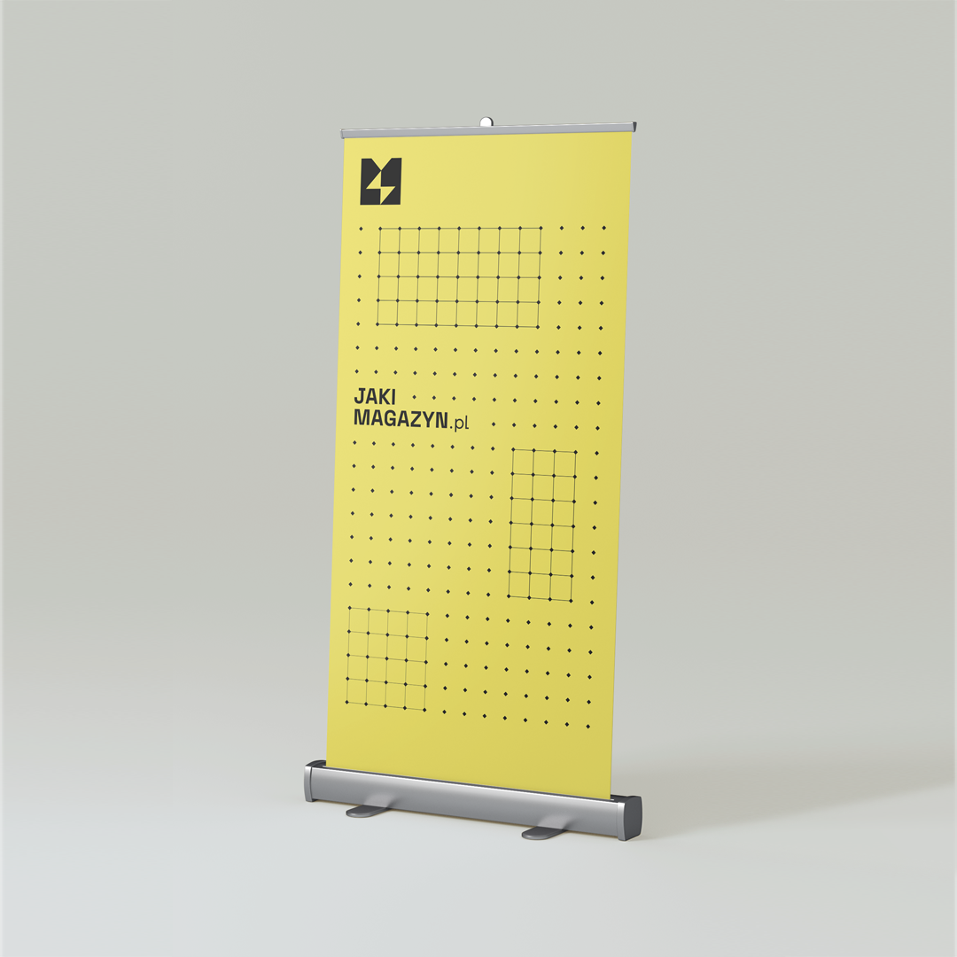
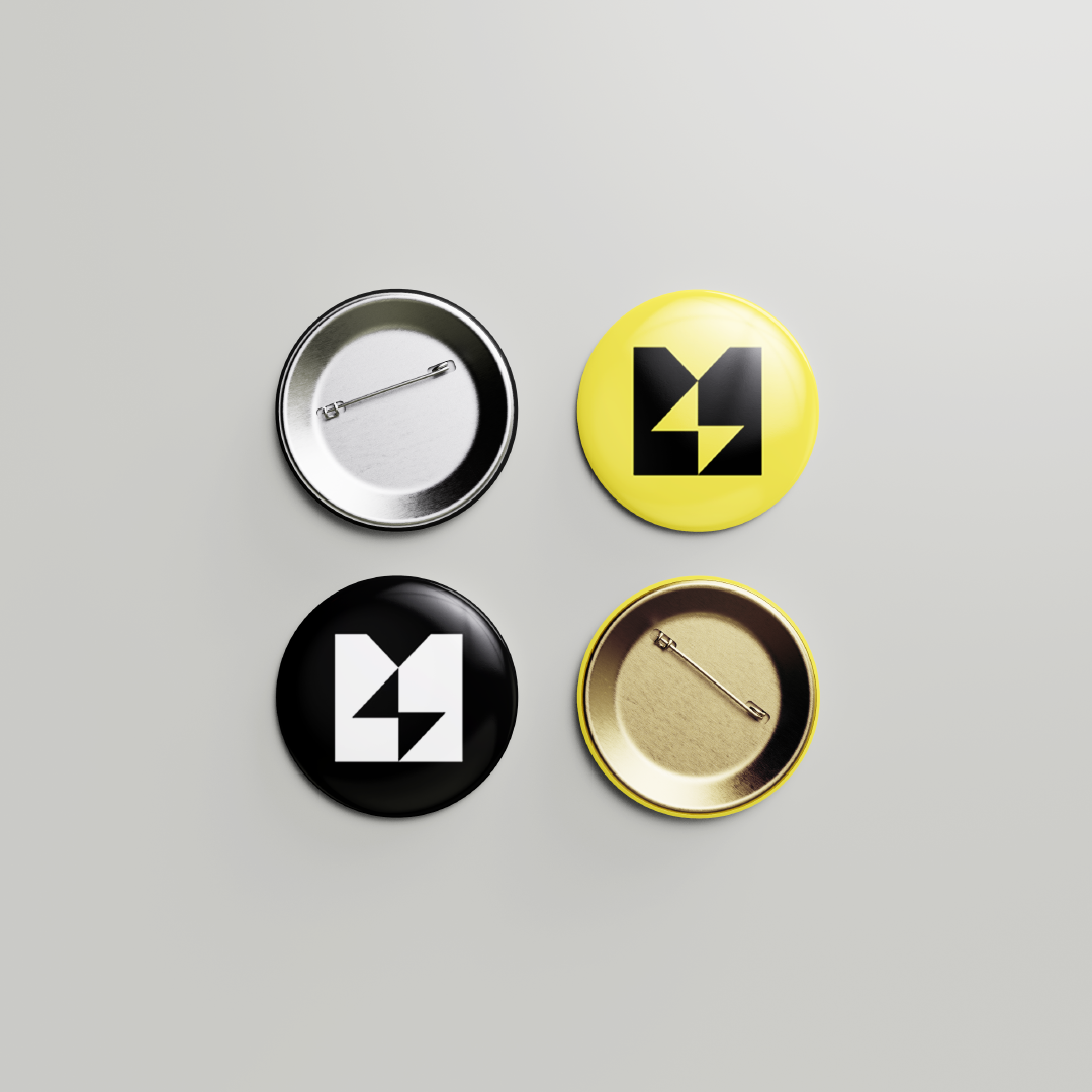
Thanks to the universal design and flexible corporate identity, we were able to create designs for many corporate gadgets. Among them were business cards, pens, pins, roll-ups and a package of letterheads. They will not only provide a professional setting for the office, workplace equipment, but also an interesting gift. Each gadget, designed in accordance with the corporate identity book, features the logo and related graphic elements, which also visually communicates the values of What Magazine in its own way.
Do you need a corporate identity?
See our projects:
Scope: logo, editable social media graphics system, brand book, corporate lettering selection, promotional gadget designs, corporate color scheme, business cards, folder and letterhead design
Year: 2023


The renewable energy sector in Poland has gained double momentum in recent years and has become as competitive as ever. At the same time, the number of sites advertising their services in this industry is increasing on the Internet. What Magazine approached us for help in creating a distinctive and professional visual identity for a portal that collects and compares information on various energy storage systems. In the plethora of information, we began to value simplicity and proven sources exhaustive of a given topic. Our task was to translate this idea into a graphic canvas.


Based on our previous project for sales trainer Filip Kaszubowski and his proprietary training courses on selling renewable energy solutions, we designed a visual identity that corresponds to the graphic theme of "Energy for Sale." The logo was composed of shapes that depict the letter "M" and also refers to Filip's personal brand logo.

Colors carry an emotional charge and allow to attribute to a given thing, person, event the qualities associated with them. The color palette of What Magazine consists of base colors: black and white, as well as one dominant color: bright, but not pastel yellow. By minimizing the color scheme to 3 colors, we were able to evoke associations with the industry and subtly highlight the brand's origin, i.e. related products. This is one of the most important steps to consistent visual communication.
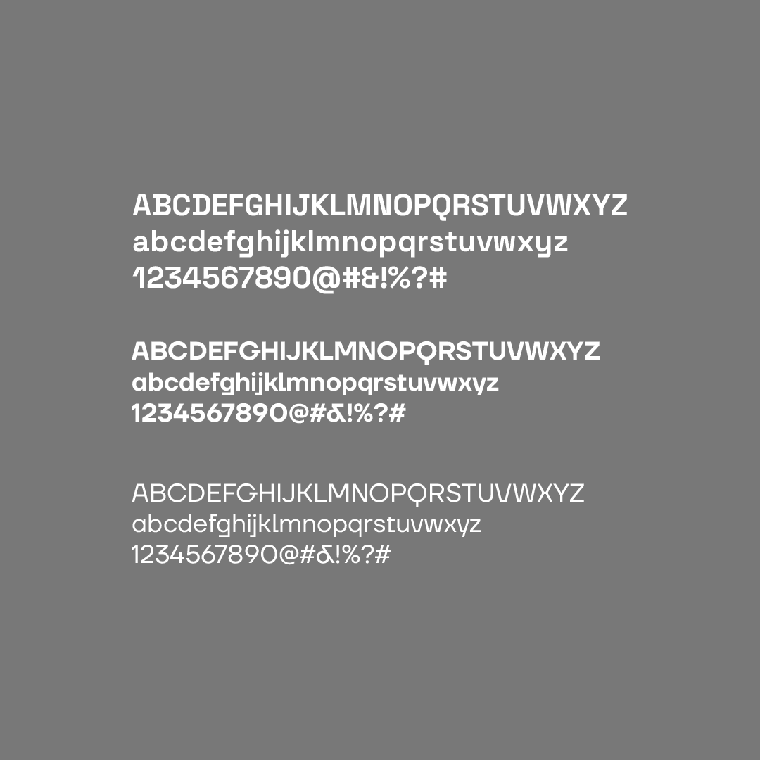


We know how important it is to save time and reduce costs when running a business, so our client received a set of fully editable posts for use on a variety of platforms. Social media is an ideal place to build relationships with your target audience, as well as to increase sales. Contrary to the common thinking that an online portal is such a place in itself, creating a strategy using dedicated platforms can prove crucial in attracting customers as well as strengthening one's position in the market.


We had to combine the image of a portal with a theme closely embedded in the RES industry with the aesthetics of our client's other services. Wanting to create a coherent visual identity that meets this condition, we decided to design a pattern subtly alluding to the characteristic appearance of the grid on photovoltaic panels. We later used it in a system of graphics for social media.


Thanks to the universal design and flexible corporate identity, we were able to create designs for many corporate gadgets. Among them were business cards, pens, pins, roll-ups and a package of letterheads. They will not only provide a professional setting for the office, workplace equipment, but also an interesting gift. Each gadget, designed in accordance with the corporate identity book, features the logo and related graphic elements, which also visually communicates the values of What Magazine in its own way.
Do you need a corporate identity?
See our projects:
Follow us!
INSTAGRAM: