
During our analysis of the previous visual identity, we noticed that the institution had a problem with a non-functional logo, a lack of a distinctive logotype and an unregulated name spelling. We also noticed a lack of proper lettering, a lot of inconsistency in visual communication and general difficulties in creating information publications. Based on an audit of the company's existing image and the promotional materials it uses, we went through a consultation process together with the client, which ended with the selection of a direction for change.
We focused on the necessary improvement of the logo and its functionality. The logo must directly relate to the business area, so our priority became the development of the Cobor logotype. In the end, we decided to base the design on a geometry that refers to the division of agricultural fields and pea grains. We worked on the geometry of the logo and proposed different variants of lettering, in two language and composition versions. During the rebranding, we focused on bringing out the adaptability and ease of "use" of the logo and other elements of the identity, which will be used by Coboru, as well as its subordinate plants and associates. Want to see another rebranding by us? Check out our work.
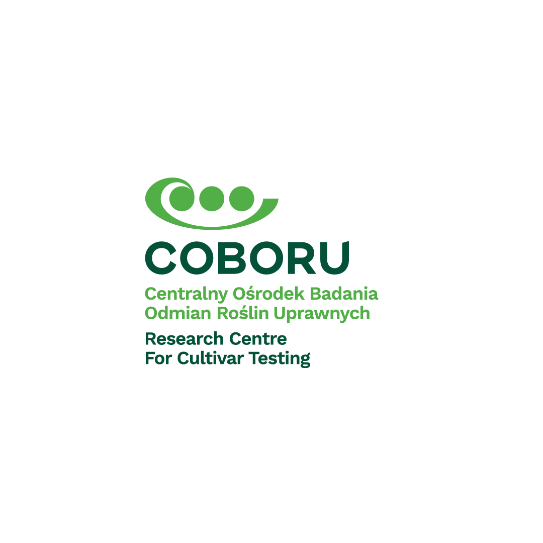

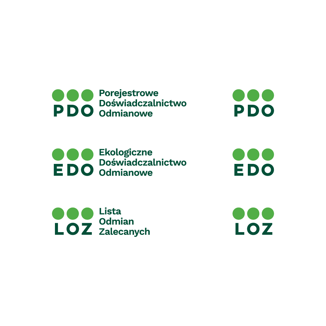
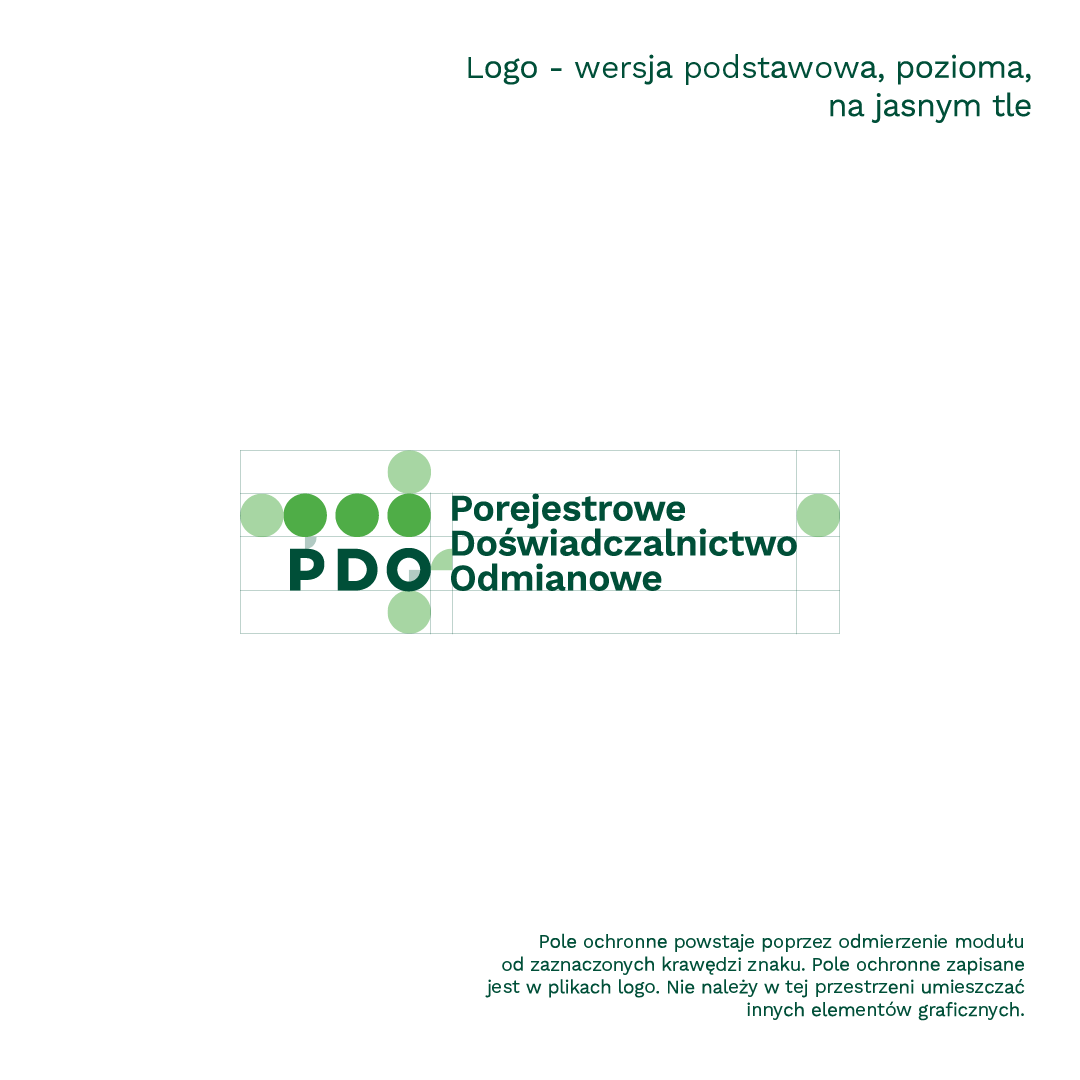
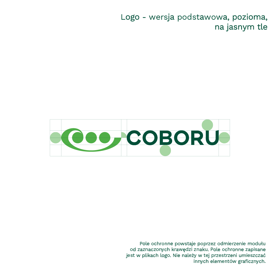
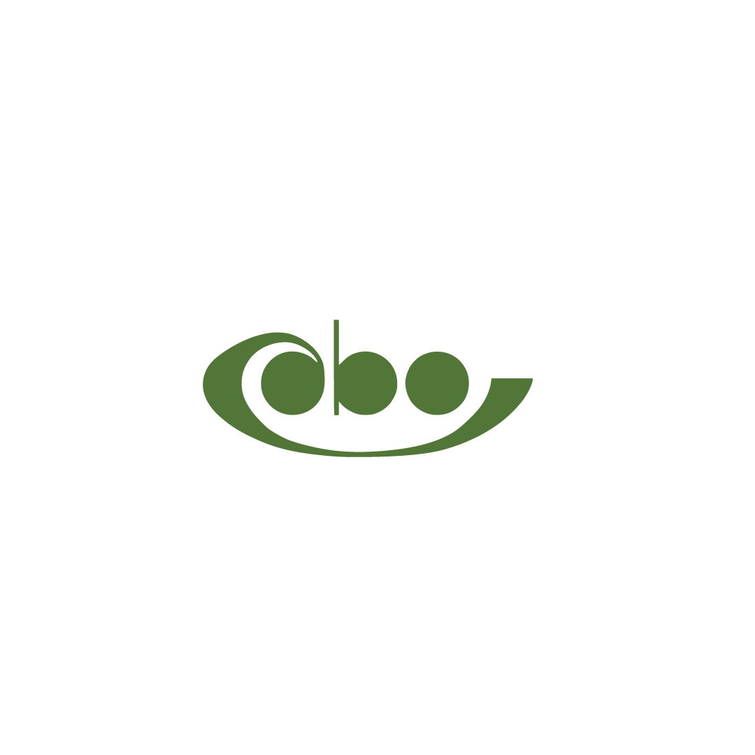
Our primary goal was to create the right system of associations for a potential recipient (that is, also a potential partner). We opted for elegance in a nutshell, i.e. simplicity and professionalism. The logo consists of symbolism alluding to the division of farmland and pea grains. It is distinct enough to work on its own as well. The whole logo winks at the viewer in a non-intrusive way: the graphic resembles the shape of the abbreviated name of the institution referring to the lettering.
At YOS, we believe that even the best design without proper implementation can be written off. A well-designed corporate identity system is one thing, and training the client so that he, like us, can use his new layout with equal ease (and pleasure) to use his new graphic design, is another and equally important task. To make it easier we prepared a clear standards for all employees, so they can use each graphic element (such as the logo) seamlessly.
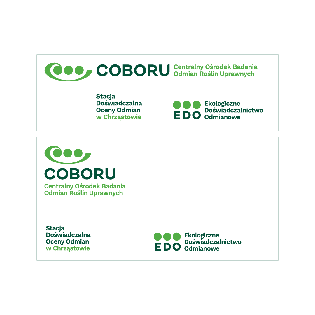
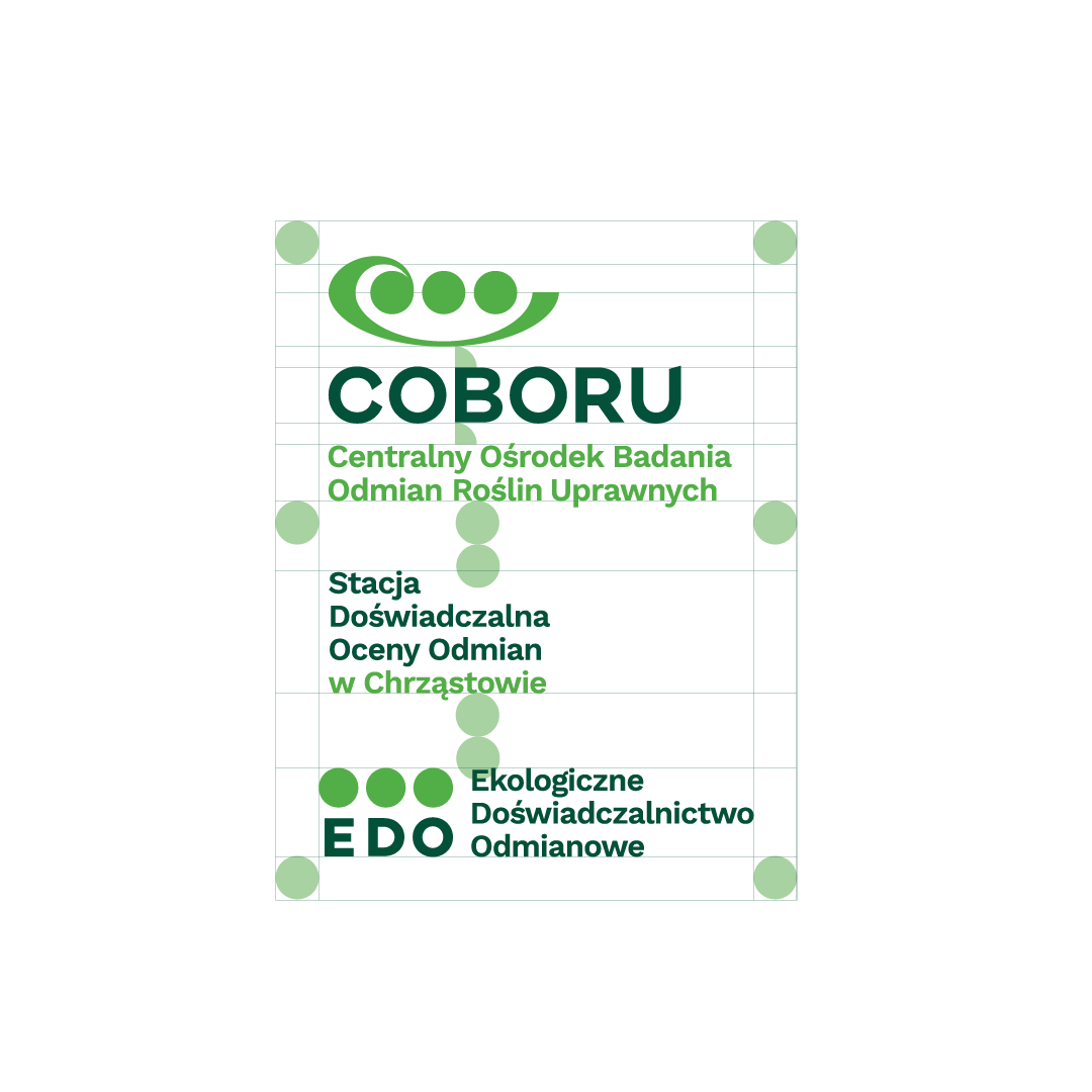

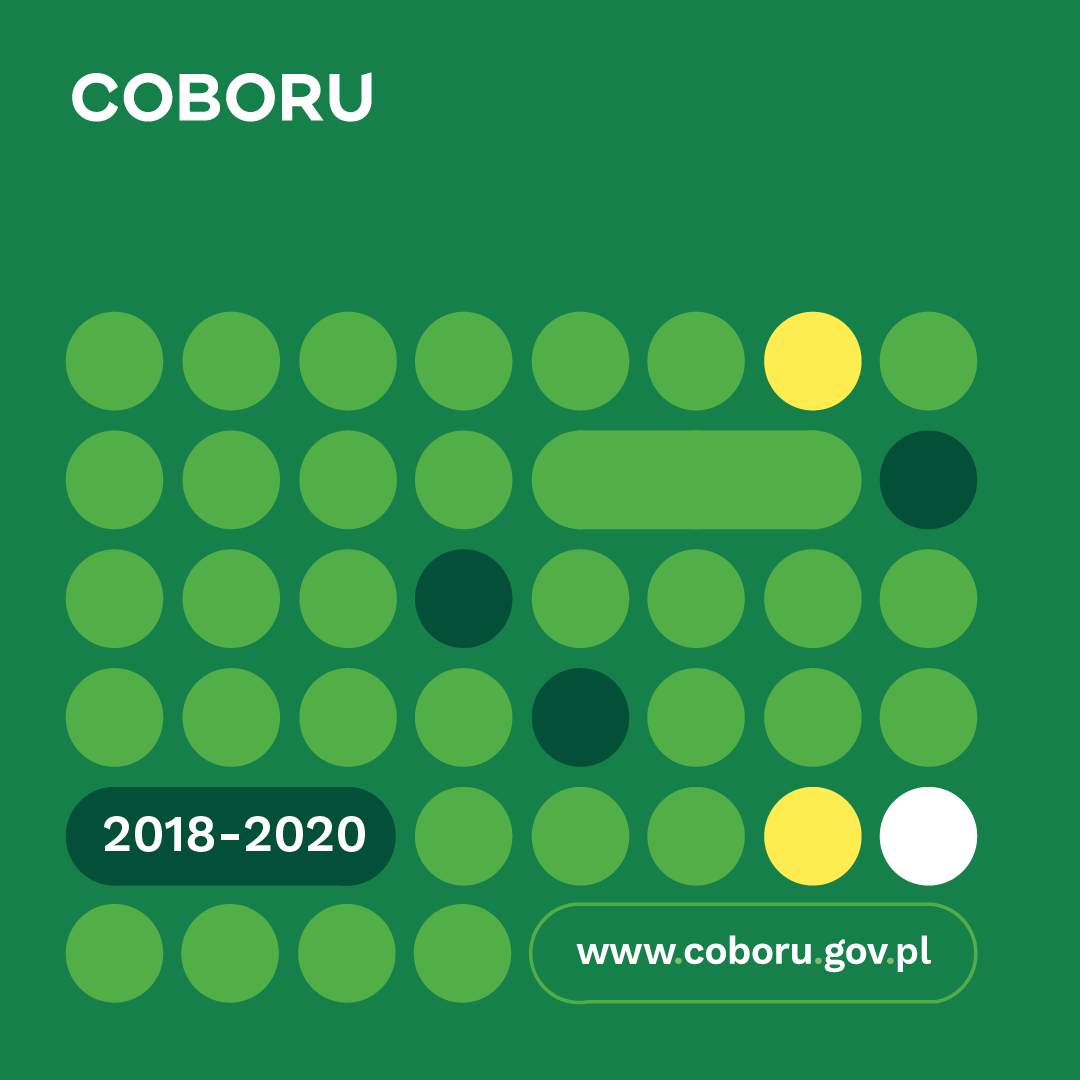
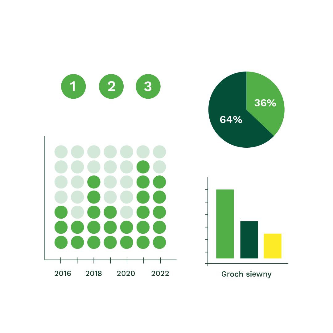
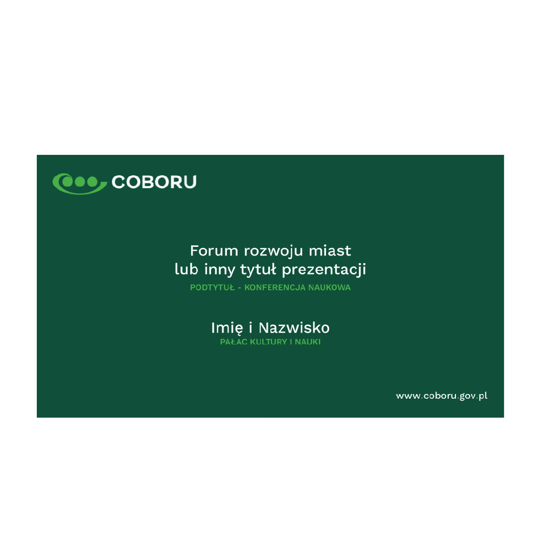
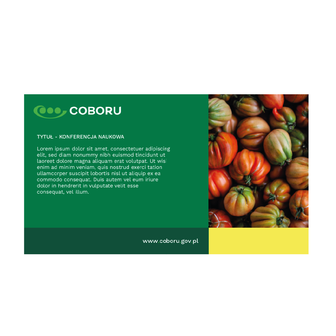
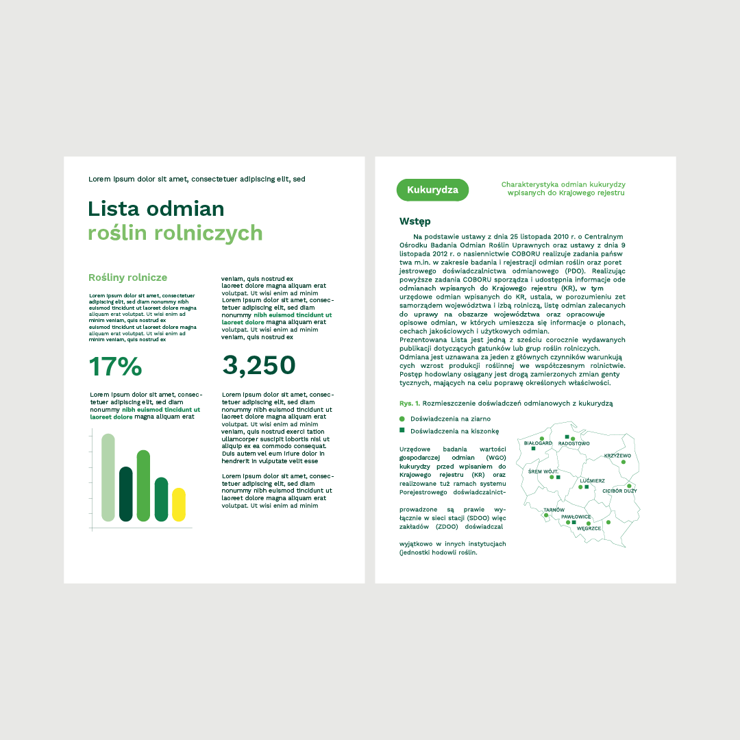
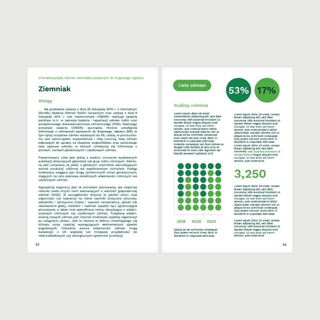
The graphic work, approved by the client, culminated in the creation of a comprehensive Corporate Identity Book. This book showcases a wide range of practical applications for the main graphic theme. Furthermore, it incorporates standards for charts, informational graphics, text styles, color combinations, icons, presentation templates, and the layout of promotional materials. These standards prove to be especially effective in day-to-day operations and business dealings.
It was crucial for us to establish comprehensive guidelines for the consistent and proper use of graphic signs and all elements within the visual communication system. This included careful consideration of an appropriate color scheme and typography. When chosen thoughtfully, refined, and consistently applied, these elements linger in the memory of the user and contribute to shaping the company's image.The showcased range of advertising gadgets, spanning from rollups and caps to folders and calendars, serves as a testament to the value of investing in a new visual identity.


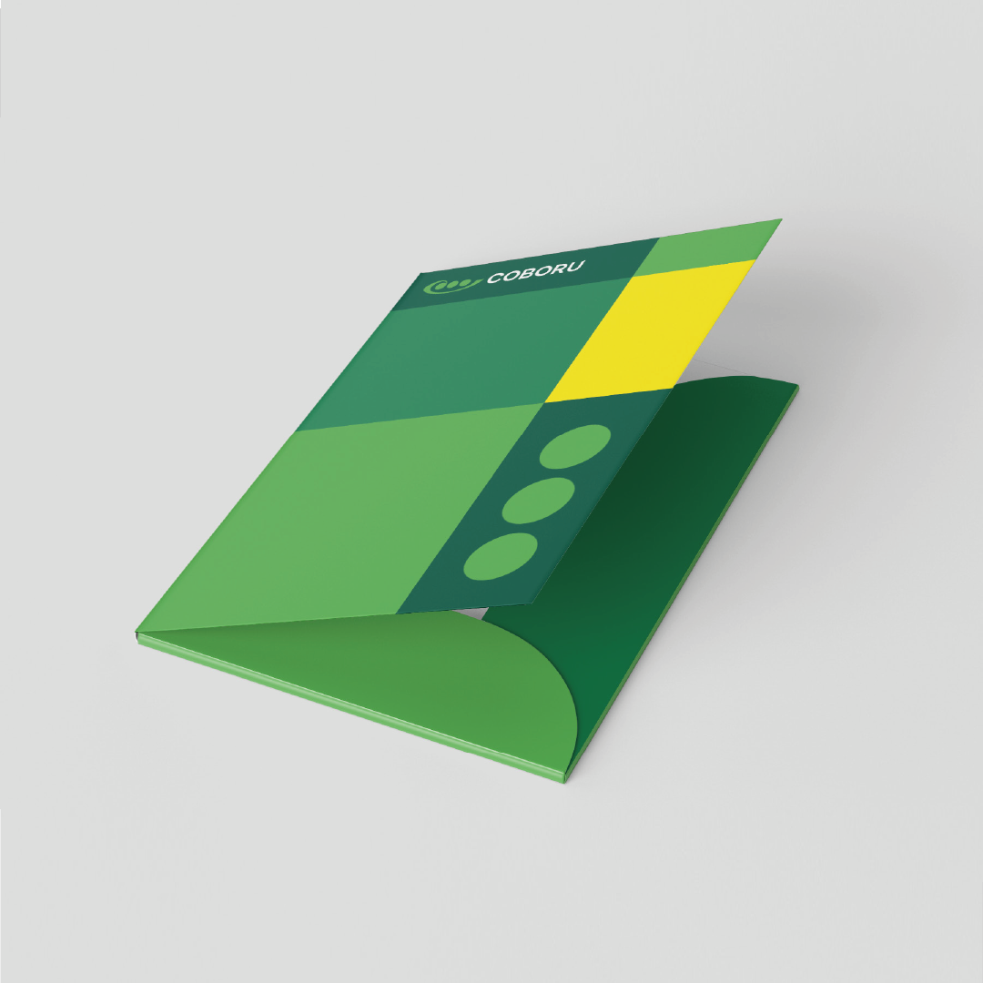
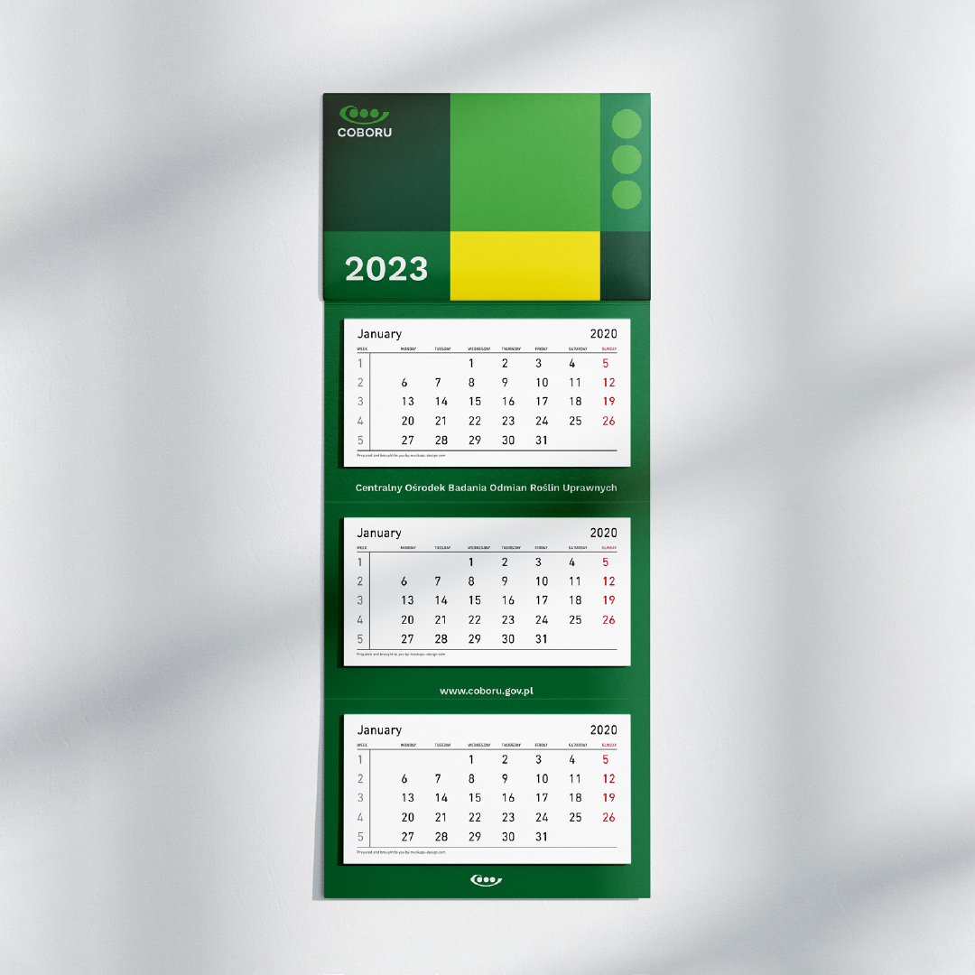
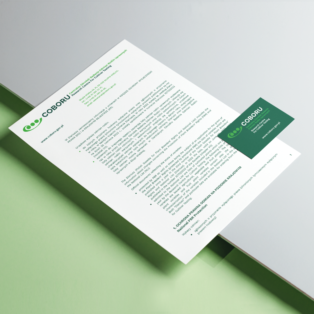
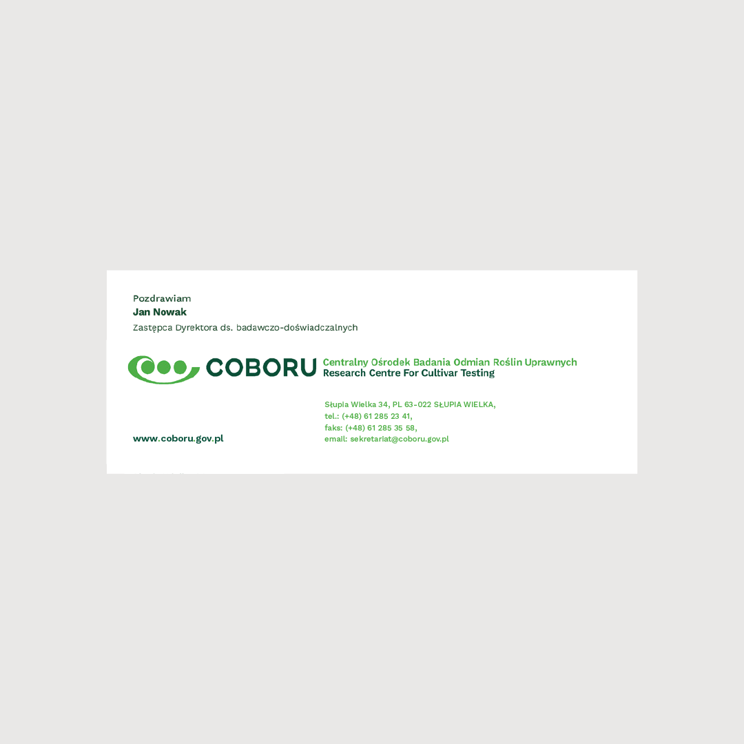
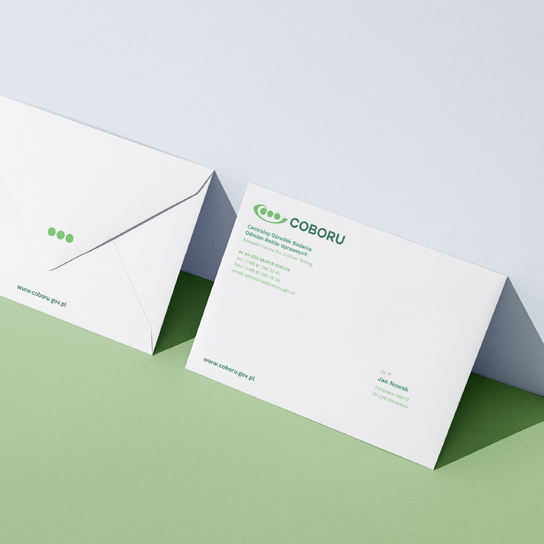
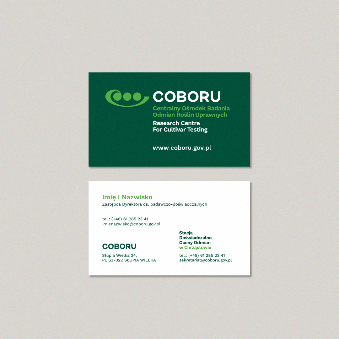


With our client's needs in mind, our objective was to craft a minimalist and user-friendly visual identity. We believe that the key to fostering the right relationship with any company's environment lies in the careful selection of visual components. We developed the system which has demonstrated its effectiveness through a range of advertising materials, including pens, business cards, lanyards, and calendars.
We prioritized the development of comprehensive rules for the consistent and accurate use of graphic signs and all elements within the visual communication system. This included meticulous consideration of the appropriate color scheme and typography. When thoughtfully selected, refined, and consistently applied, these elements endure in the memory of the user, shaping the company's image. The standards we've established have proven highly effective in our printed publications, including folders, flyers, and company guides.

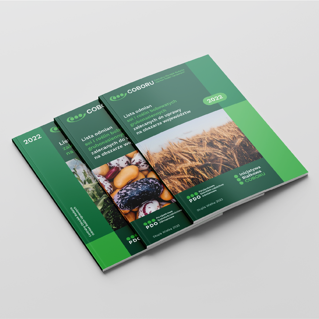
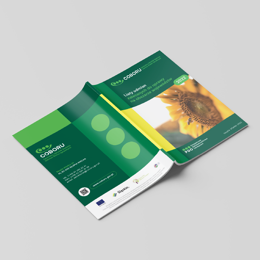
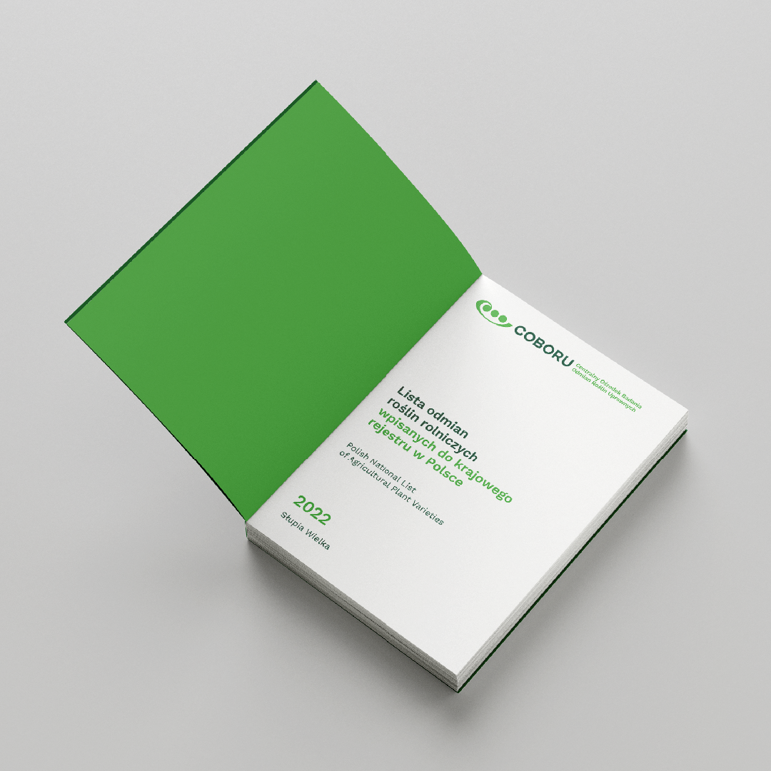

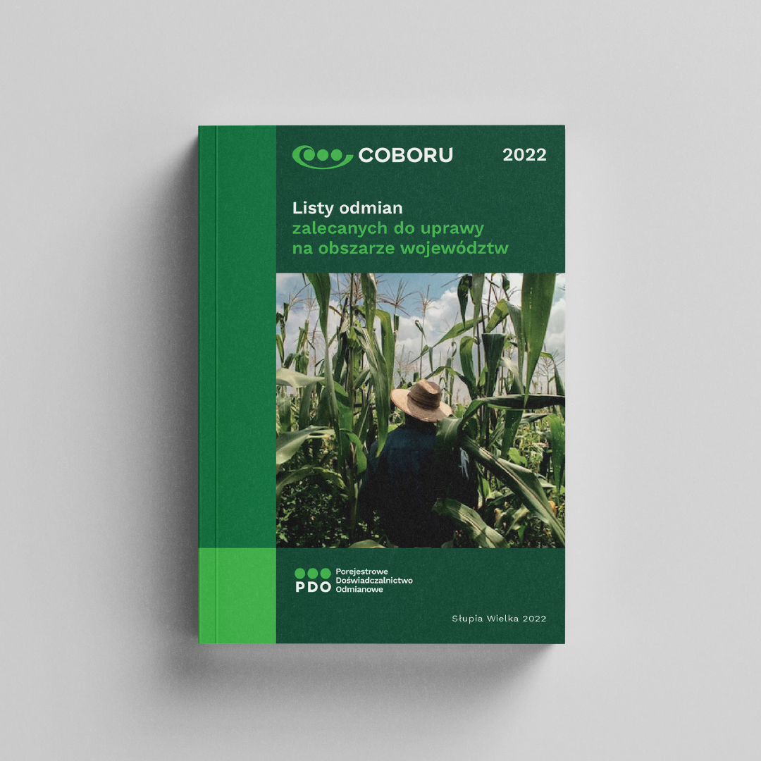
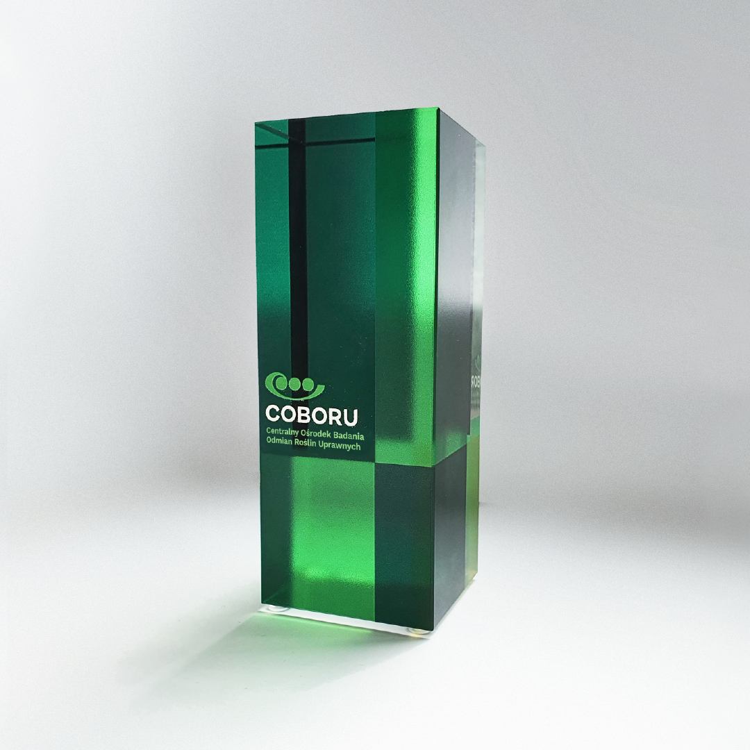

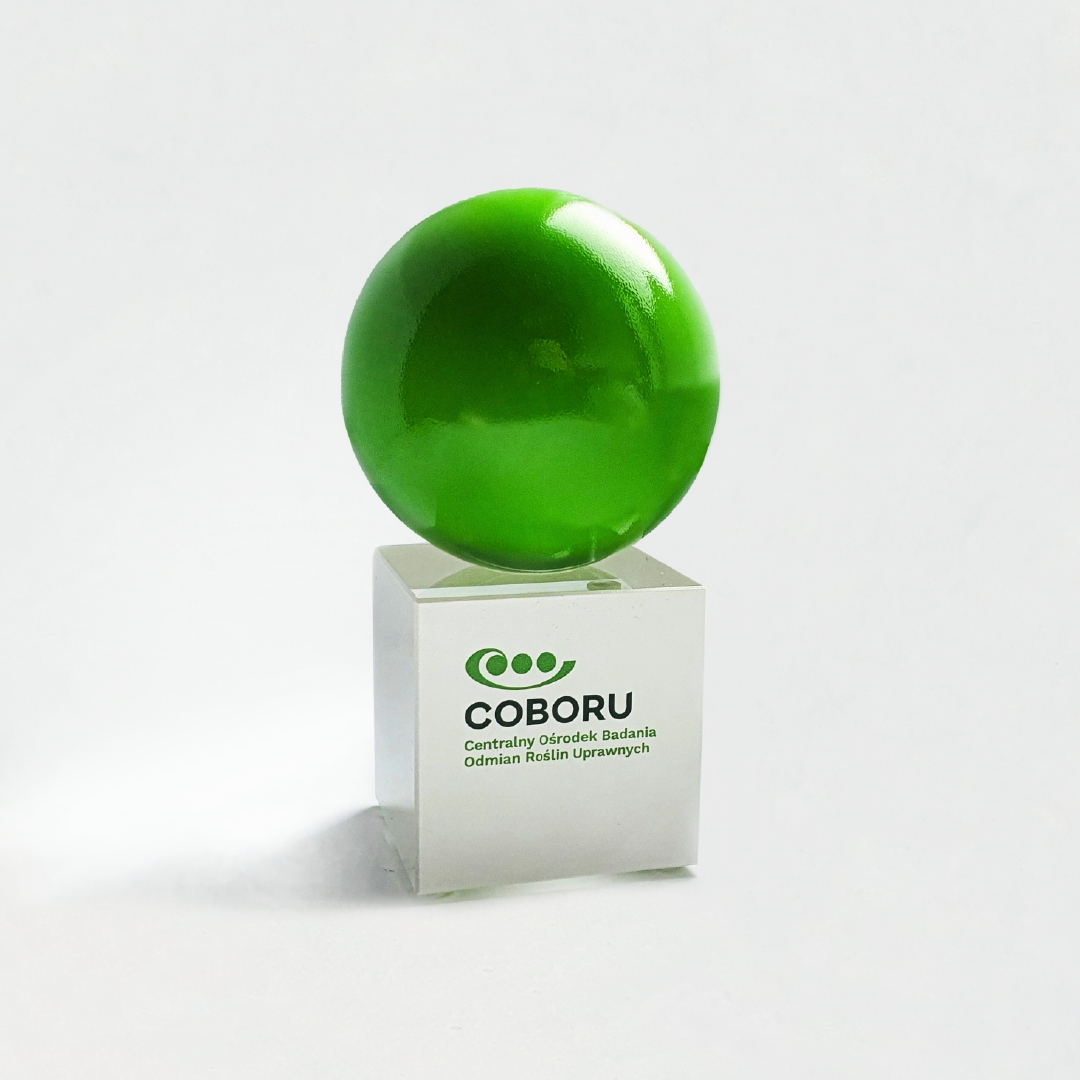

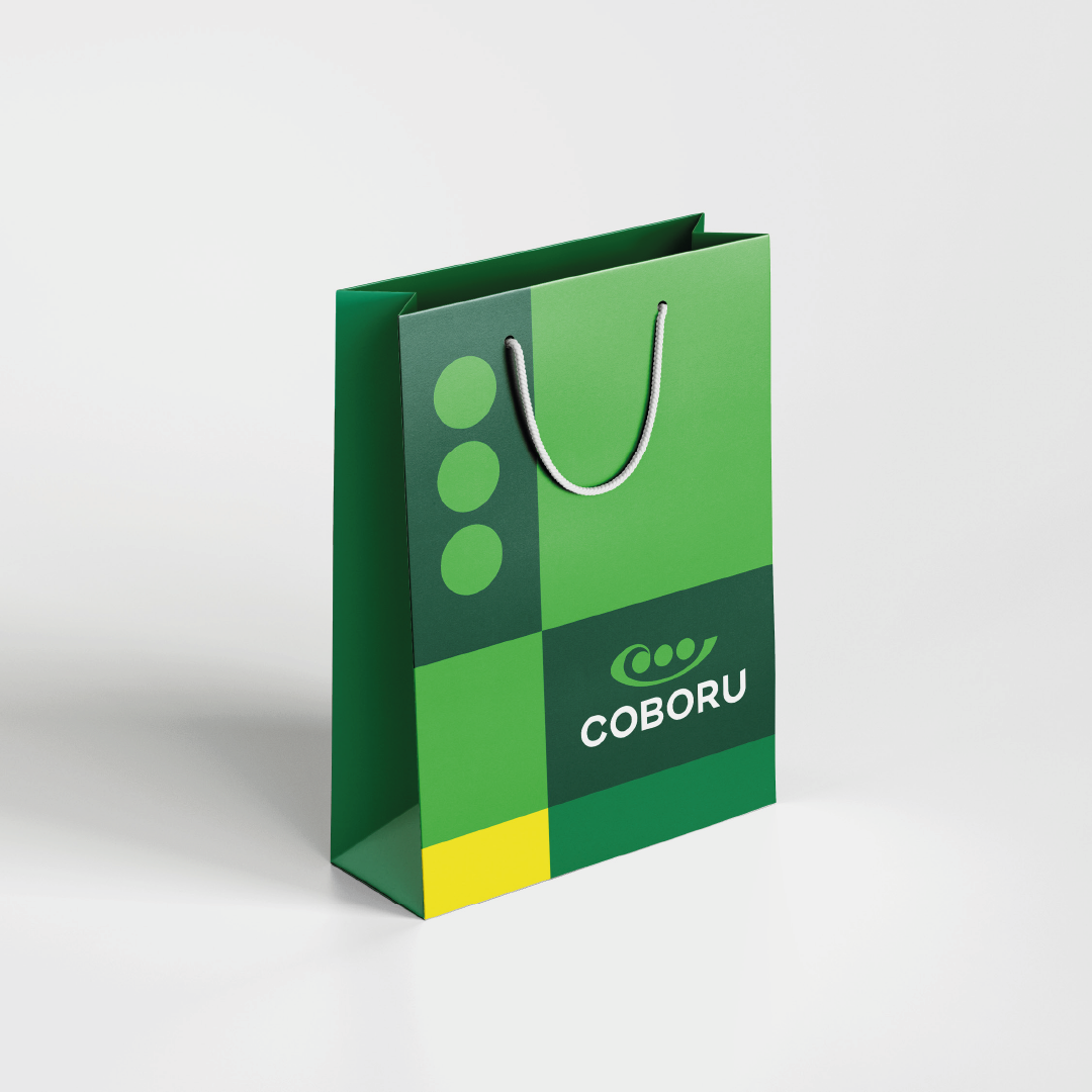

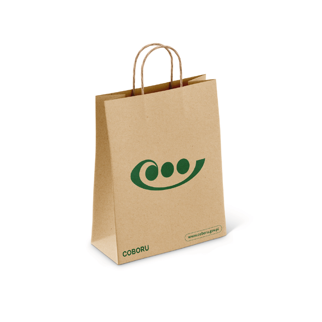
In a relatively short timeframe, we have successfully developed an extensive visual toolkit for the company, ensuring its effectiveness for years to come. A significant portion of our efforts was dedicated to crafting graphic materials across the entire Center. From promotional bags to vehicle branding, we designed dozens of new advertising materials. Additionally, we created a bespoke statuette that not only aligns with the corporate identity but is destined to leave a lasting impression in the company's history and in the memories of employees, customers, and those associated with the company.
Need a rebranding?
See our projects:


We focused on the necessary improvement of the logo and its functionality. The logo must directly relate to the business area, so our priority became the development of the Cobor logotype. In the end, we decided to base the design on a geometry that refers to the division of agricultural fields and pea grains. We worked on the geometry of the logo and proposed different variants of lettering, in two language and composition versions. During the rebranding, we focused on bringing out the adaptability and ease of "use" of the logo and other elements of the identity, which will be used by Coboru, as well as its subordinate plants and associates. Want to see another rebranding by us? Check out our work.


Our primary goal was to create the right system of associations for a potential recipient (that is, also a potential partner). We opted for elegance in a nutshell, i.e. simplicity and professionalism. The logo consists of symbolism alluding to the division of farmland and pea grains. It is distinct enough to work on its own as well. The whole logo winks at the viewer in a non-intrusive way: the graphic resembles the shape of the abbreviated name of the institution referring to the lettering.


At YOS, we believe that even the best design without proper implementation can be written off. A well-designed corporate identity system is one thing, and training the client so that he, like us, can use his new layout with equal ease (and pleasure) to use his new graphic design, is another and equally important task. To make it easier we prepared a clear standards for all employees, so they can use each graphic element (such as the logo) seamlessly.


The graphic work, approved by the client, culminated in the creation of a comprehensive Corporate Identity Book. This book showcases a wide range of practical applications for the main graphic theme. Furthermore, it incorporates standards for charts, informational graphics, text styles, color combinations, icons, presentation templates, and the layout of promotional materials. These standards prove to be especially effective in day-to-day operations and business dealings.


It was crucial for us to establish comprehensive guidelines for the consistent and proper use of graphic signs and all elements within the visual communication system. This included careful consideration of an appropriate color scheme and typography. When chosen thoughtfully, refined, and consistently applied, these elements linger in the memory of the user and contribute to shaping the company's image.The showcased range of advertising gadgets, spanning from rollups and caps to folders and calendars, serves as a testament to the value of investing in a new visual identity.


With our client's needs in mind, our objective was to craft a minimalist and user-friendly visual identity. We believe that the key to fostering the right relationship with any company's environment lies in the careful selection of visual components. We developed the system which has demonstrated its effectiveness through a range of advertising materials, including pens, business cards, lanyards, and calendars.


We prioritized the development of comprehensive rules for the consistent and accurate use of graphic signs and all elements within the visual communication system. This included meticulous consideration of the appropriate color scheme and typography. When thoughtfully selected, refined, and consistently applied, these elements endure in the memory of the user, shaping the company's image. The standards we've established have proven highly effective in our printed publications, including folders, flyers, and company guides.


In a relatively short timeframe, we have successfully developed an extensive visual toolkit for the company, ensuring its effectiveness for years to come. A significant portion of our efforts was dedicated to crafting graphic materials across the entire Center. From promotional bags to vehicle branding, we designed dozens of new advertising materials. Additionally, we created a bespoke statuette that not only aligns with the corporate identity but is destined to leave a lasting impression in the company's history and in the memories of employees, customers, and those associated with the company.


Need a rebranding?
See our projects:
Follow us!
INSTAGRAM: