Client: Poznań International Fair
Year: 2023


Another cooperation with Poznan International Fair concerned refreshing the graphic theme of the LOOK and BeautyVISION fairs, which present beauty trends and present ideas aimed at both professionals and enthusiasts of the cosmetics and hairdressing industries. Our agency took care of creating a new layout that gave freshness and emphasized the theme of the fair, as well as implementing it in materials promoting the event.
A central aspect during the creation of the logotype was the desire to create a personalized letter styling that would characterize each part of the fair separately, but also allow for the summation of the events. A delicate font with the letter "O" highlighted allows for any aesthetic variation, and additionally connects the two names of the fair. It is a universal identification element that also graphically relates to the content of the event.


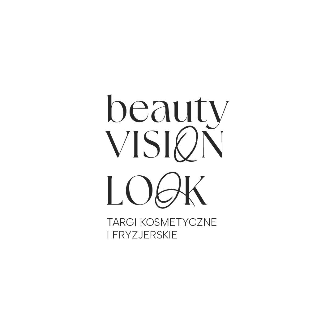

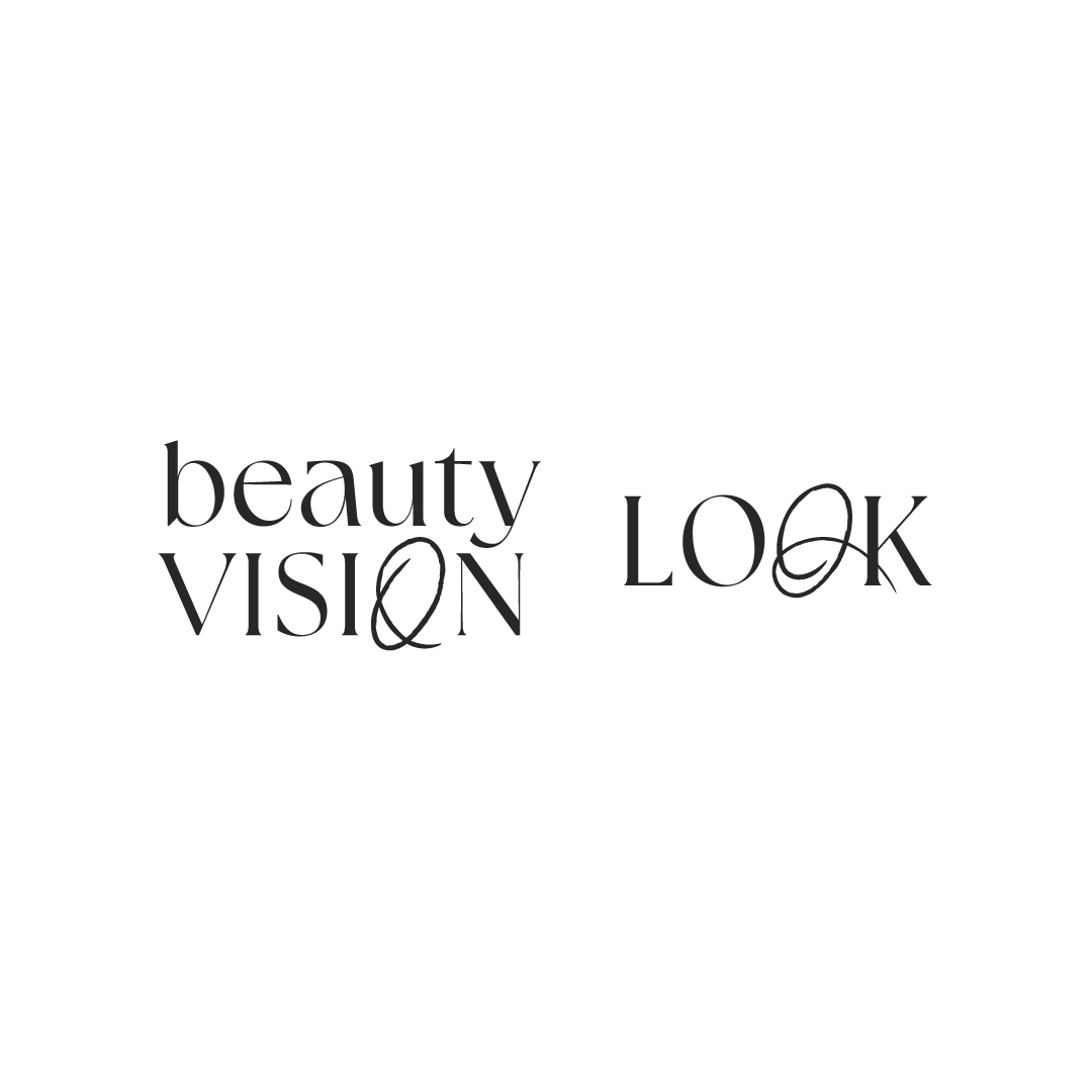
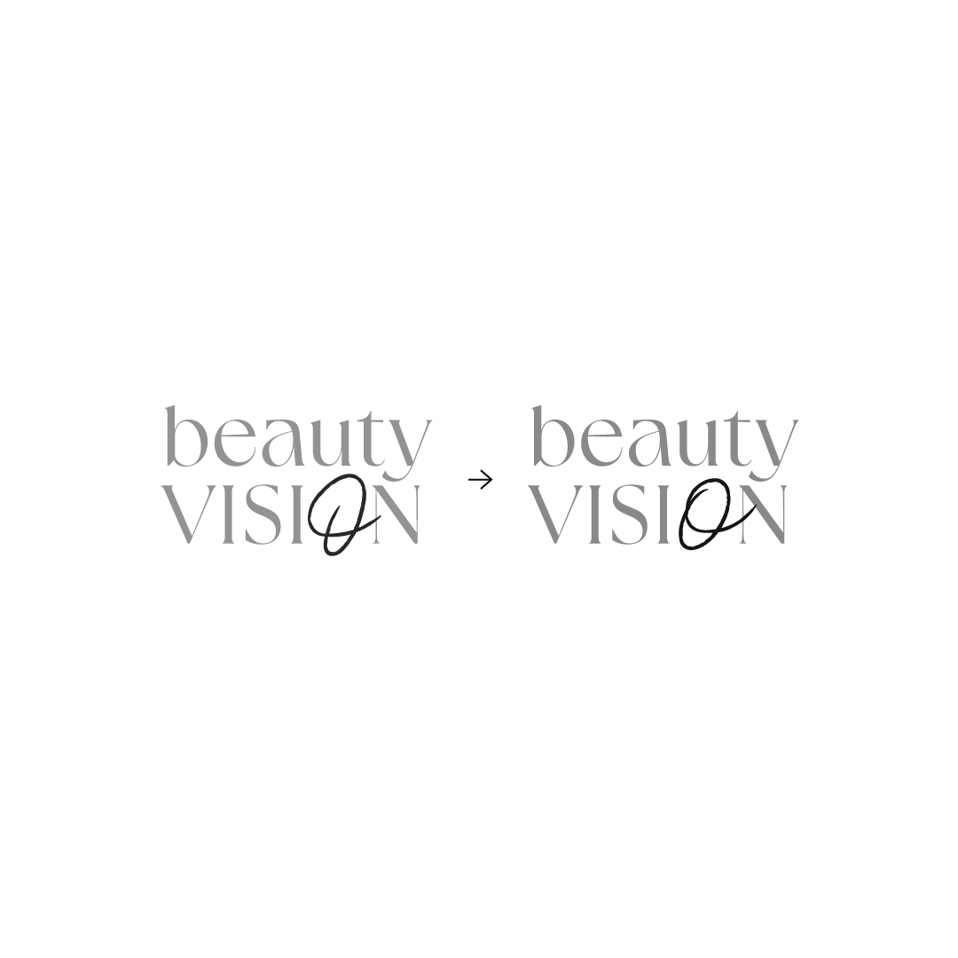

We placed the LOOK and BeautyVISION logos in the center and focused on making the name resonate better with the use of capital letters. We highlighted the second letter "O", which catches the eye and integrates stylistically with the name of the beauty fair. The lettering looks modern and harmonizes with the style we proposed.Against the background of the colors we chose, the font looks extremely feminine and light.
Focusing on the client's needs and the specifics of the events, we created typography that refers to the beauty and hairdressing industries. We chose a delicate, feminine font that will become a representation of both events. The proposed color scheme fits in with the theme of sensuality and thematic reference that the client wanted. We chose pastel shades of pink and black, which integrate with the broader beauty industry. The colors appear as background elements, font and part of the visual theme.


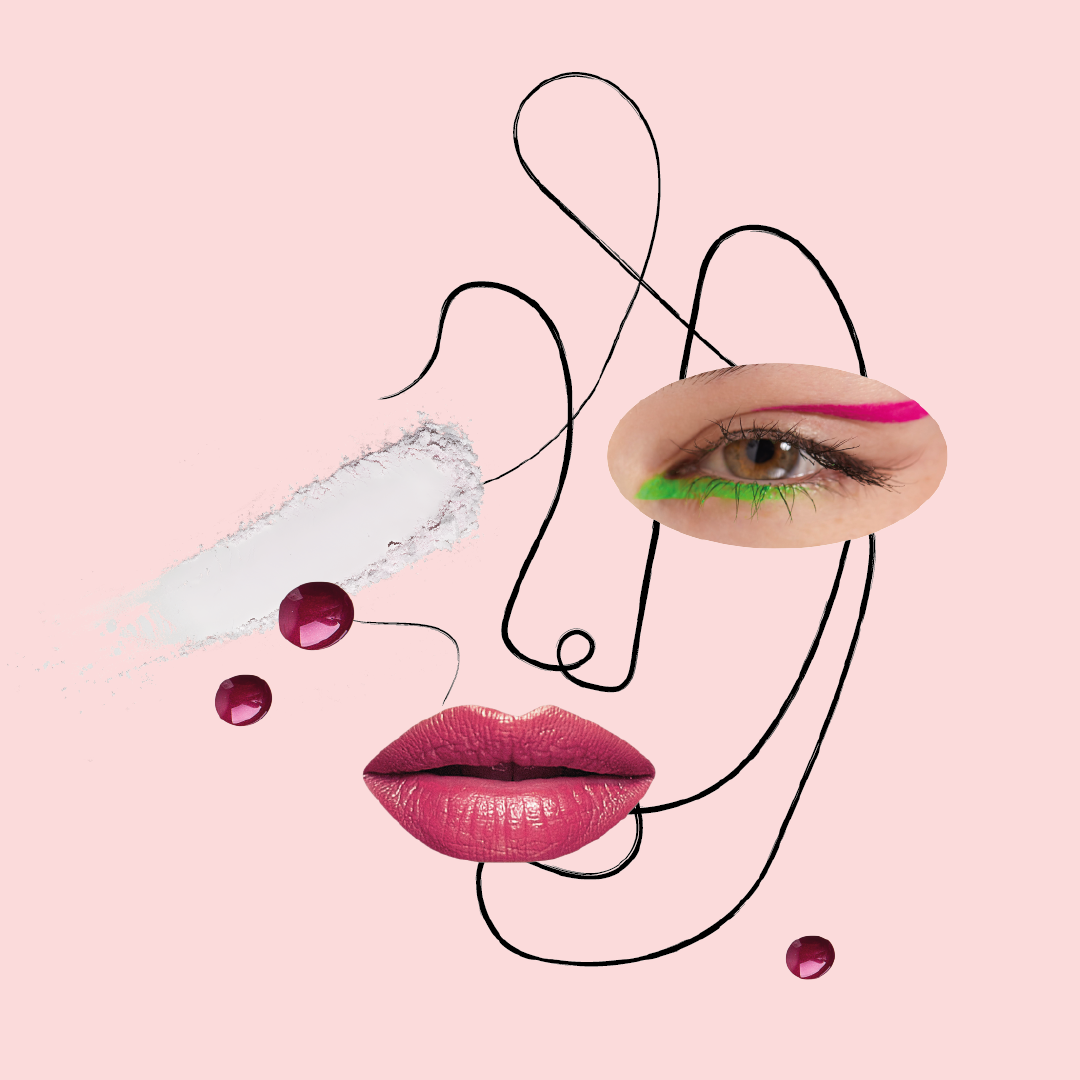
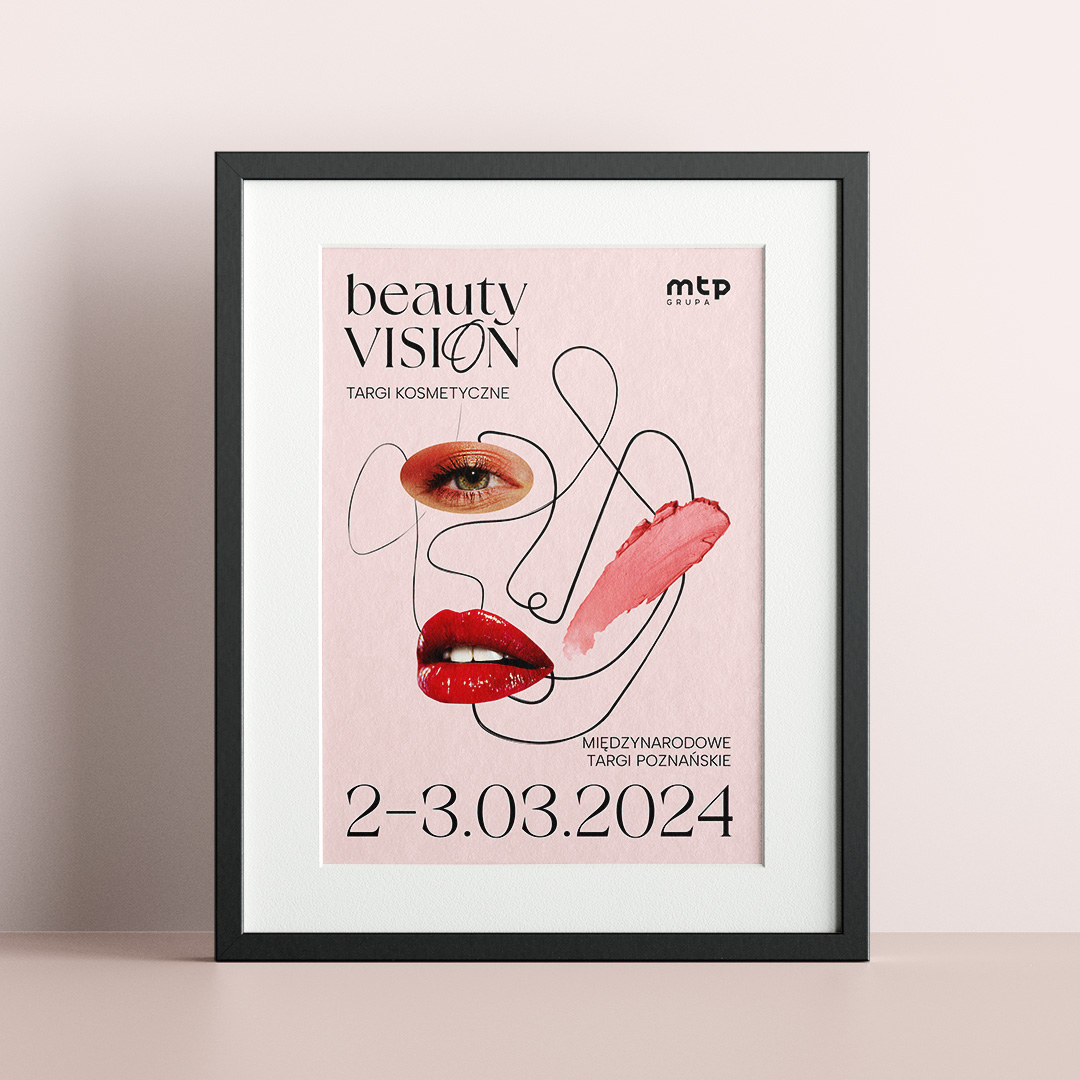
We proposed elements that can be combined into a collage that represents aspects of the hair and beauty industry theme. We used an abstract outline of a face in a drawing style, which is the base and allows us to add more elements according to the client's needs. We used fragmentary photos that refer to newspaper clippings from the beauty industry, and finished the whole thing off by adding elements of cosmetics. The proposed motifs create endless possibilities for modification and creation of new designs without the need to contact the agency.
In the illustrations created by us, the base is always a universal outline of a face made in an abstract style. Applied to it can be the identification of both events. Realistic cut-outs are composed with samples of cosmetic care, which is the idea of the event. The placement of details is arbitrary and provides ample opportunity to represent individuality, as well as the integrity of the events.
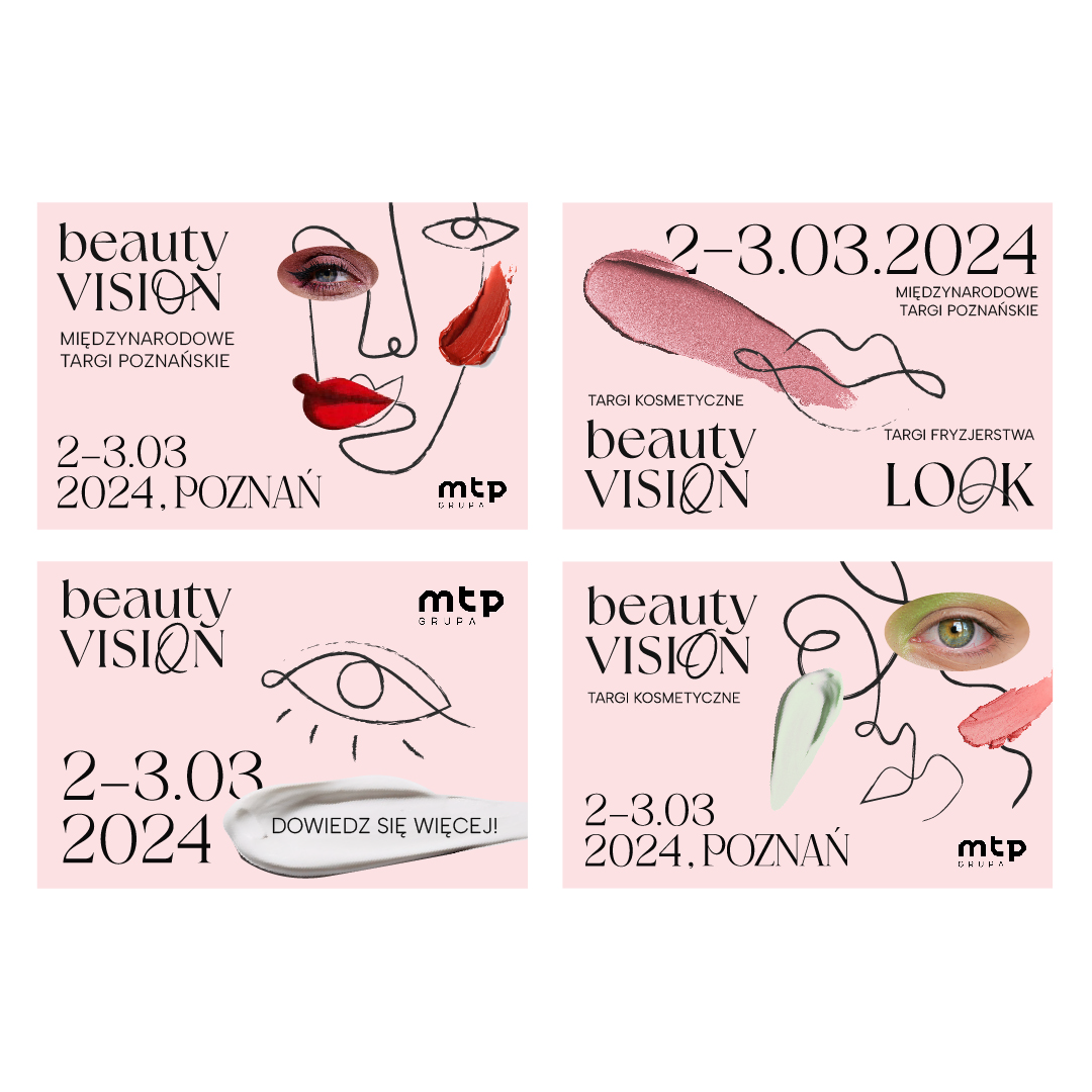
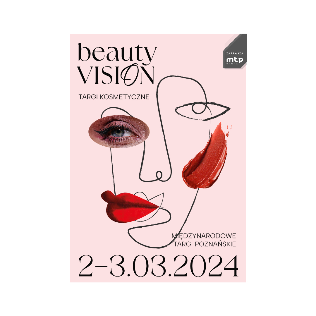

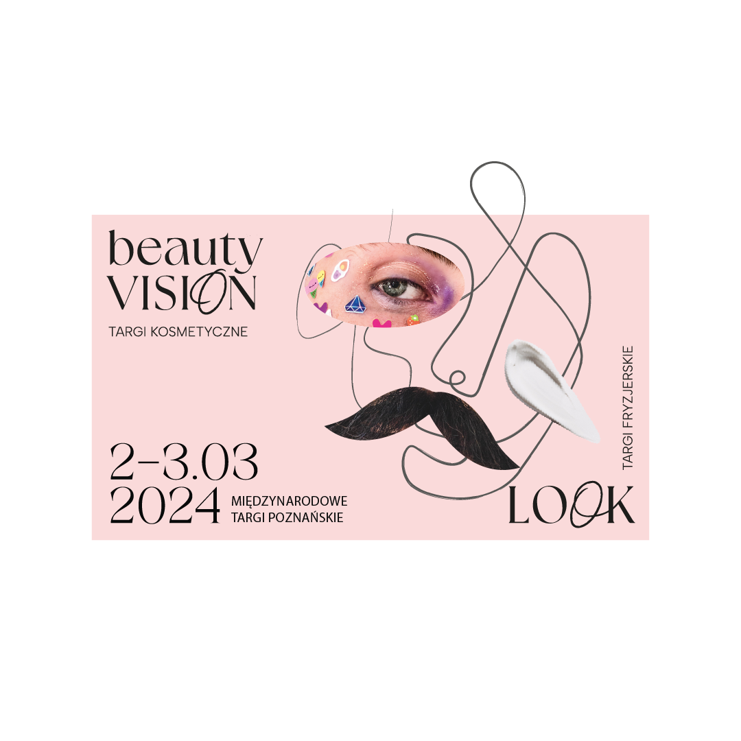
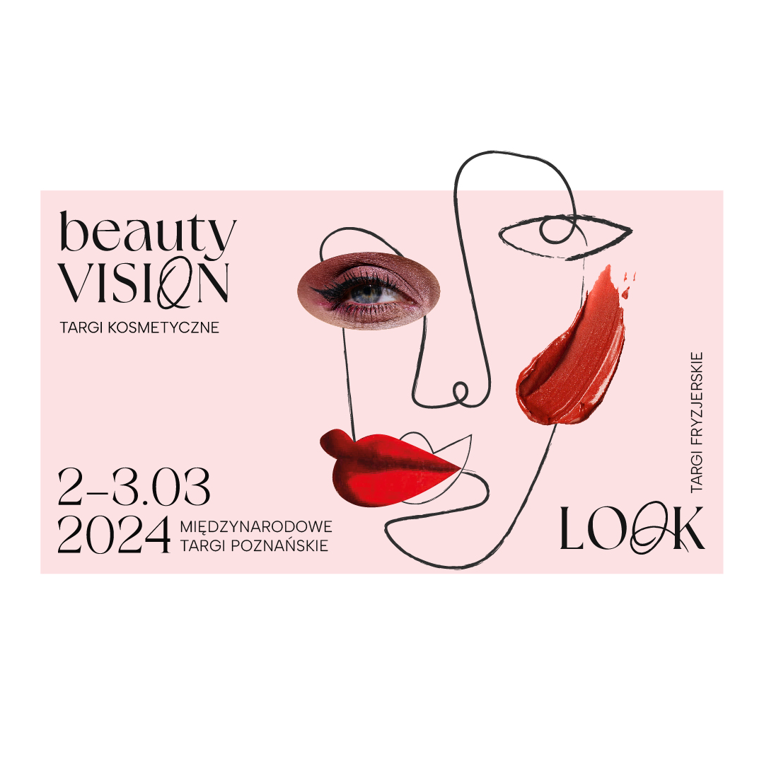
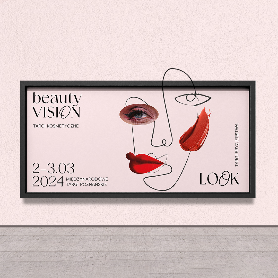
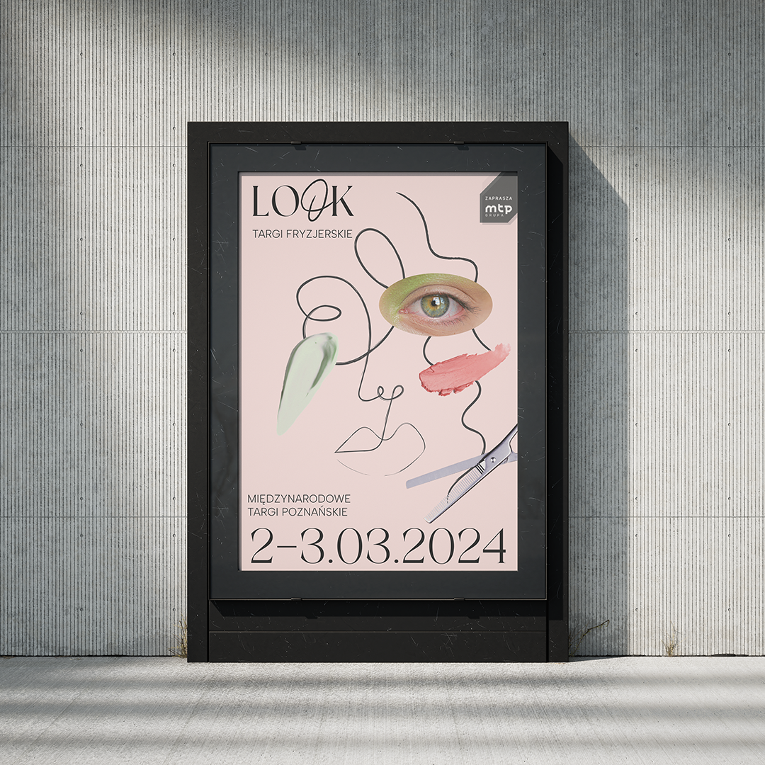
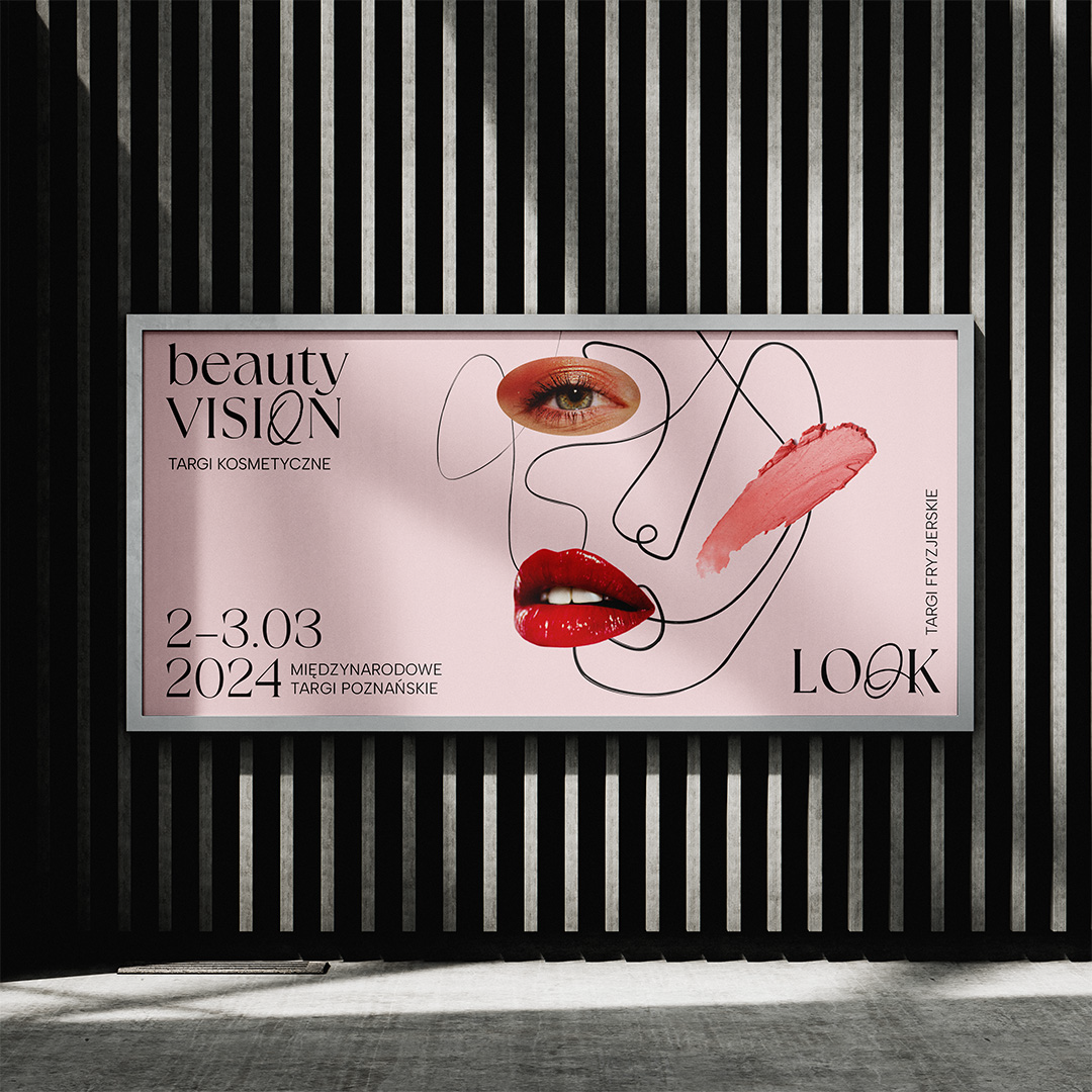

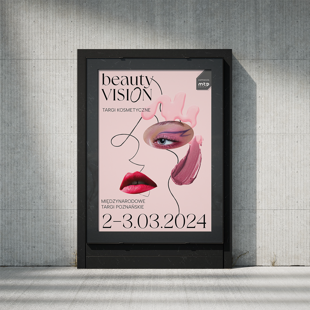
The billboards use all the elements created by our agency. The modern composition includes the name of the event, the date and place of the event, the MTP group logo and graphic motifs in several scenes. The whole refers to the theme of the events and harmonizes with the background colors. We offered the client both individual and combined versions.
The entire identity was created in such a way as to be readable and usable in many ways and on many available formats. We provided the client with access to a range of possibilities that, even when randomly combined, will create a sensual image of the beauty industry. The alternate use of components will diversify the fair's representation and reach the target audience and all those interested in beauty and hairdressing.




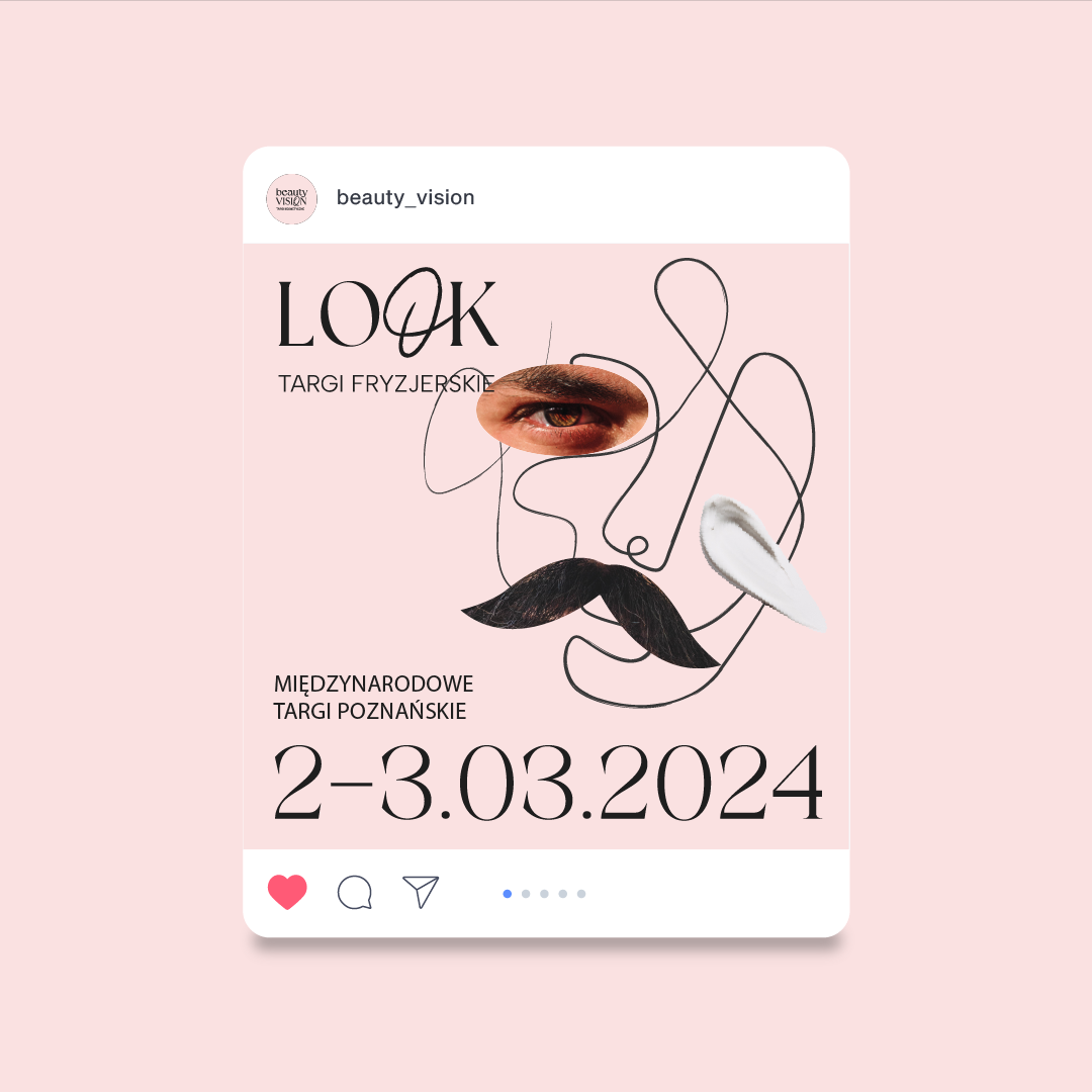

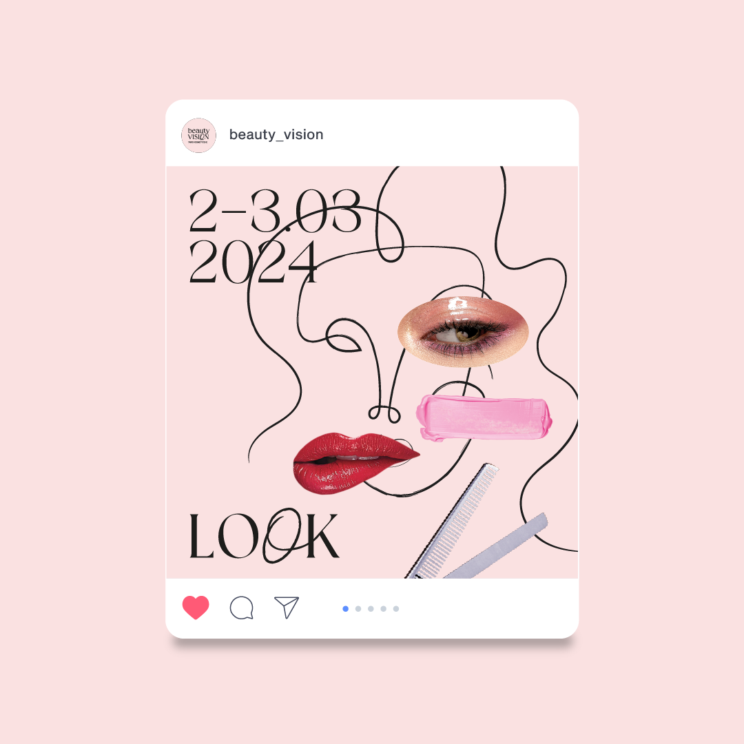


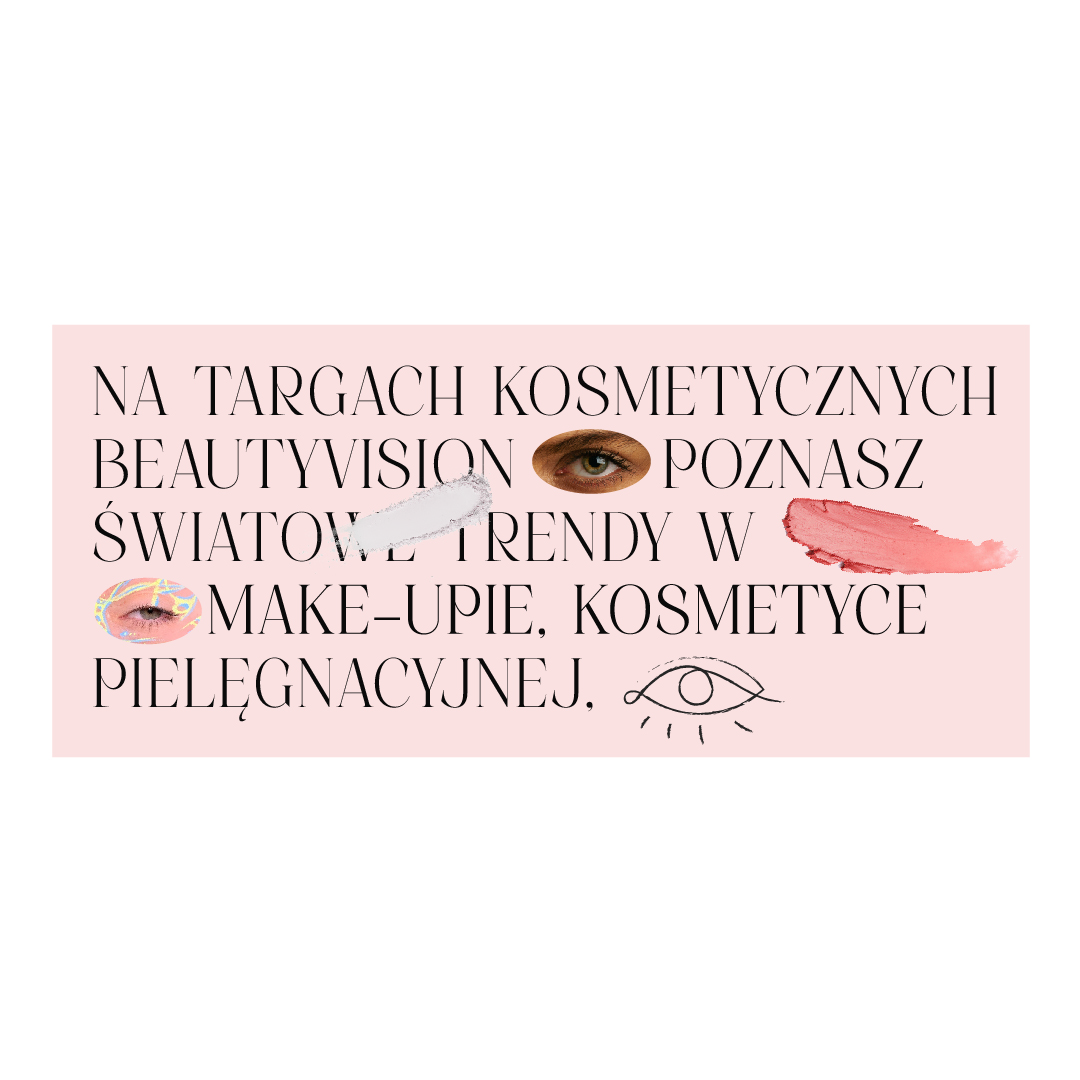
Using the new visual identity, sample posts were created for the event's social media channels, which will serve an informative function and allow direct contact with the target group. The sample posts are characterized by the new design created by our agency. They make use of both textual and visual elements in the form of background colors, oval-shaped photos or fragments of cosmetics.
Let your company stand out
See our projects:
Client: Poznań International Fair
Year: 2023


Focusing on the client's needs and the specifics of the events, we created typography that refers to the beauty and hairdressing industries. We chose a delicate, feminine font that will become a representation of both events. The proposed color scheme fits in with the theme of sensuality and thematic reference that the client wanted. We chose pastel shades of pink and black, which integrate with the broader beauty industry. The colors appear as background elements, font and part of the visual theme.


Another cooperation with Poznan International Fair concerned refreshing the graphic theme of the LOOK and BeautyVISION fairs, which present beauty trends and present ideas aimed at both professionals and enthusiasts of the cosmetics and hairdressing industries. Our agency took care of creating a new layout that gave freshness and emphasized the theme of the fair, as well as implementing it in materials promoting the event.


In the illustrations created by us, the base is always a universal outline of a face made in an abstract style. Applied to it can be the identification of both events. Realistic cut-outs are composed with samples of cosmetic care, which is the idea of the event. The placement of details is arbitrary and provides ample opportunity to represent individuality, as well as the integrity of the events.


We placed the LOOK and BeautyVISION logos in the center and focused on making the name resonate better with the use of capital letters. We highlighted the second letter "O", which catches the eye and integrates stylistically with the name of the beauty fair. The lettering looks modern and harmonizes with the style we proposed.Against the background of the colors we chose, the font looks extremely feminine and light.


A central aspect during the creation of the logotype was the desire to create a personalized letter styling that would characterize each part of the fair separately, but also allow for the summation of the events. A delicate font with the letter "O" highlighted allows for any aesthetic variation, and additionally connects the two names of the fair. It is a universal identification element that also graphically relates to the content of the event.


We proposed elements that can be combined into a collage that represents aspects of the hair and beauty industry theme. We used an abstract outline of a face in a drawing style, which is the base and allows us to add more elements according to the client's needs. We used fragmentary photos that refer to newspaper clippings from the beauty industry, and finished the whole thing off by adding elements of cosmetics. The proposed motifs create endless possibilities for modification and creation of new designs without the need to contact the agency.


The entire identity was created in such a way as to be readable and usable in many ways and on many available formats. We provided the client with access to a range of possibilities that, even when randomly combined, will create a sensual image of the beauty industry. The alternate use of components will diversify the fair's representation and reach the target audience and all those interested in beauty and hairdressing.


The billboards use all the elements created by our agency. The modern composition includes the name of the event, the date and place of the event, the MTP group logo and graphic motifs in several scenes. The whole refers to the theme of the events and harmonizes with the background colors. We offered the client both individual and combined versions.


Using the new visual identity, sample posts were created for the event's social media channels, which will serve an informative function and allow direct contact with the target group. The sample posts are characterized by the new design created by our agency. They make use of both textual and visual elements in the form of background colors, oval-shaped photos or fragments of cosmetics.
Let your company stand out
See our projects:
Follow us!
INSTAGRAM: