Industry: food
Perlik is a producer of meat products made traditionally in the Bory Tucholskie area. The family-run company has been creating cold meats from raw material from its own farm for more than 30 years. Their products are made from the passion and years of experience of the master butcher and his family team. Our client decided to invest in the company's professional image to strengthen the already solid brand position and open it up to new challenges.
Year: 2023
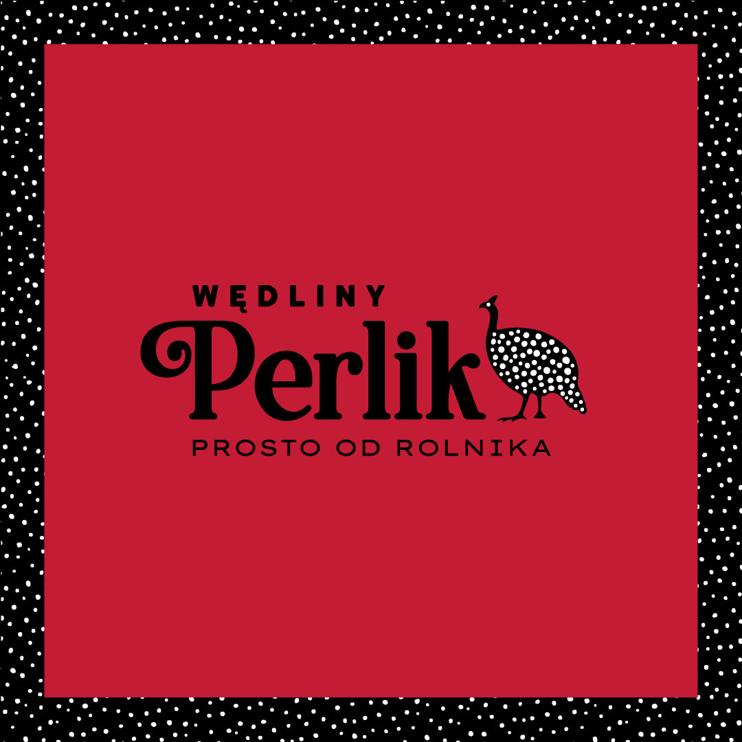
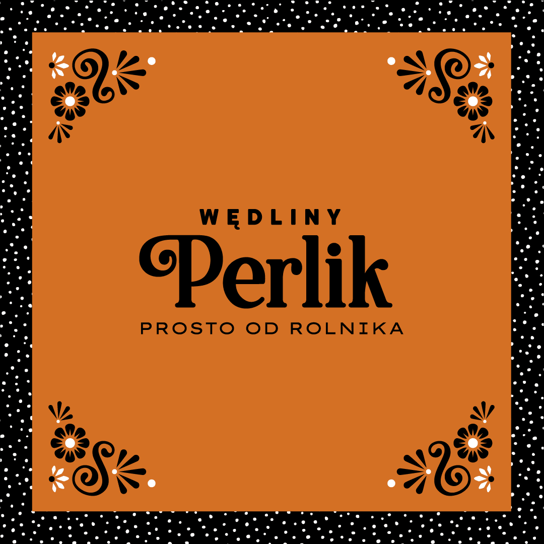
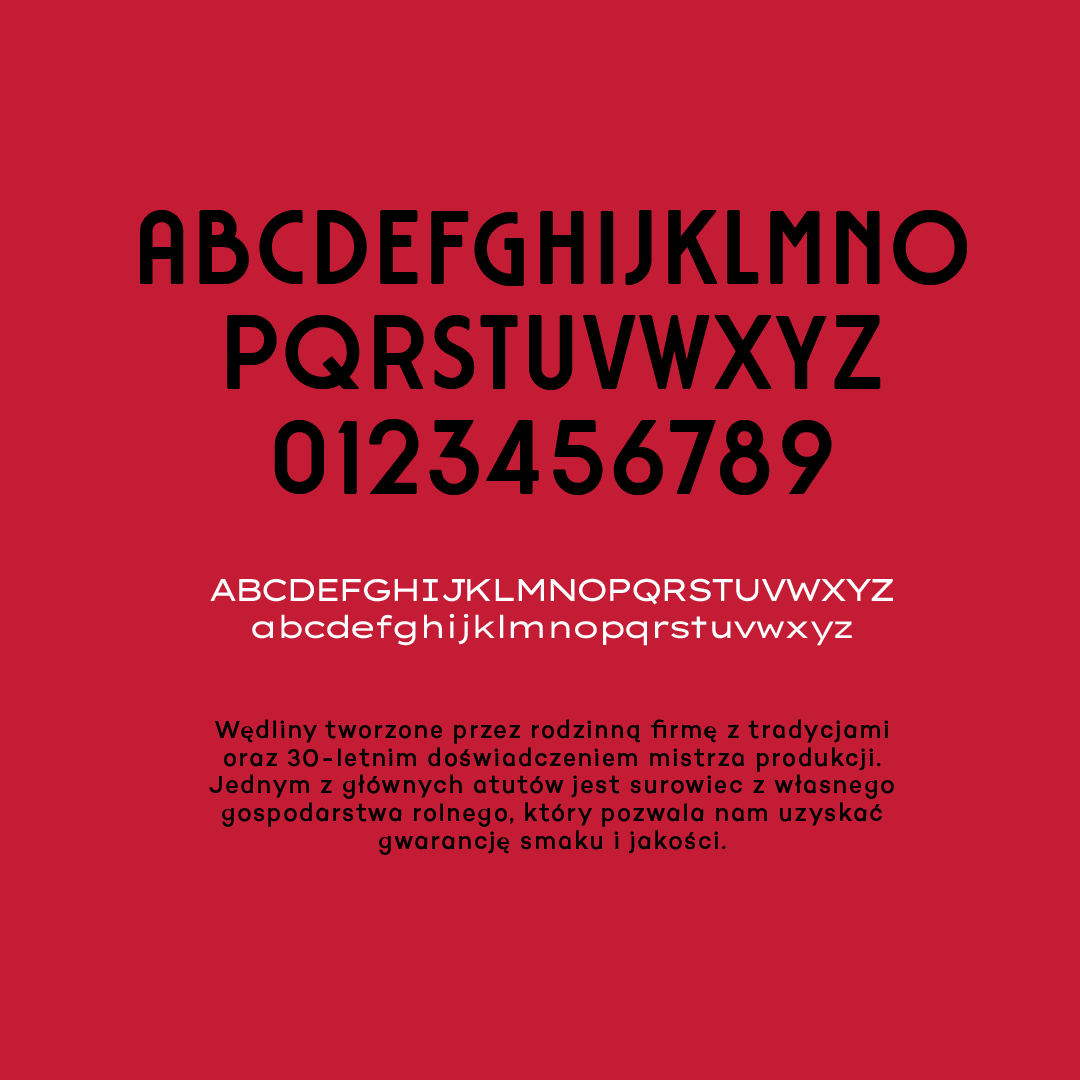
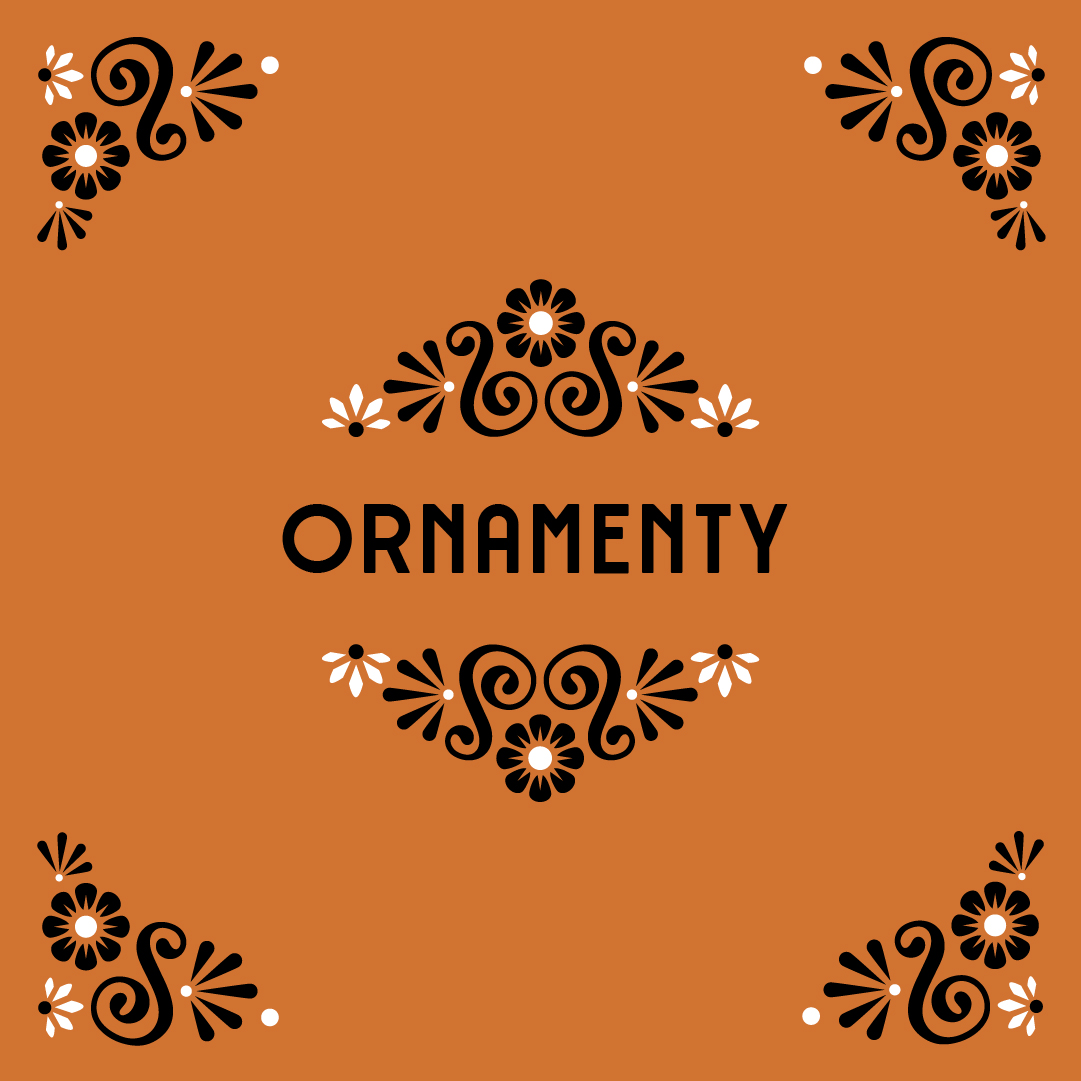

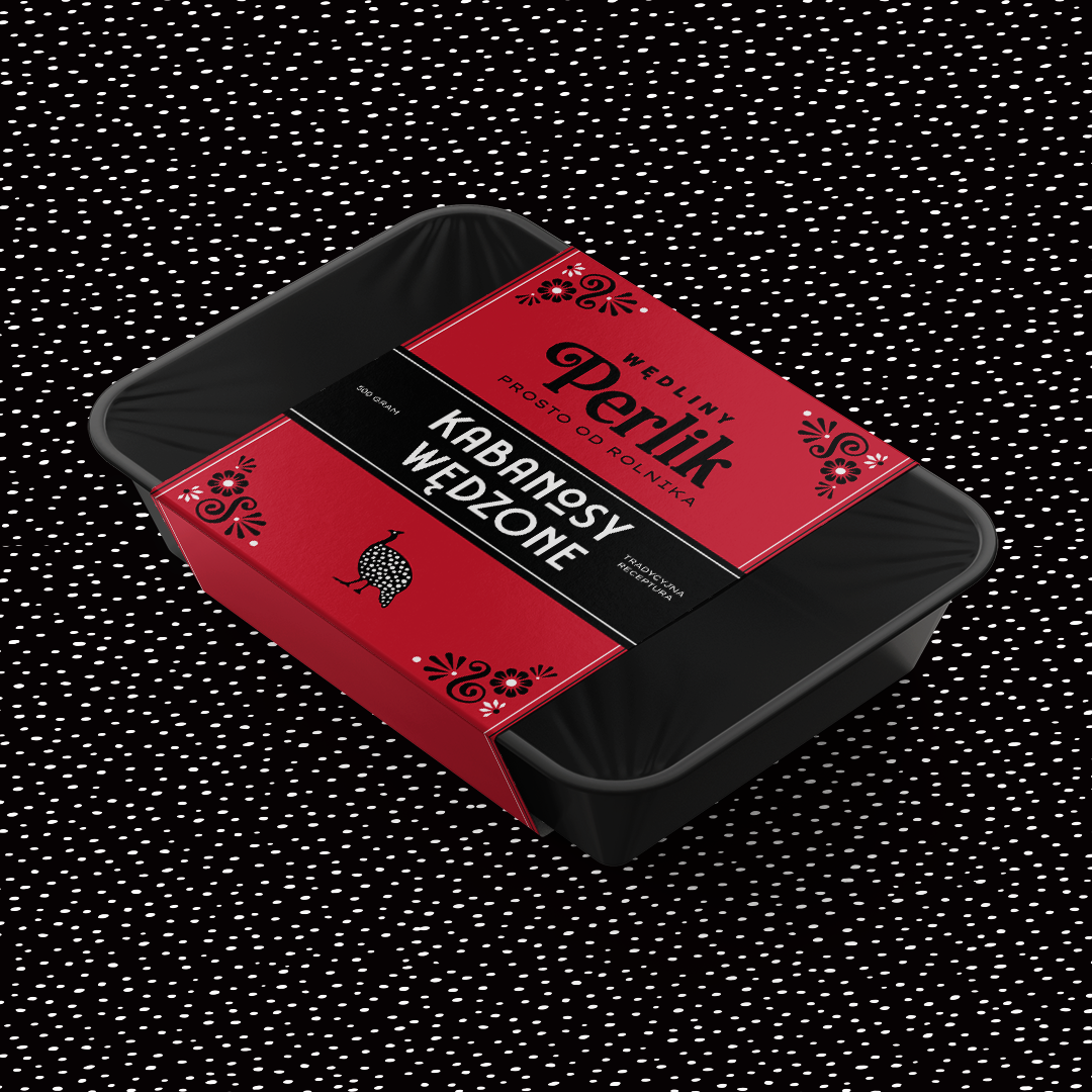
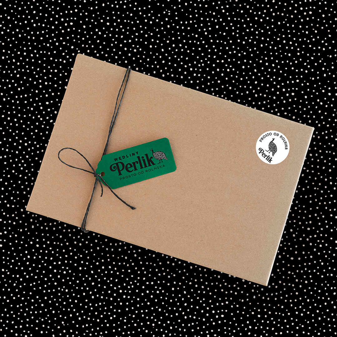
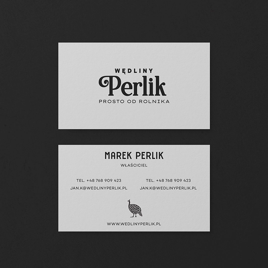
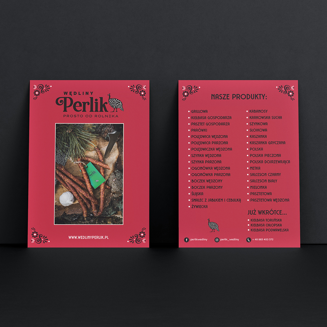
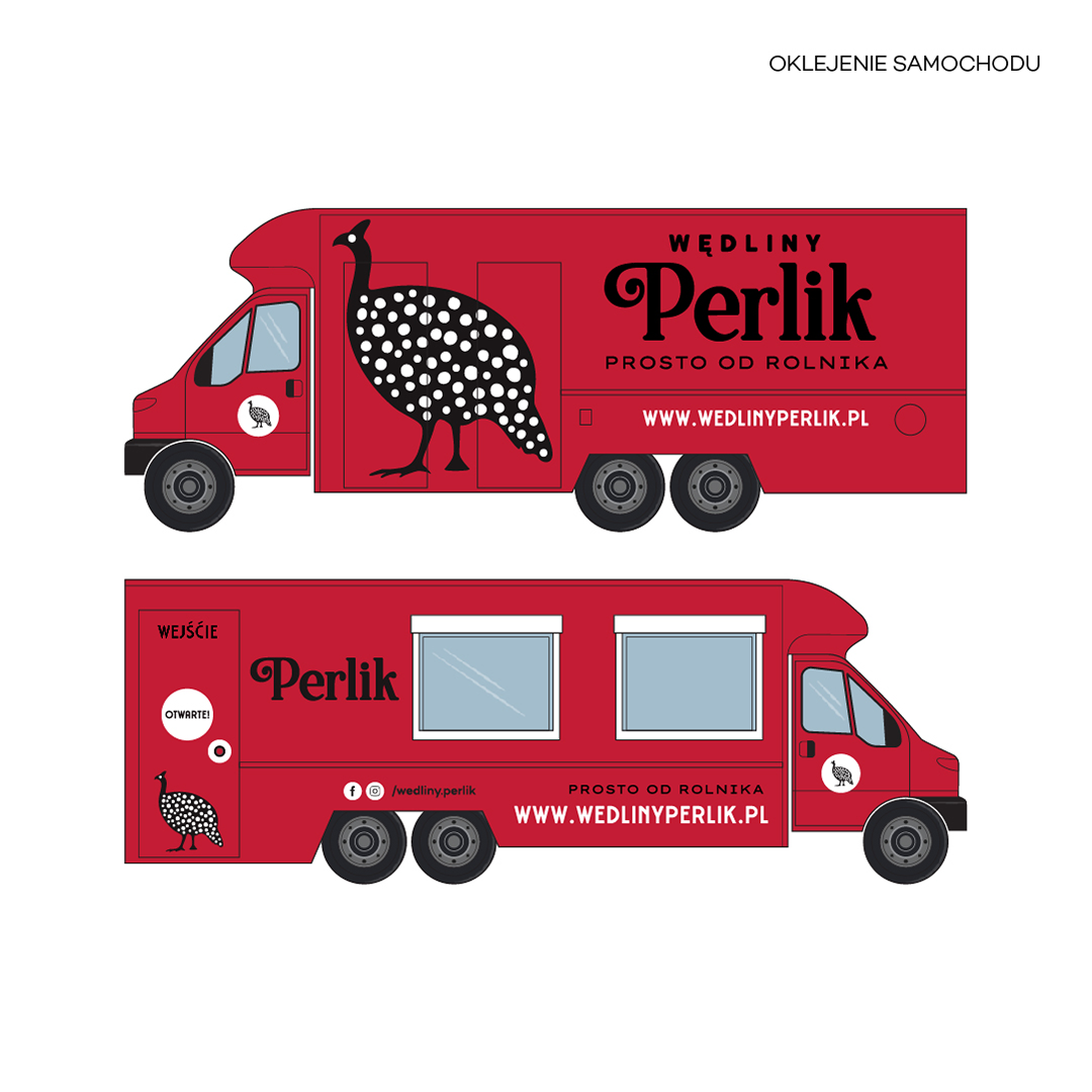
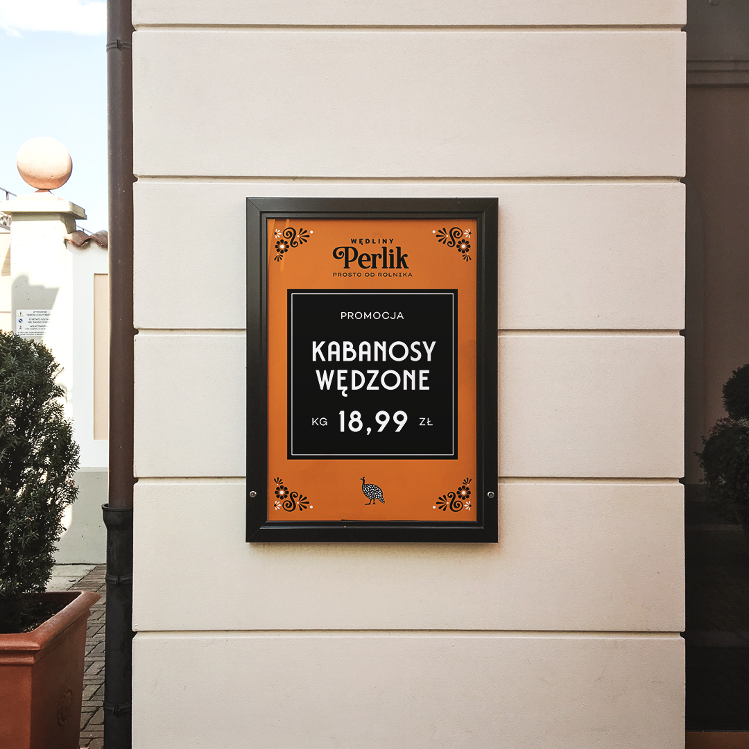
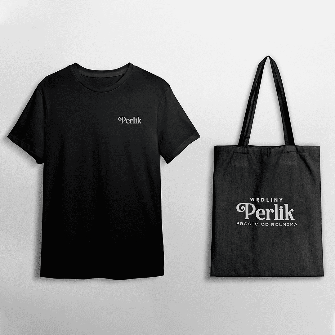
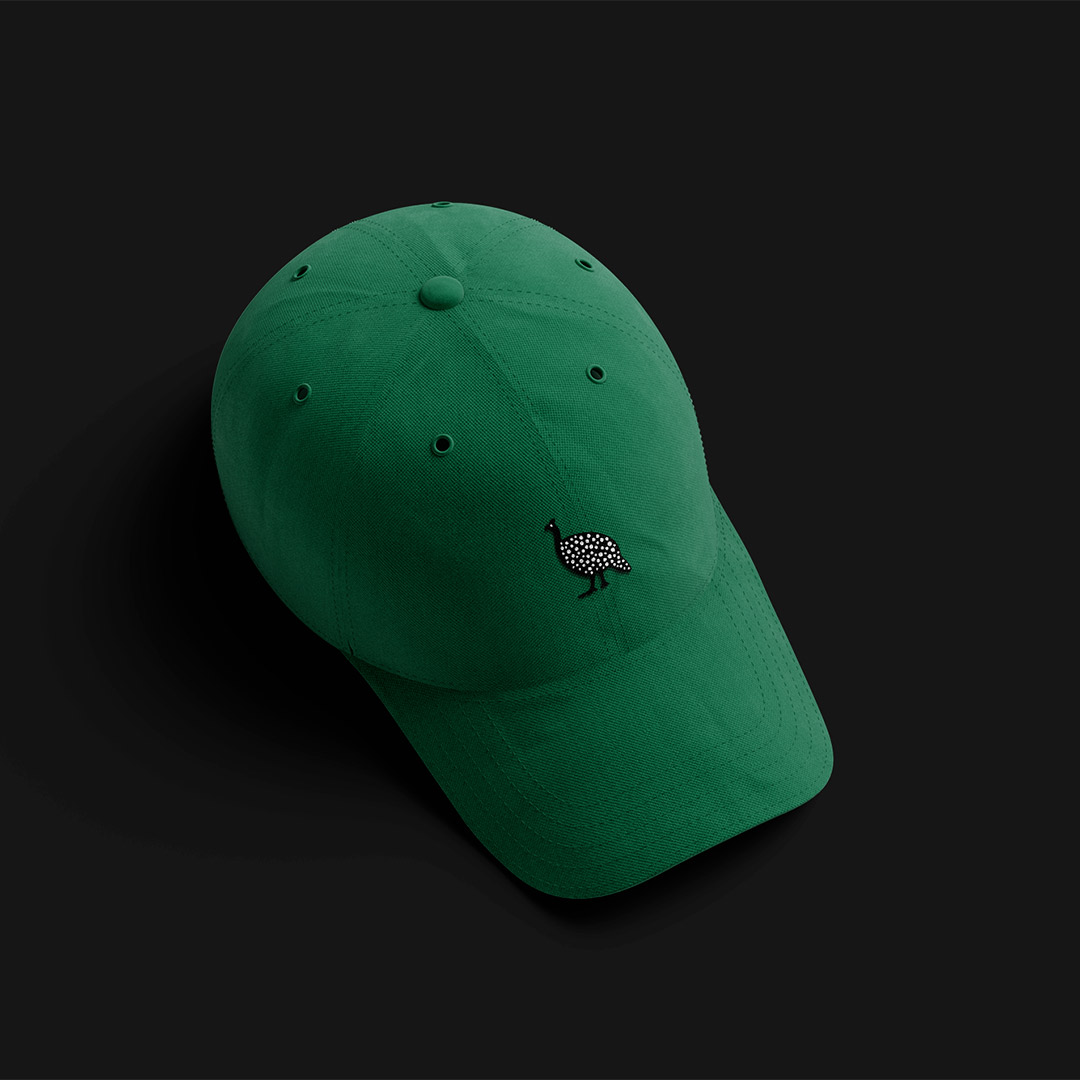
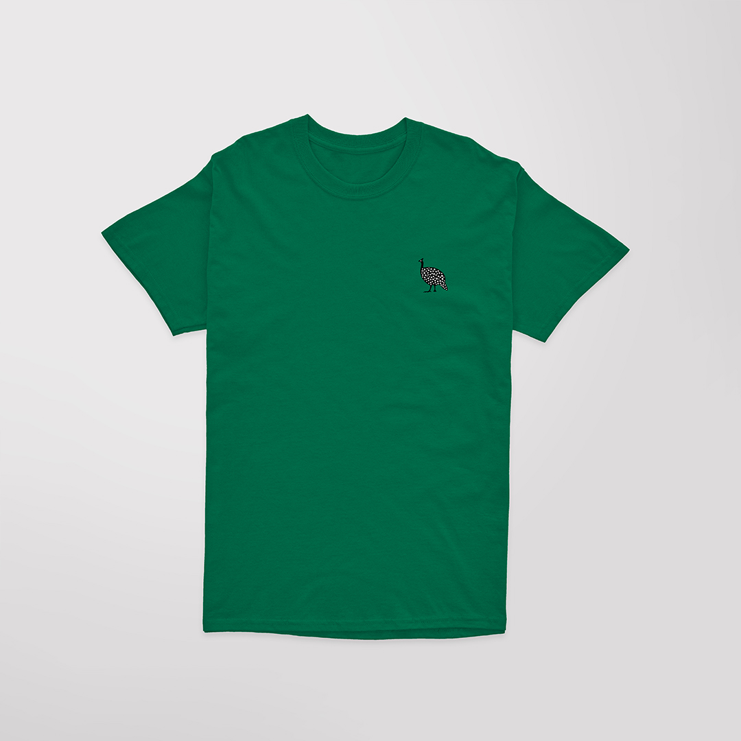
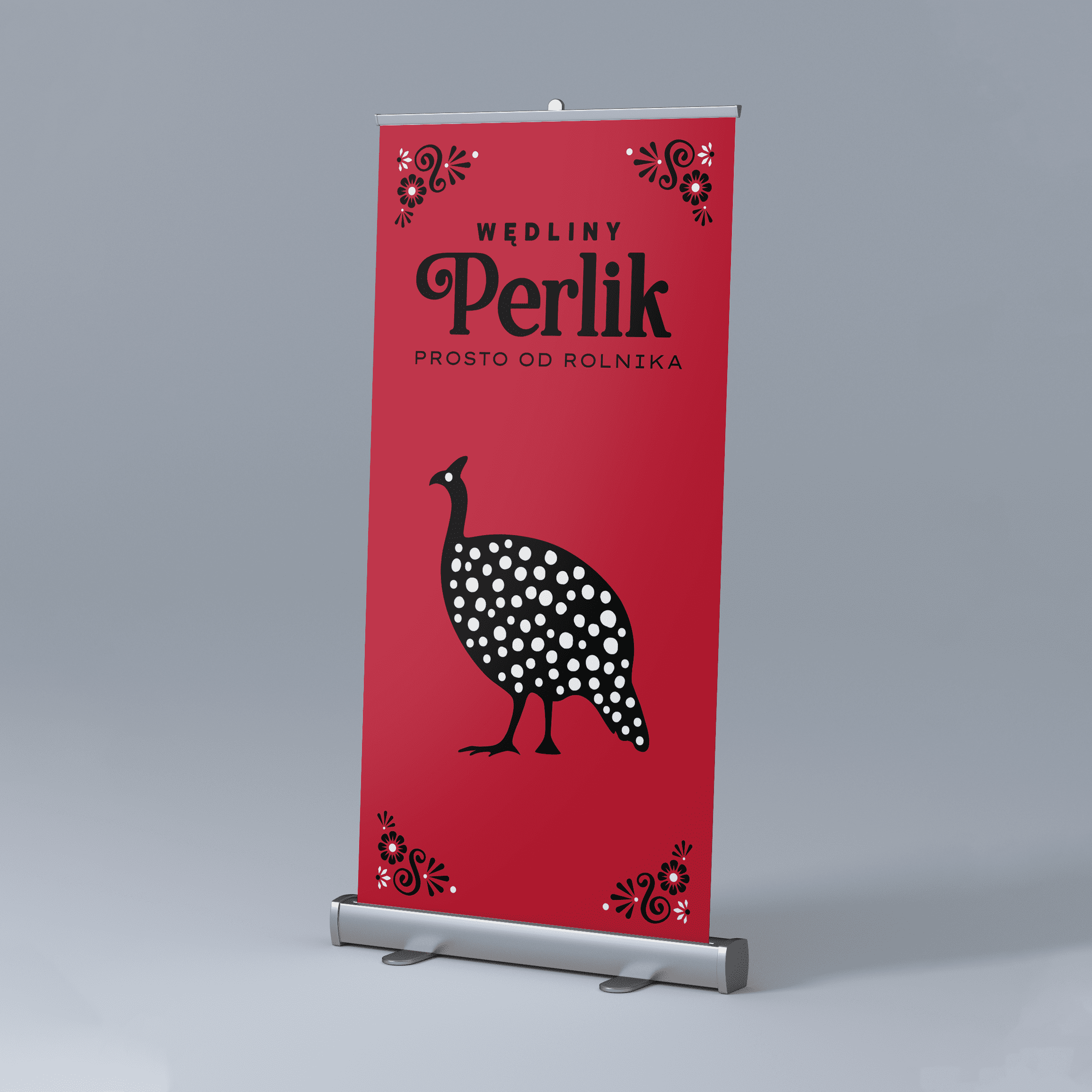
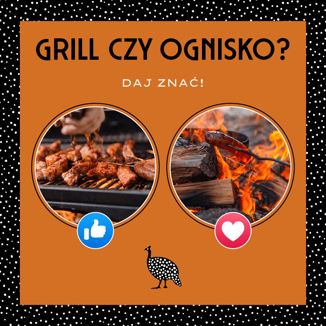
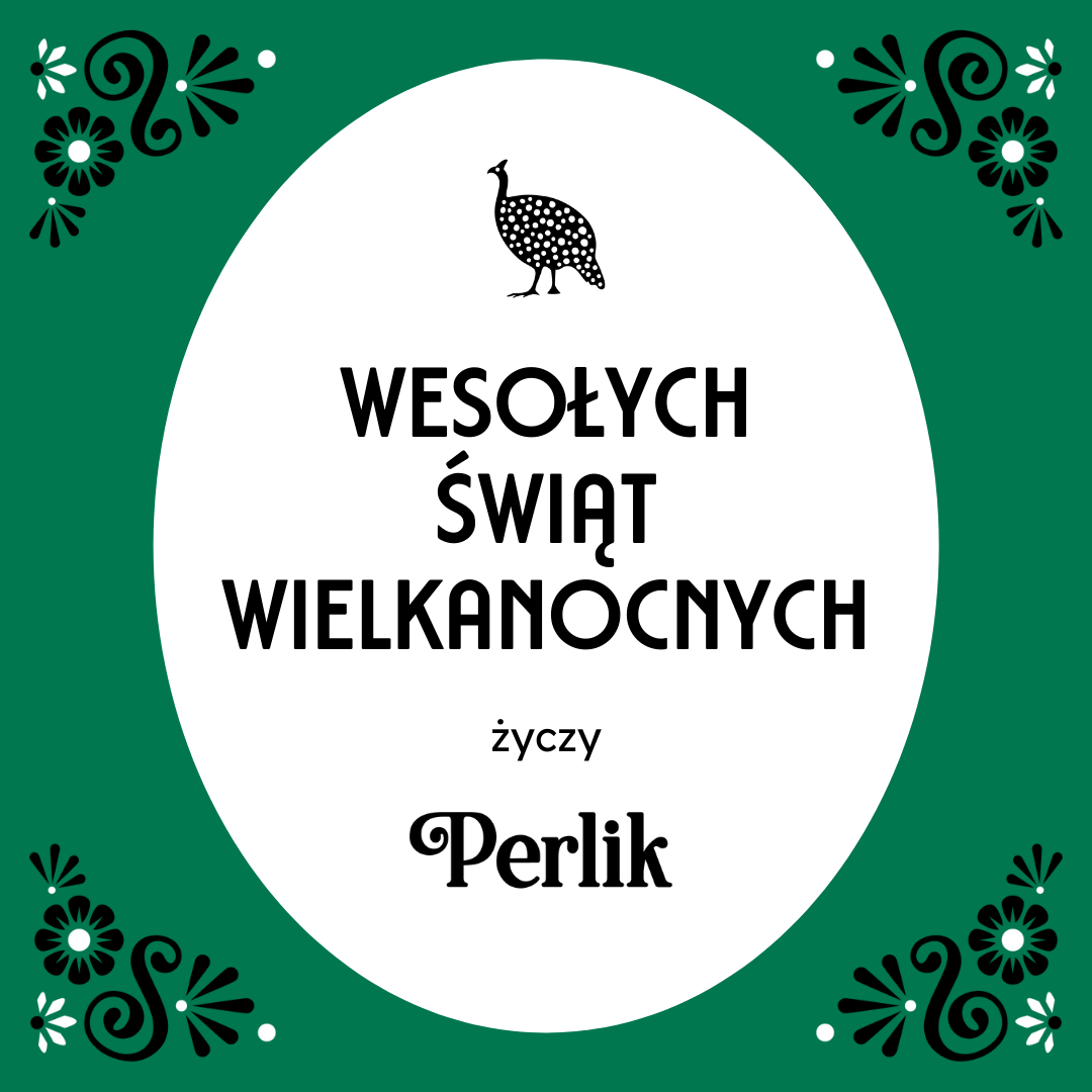
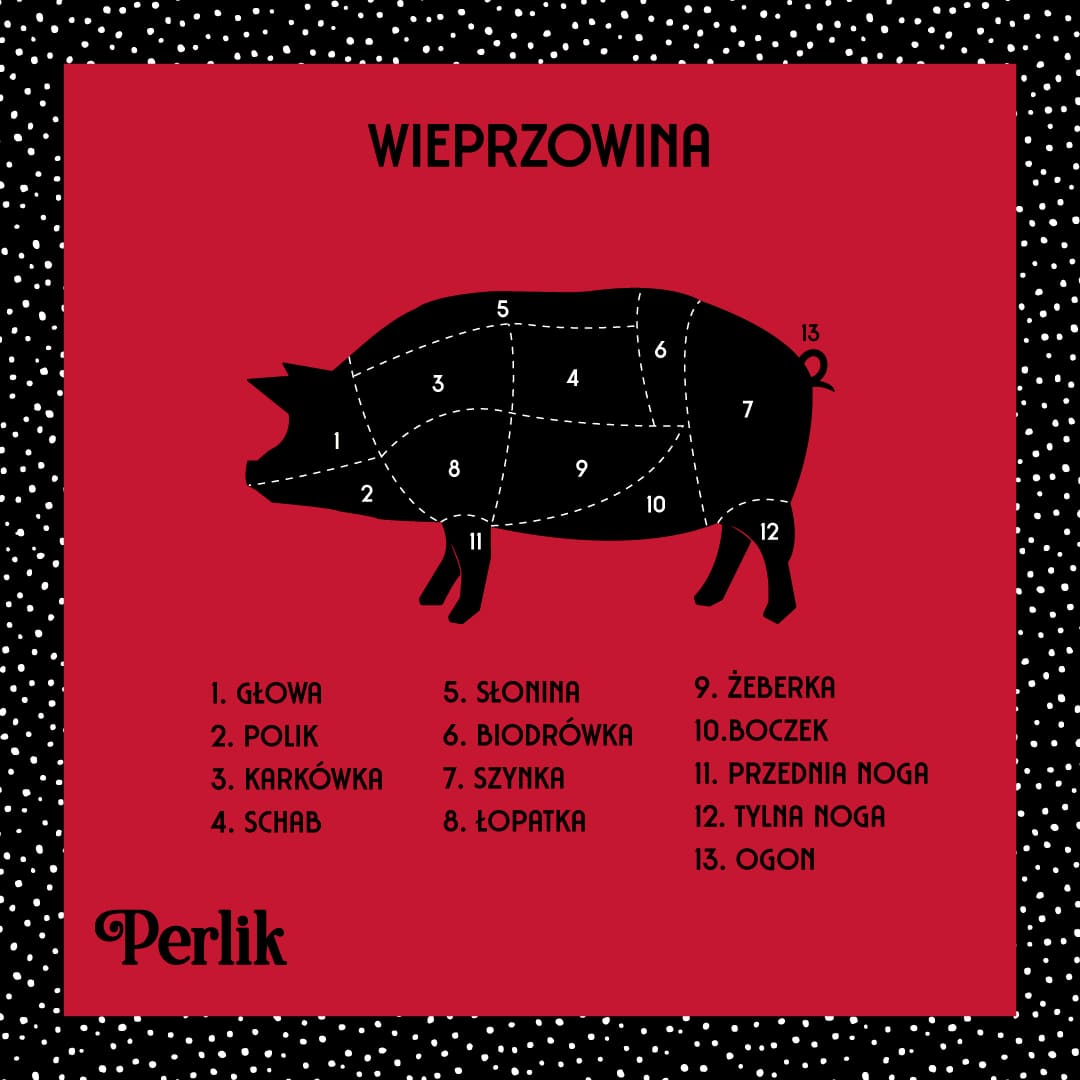
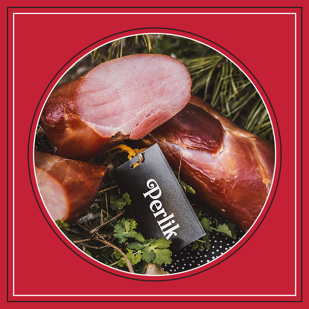
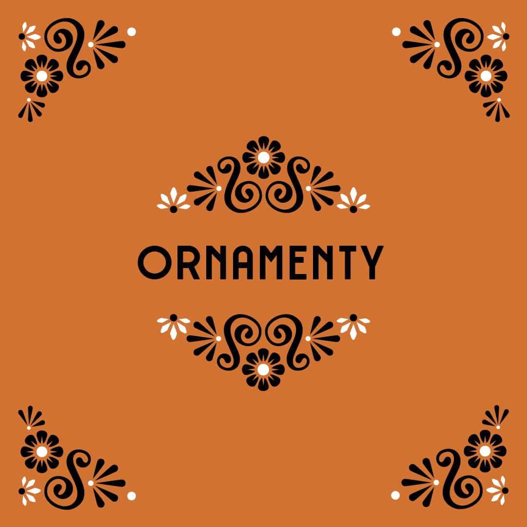
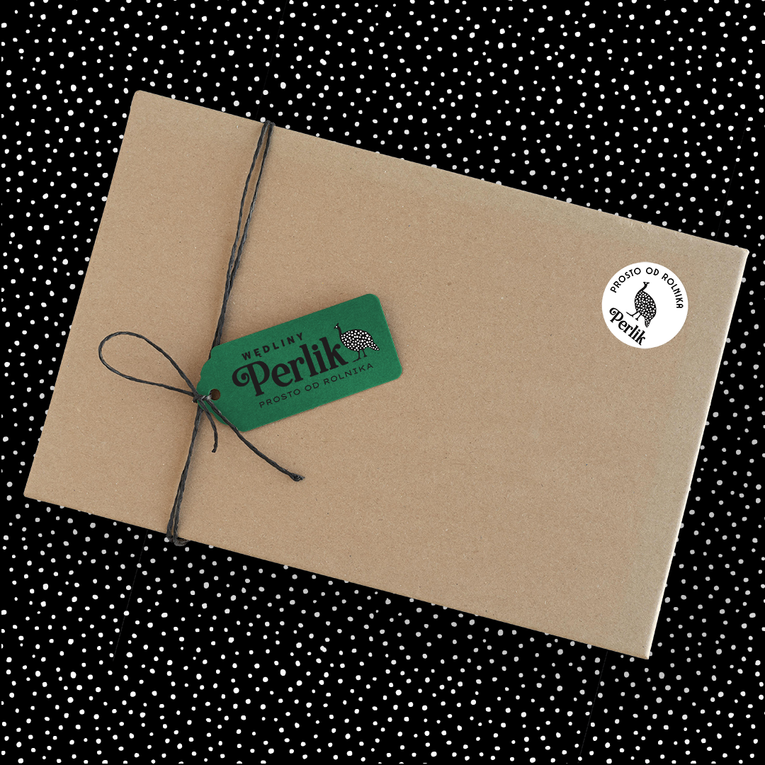
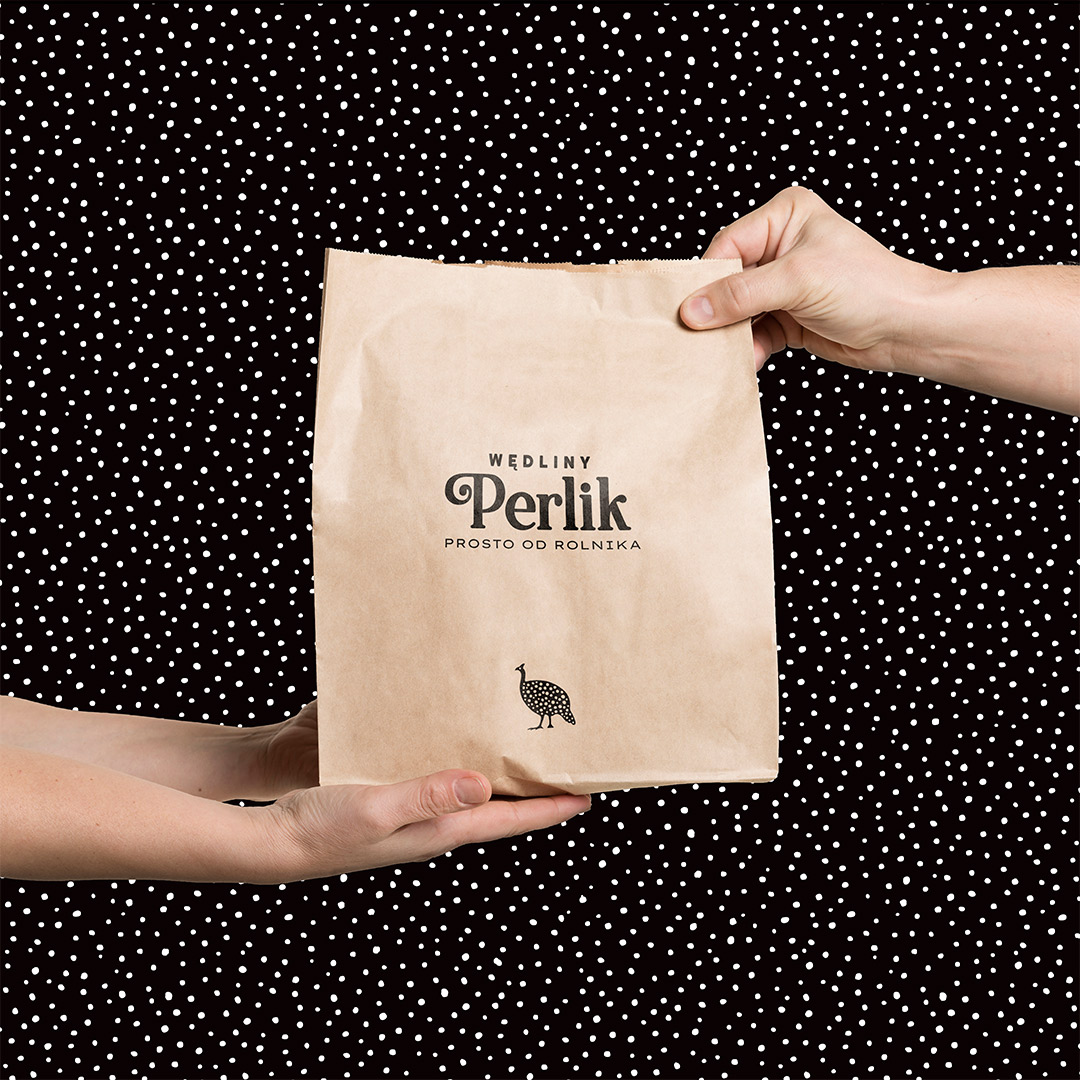
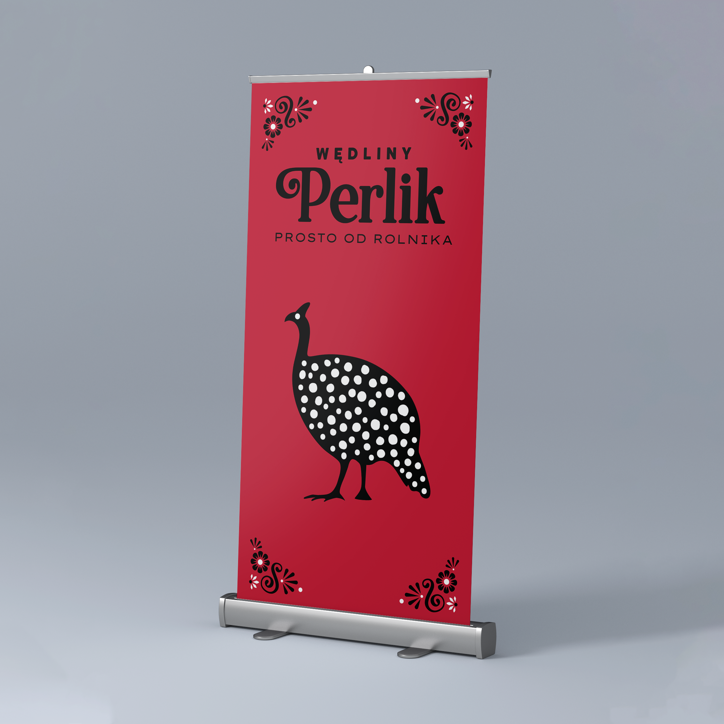
Identity is not just a trademark - we took care of comprehensive, multifaceted preparation of visual identity standards, including promotional materials, both printed and digital. Wanting to build a distinctive, unique character of the brand, we selected appropriate graphic solutions, which we standardized in the visual identity book. To ensure that all elements of advertising creations build lasting associations with it among a group of recipients. Precisely selected typefaces, colors and permanent ornaments served to build a traditional, natural and responsible mood with which the company is to be correlated. The whole project was framed by a strong color combination - dominant red and complementary orange and green referring to the naturalness of the products.


What do you have an idea for an identification?
View our other projects:
Perlik is a producer of meat products made traditionally in the Bory Tucholskie area. The family-run company has been creating cold meats from raw material from its own farm for more than 30 years. Their products are made from the passion and years of experience of the master butcher and his family team. Our client decided to invest in the company's professional image to strengthen the already solid brand position and open it up to new challenges.


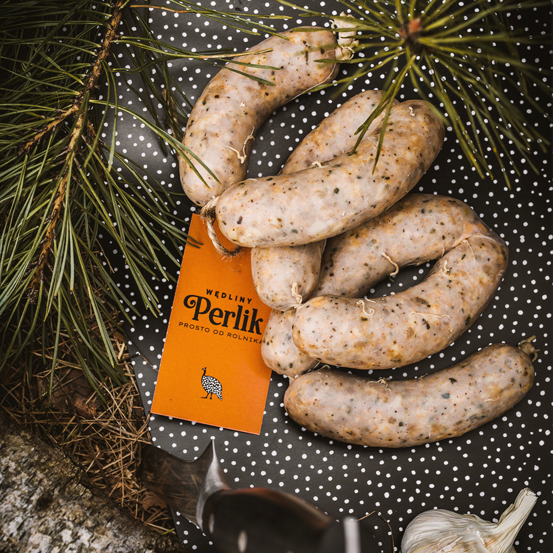
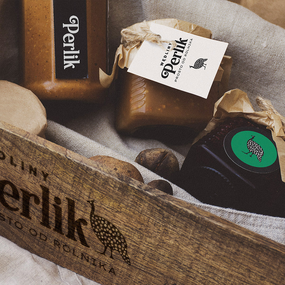
Identity is not just a trademark - we took care of comprehensive, multifaceted preparation of visual identity standards, including promotional materials, both printed and digital. Wanting to build a distinctive, unique character of the brand, we selected appropriate graphic solutions, which we standardized in the visual identity book. To ensure that all elements of advertising creations build lasting associations with it among a group of recipients. Precisely selected typefaces, colors and permanent ornaments served to build a traditional, natural and responsible mood with which the company is to be correlated. The whole project was framed by a strong color combination - dominant red and complementary orange and green referring to the naturalness of the products.






What do you have an idea for an identification?
View our other projects:
Follow us!
INSTAGRAM: