
Słodka Cześnikowska is a well-known artisan ice cream shop in Poznań, recognised for its high-quality products and loyal local community. As the business continued to grow, the owners decided it was time to create a visual identity that would better reflect the premium quality of their handmade ice cream while providing a consistent communication system for future development.
Our collaboration began with a series of design workshops and strategic consultations. Together with the client, we analysed customer expectations, explored multiple creative directions and refined the visual language until we developed a solution that balanced craftsmanship, warmth and contemporary aesthetics.
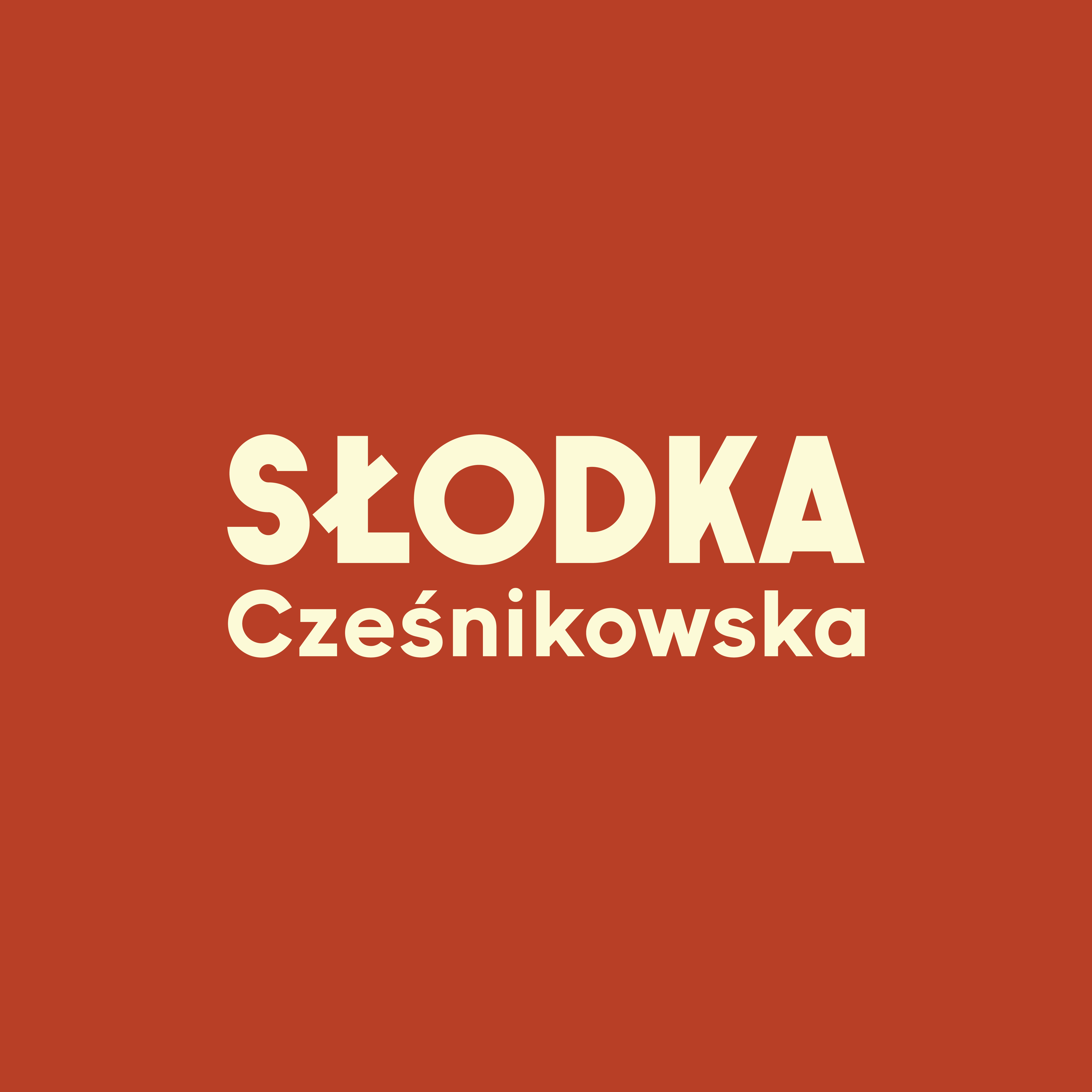
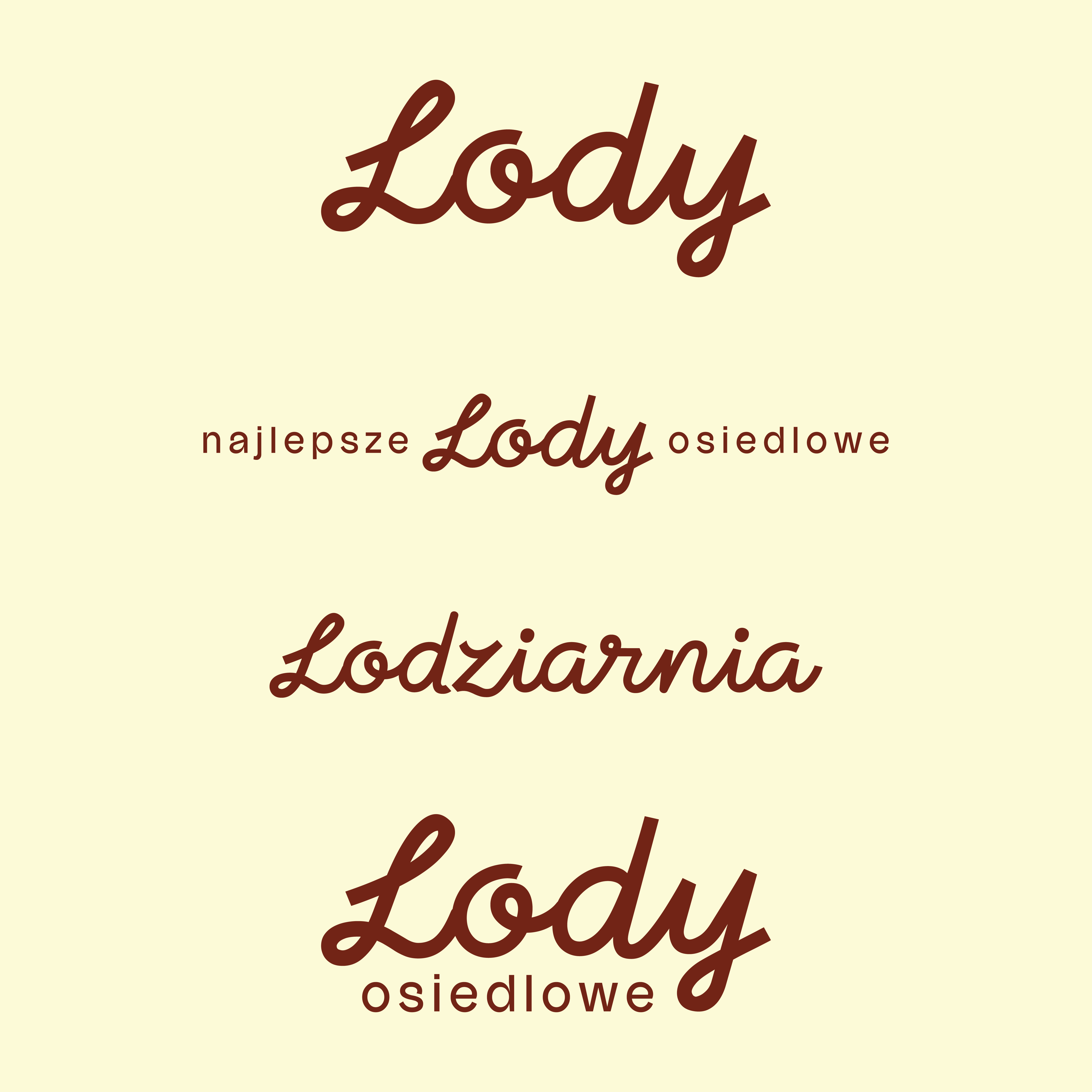
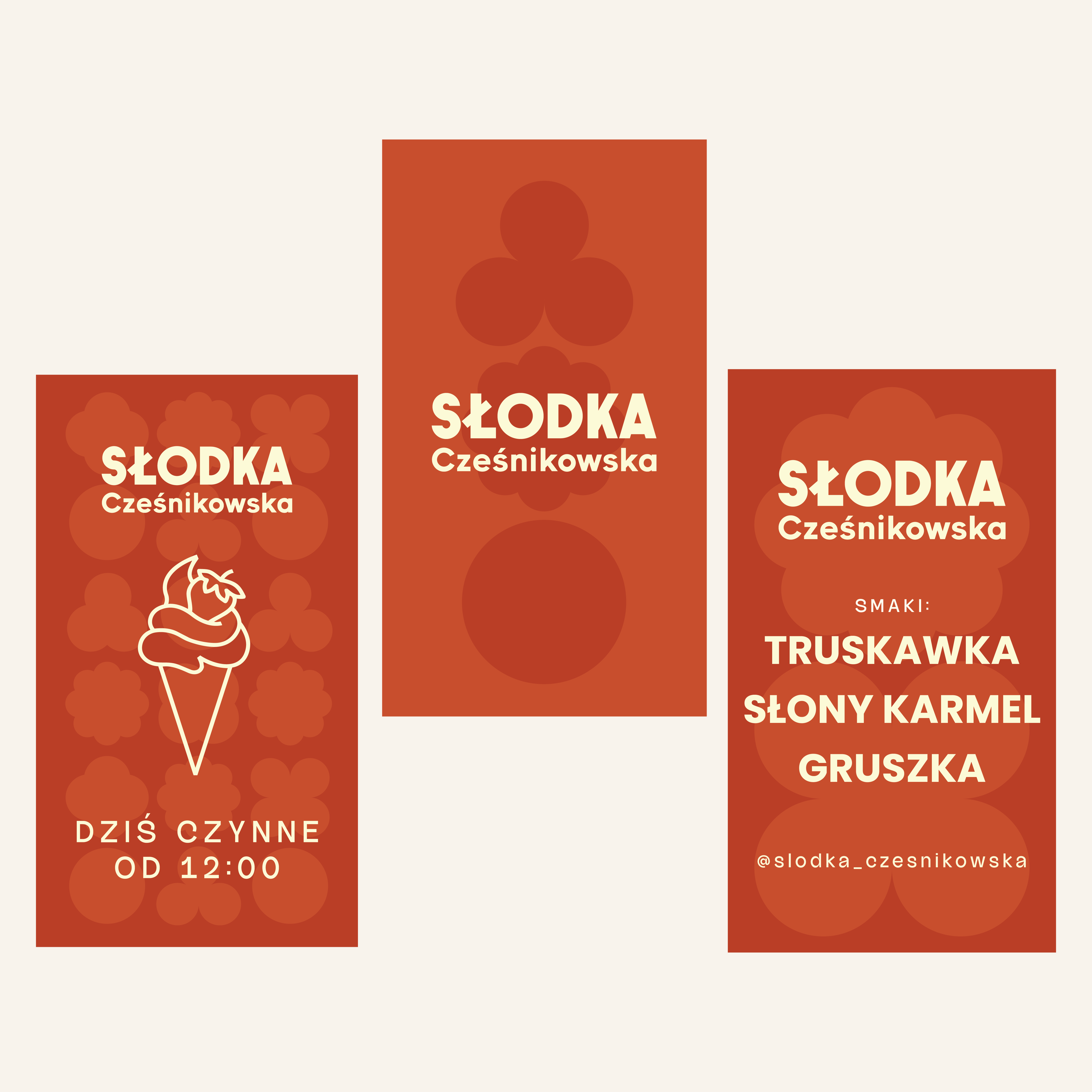
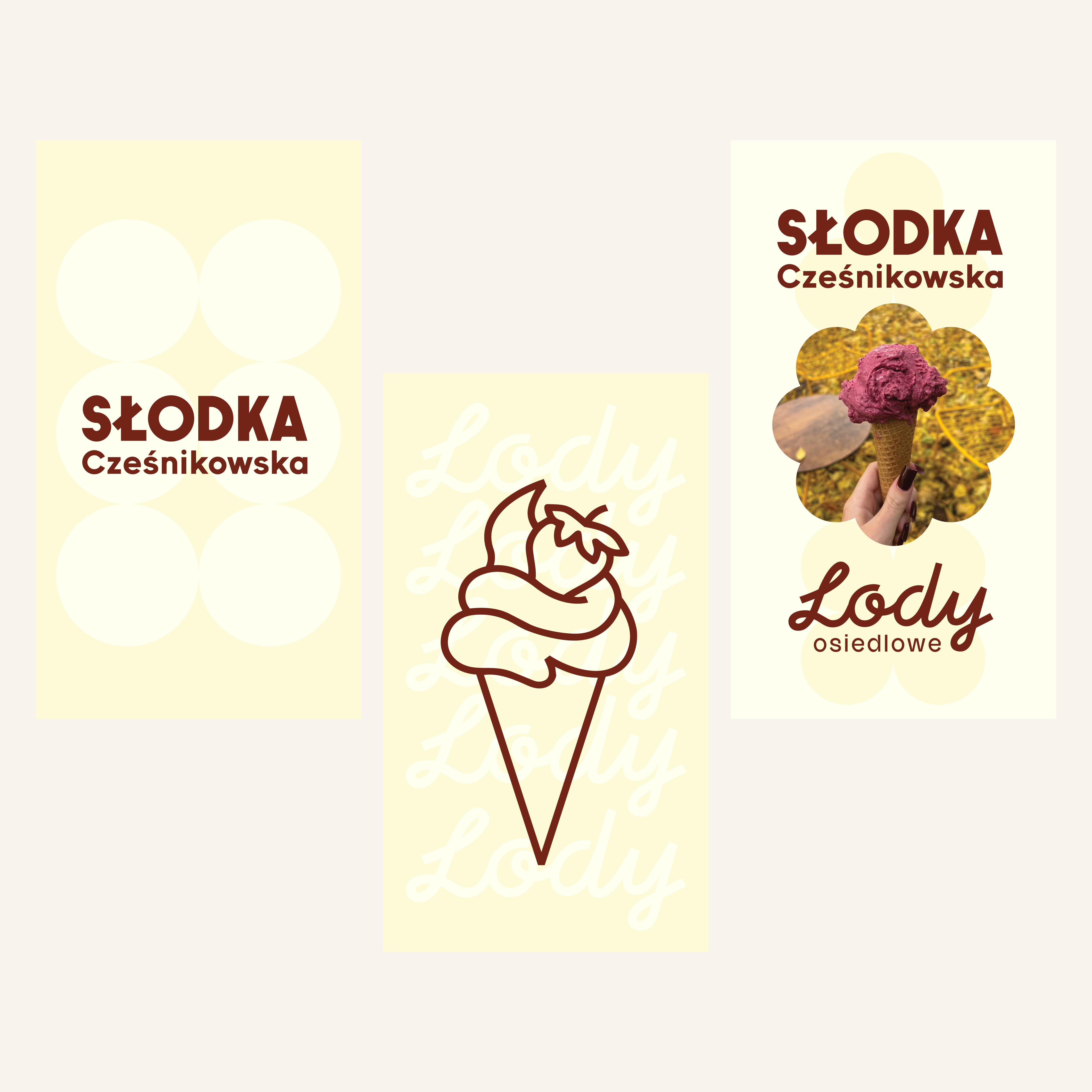
The foundation of the new visual identity is a custom-designed logo featuring geometric lettering inspired by historic artisan shop signs. Its distinctive form ensures excellent legibility and strong brand recognition across all communication channels.
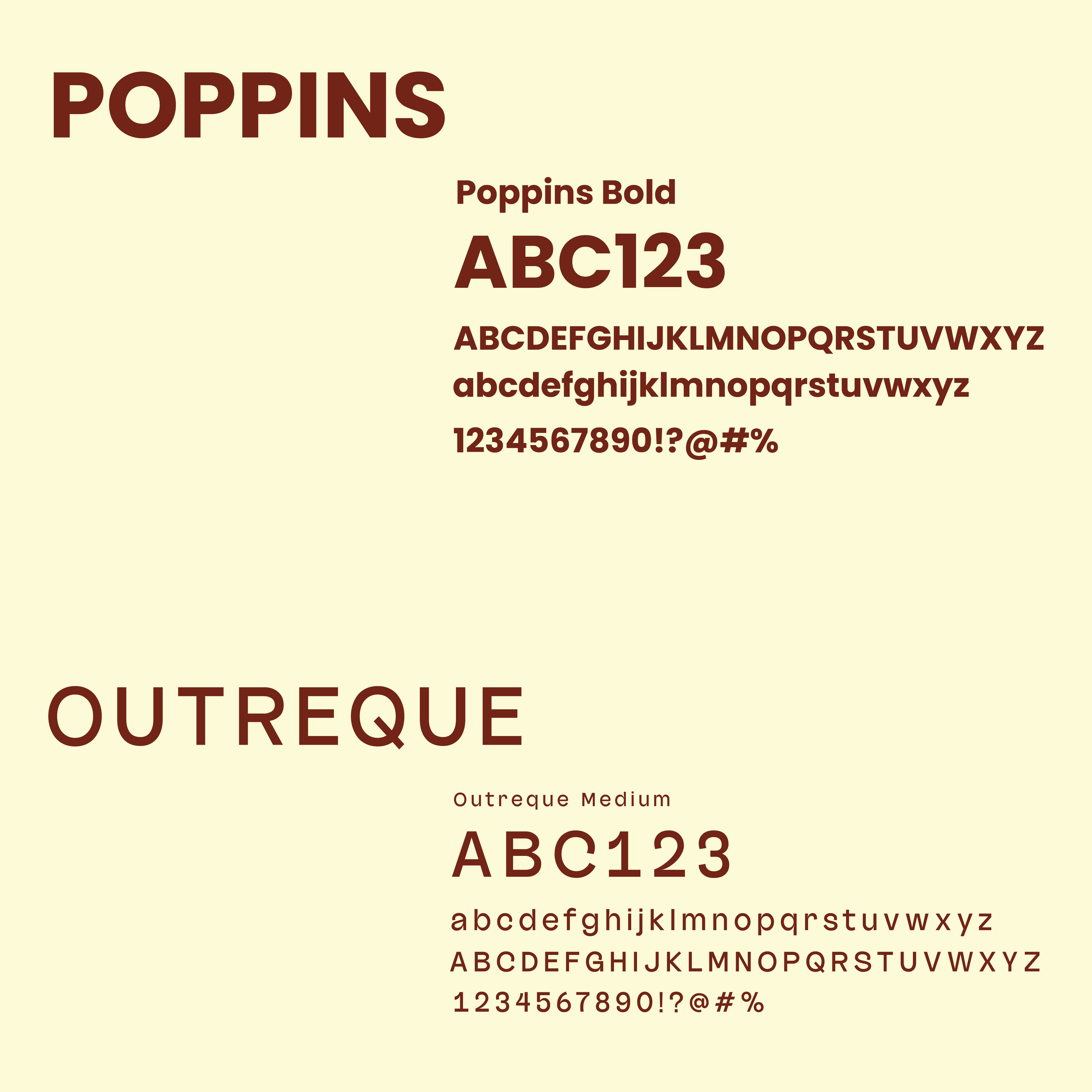
We also placed significant emphasis on typography, which plays a key role in food and hospitality branding. The bespoke type system combines clarity with the brand's approachable personality and is used consistently across both printed materials and digital communications.
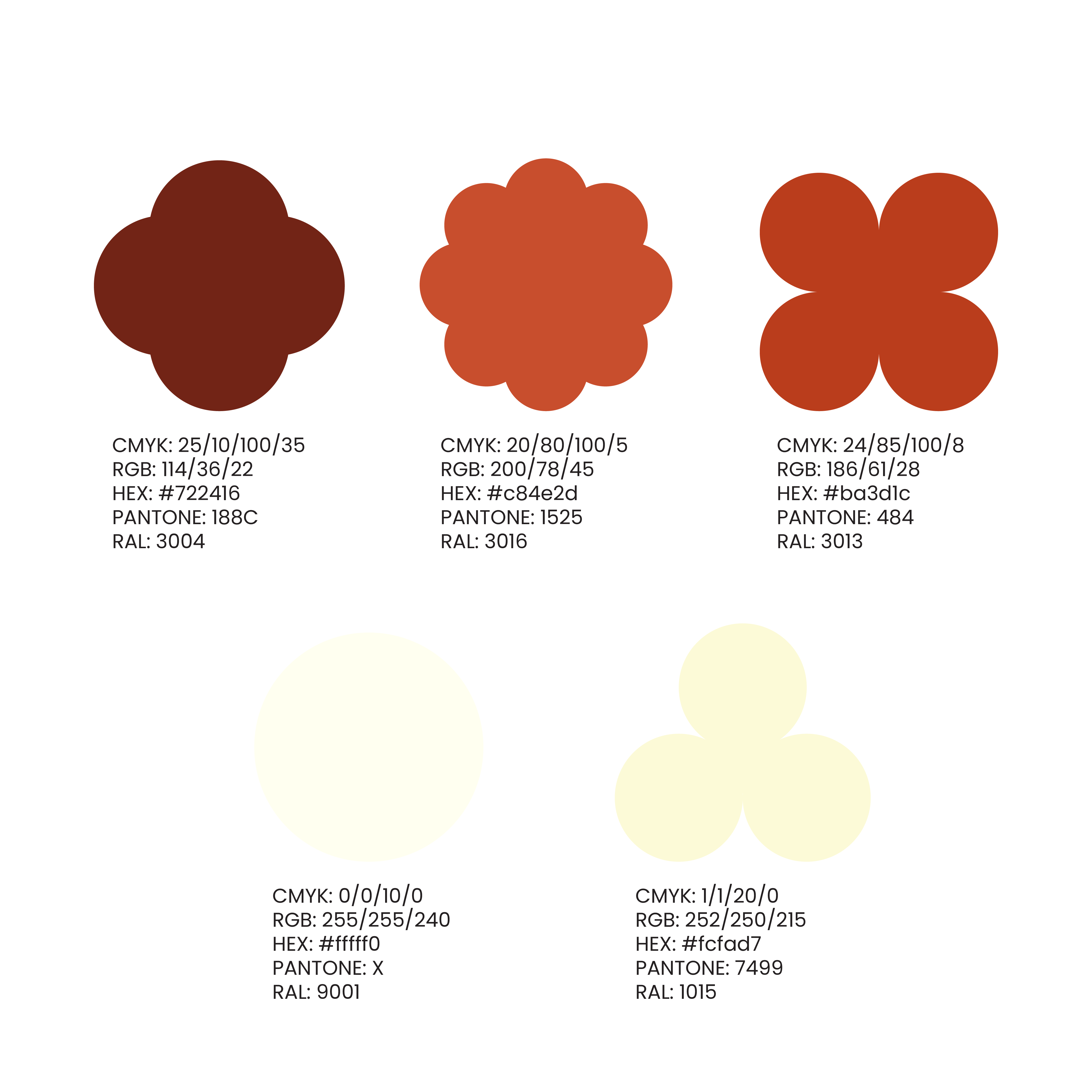
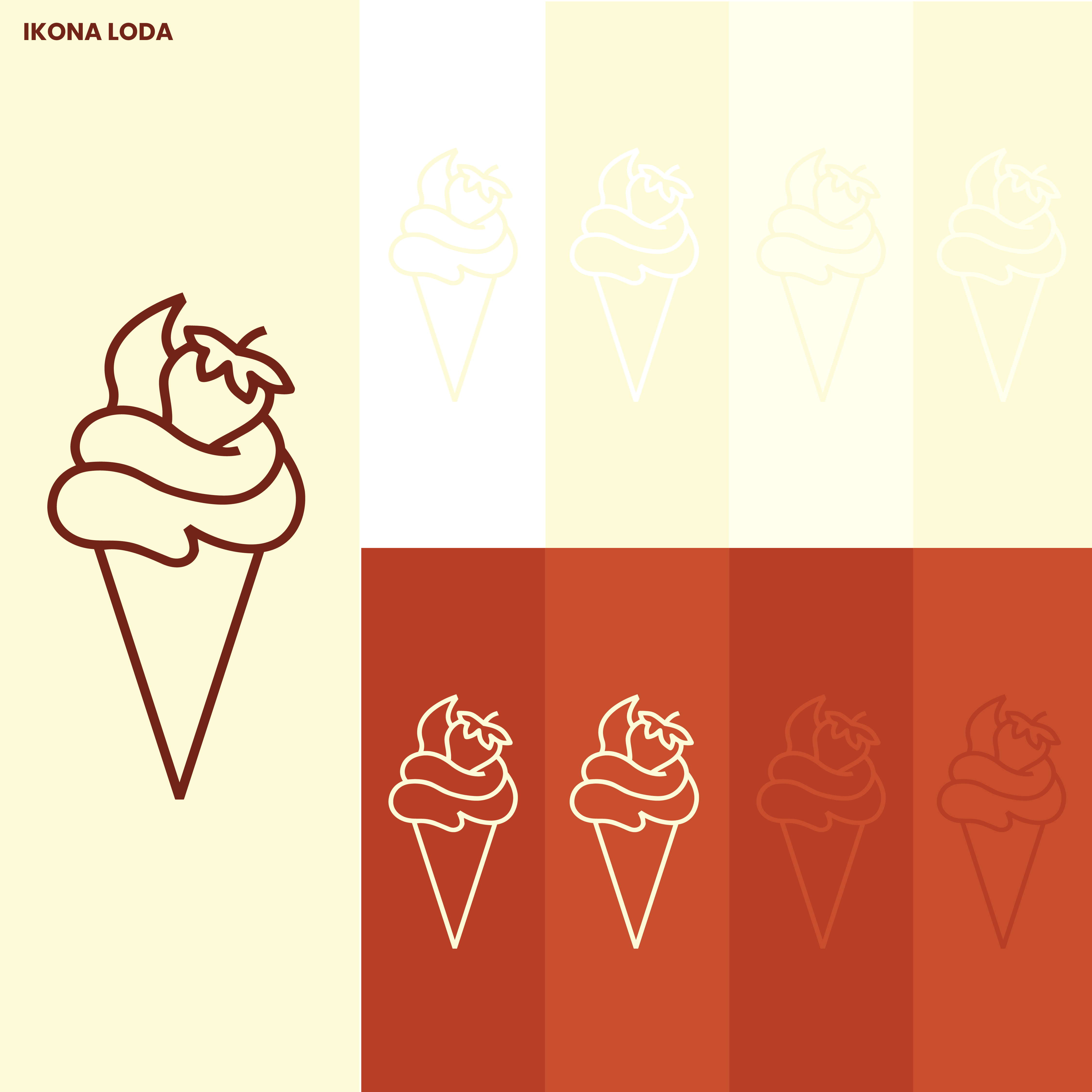
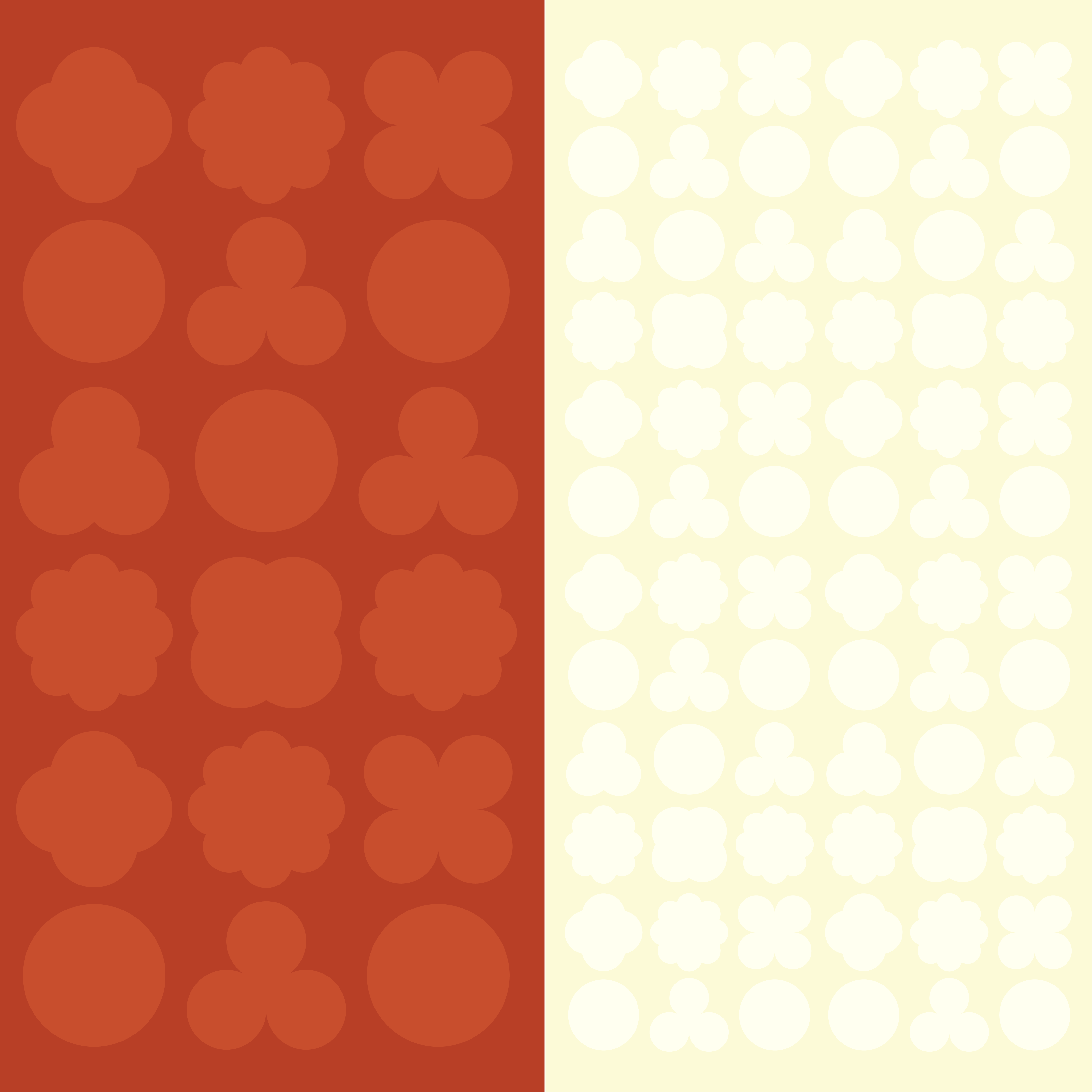
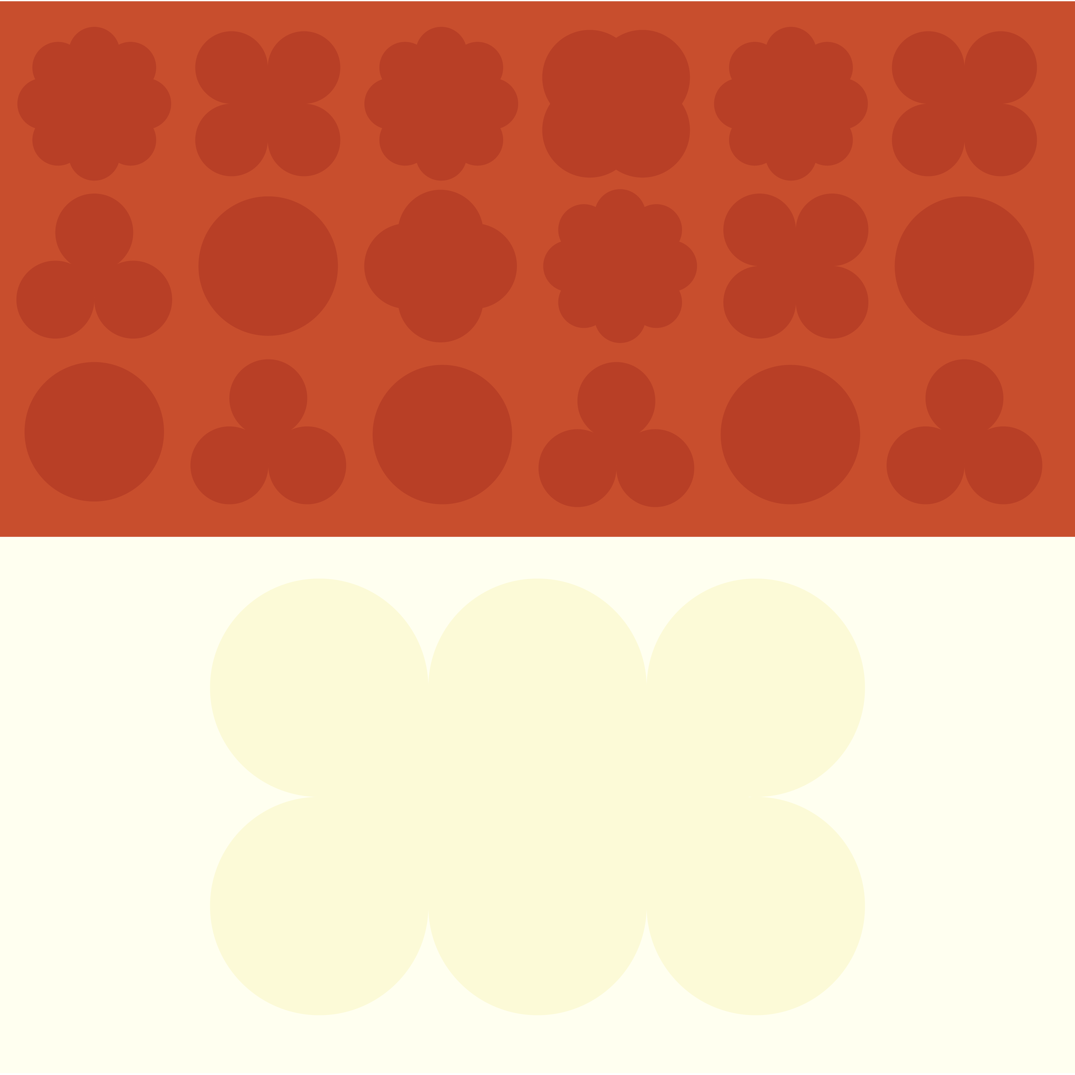
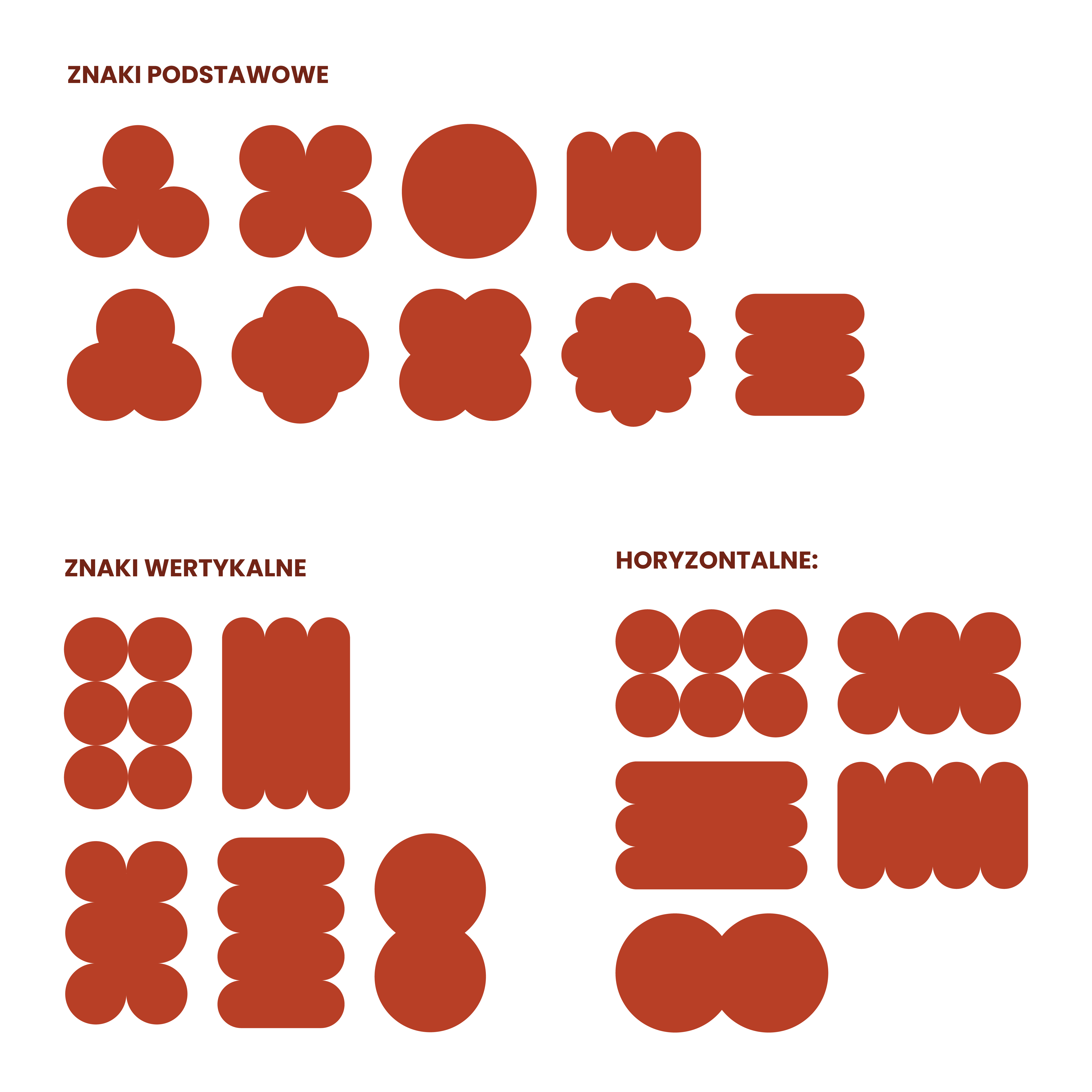
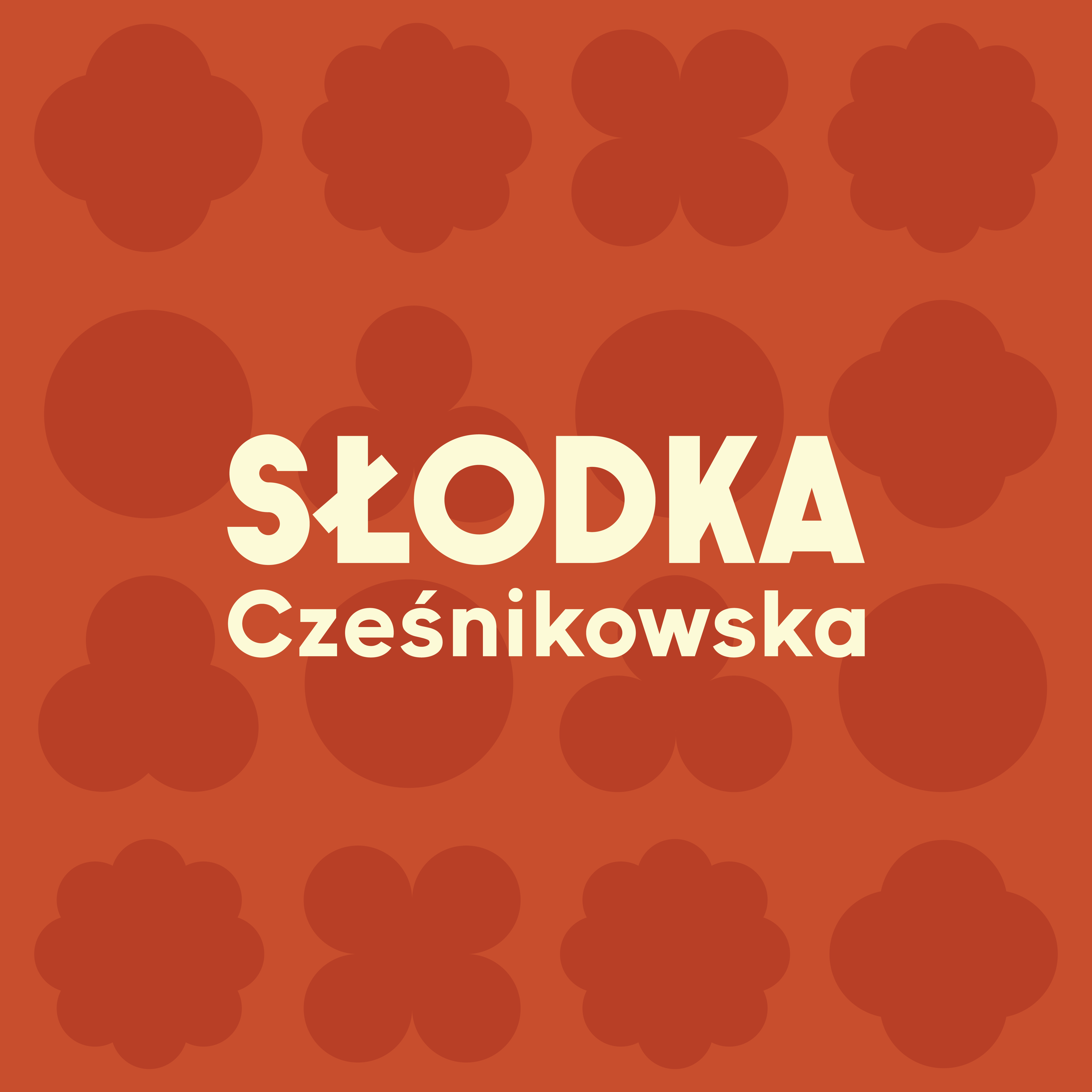
The visual identity is complemented by a flexible system of geometric patterns inspired by the flavors of the ice cream. These modular designs can be applied at various scales and in different configurations, ensuring visual consistency while allowing for diverse and engaging brand communications.
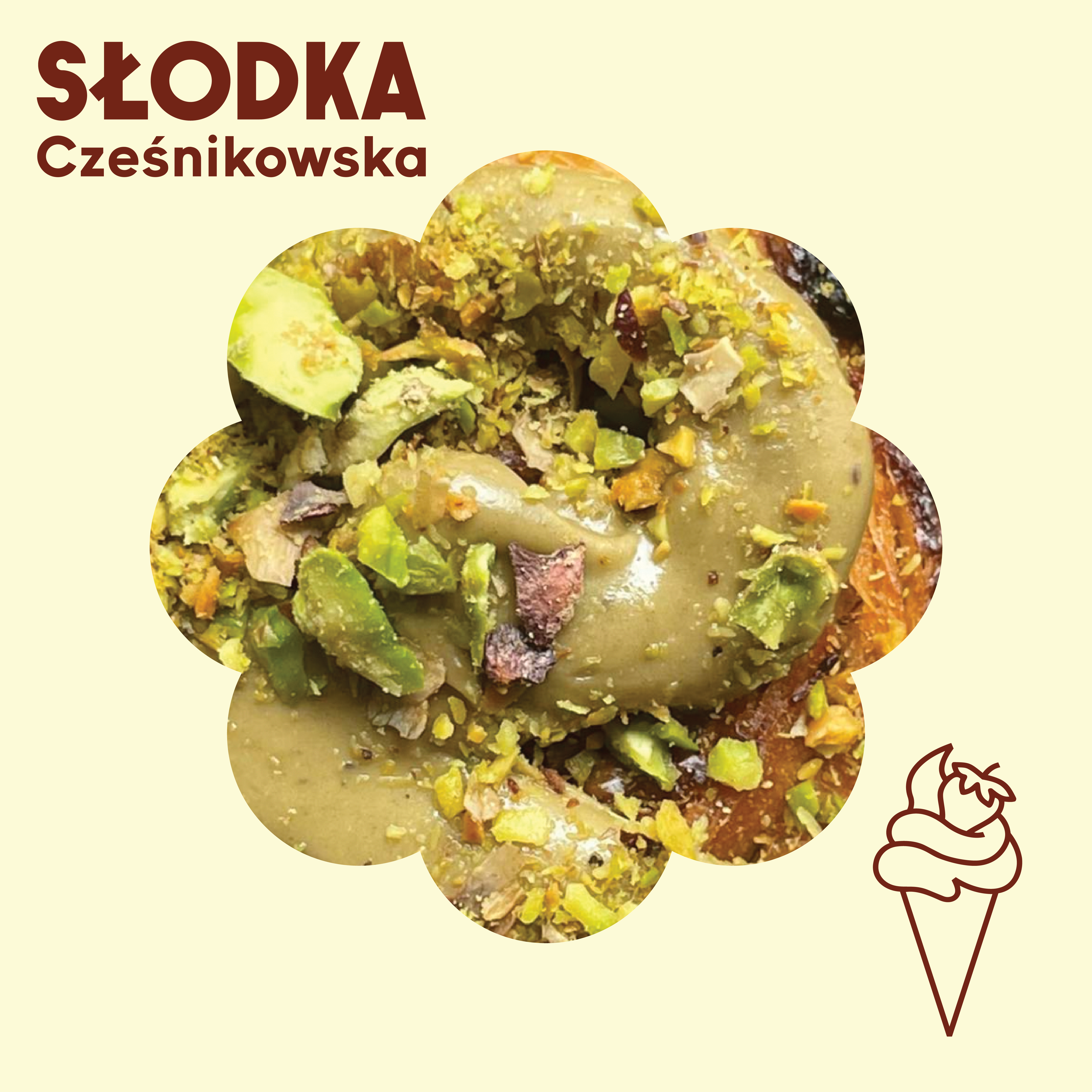
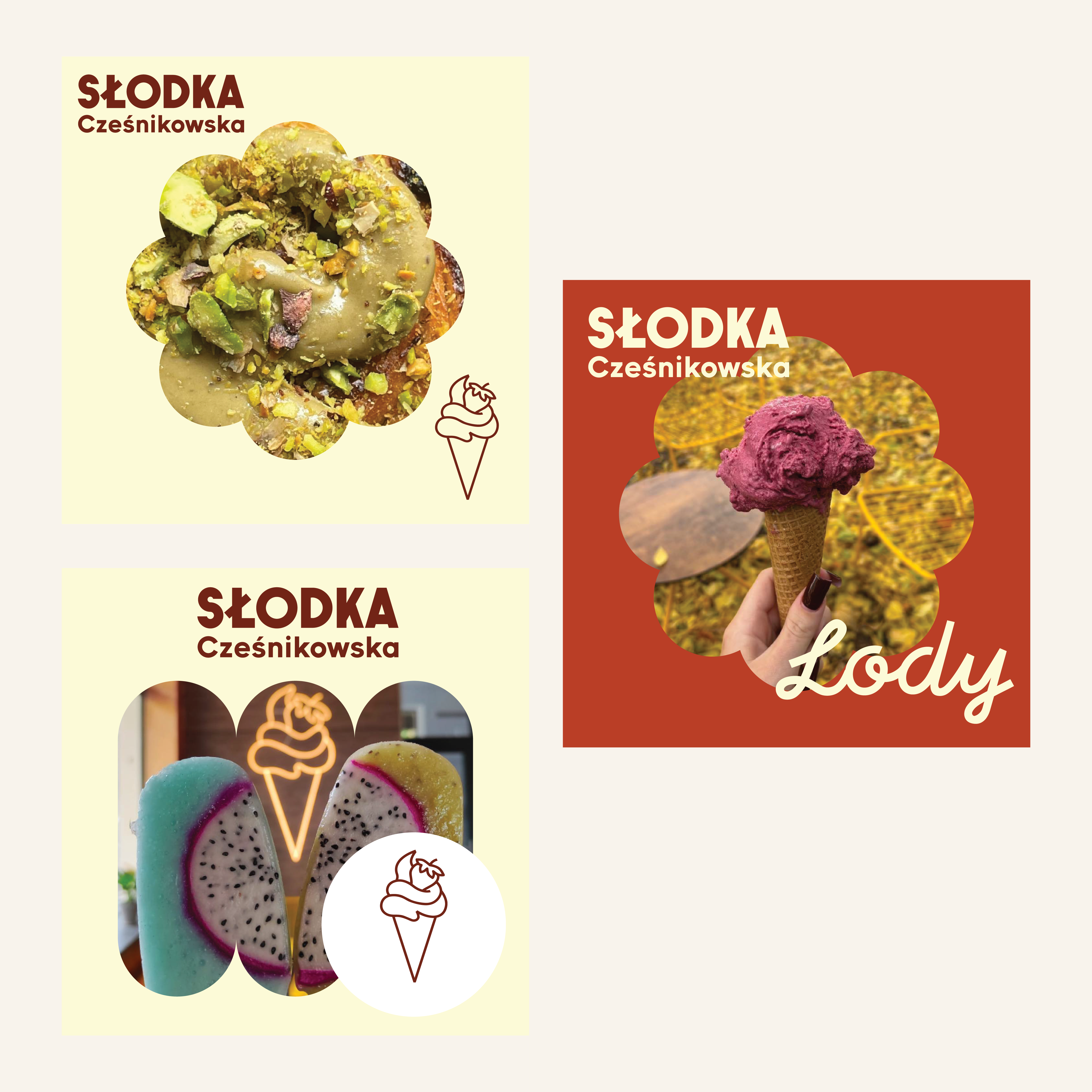
To ensure consistent day-to-day communication, we developed a complete set of social media templates for posts and stories. The templates combine the brand patterns, carefully designed typography and photography layouts, making it easy to promote seasonal flavours, special offers and everyday activities.
The entire system was prepared in Canva, allowing the client's team to create professional content directly from mobile devices while maintaining visual consistency across all communication channels.
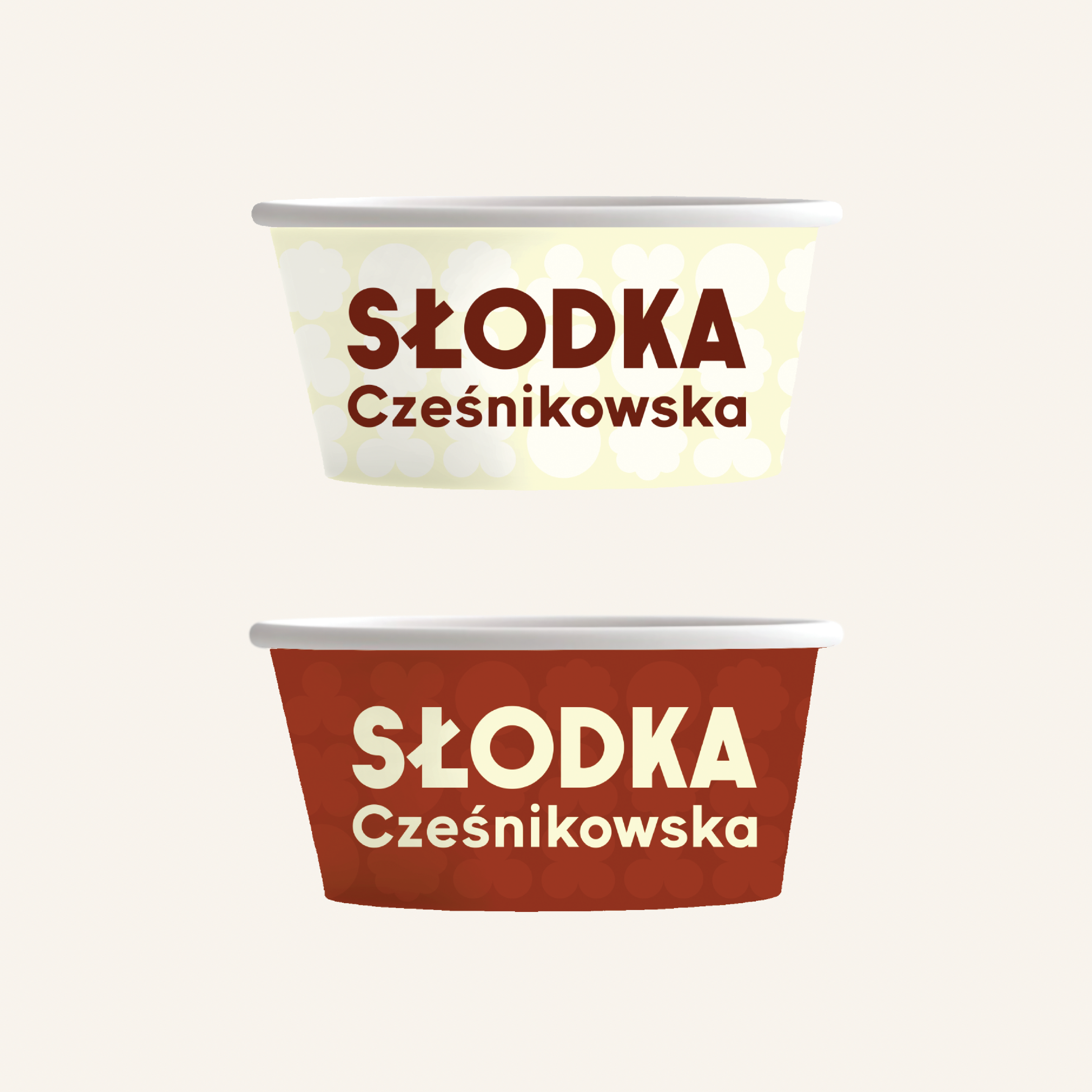
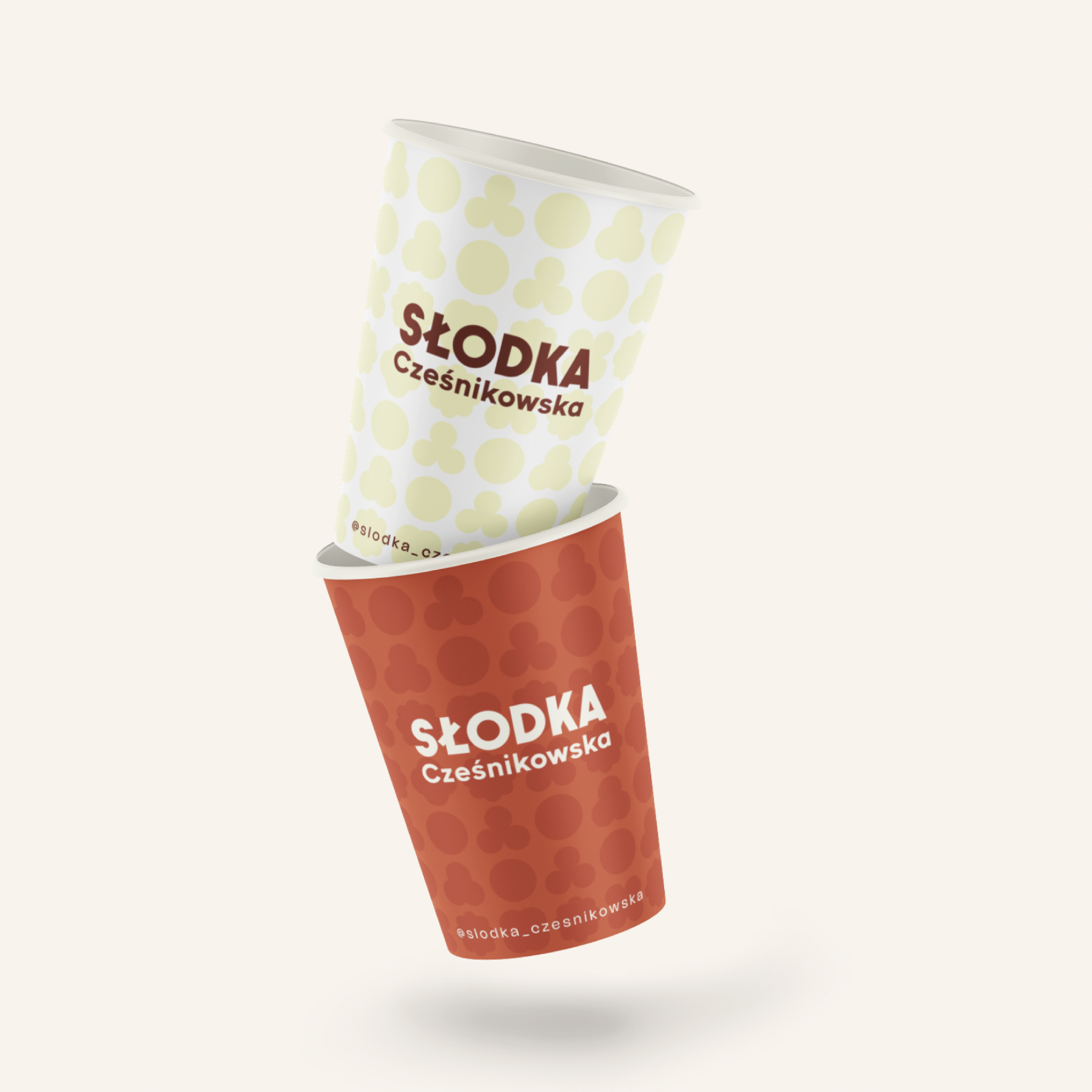
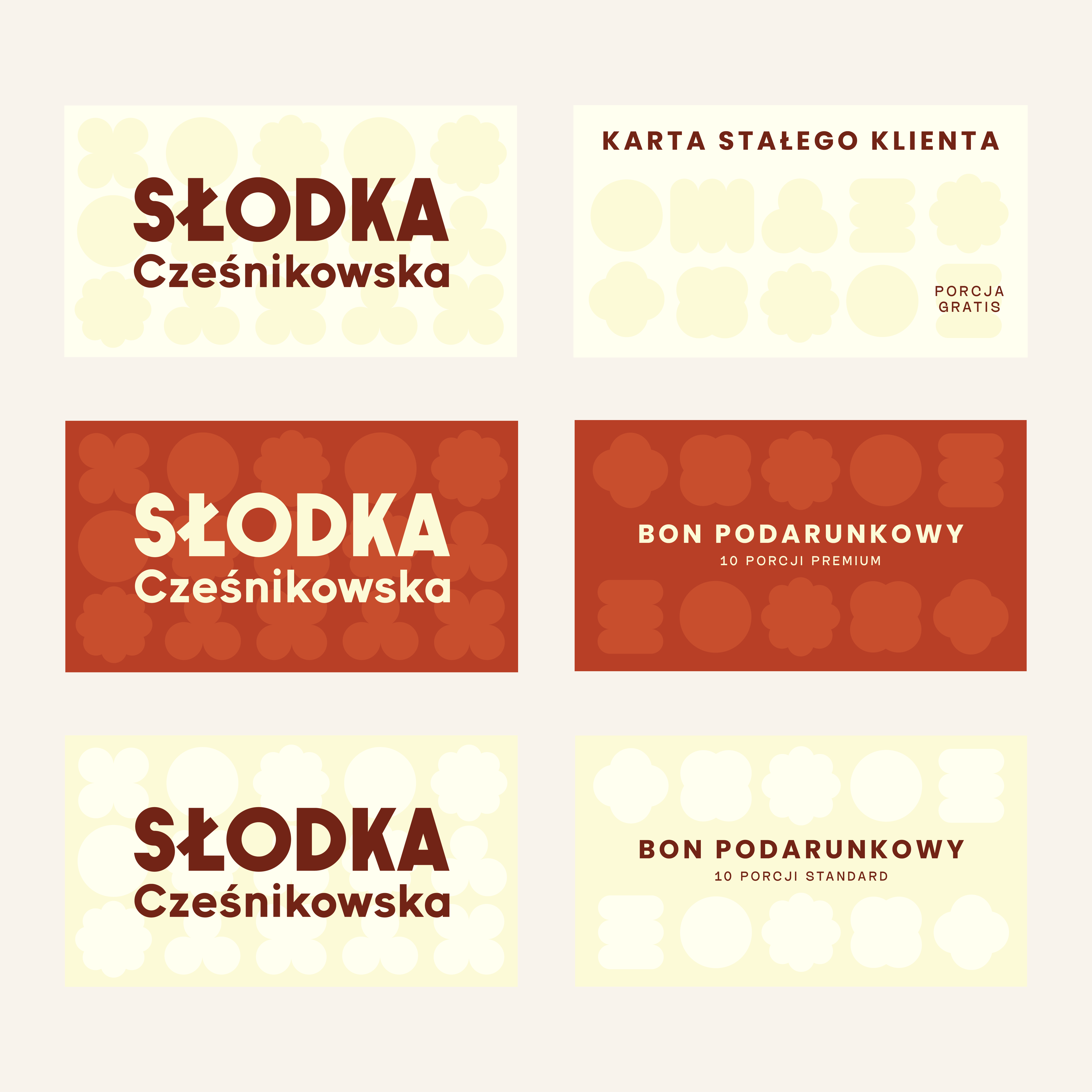
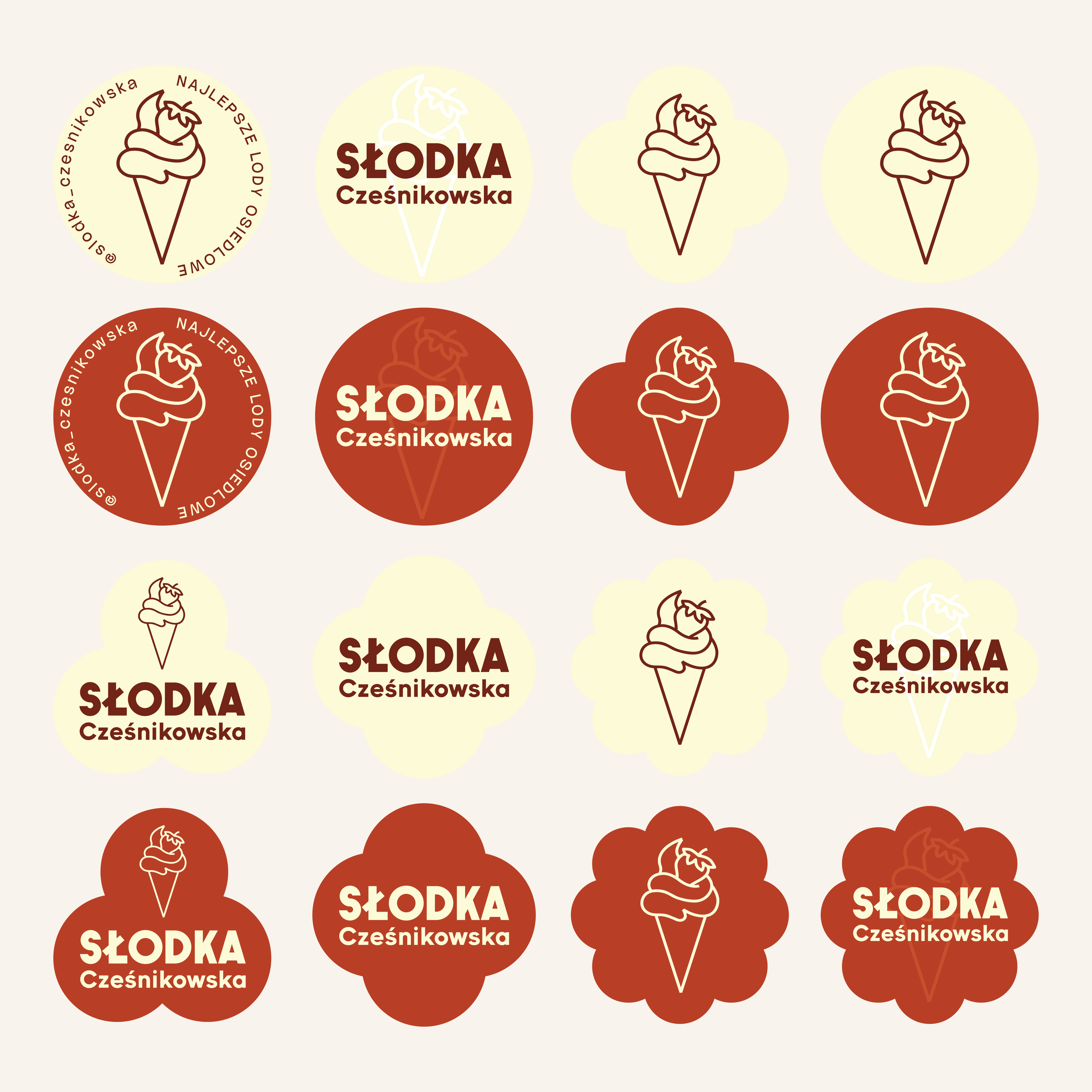
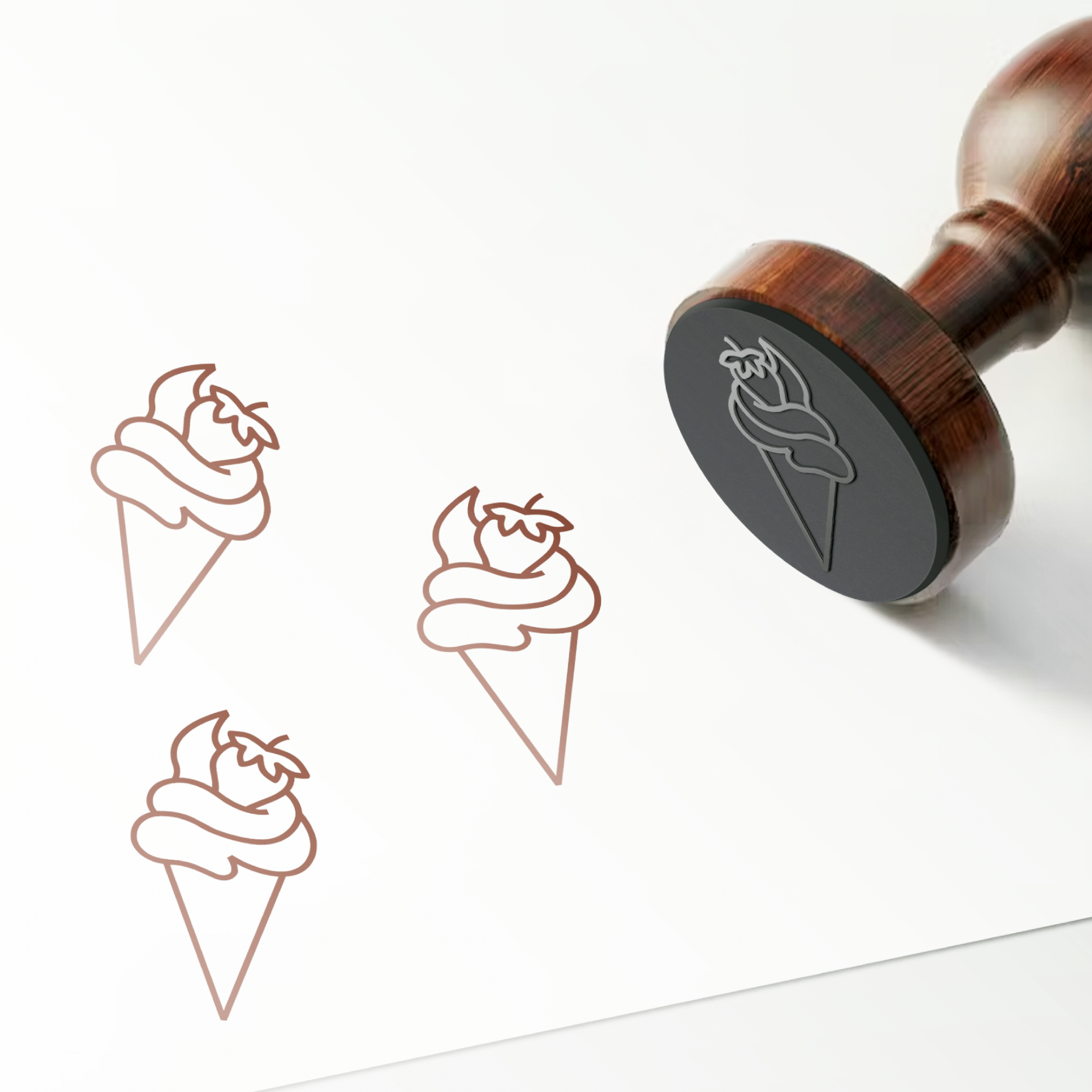
The project also included a comprehensive range of branded materials used throughout the ice cream shop. We designed ice cream cups, coffee cups, stickers, stamps, gift vouchers and promotional posters, ensuring that every customer interaction reflects the same visual identity.
By developing clear design standards for printed materials and packaging, the brand gained a coherent appearance that strengthens recognition and supports future business growth.
Our goal was to create more than a logo. We developed a complete visual identity system that supports everyday marketing while remaining scalable for future locations and franchise development.
The project combines strategic thinking, branding, graphic design and practical communication tools into one consistent system. The result is a memorable and flexible identity that reflects the quality of Słodka Cześnikowska's products while making everyday marketing simpler, faster and more efficient.