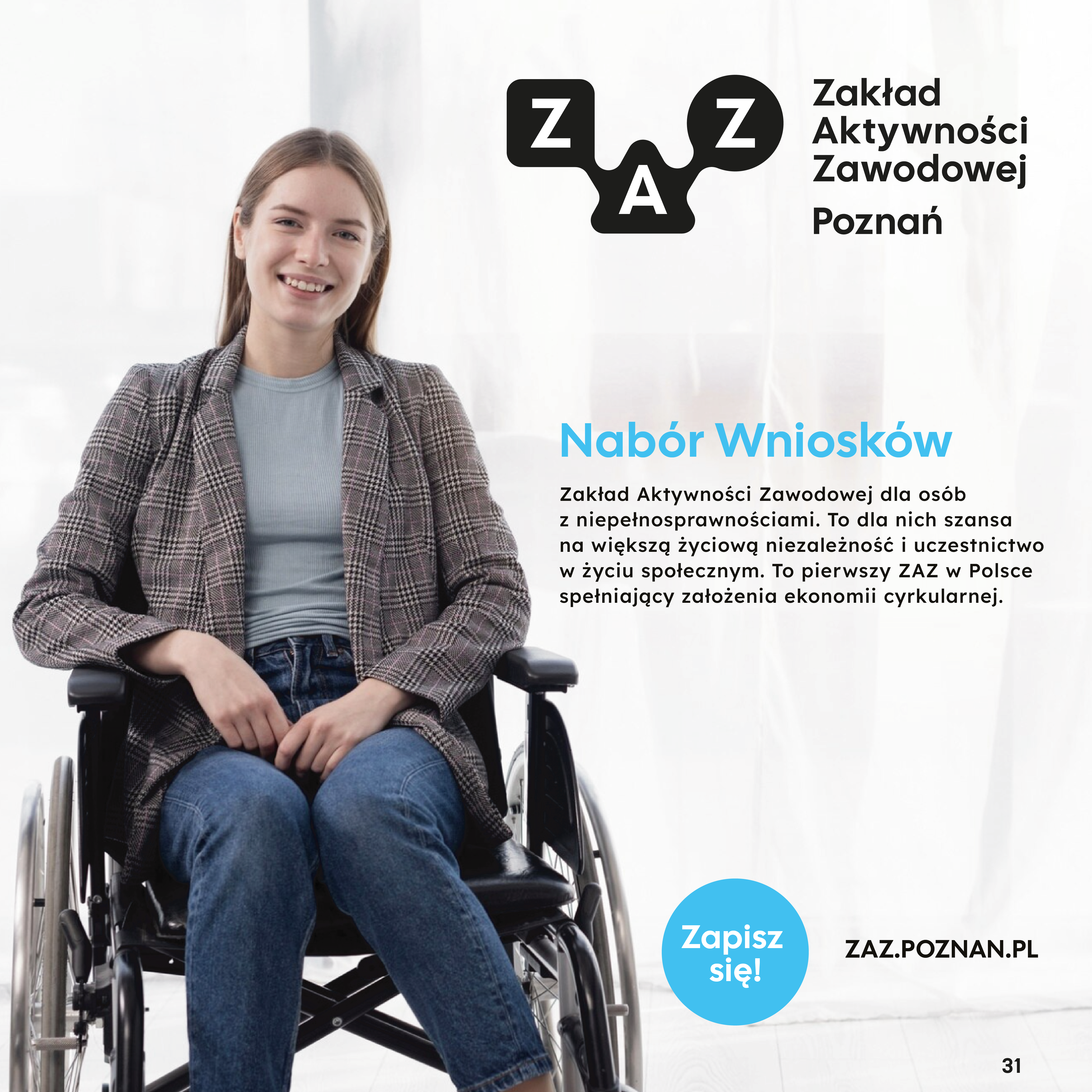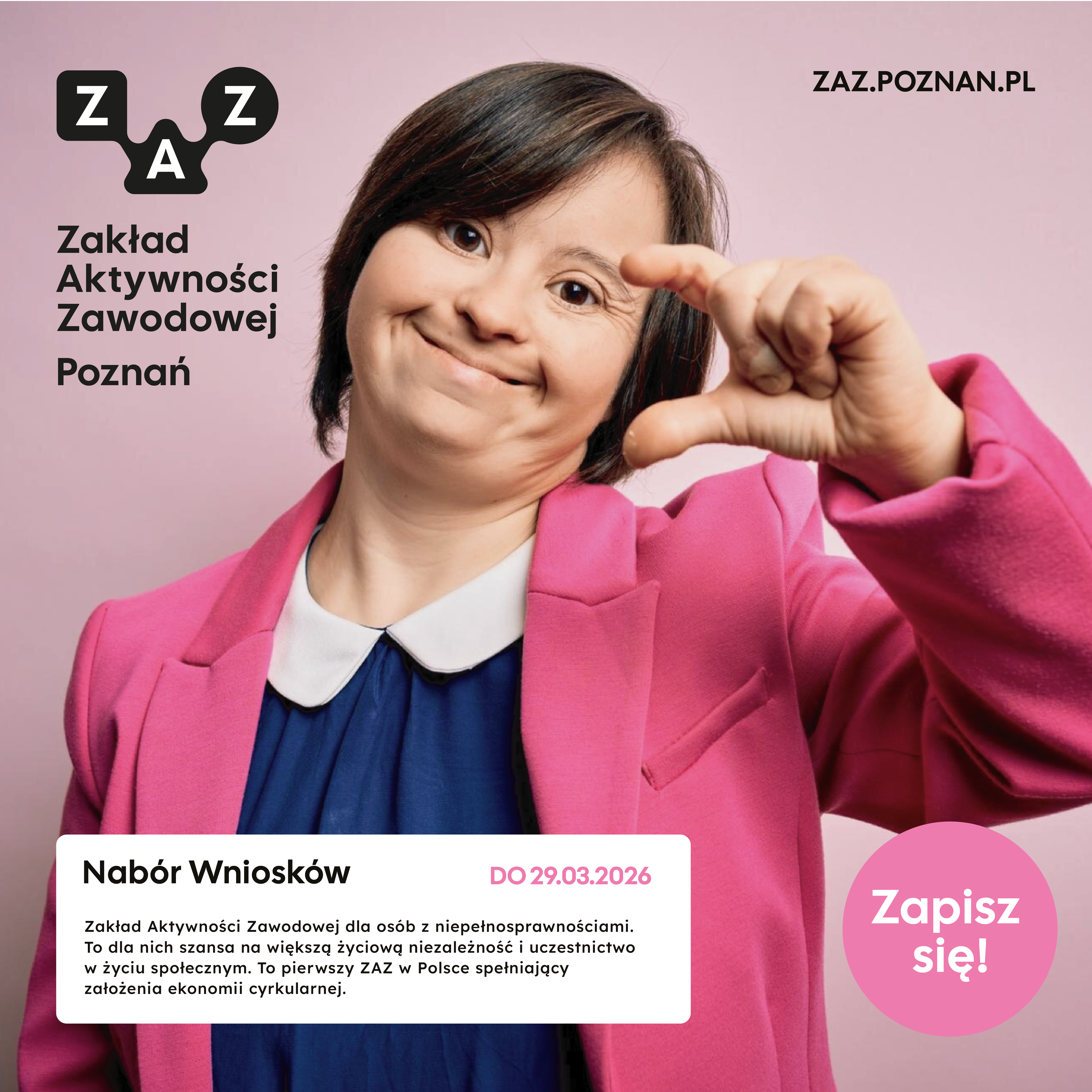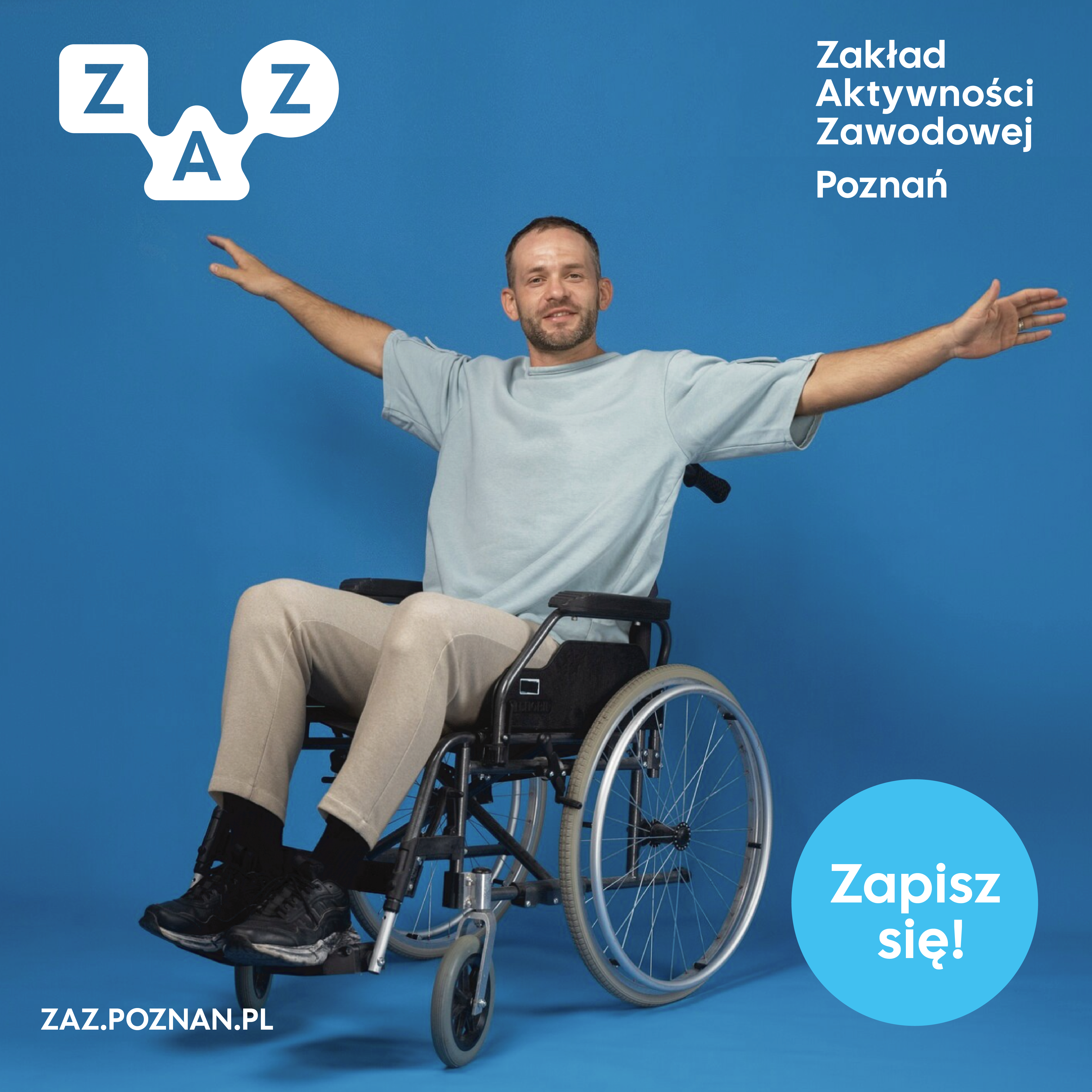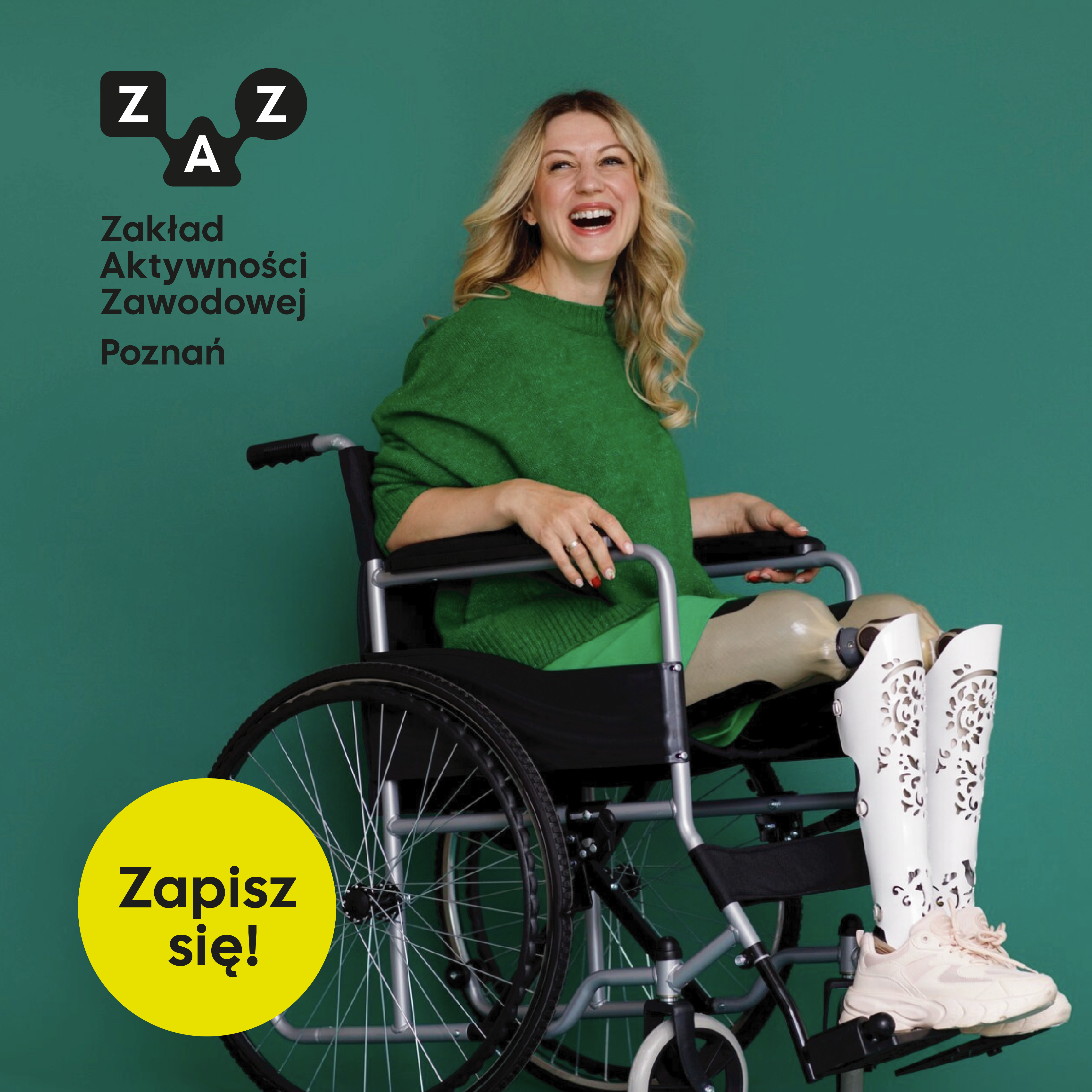
For ZAZ Poznań, we developed a comprehensive visual identity system supporting an organisation dedicated to the professional activation and employment of people with disabilities. The project began with a series of consultations and an analysis of the needs of various stakeholder groups, including employees, partners, clients, and service users.
Our goal was to create a visual identity that would be modern, accessible, clear, and welcoming. The system was designed to work consistently across informational materials, marketing communication, social media channels, and the physical environment of the new ZAZ Poznań facility.
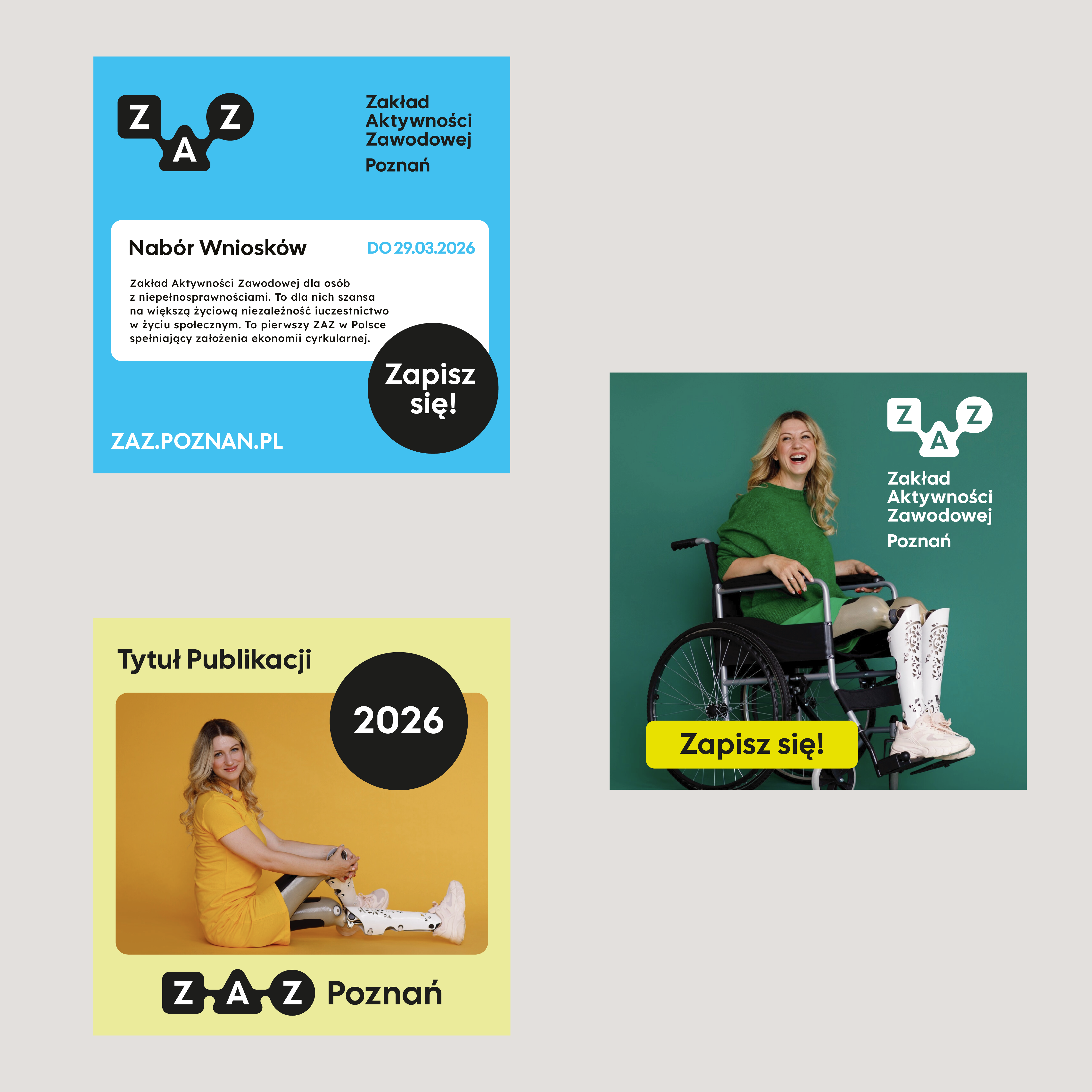
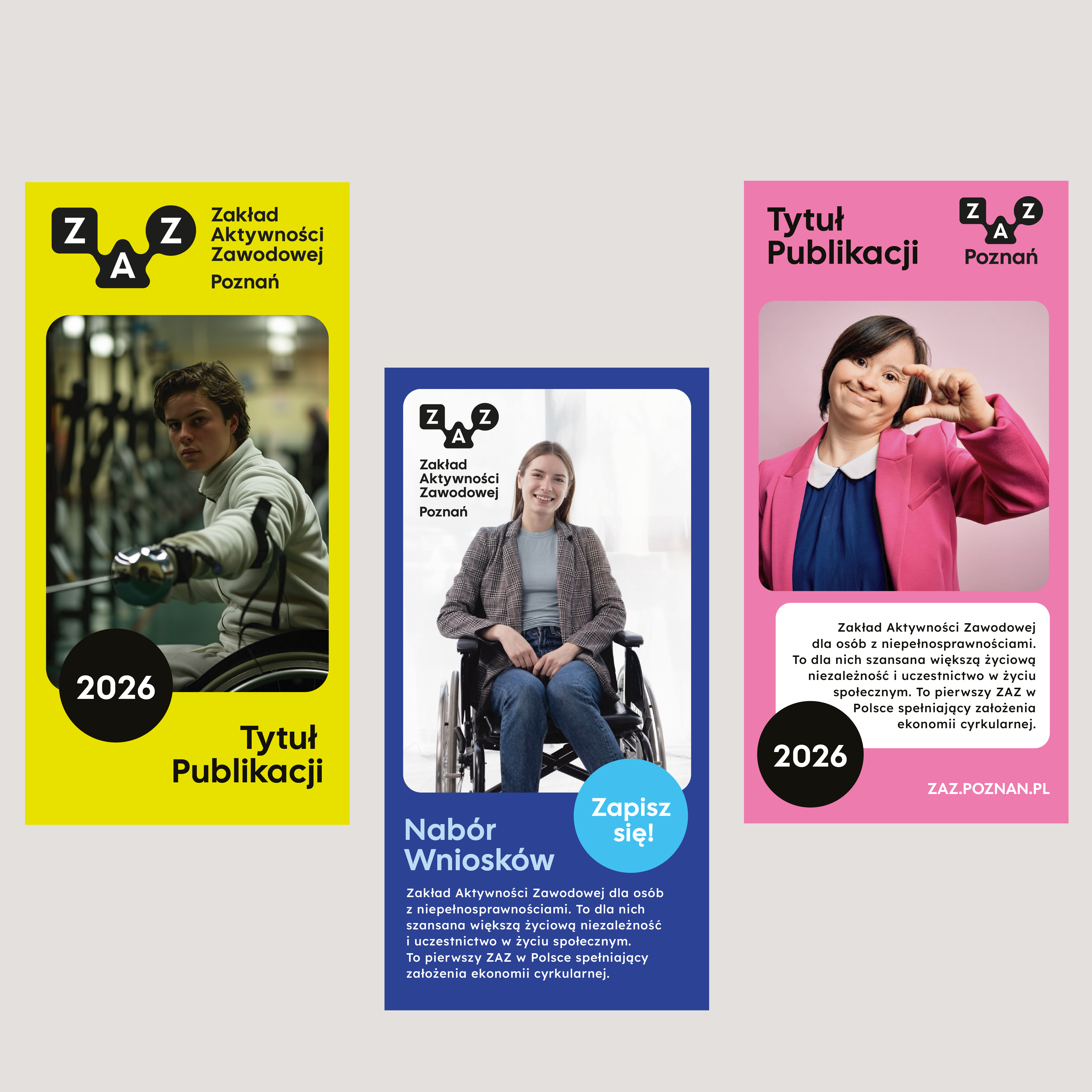
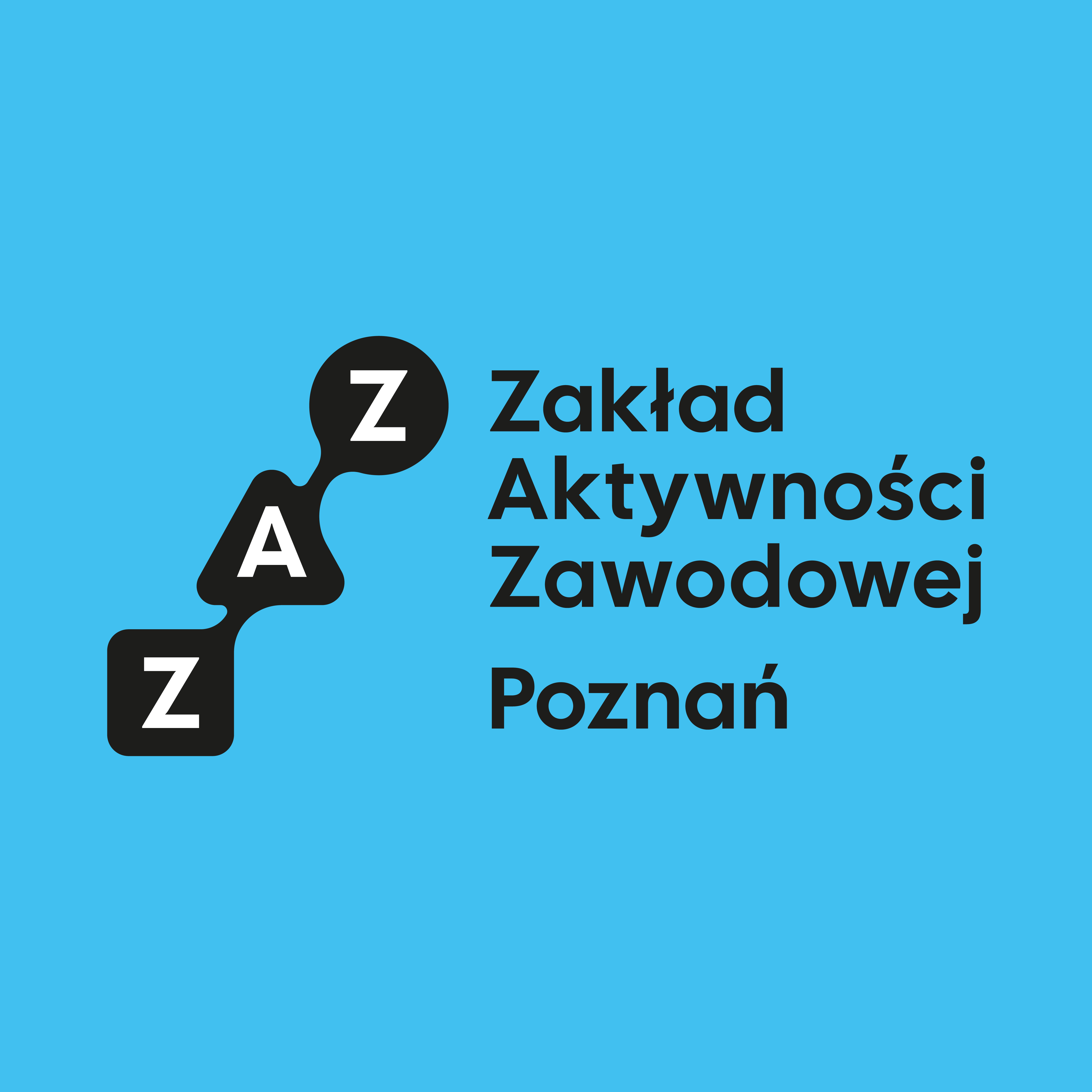
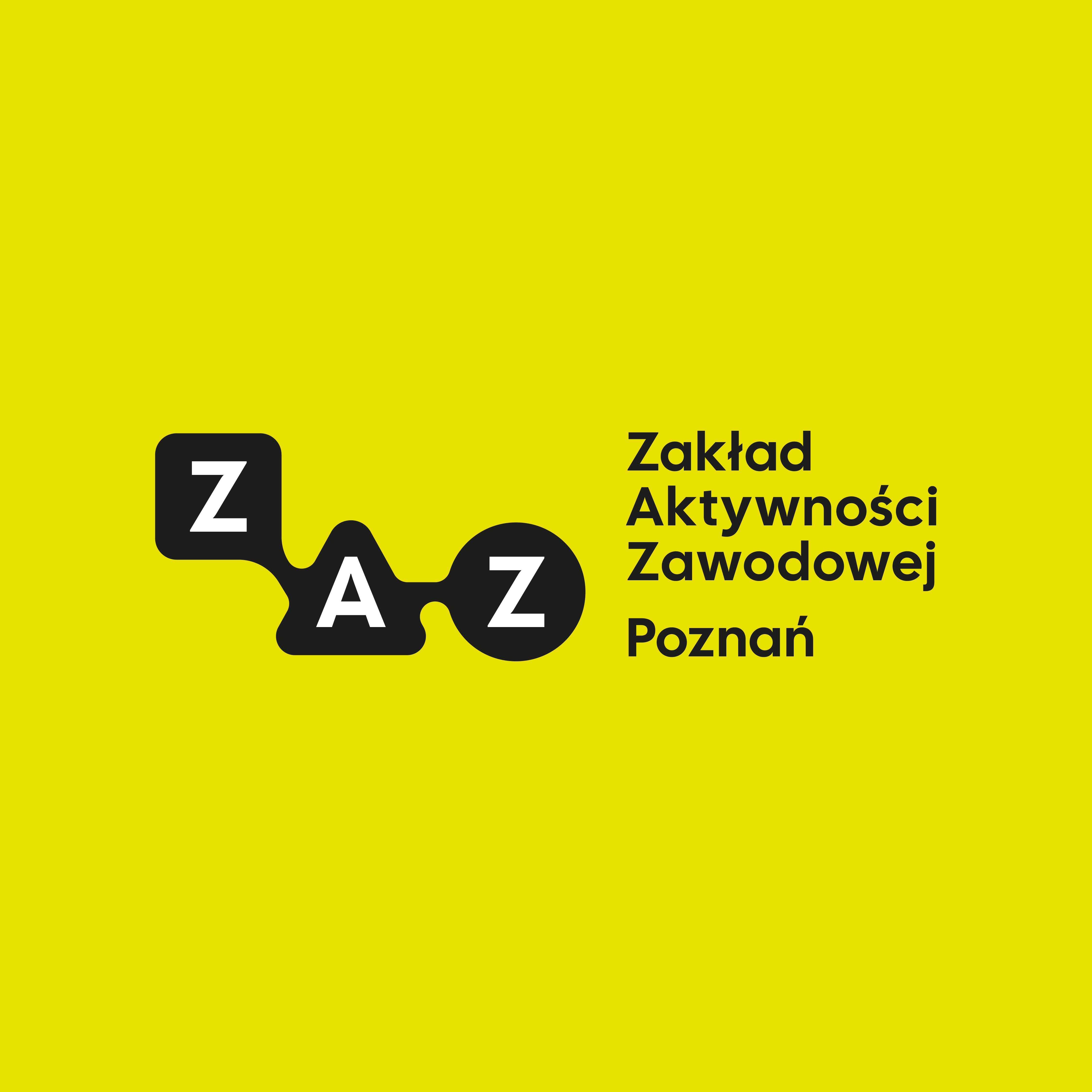
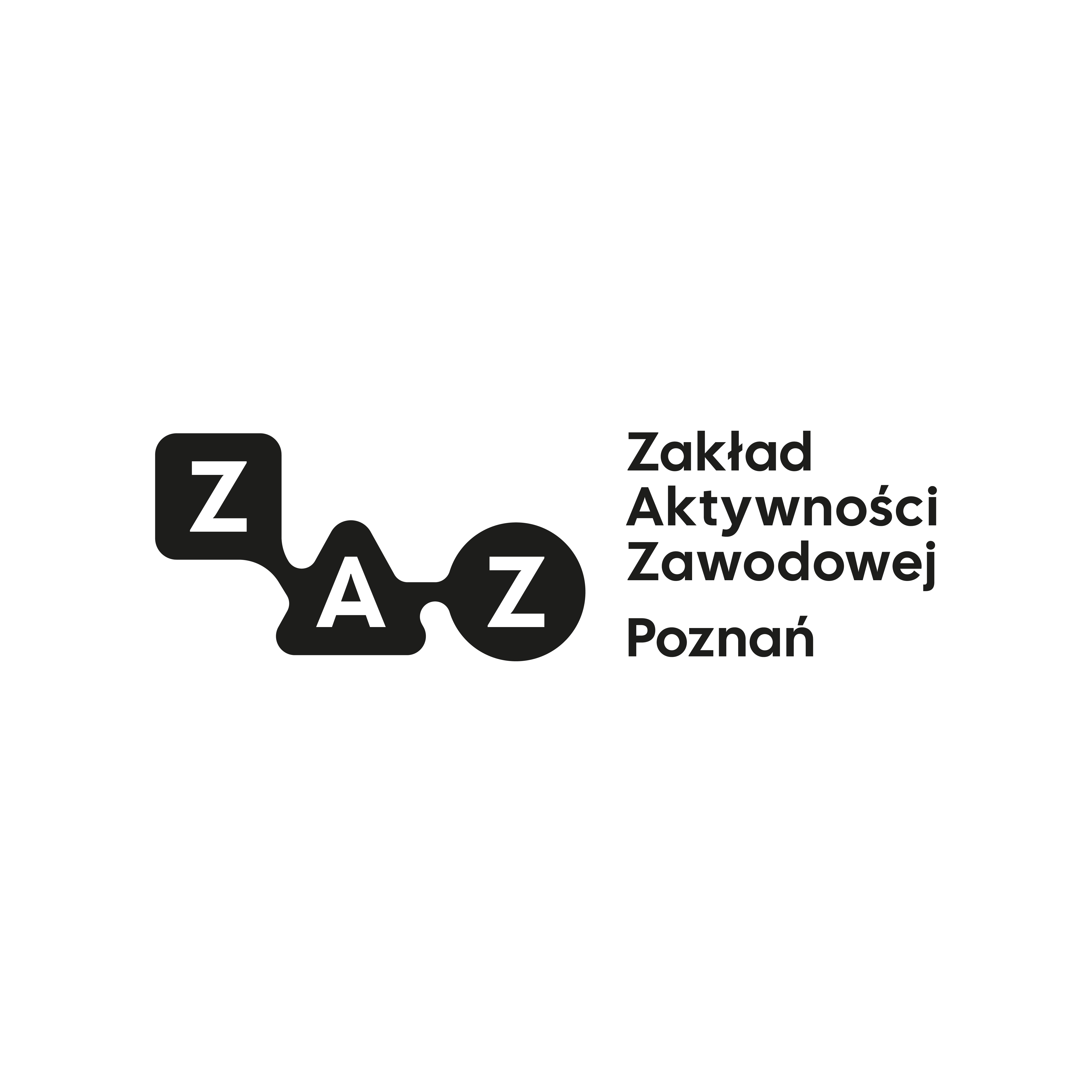
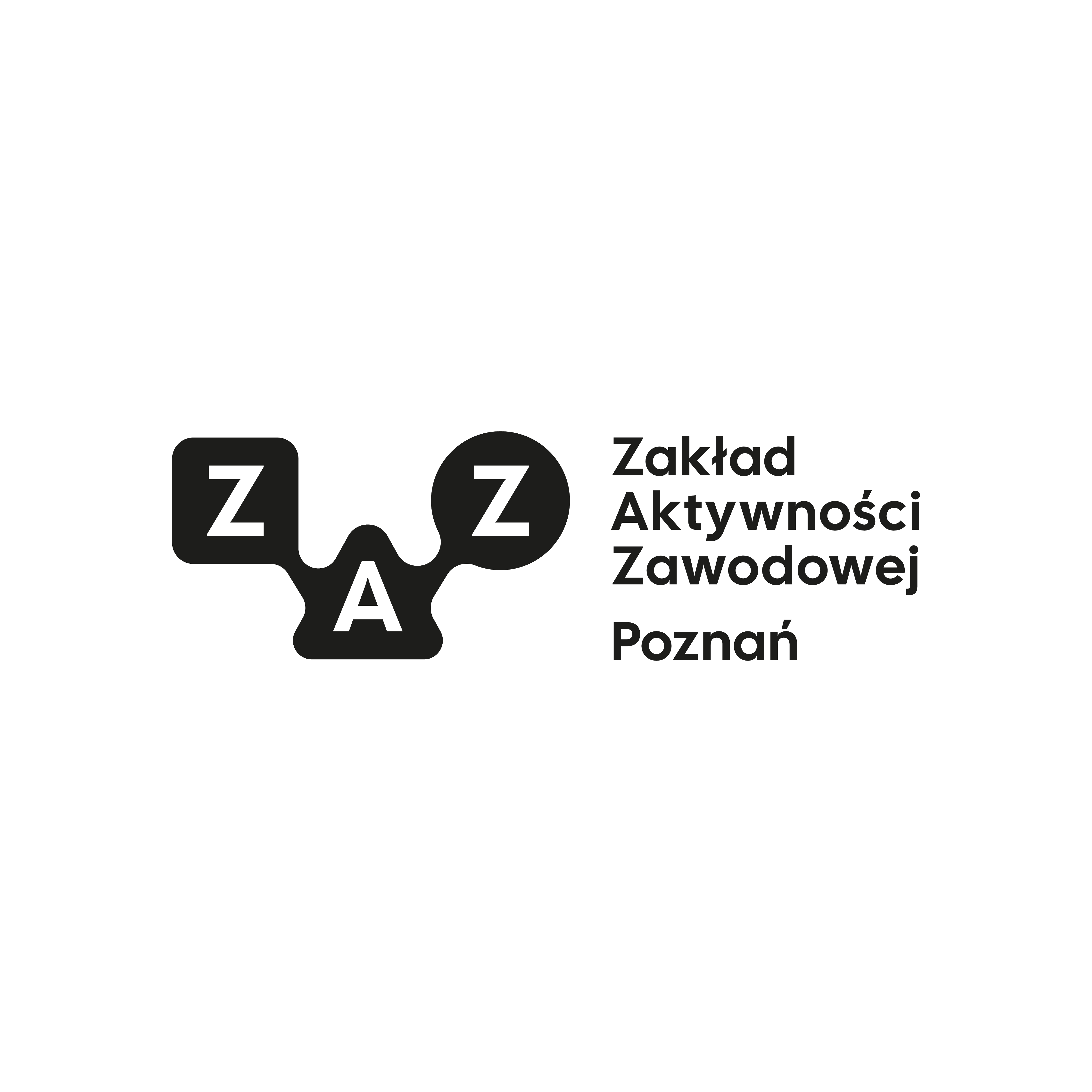
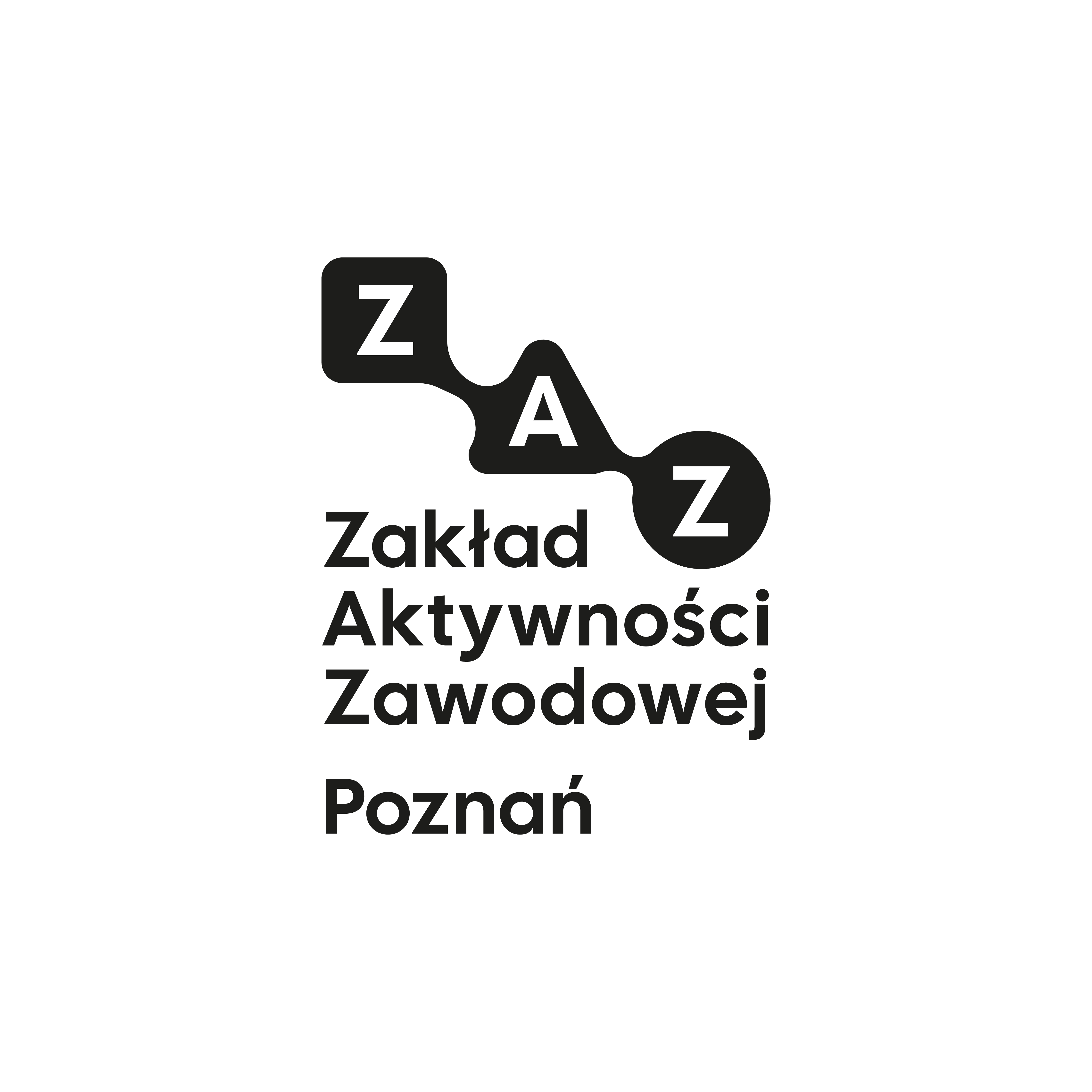
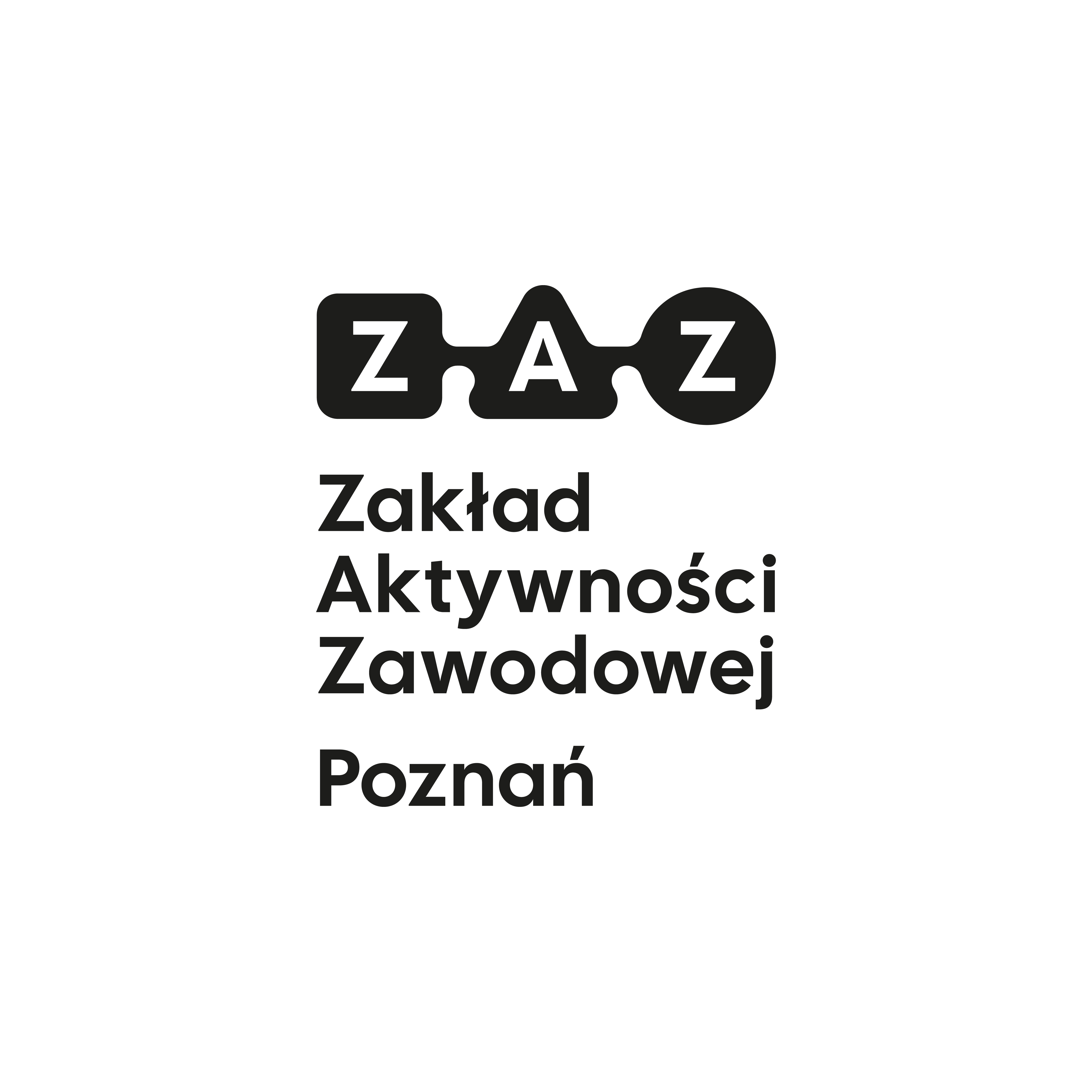
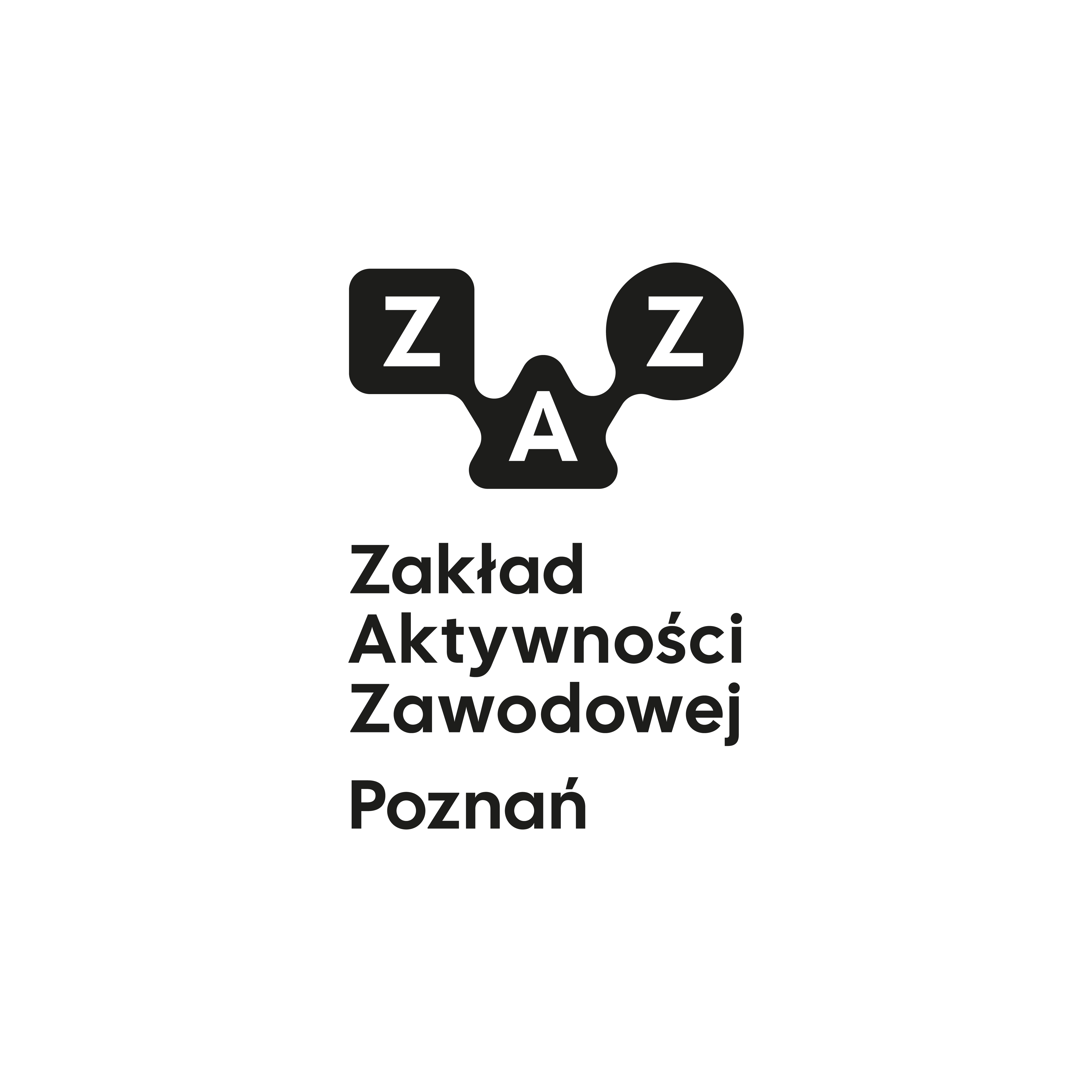
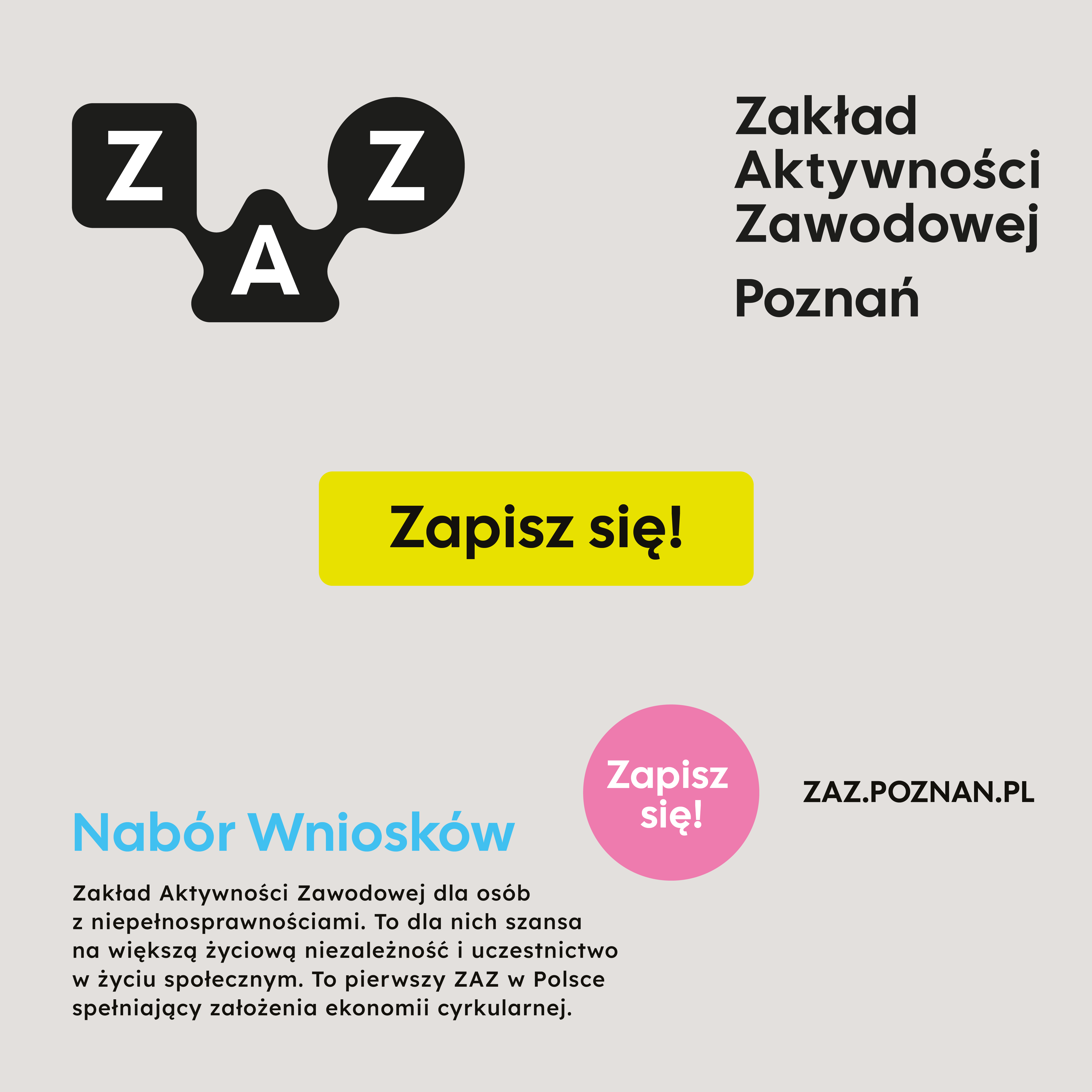
The foundation of the visual identity is a logo based on the letters ZAZ arranged within rounded geometric forms. The organic connection between the letters symbolises collaboration, activity, growth, and the diversity of the people who make up the ZAZ community.
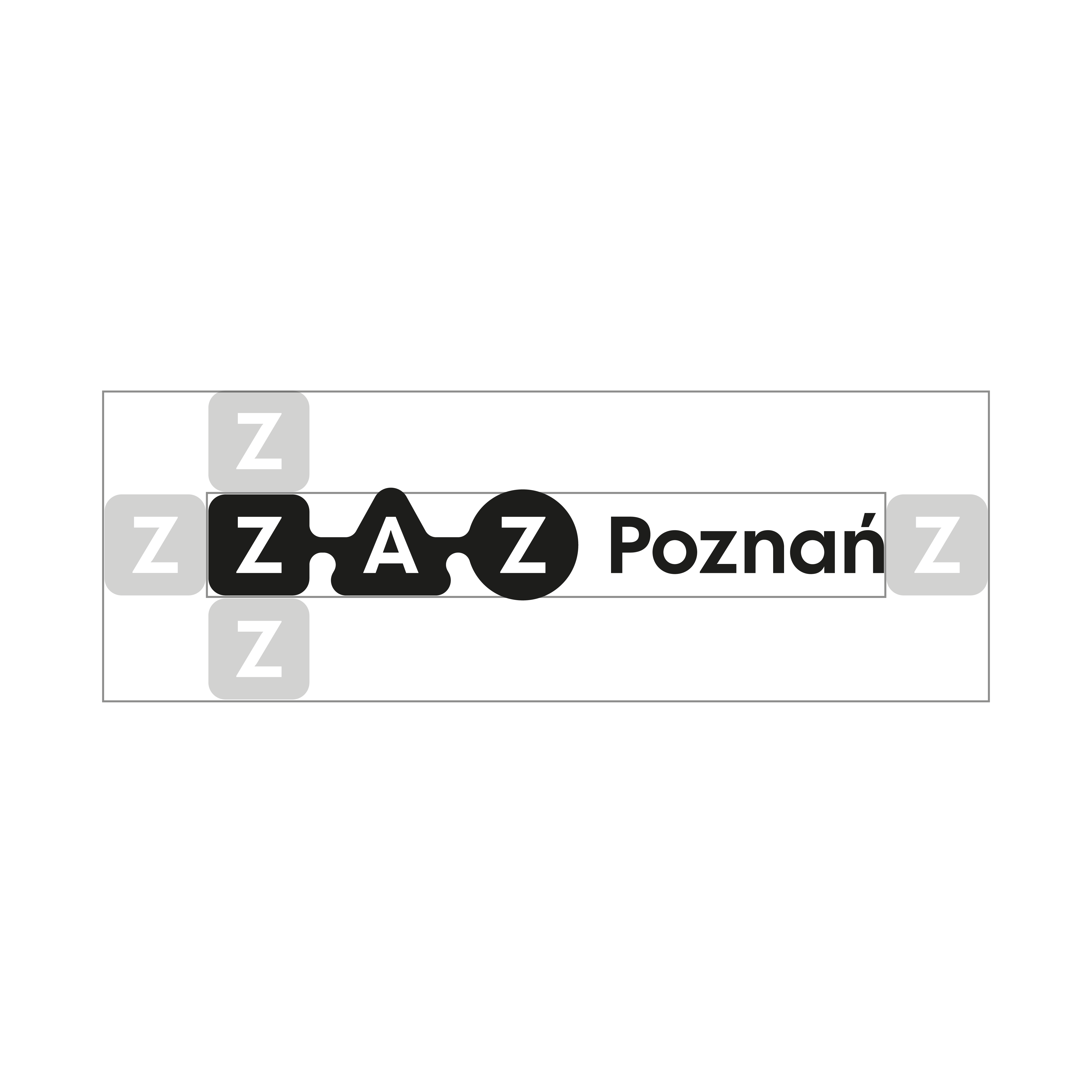
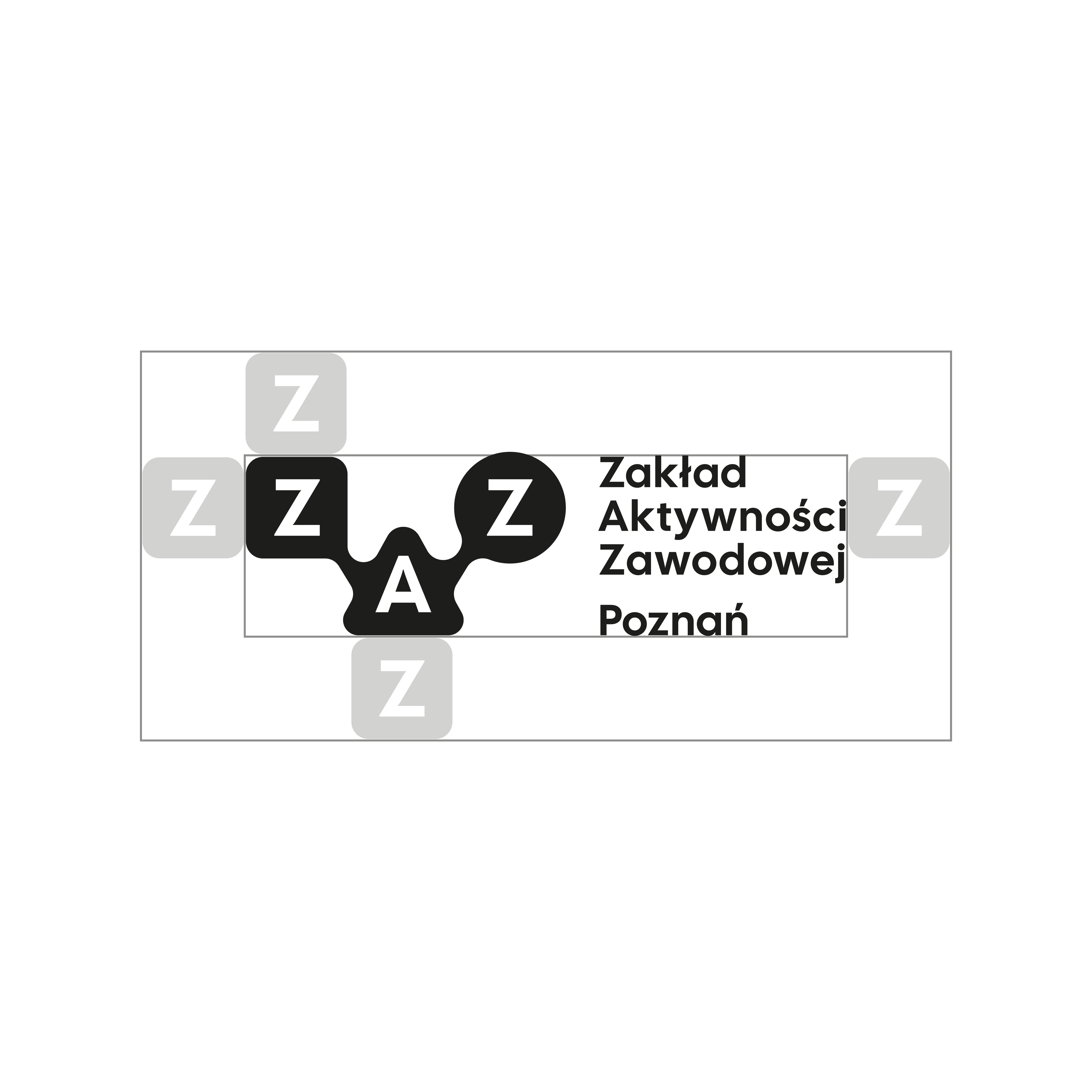
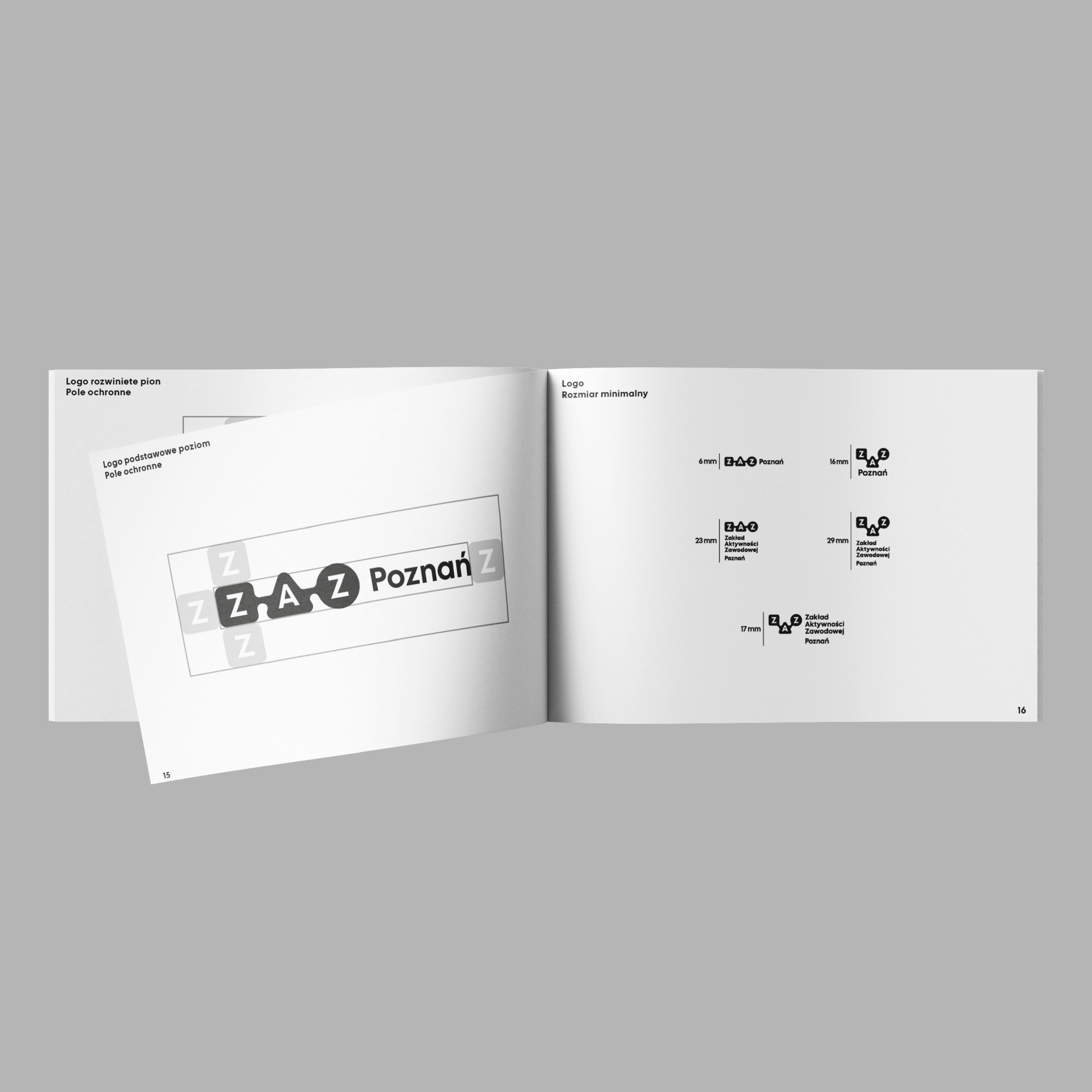
The logo was designed as a flexible system rather than a single static mark. Simplified and extended versions, vertical and horizontal layouts, as well as animated logo variants were created to support different communication needs. This approach allows the identity to remain dynamic while maintaining consistency and recognisability across all applications.
A high-contrast black-and-white colour scheme ensures excellent legibility and supports accessibility standards.


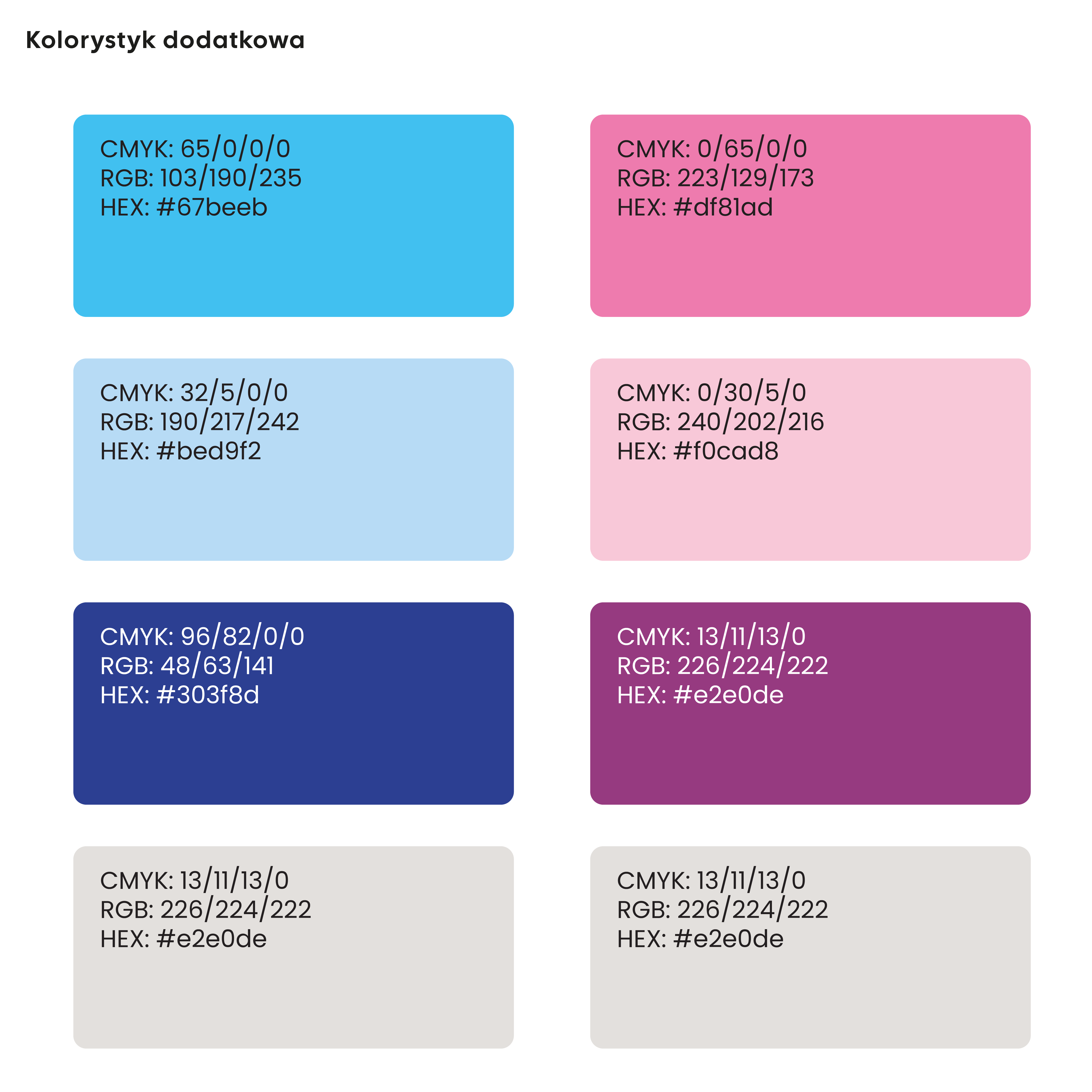
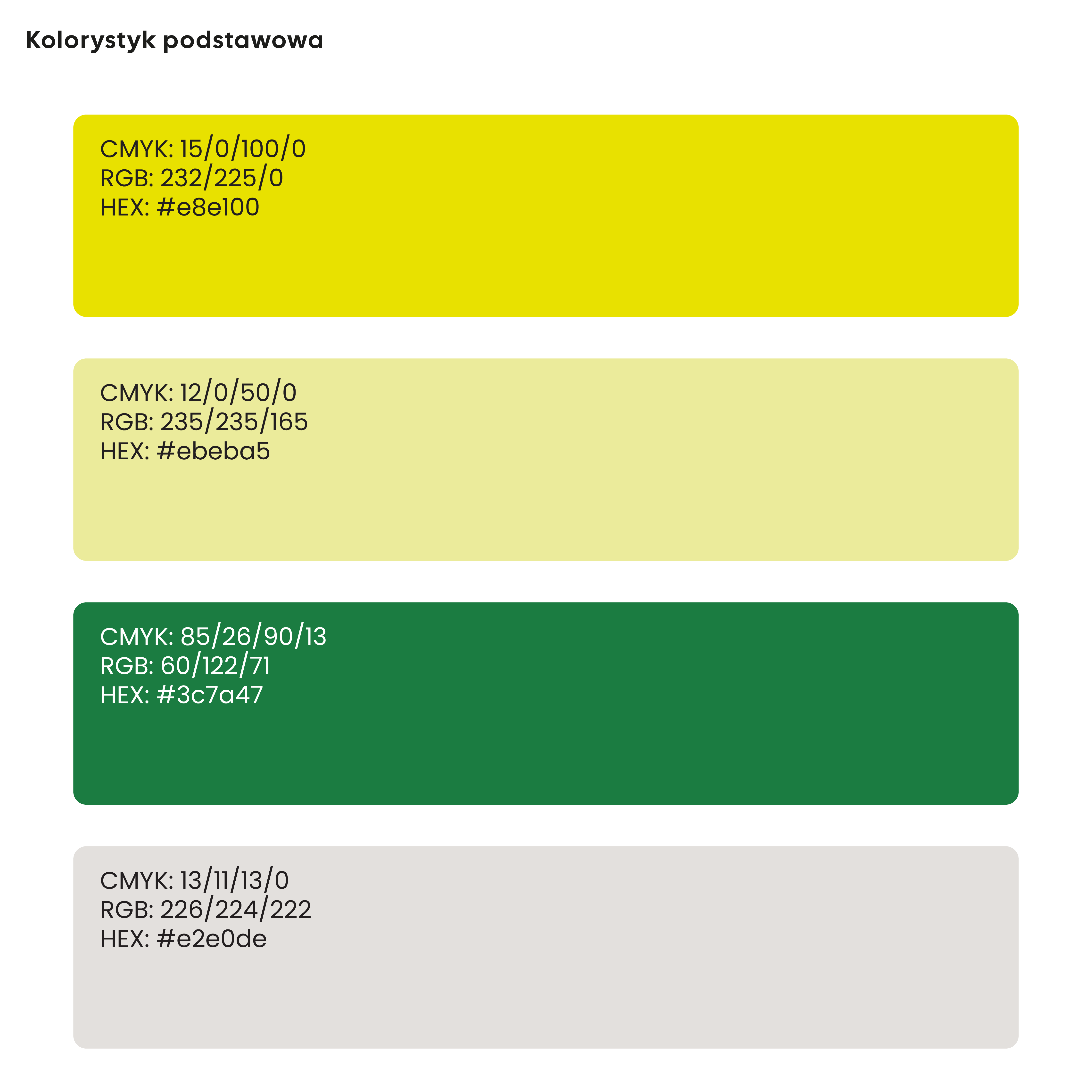
The visual identity system is supported by a colour palette built around shades of green, symbolising growth, activity, and positive change. Additional blue and pink colour families allow different areas of the organisation’s activities to be distinguished while remaining part of the same visual system.
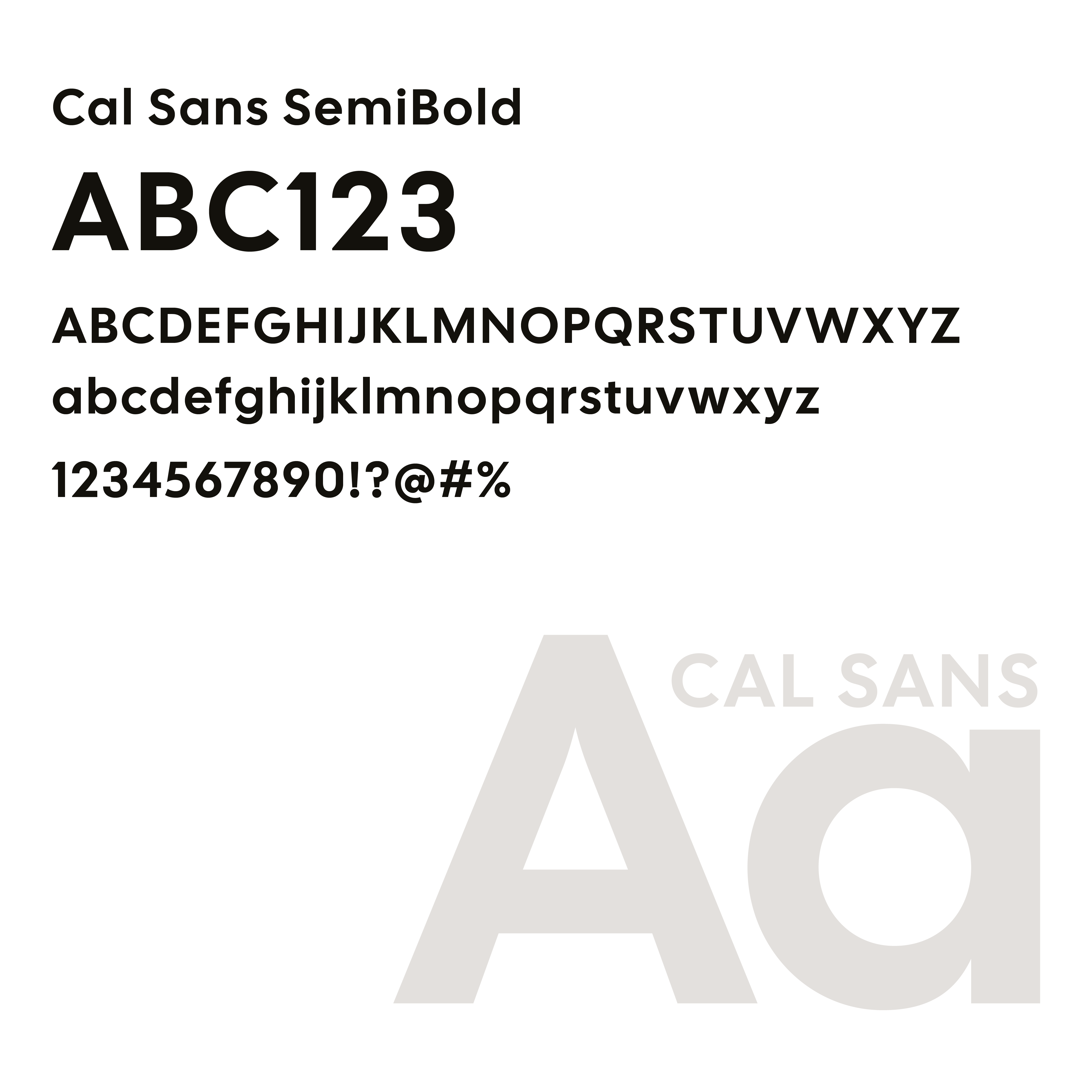
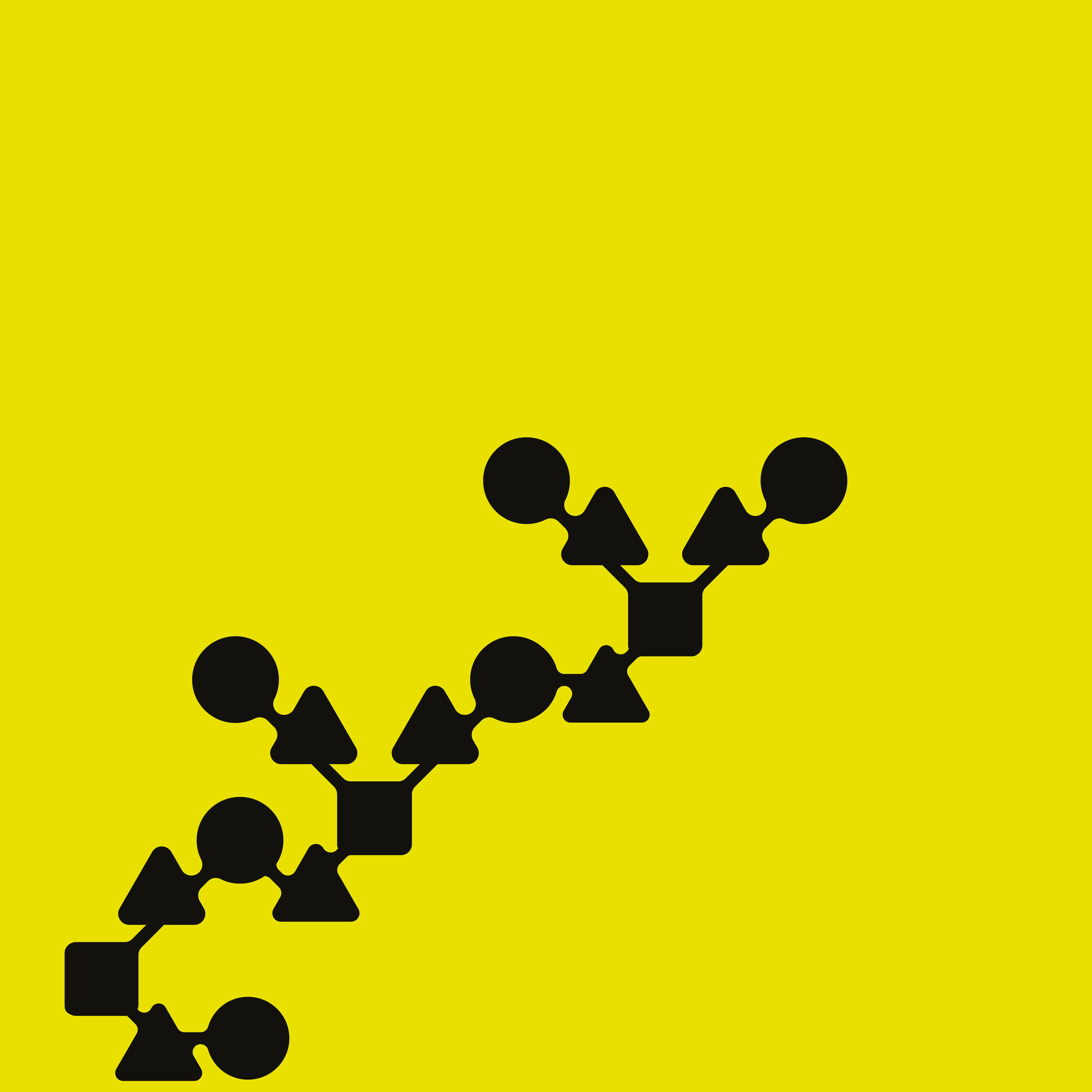
A clean geometric typeface was selected to support informational, marketing, and administrative communication. Based on the rounded shapes used in the logo, we also developed a family of graphic elements including patterns, frames, buttons, labels, and content containers used across printed and digital materials.
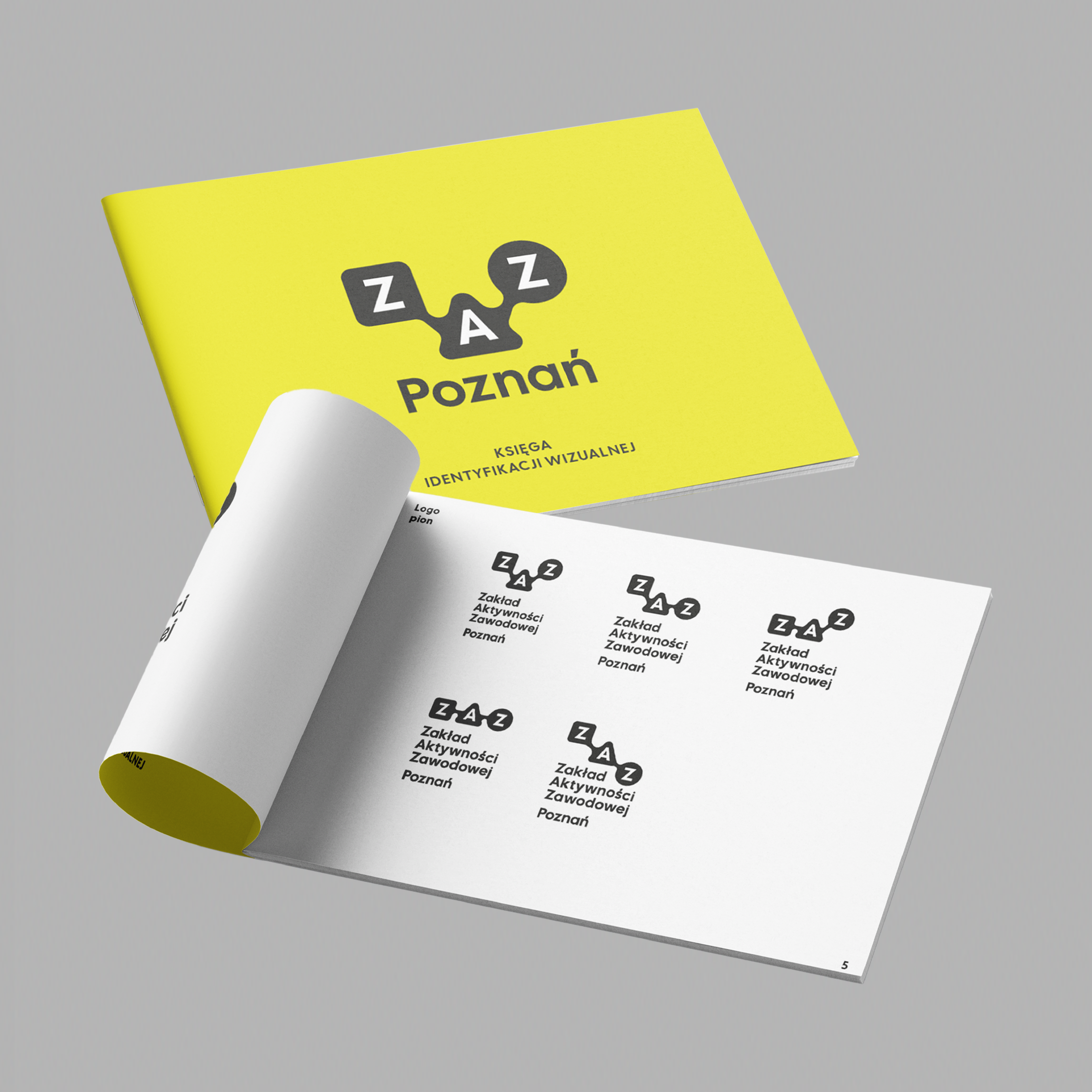
As part of the project, we prepared comprehensive brand guidelines and a structured package of source files, templates, and logo variations. This enables the organisation to independently manage and develop its communication while maintaining visual consistency.
We also developed standards for social media communication, printed materials, posters, leaflets, and informational content. The system included concepts for packaging and promotional materials related to products created by ZAZ Poznań, including coffee packaging. .
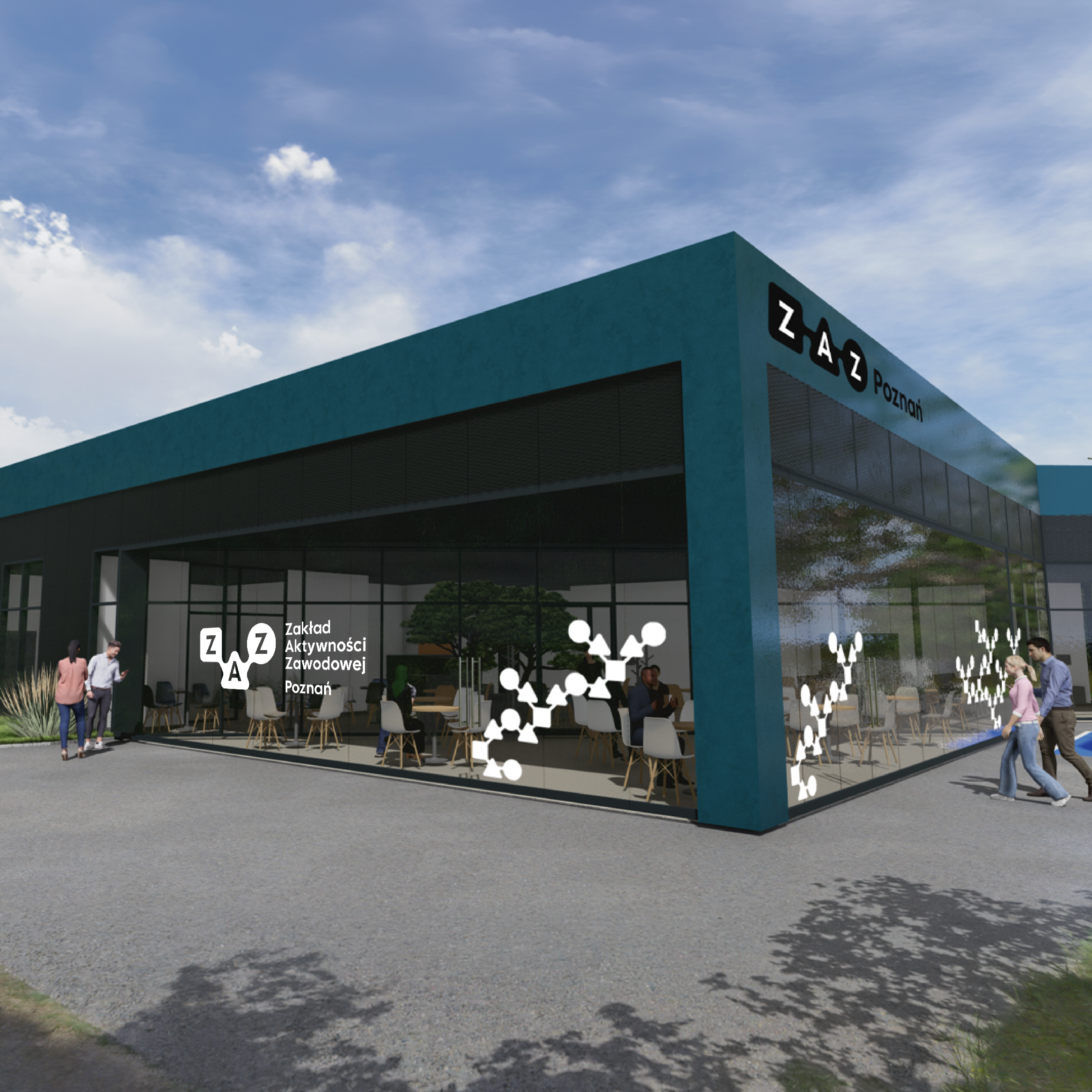
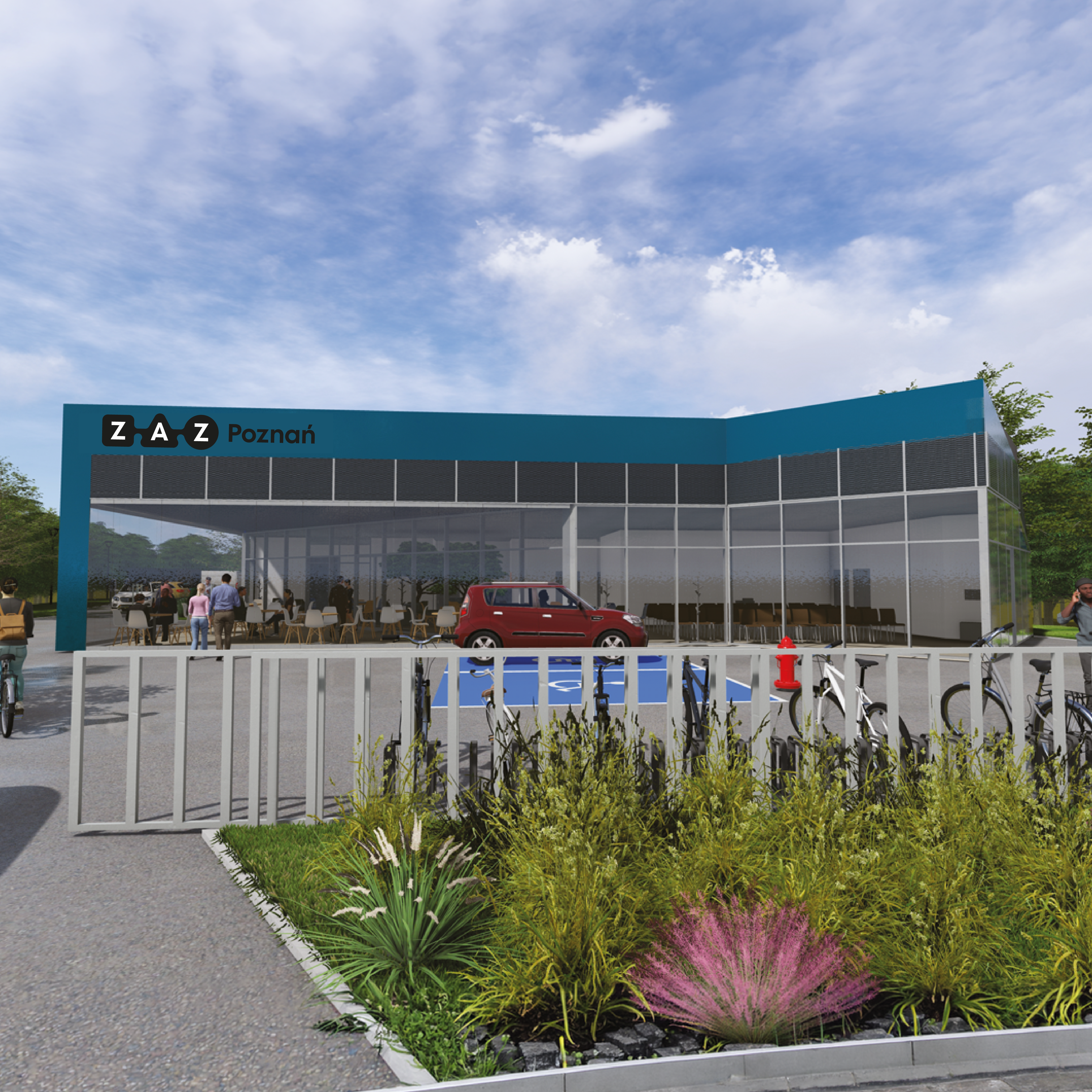
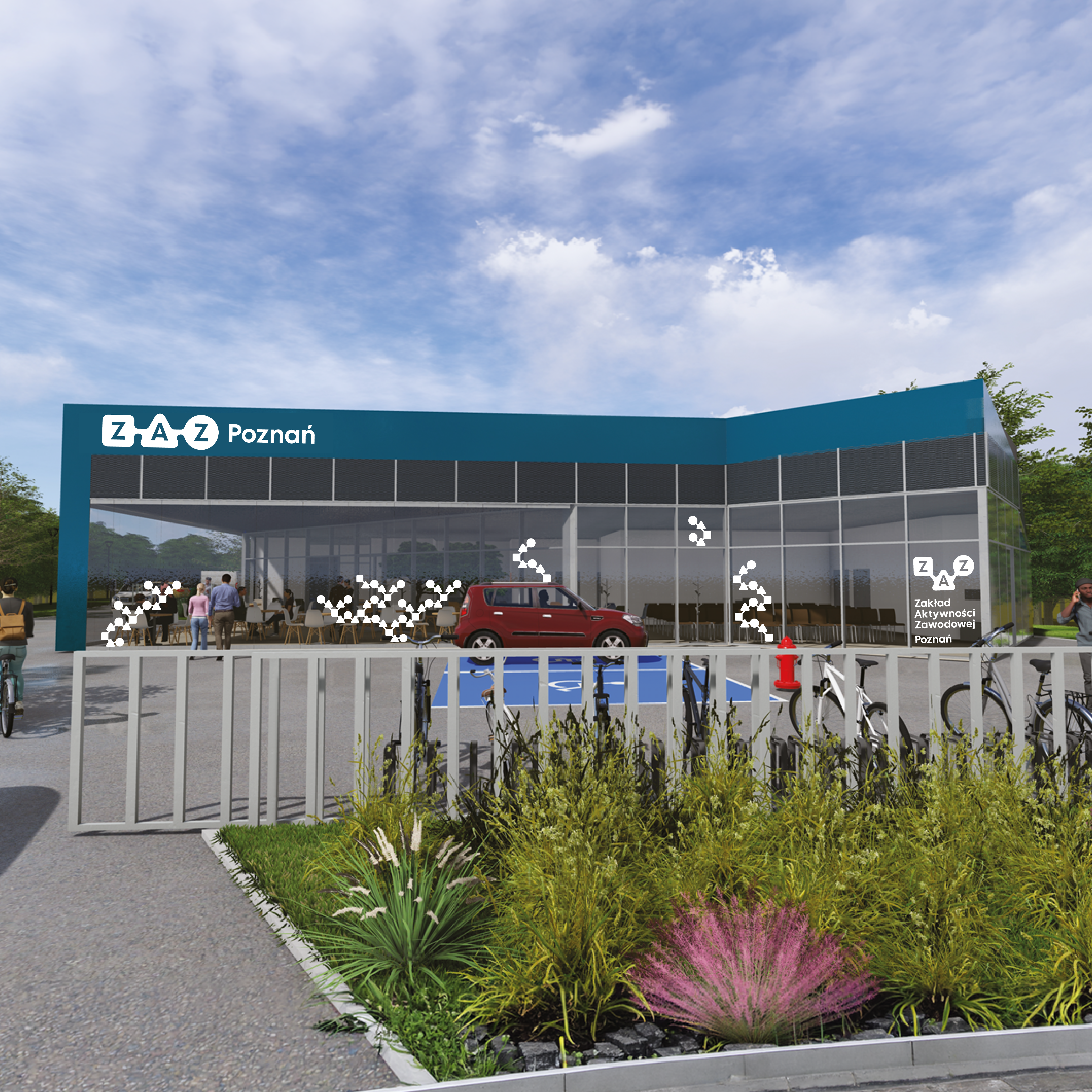
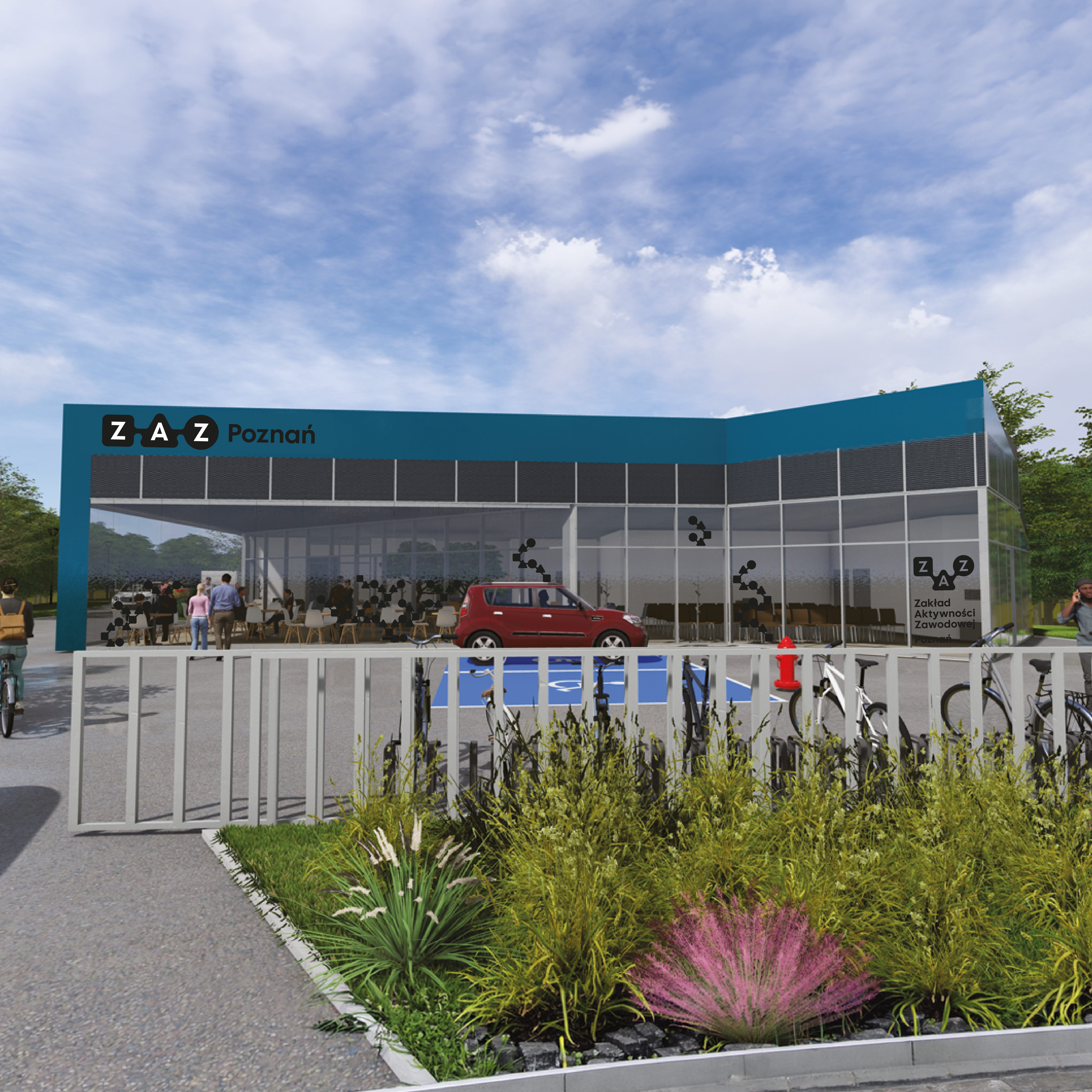
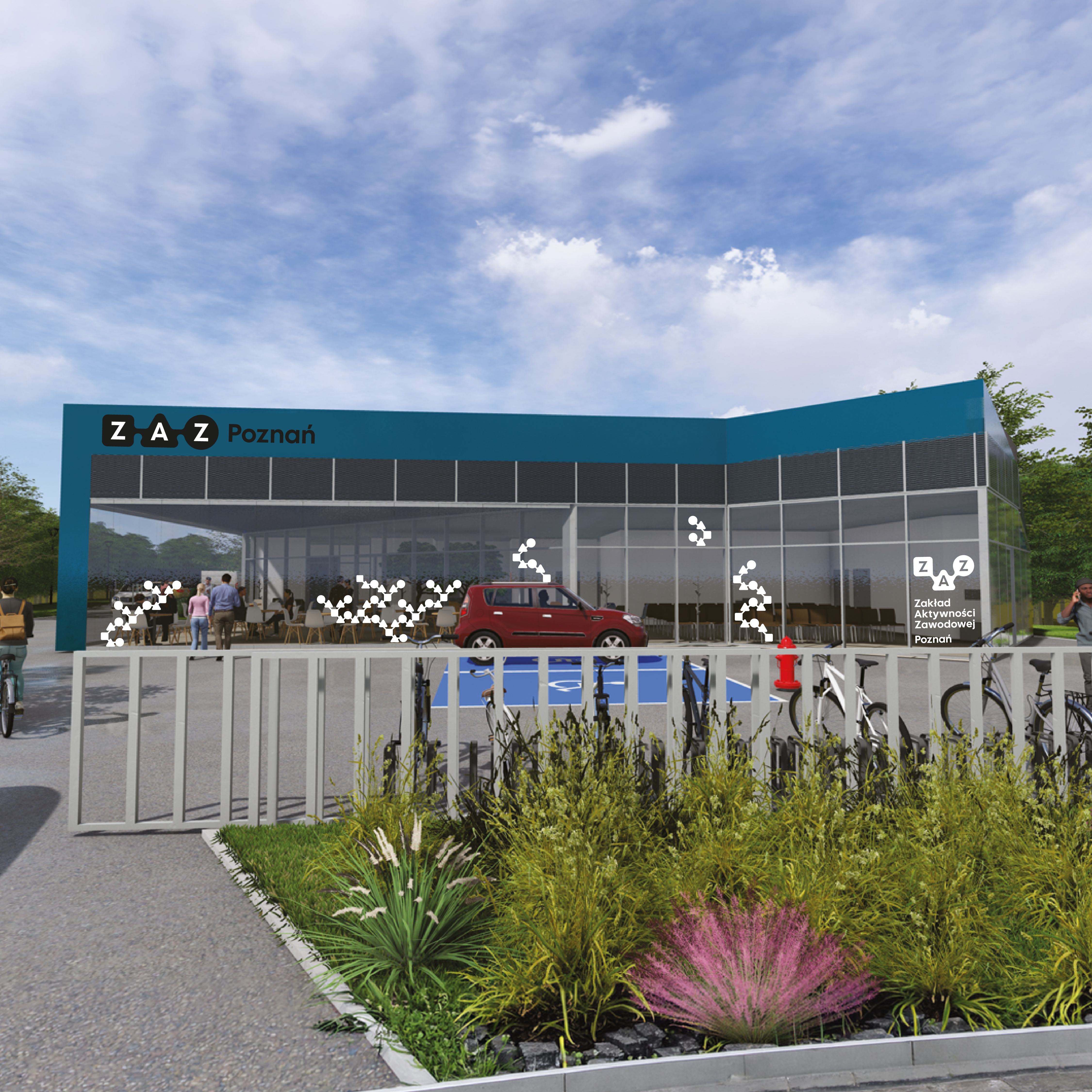
The project also included a concept for a wayfinding and external signage system for the new ZAZ Poznań building. The proposed solutions were based on elements of the visual identity, ensuring that navigation, information design, and environmental graphics form a coherent extension of the brand.
The project was fully implemented and delivered as a practical communication tool for the organisation. The result is a modern, accessible, and flexible visual identity system that supports the daily activities of ZAZ Poznań, strengthens brand recognition, and ensures consistency across all communication channels and areas of operation.