
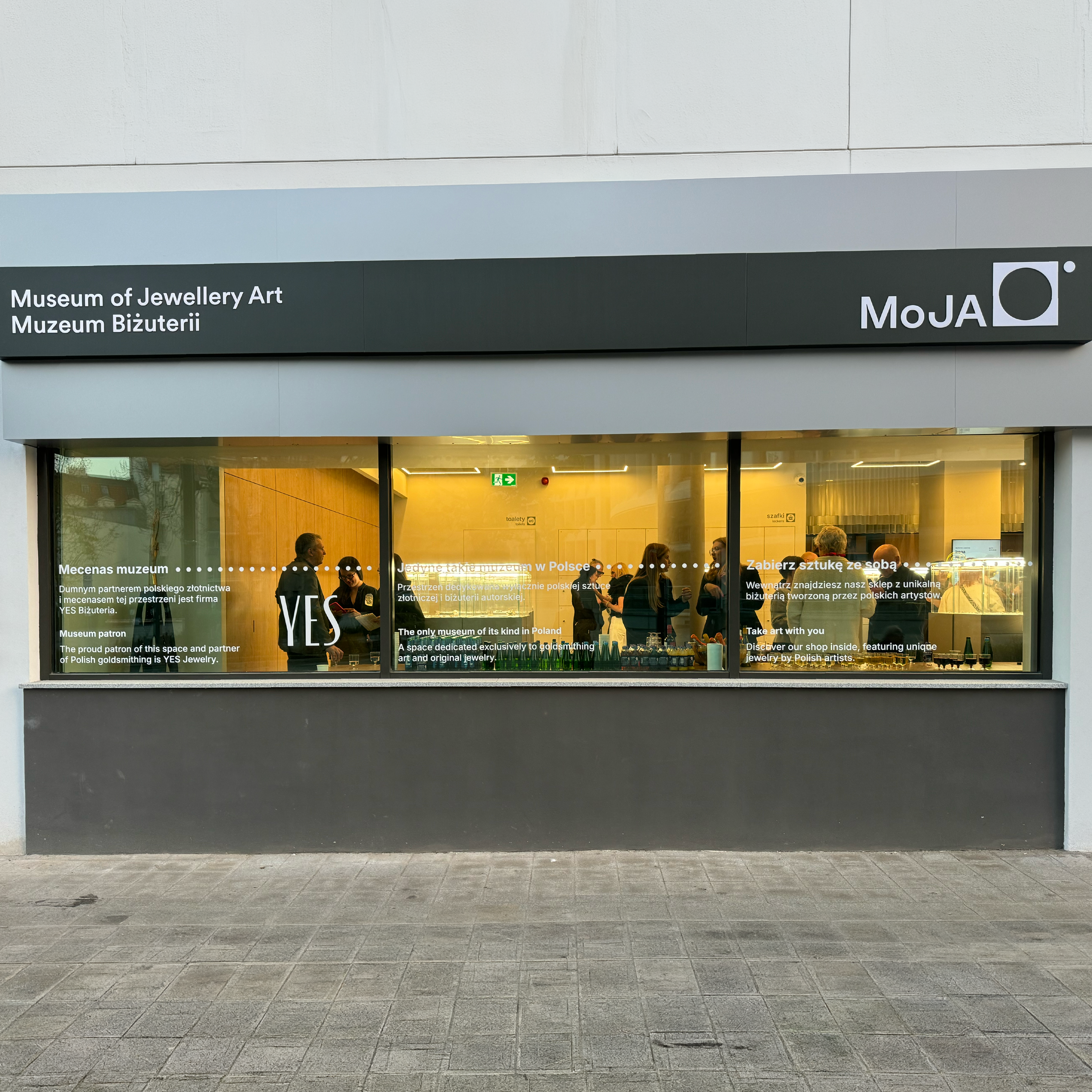
The MoJA Jewellery Museum is a unique institution presenting a collection of approximately 3,000 objects related to the history and contemporary practice of jewellery design. Our task was to develop a comprehensive wayfinding system and visual communication layer supporting visitors throughout the exhibition experience. The project was created in close collaboration with the client and required a careful balance between functionality, aesthetics, and clear communication within a museum environment.
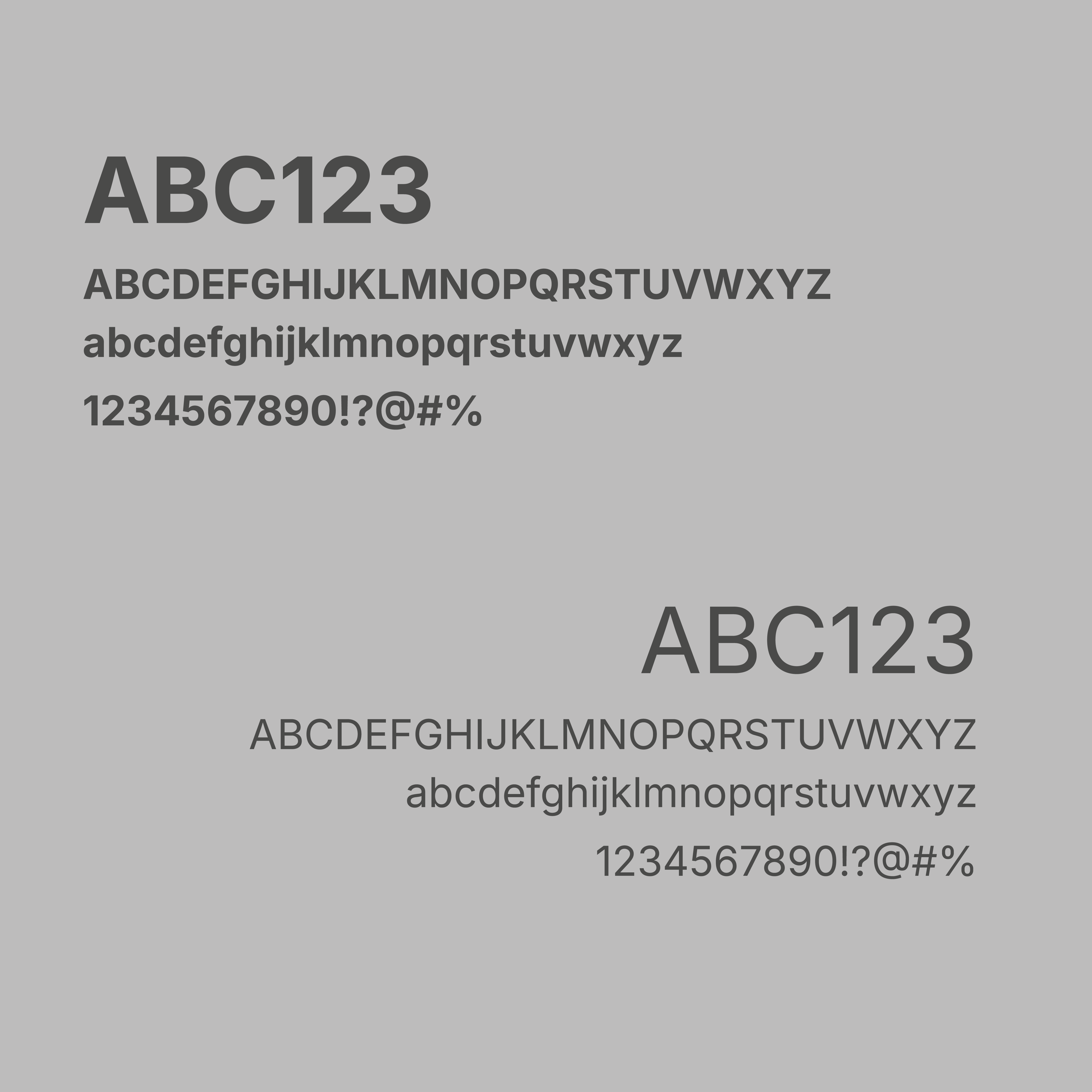
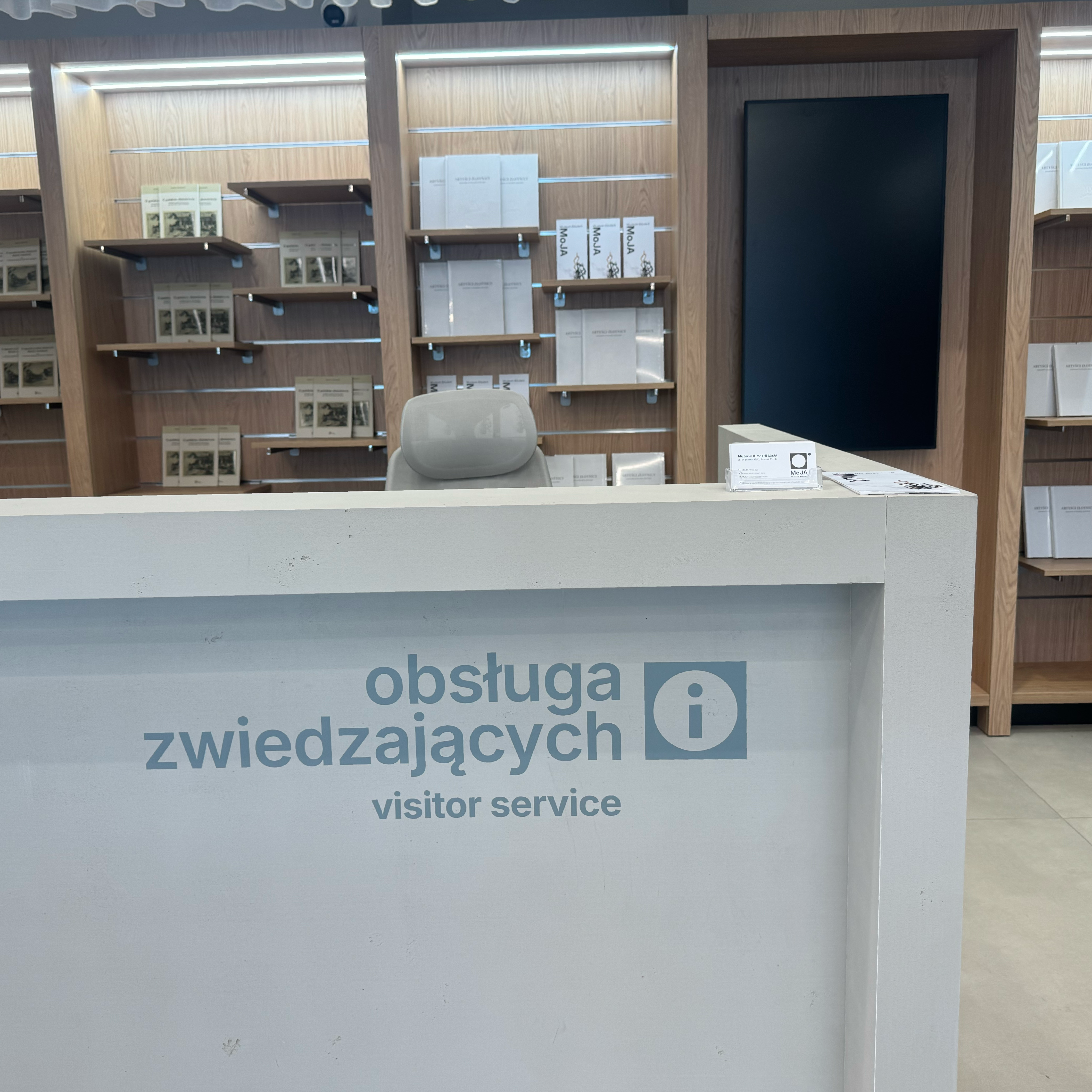
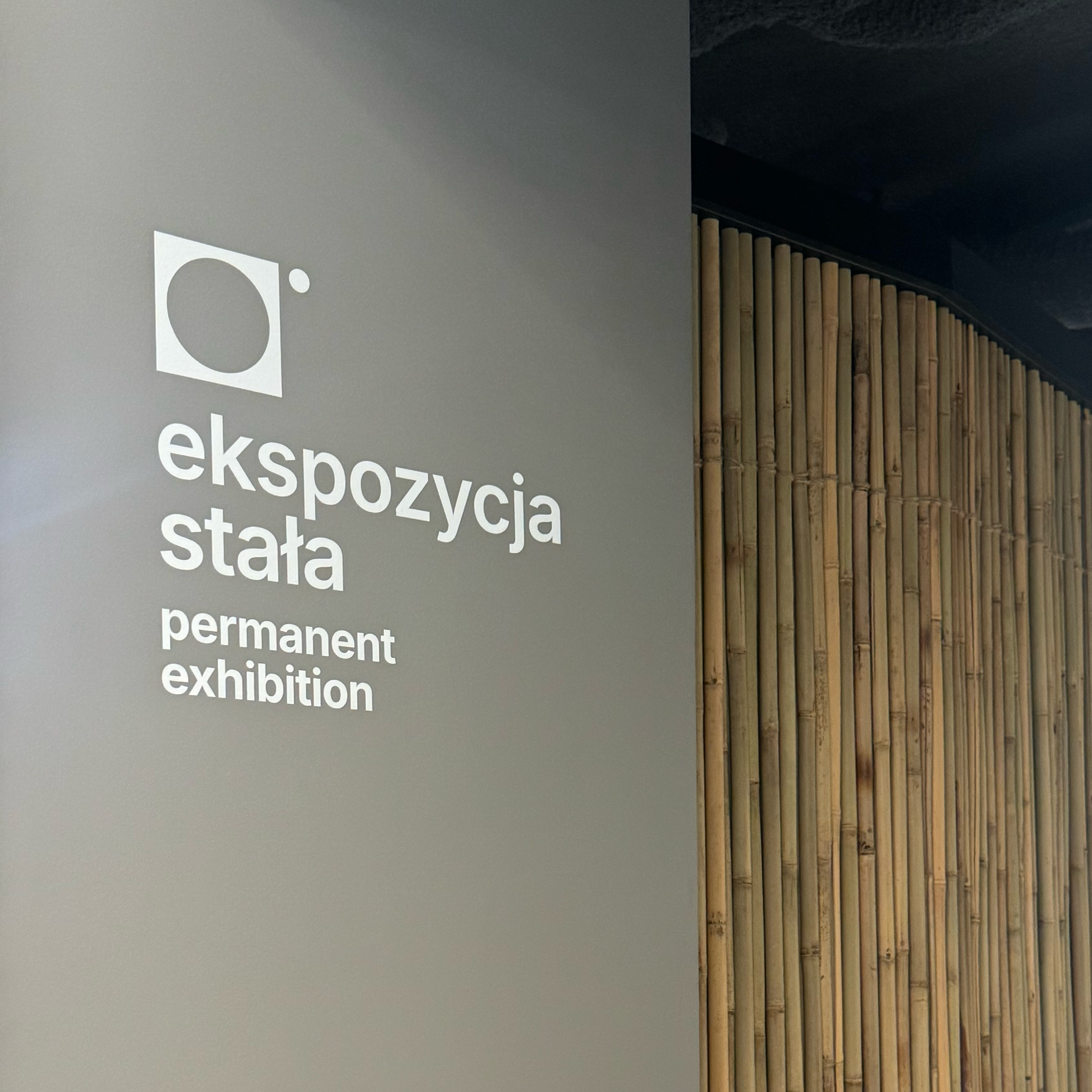
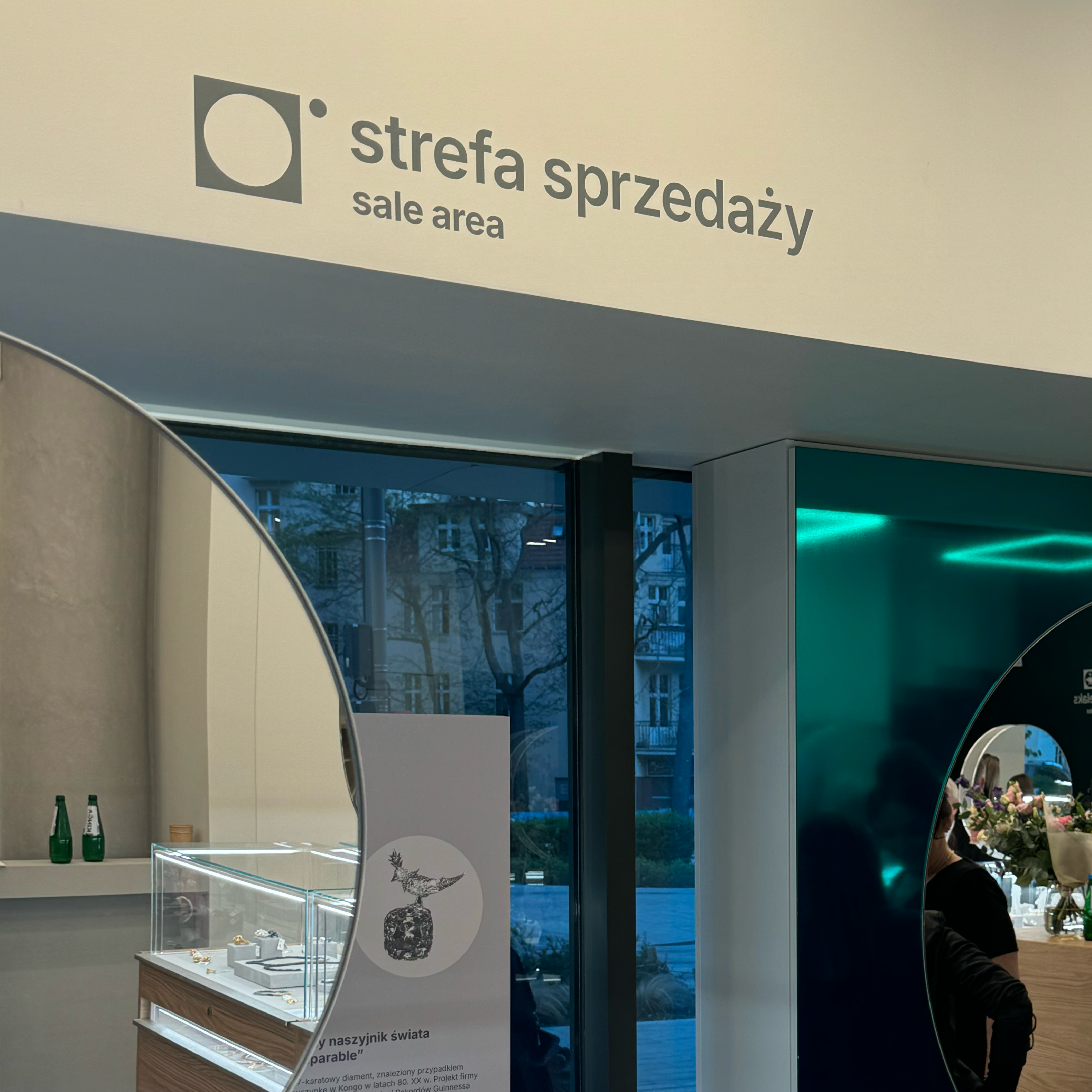
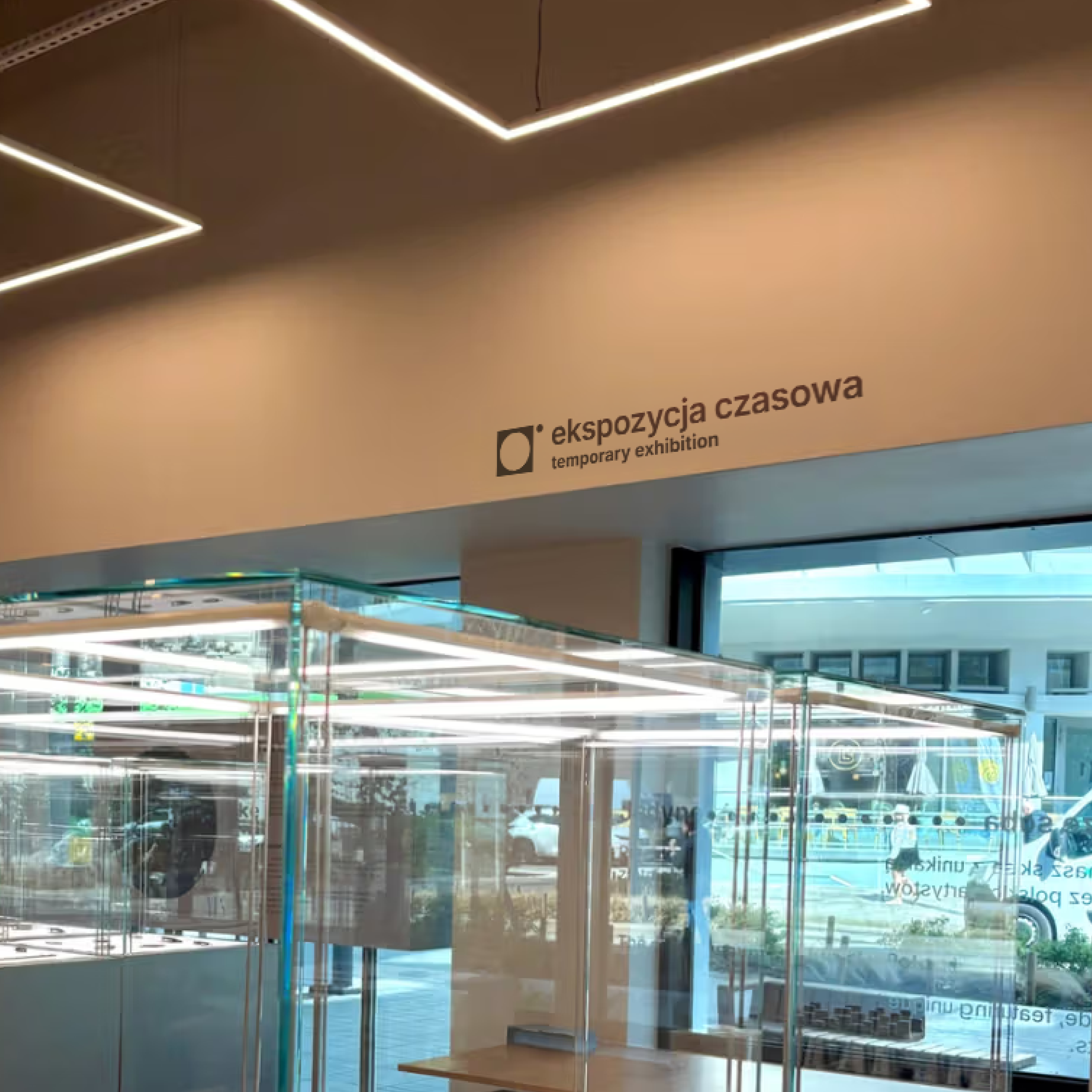
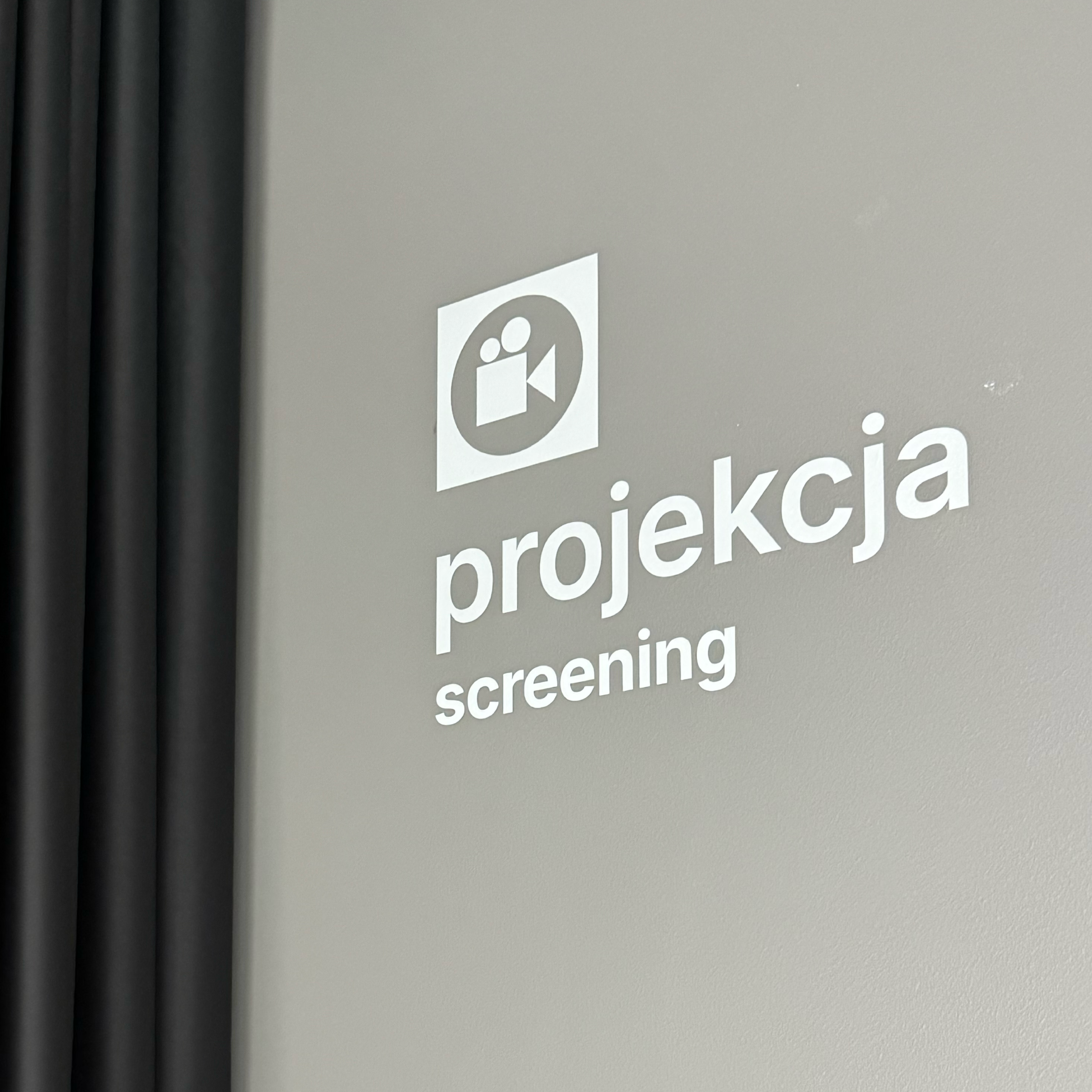
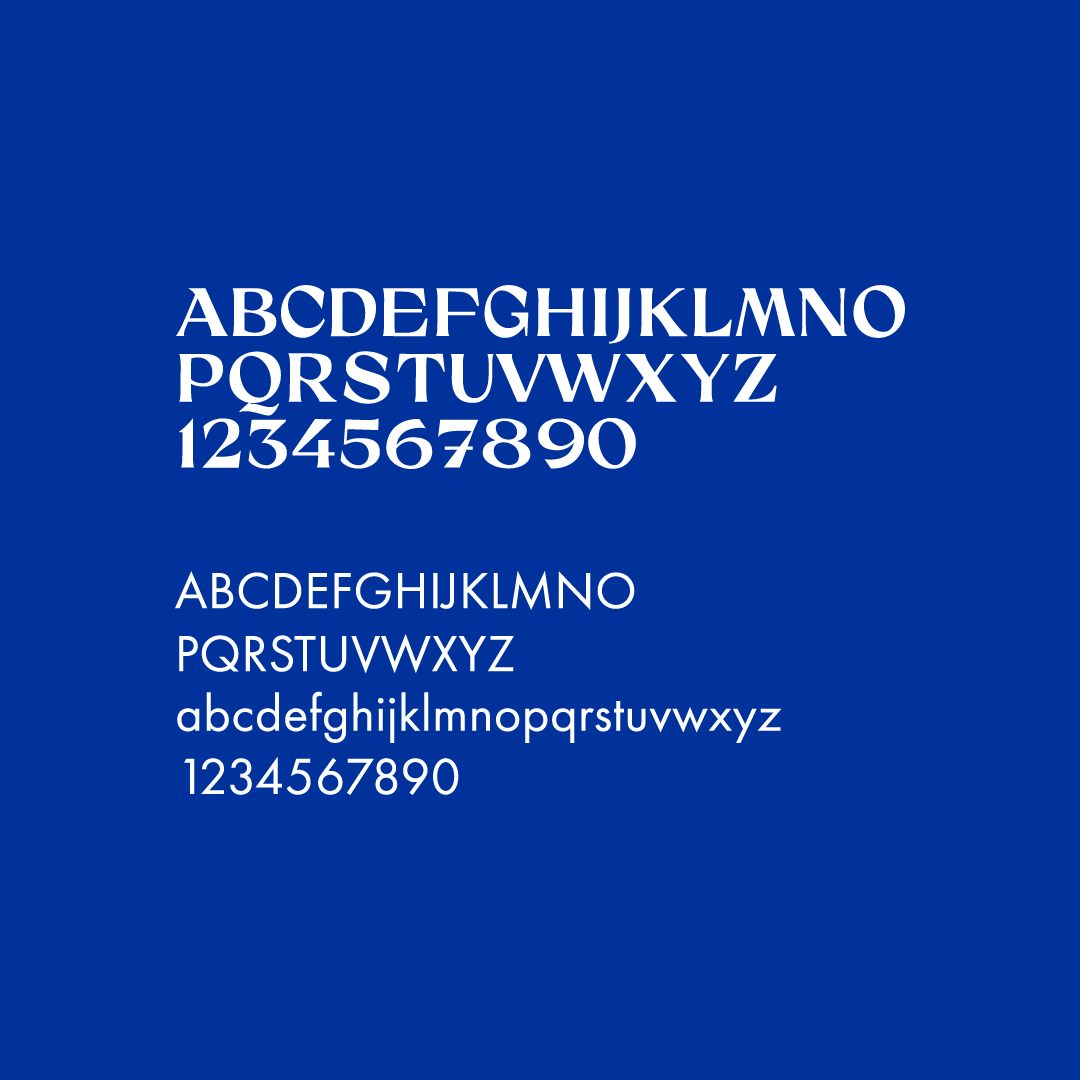
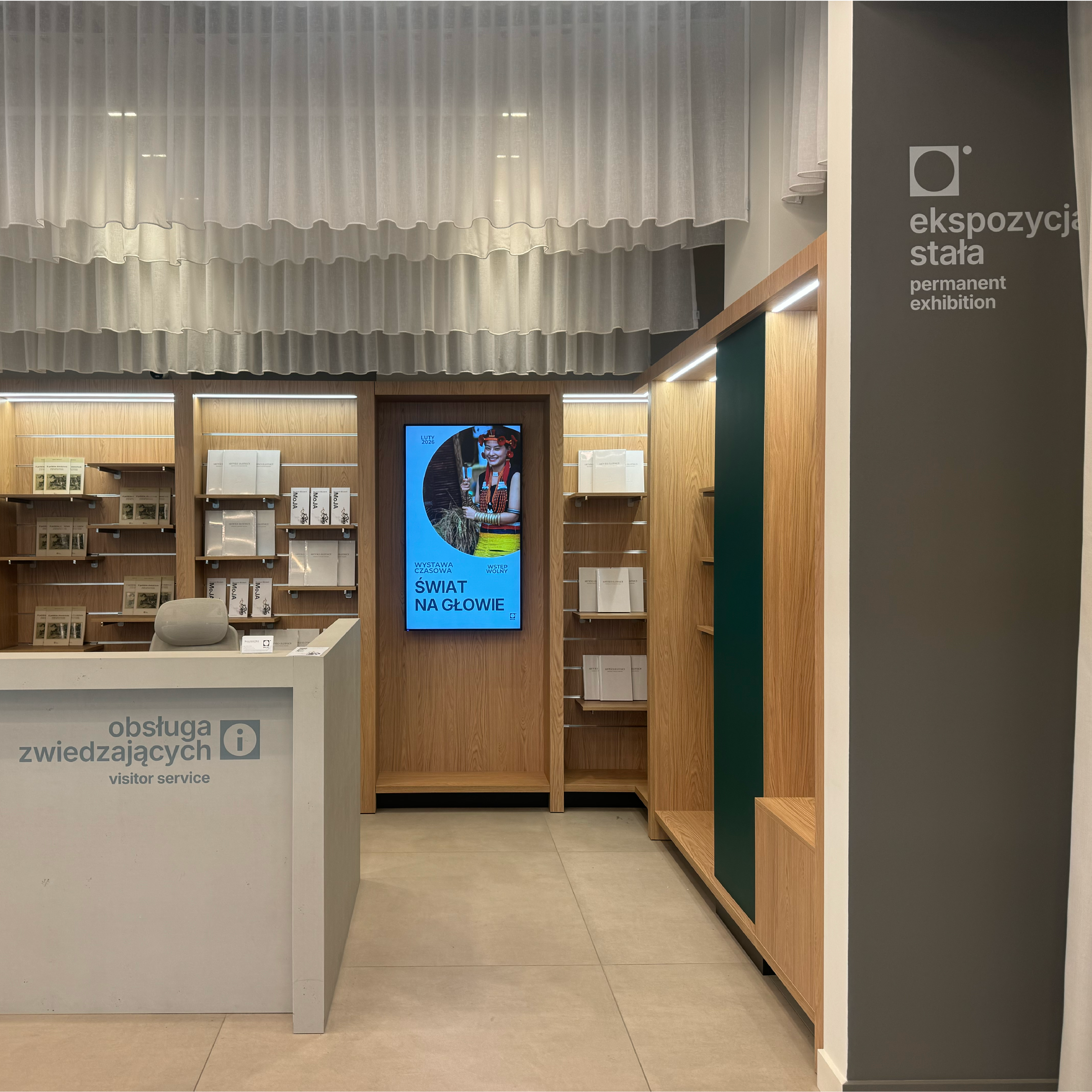
The starting point for the design process was the development of visual communication principles based on the museum’s existing logo and graphic identity. We selected a highly legible sans-serif typeface that allowed us to establish a clear hierarchy of information and effectively organise exhibition content.
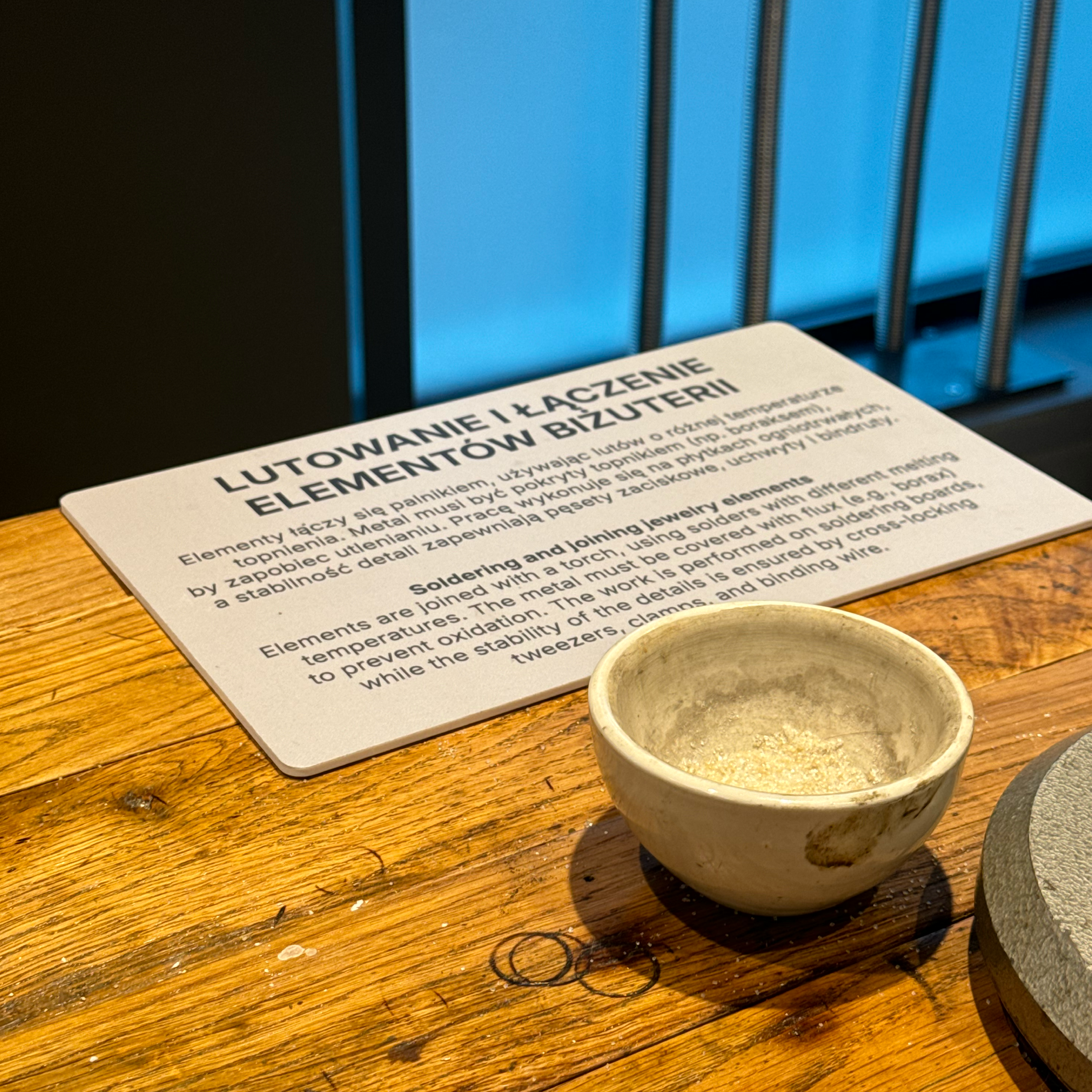
We created a complete typographic system including titles, section headings, body text, object labels, and supporting signage. Particular attention was paid to bilingual communication, resulting in a set of standards for presenting content in both Polish and English. This approach ensured visual consistency and readability despite the large volume of information displayed throughout the exhibition.
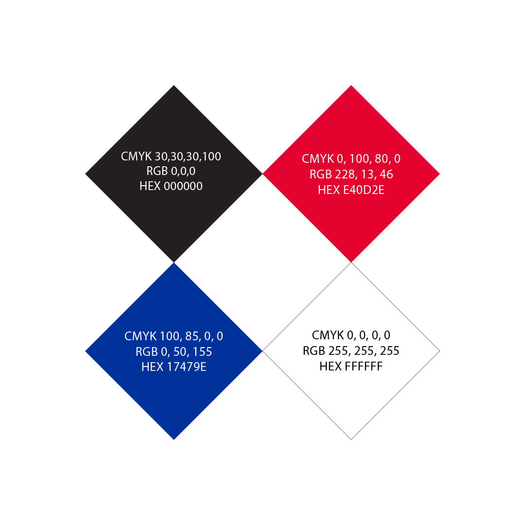
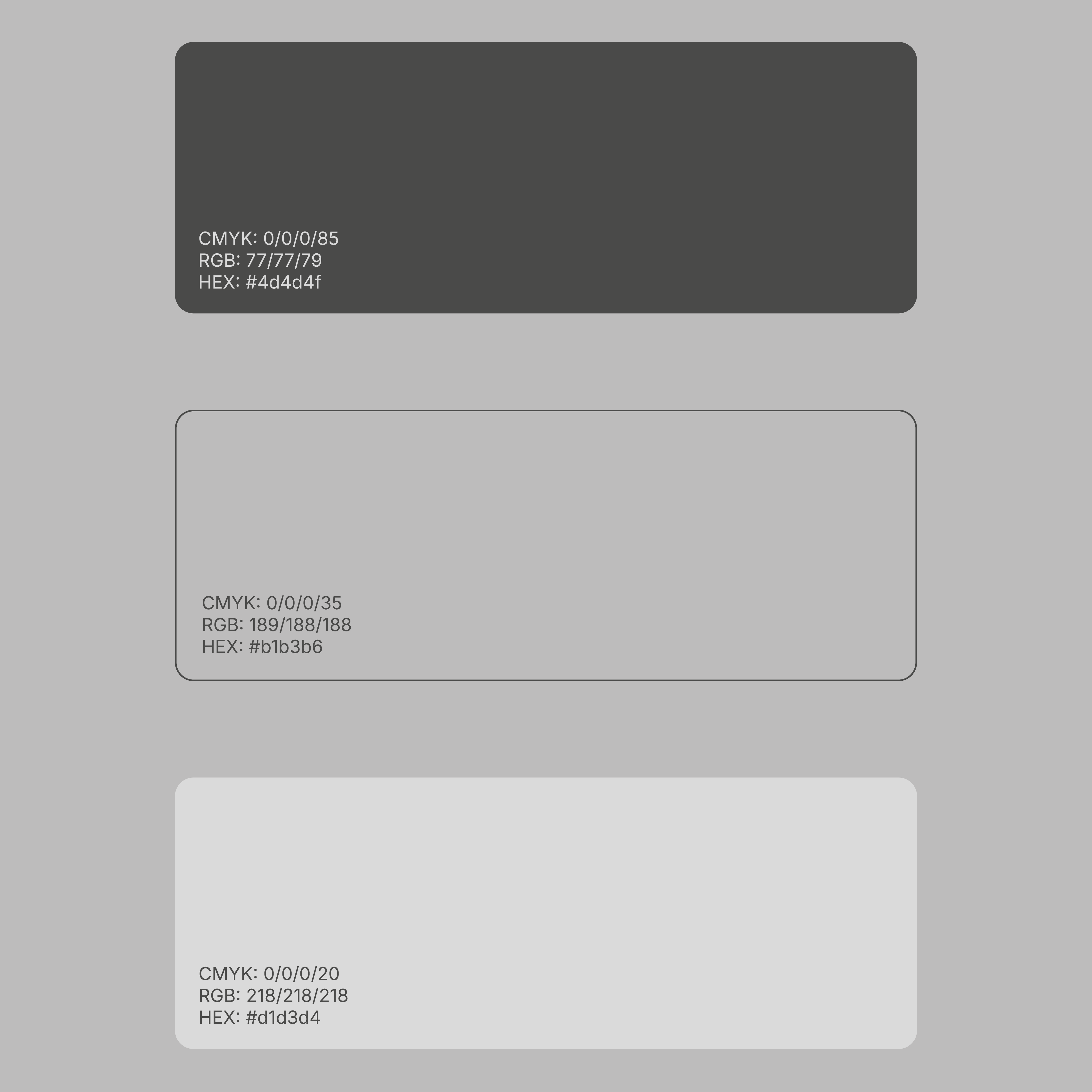
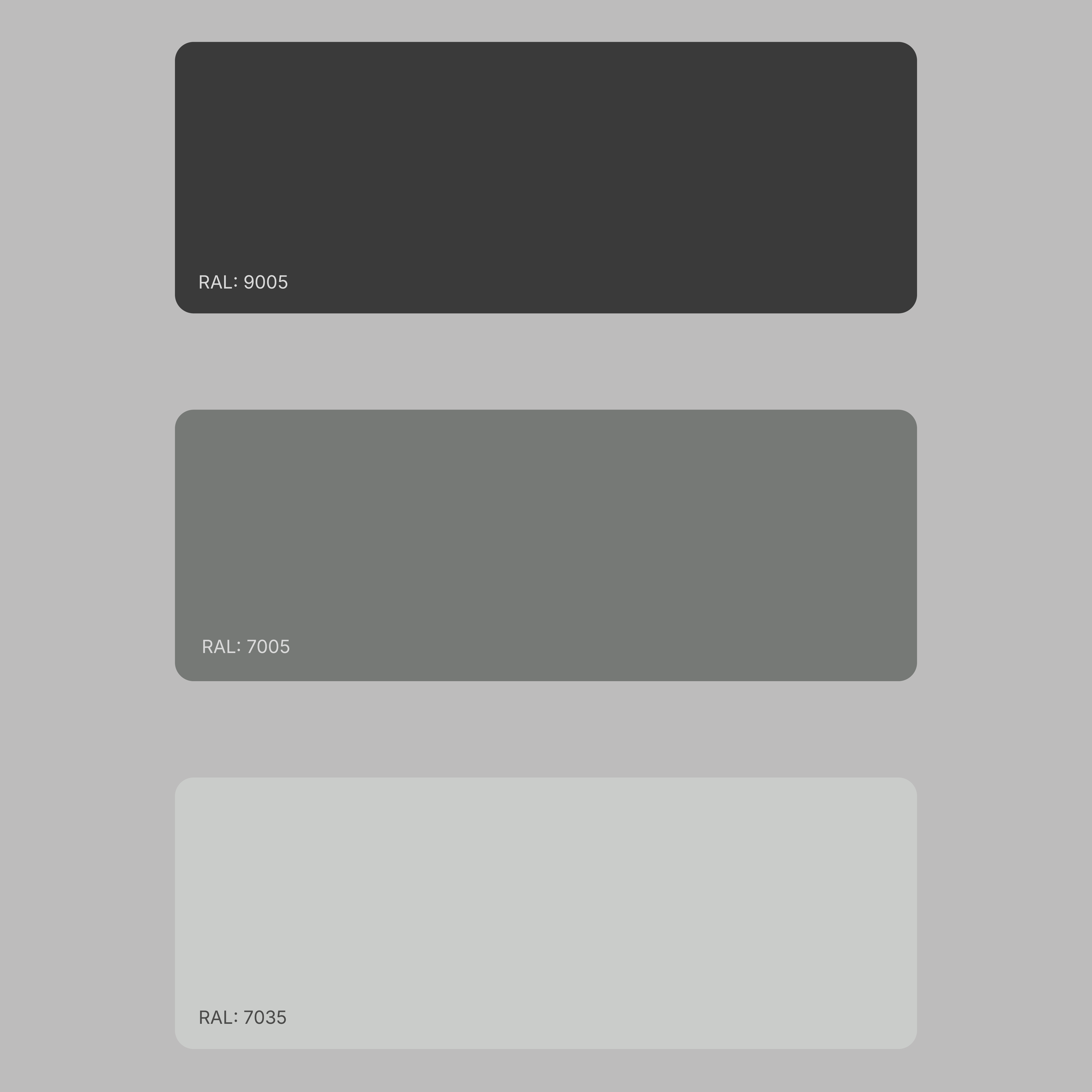
An important part of the project involved developing an appropriate colour system for various production materials and printing techniques. Working closely with the client, we created a range of grey tones that harmonised with the exhibition architecture and complemented the character of the collection.
The colours needed to perform equally well in directional signage, educational panels, and object labels. An additional challenge was maintaining consistency between exhibition zones that differed in both atmosphere and display-case finishes. The result was a unified visual system functioning effectively across all museum spaces.
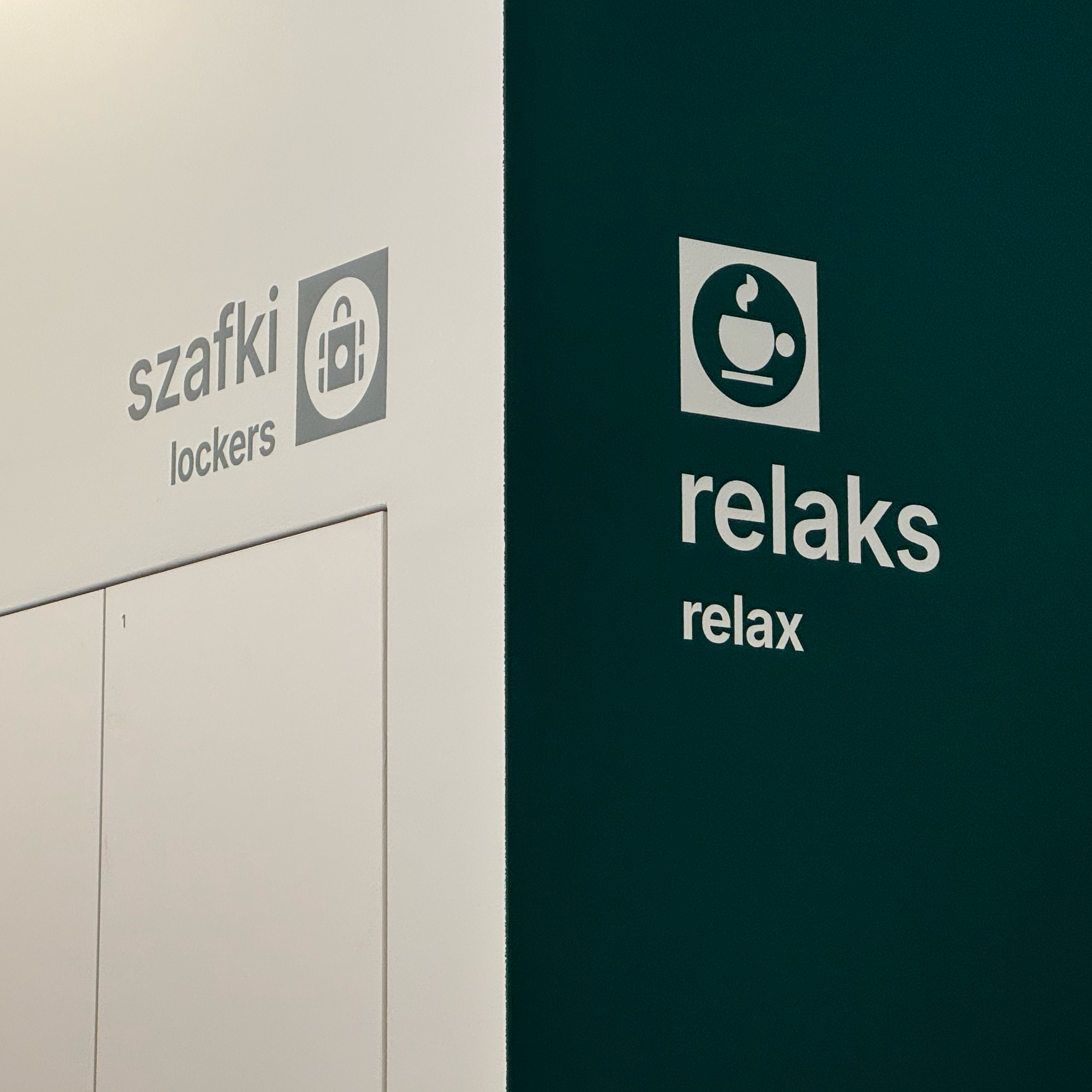
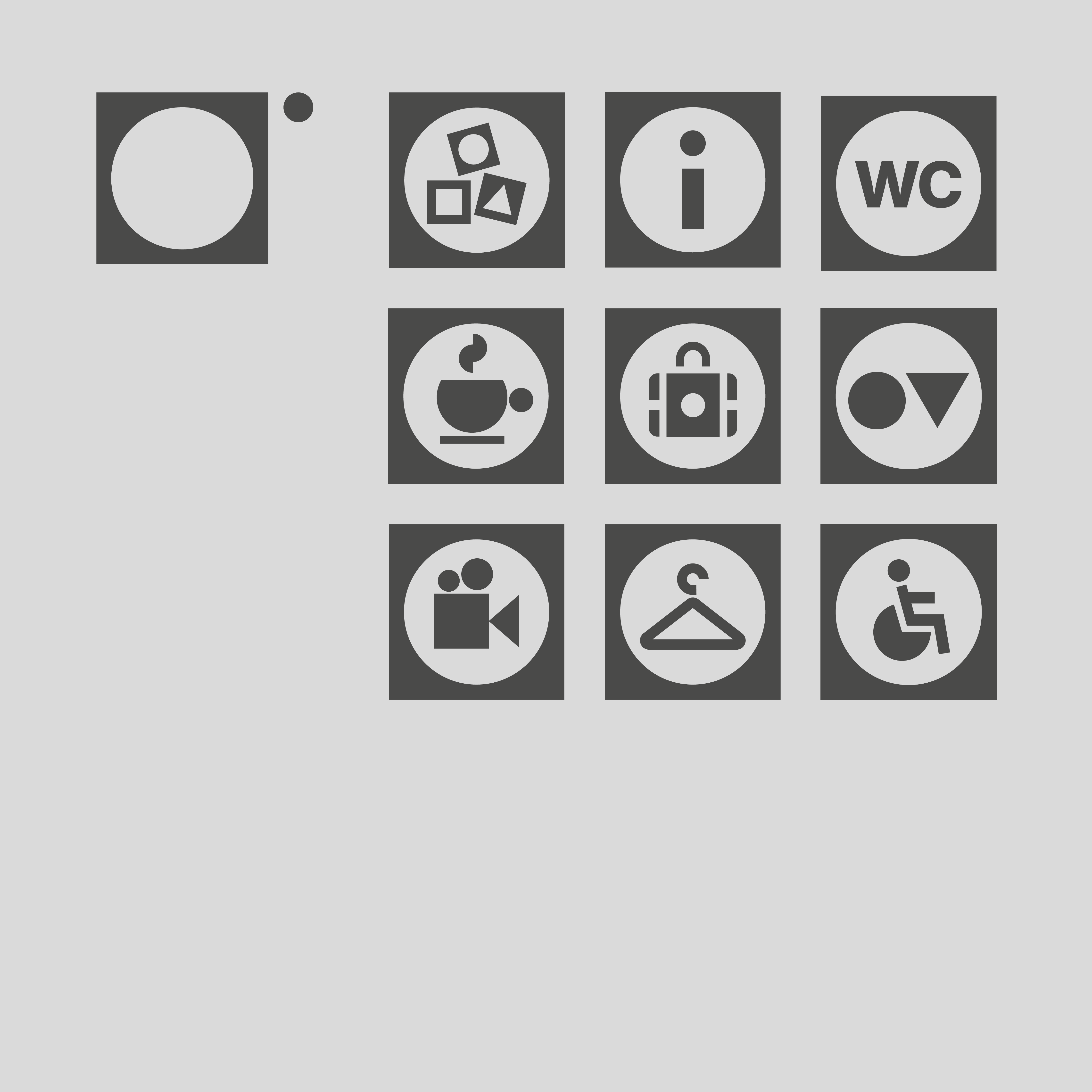
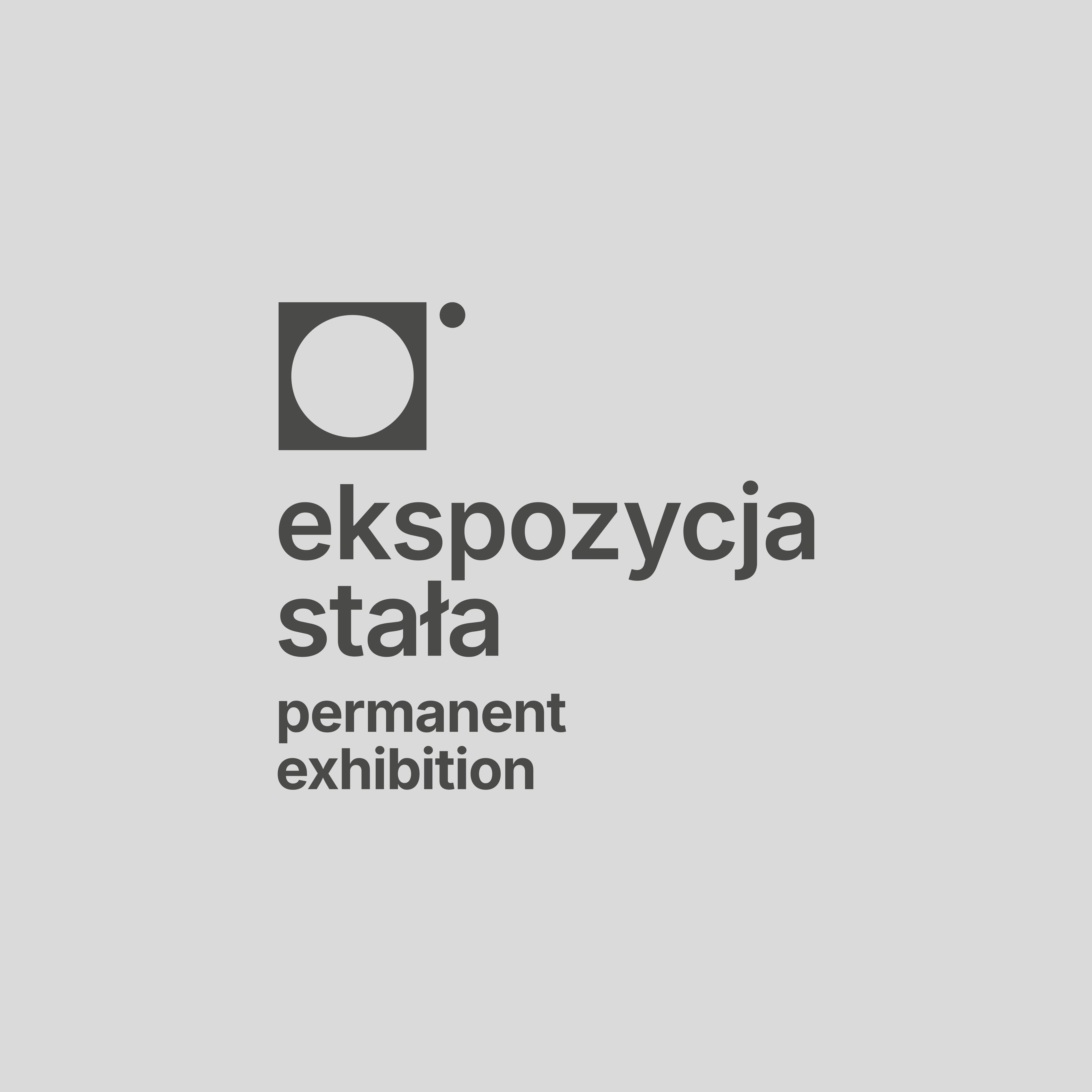

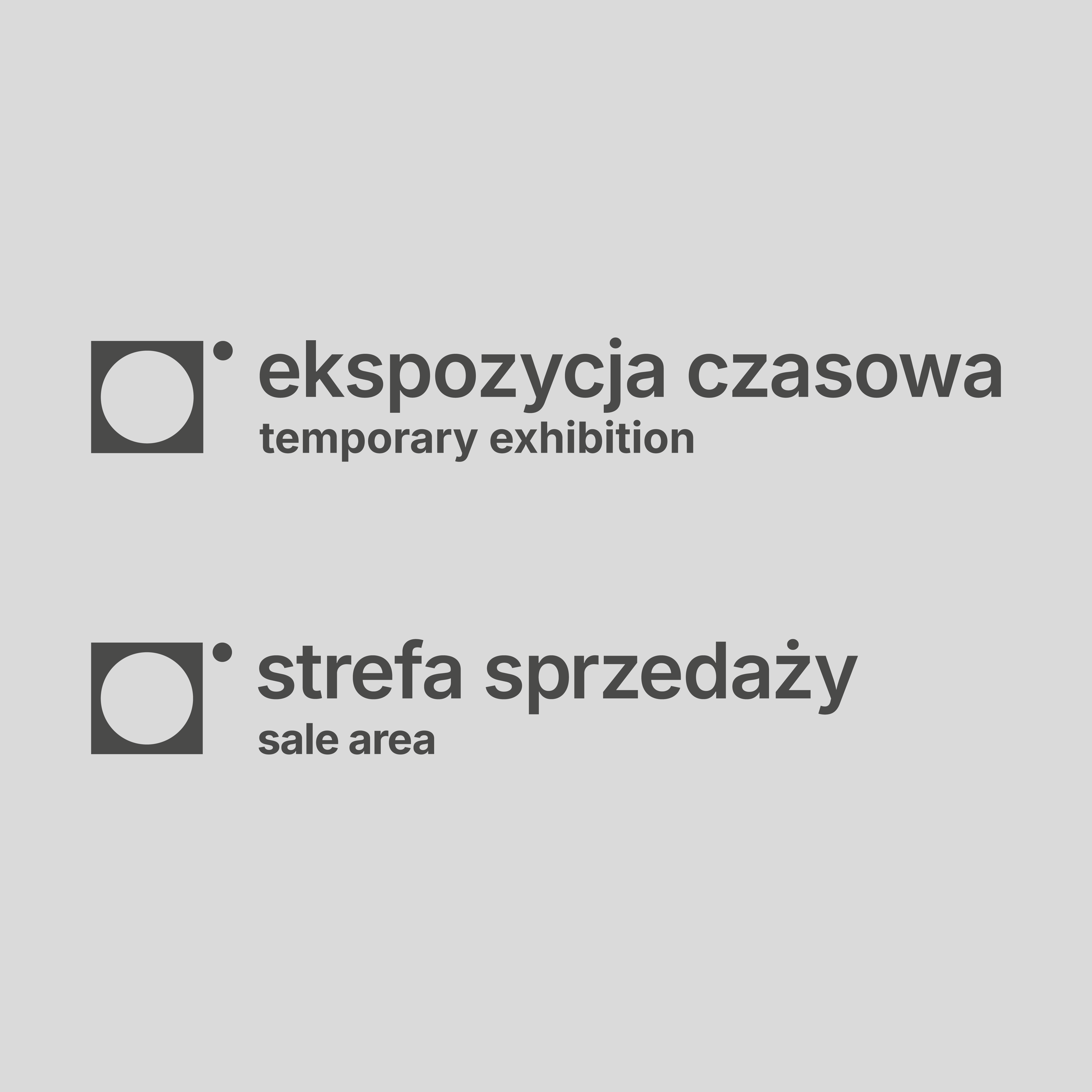
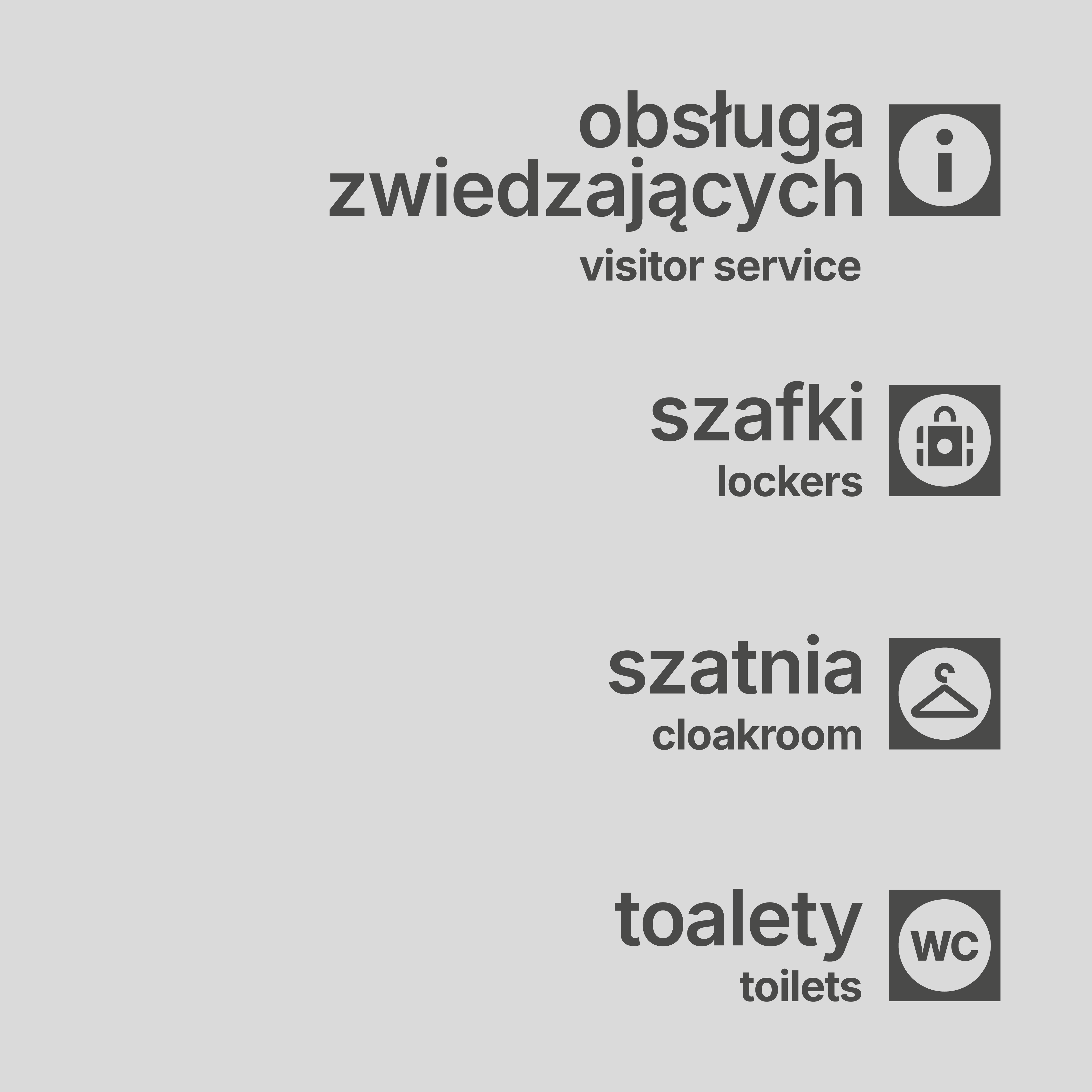
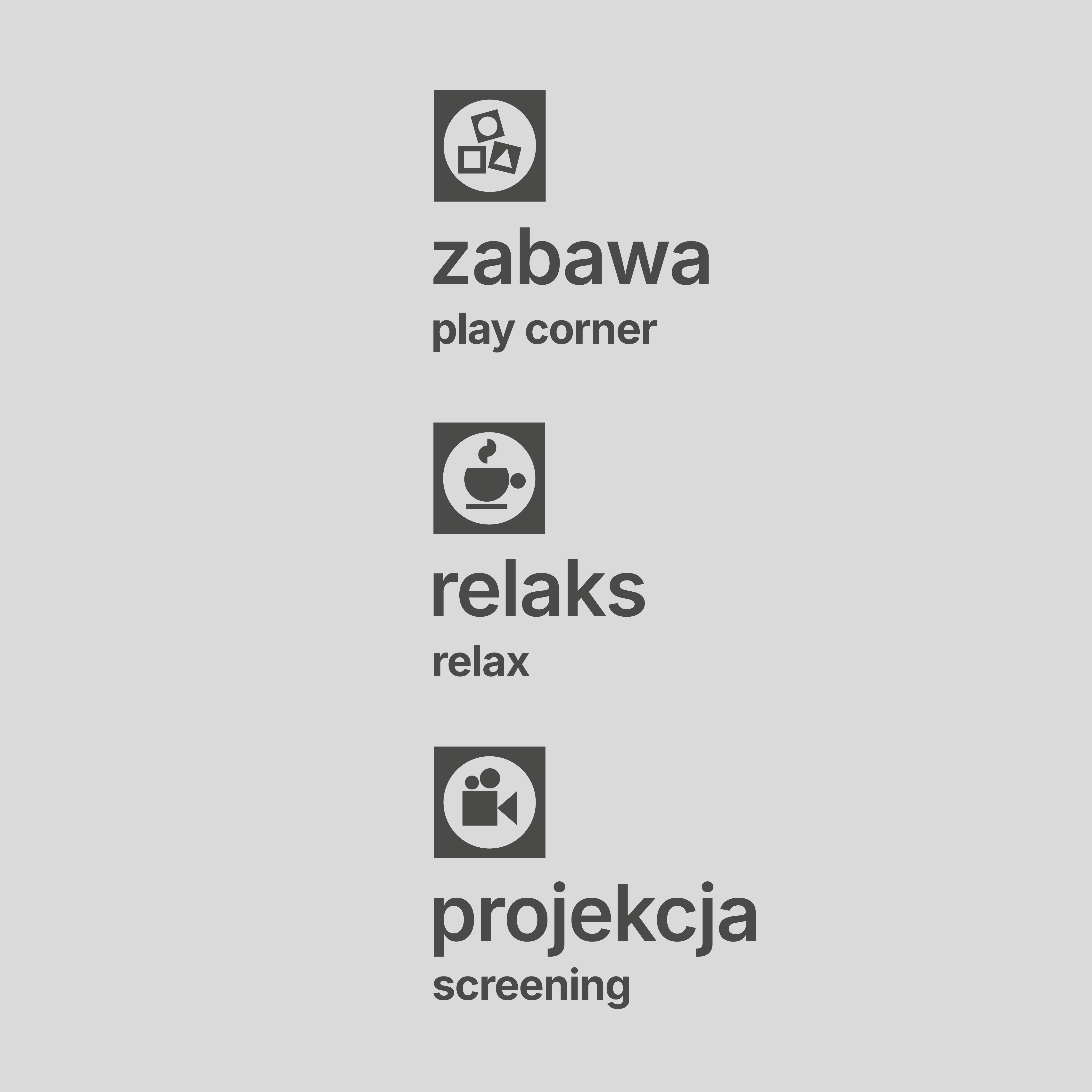
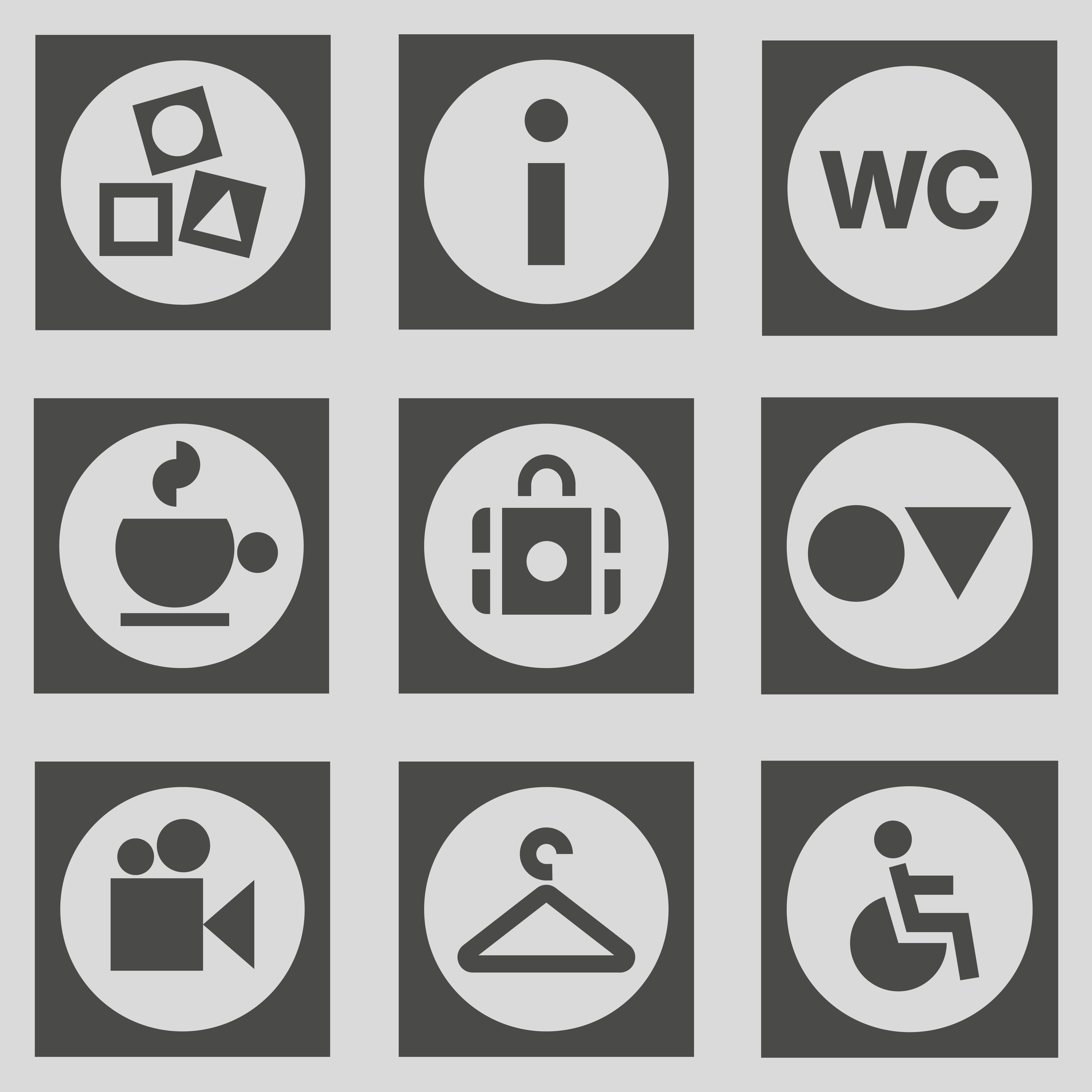
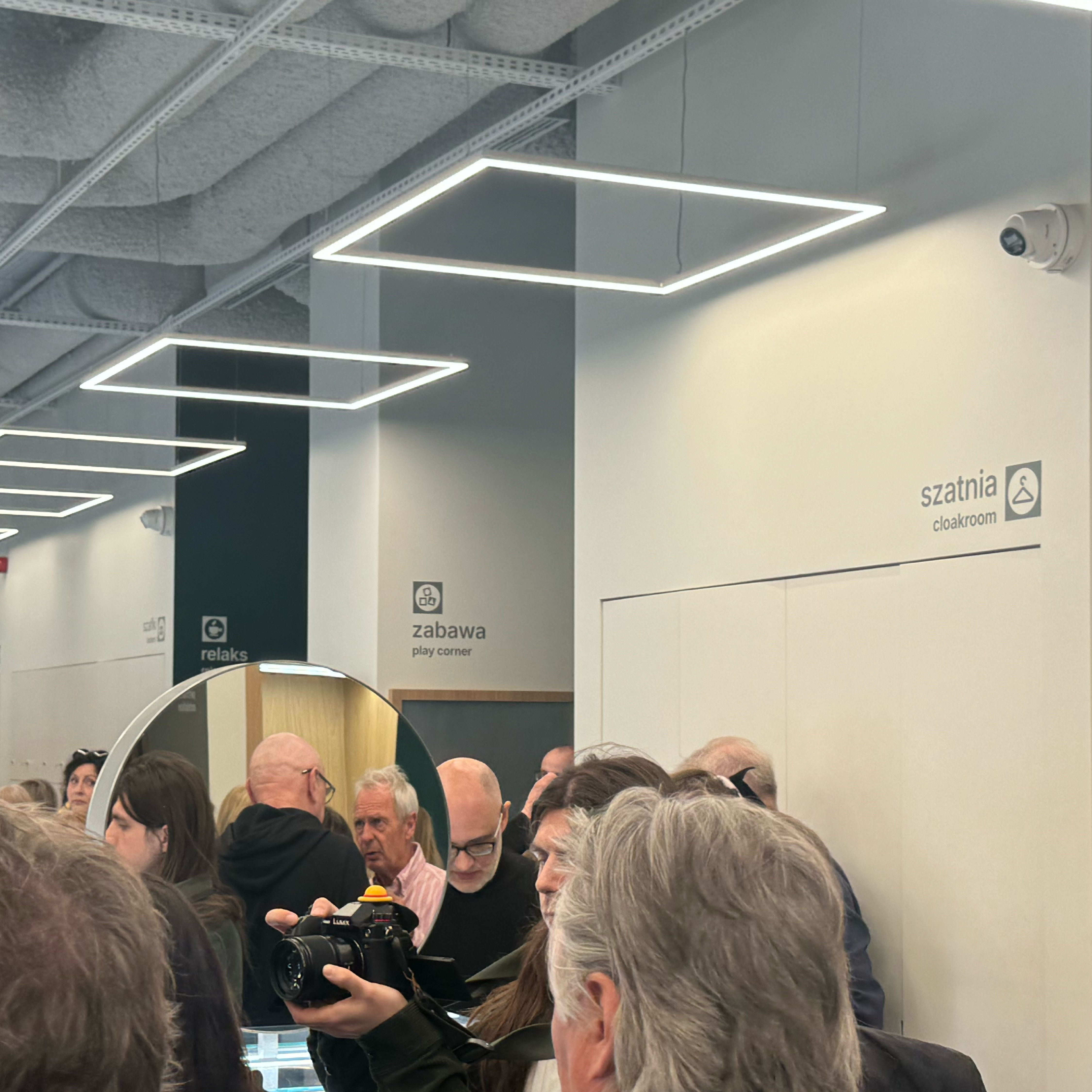
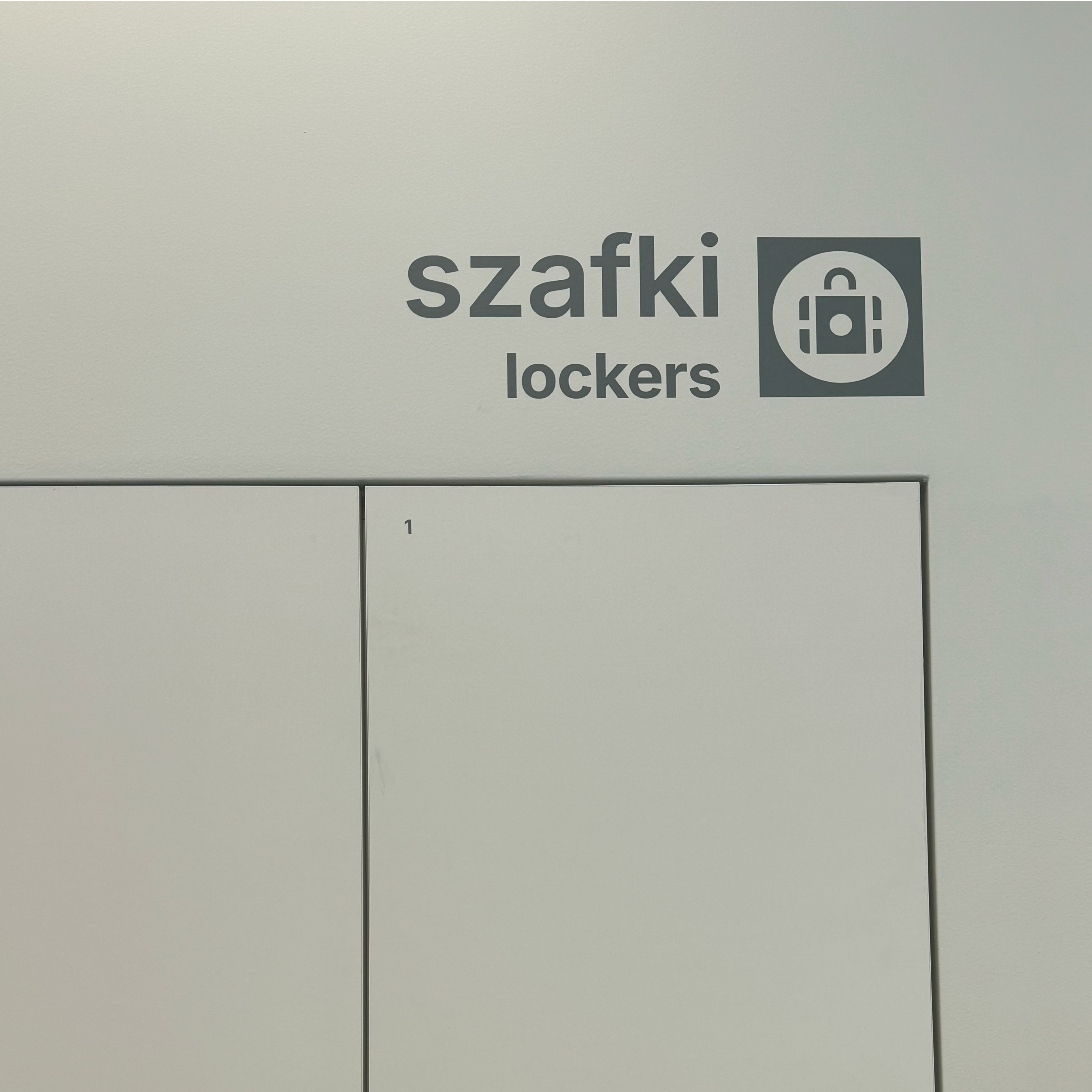
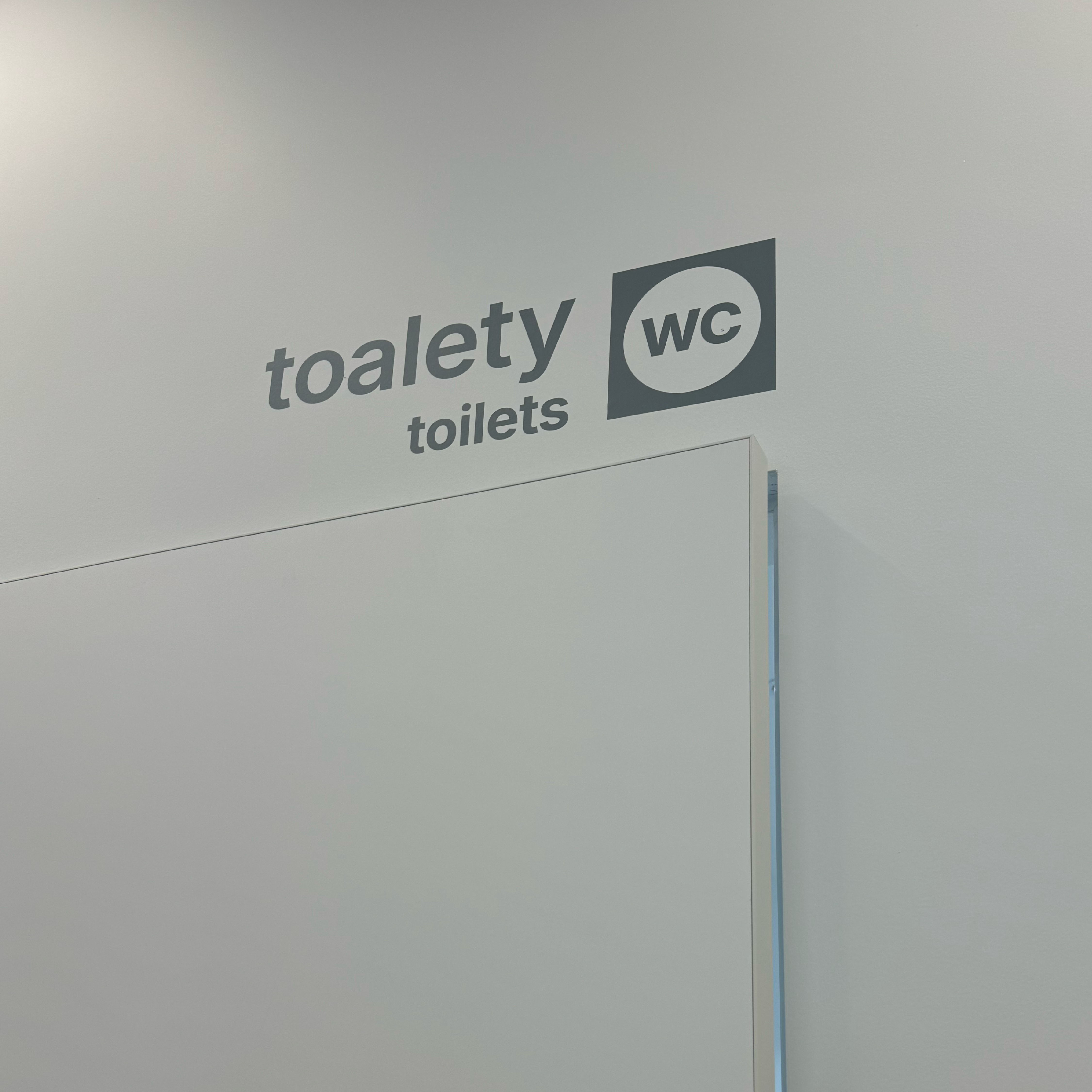
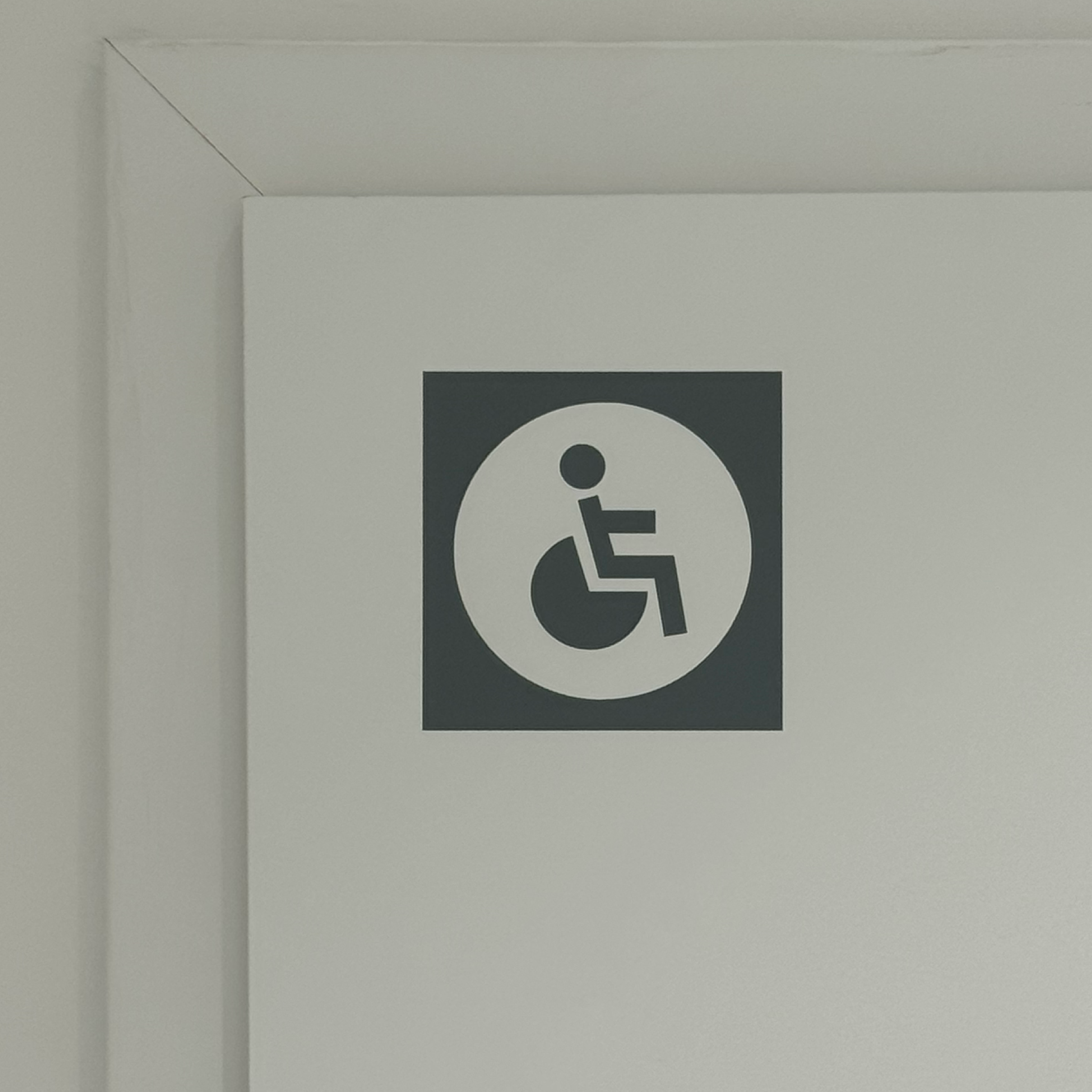
For the wayfinding system, we designed a bespoke set of icons inspired by the geometry of the museum’s visual identity. Each symbol was based on the circle and square motifs present in the institution’s logo.
The iconography was used to identify key visitor facilities such as reception, cloakroom, restrooms, relaxation areas, children’s zones, and information points. Through the consistent use of simple geometric forms, we created an intuitive and aesthetically coherent navigation system supporting visitor orientation throughout the museum.
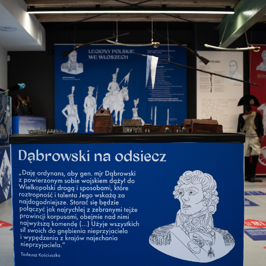
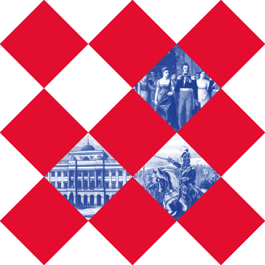
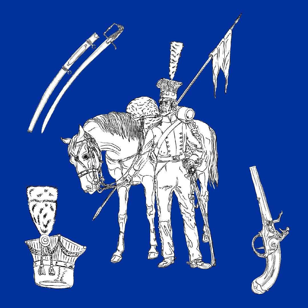
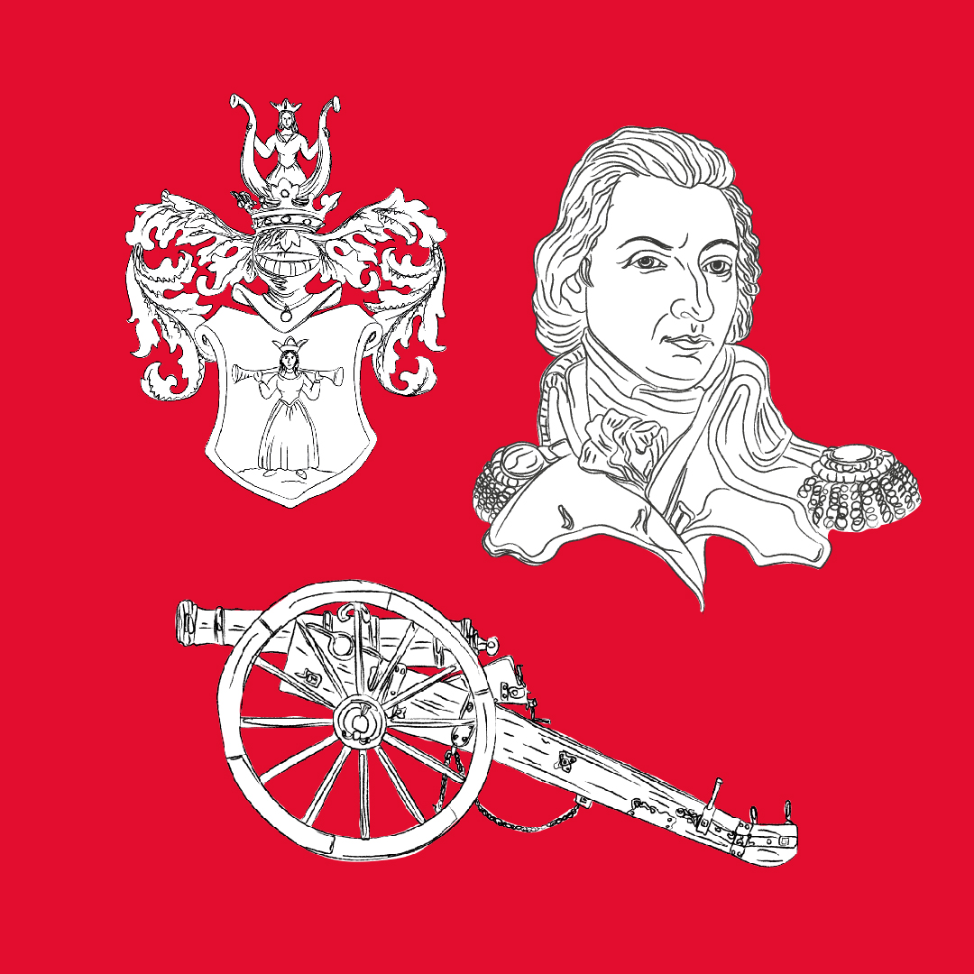
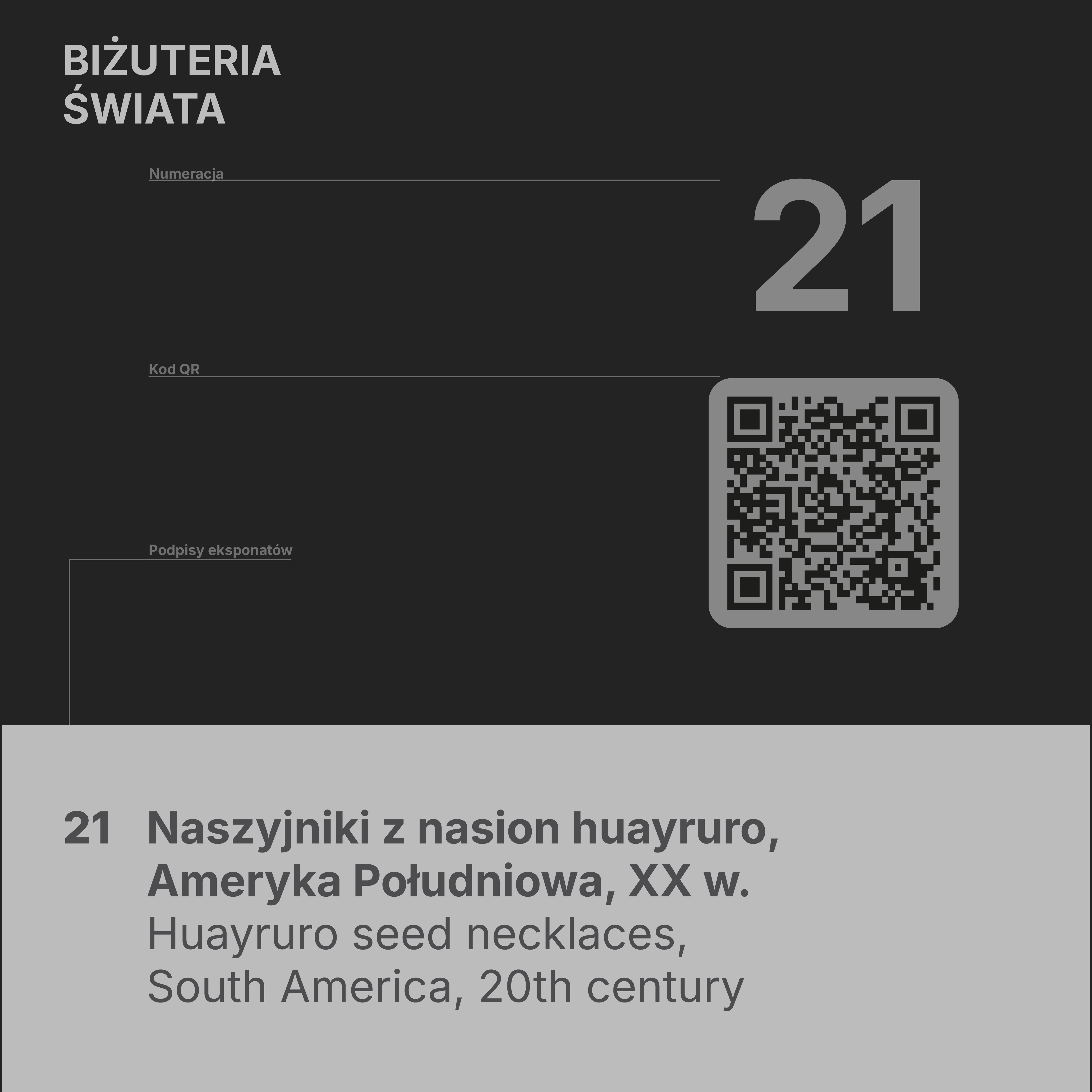
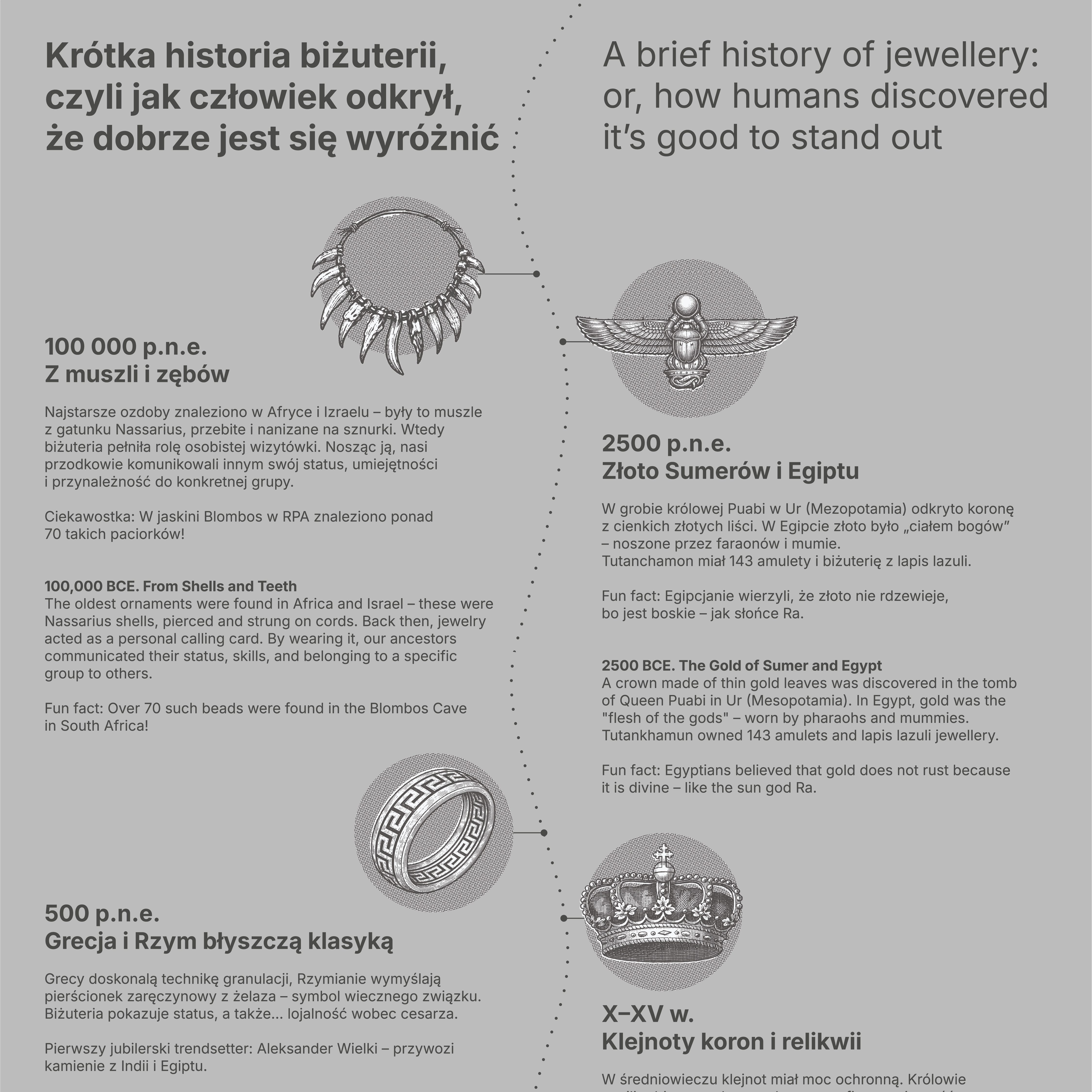
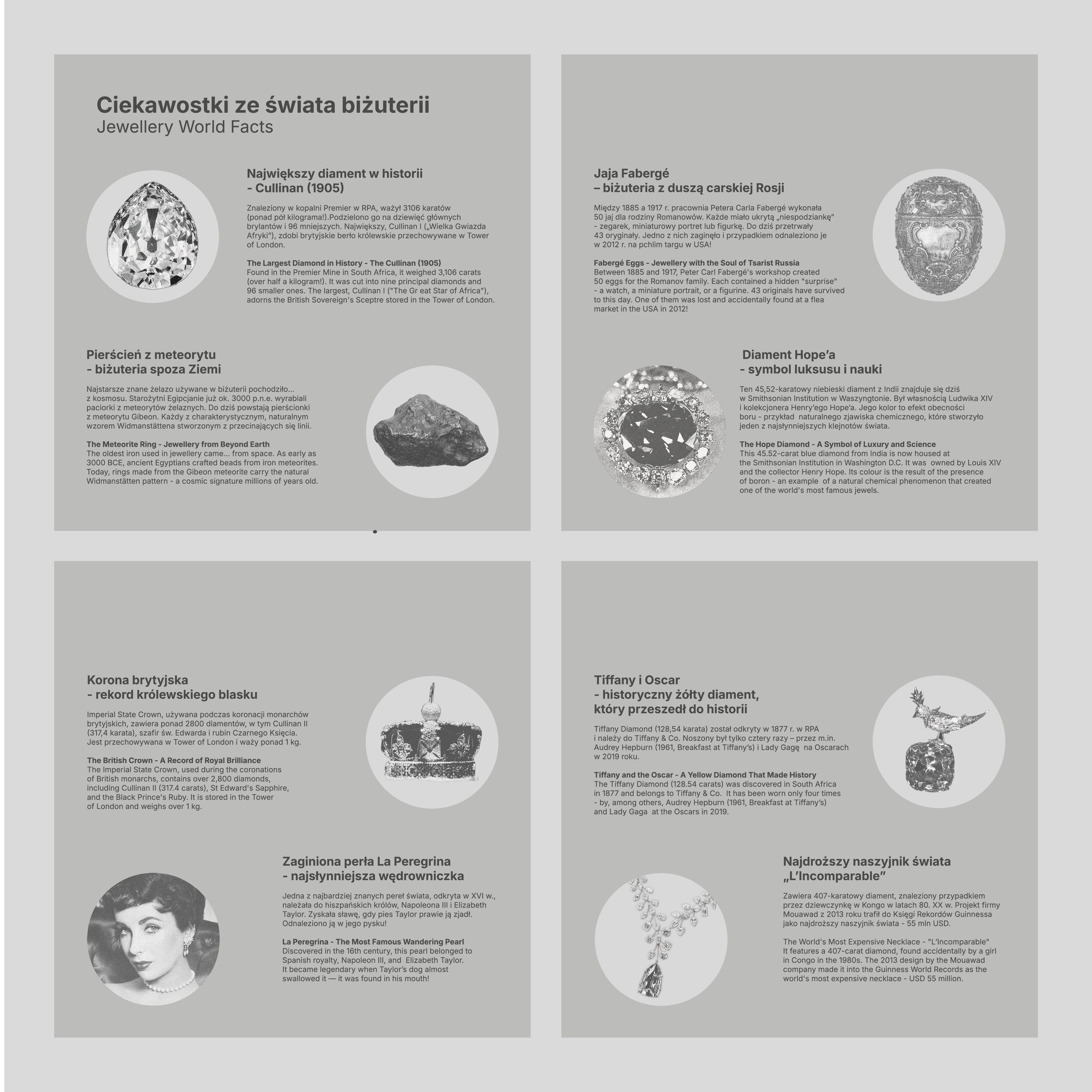
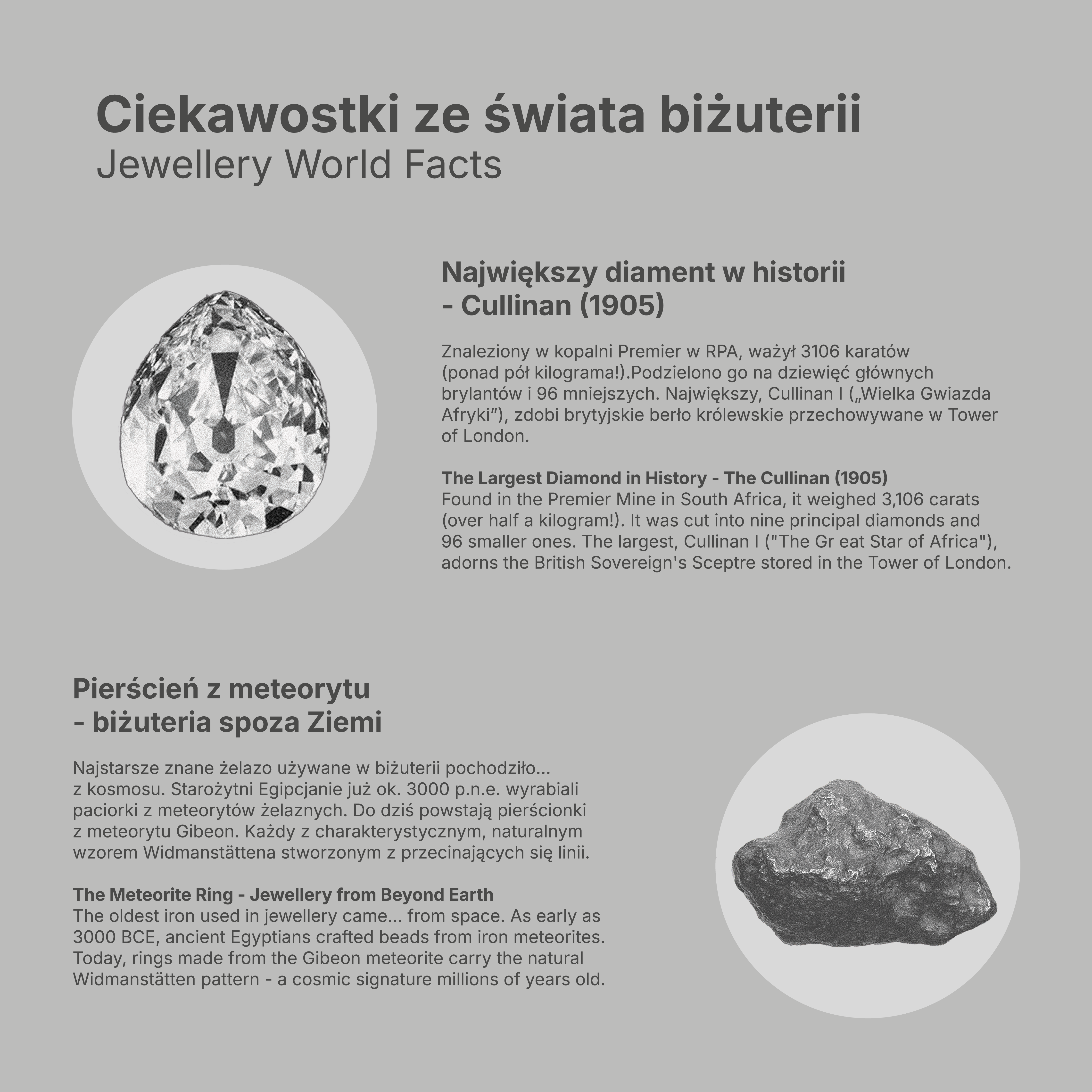
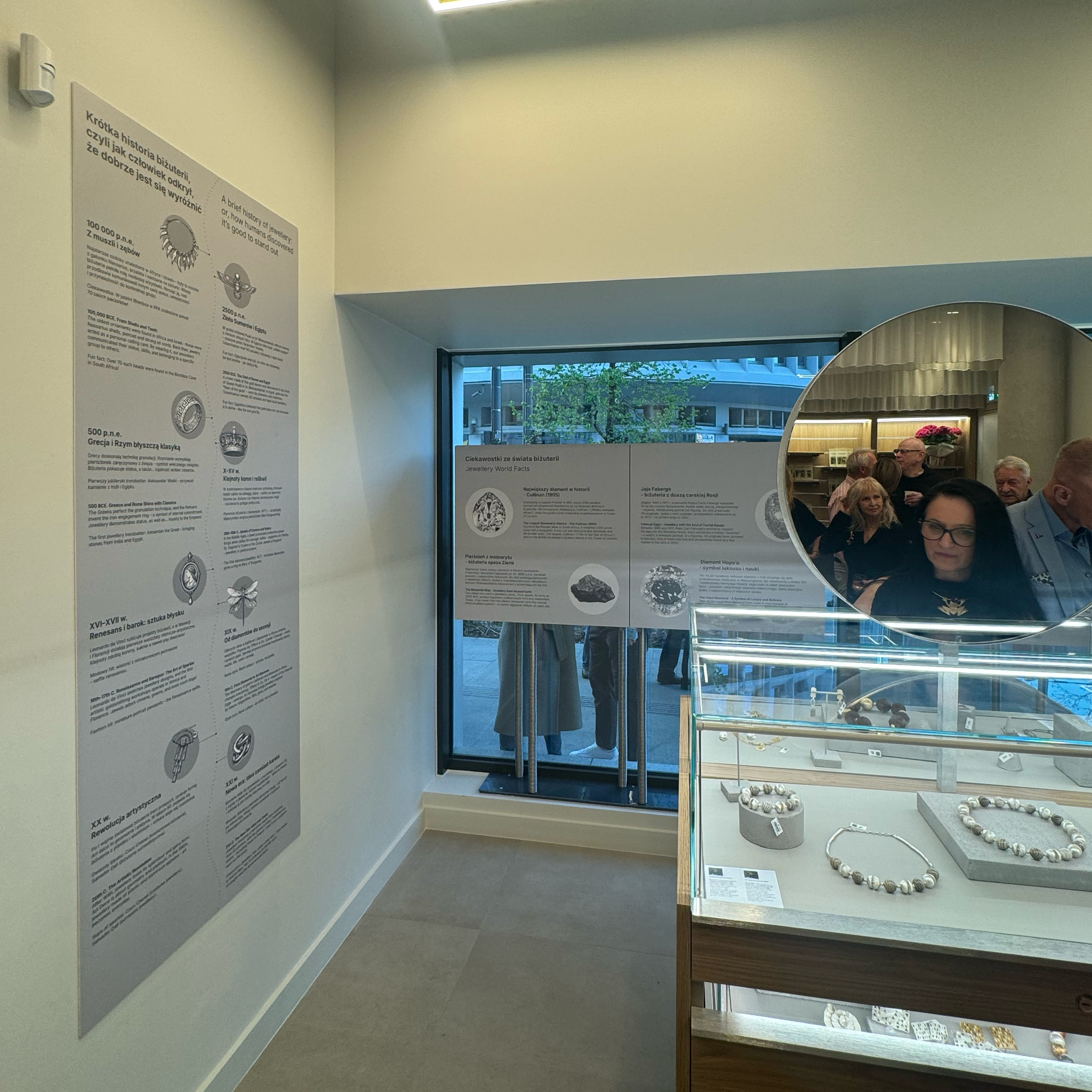
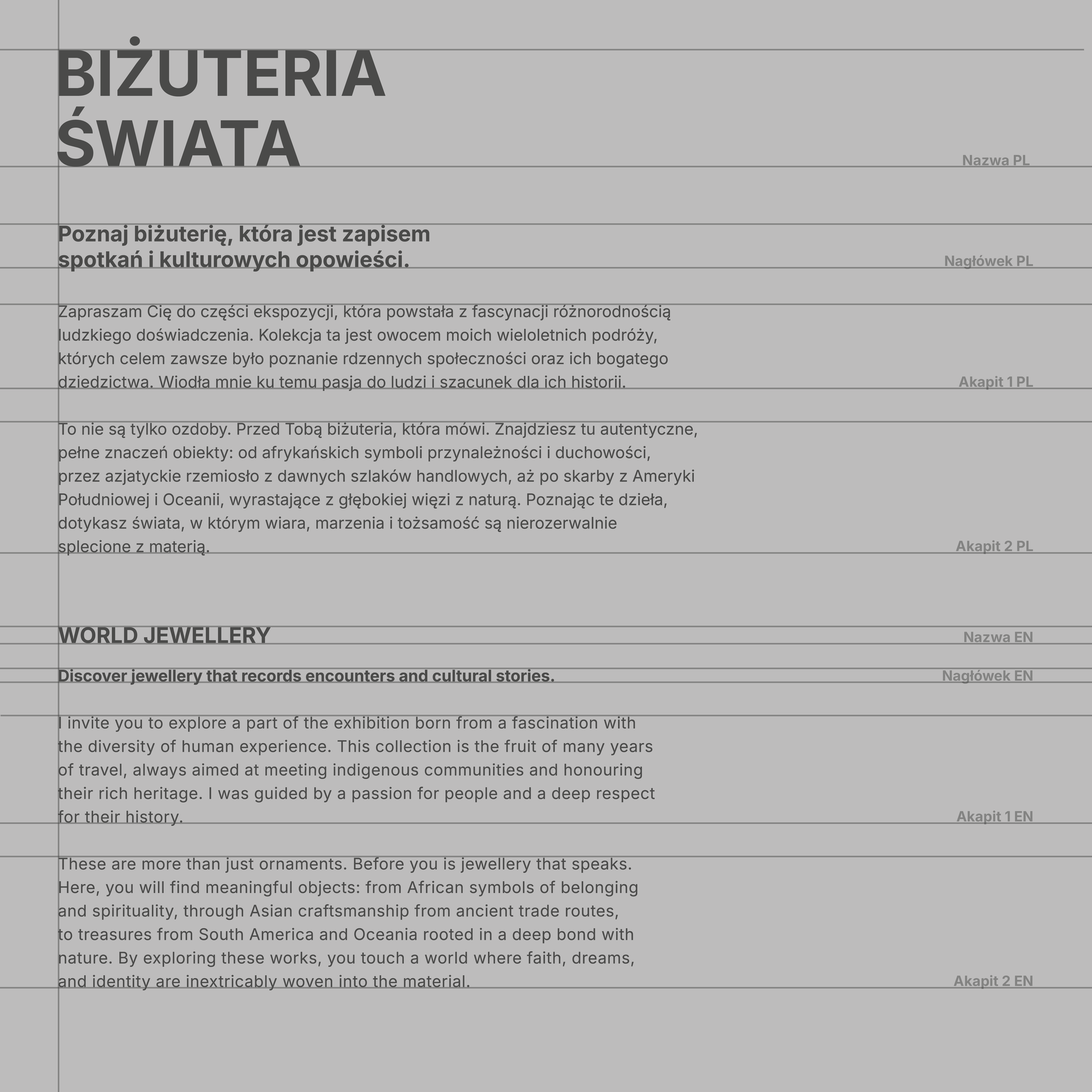
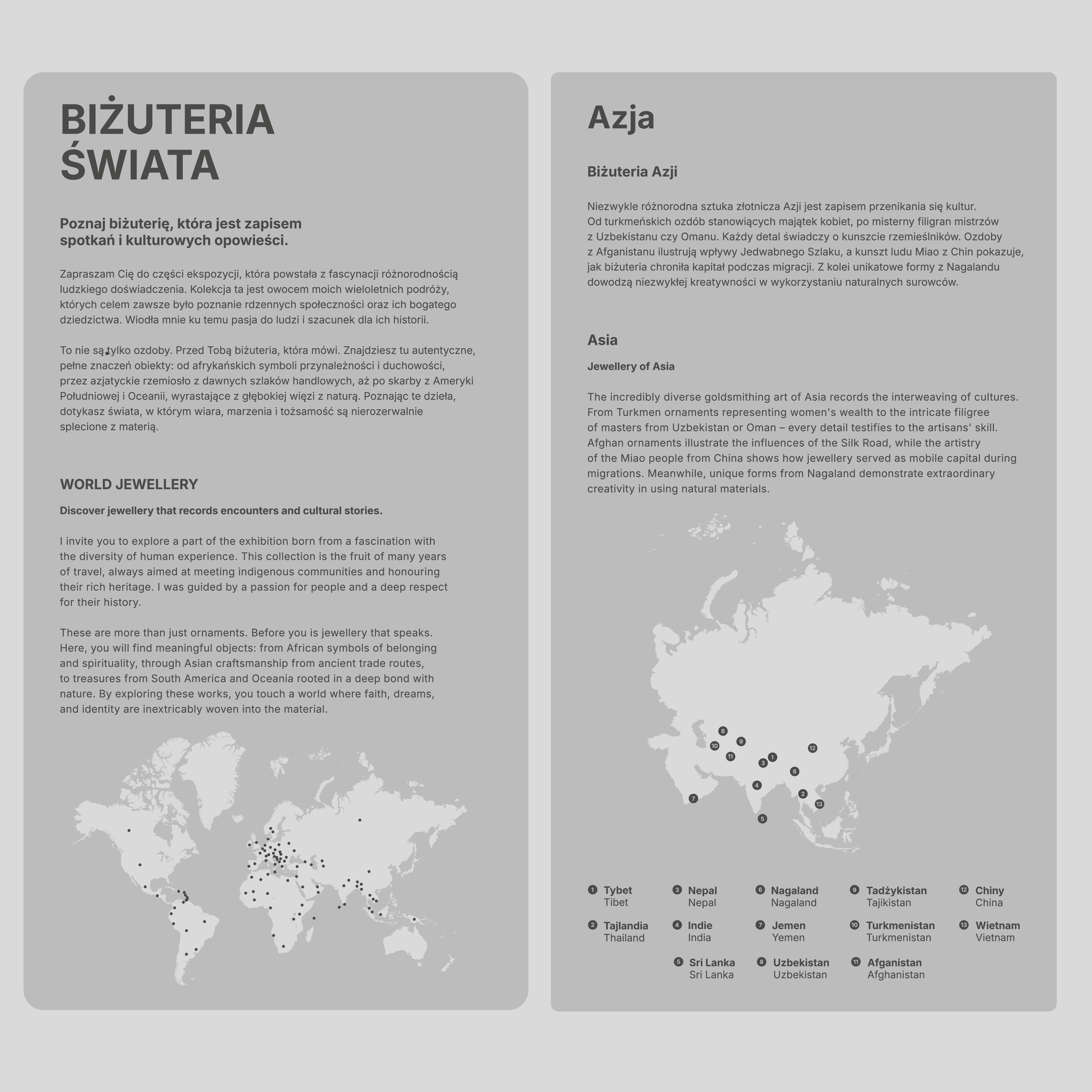
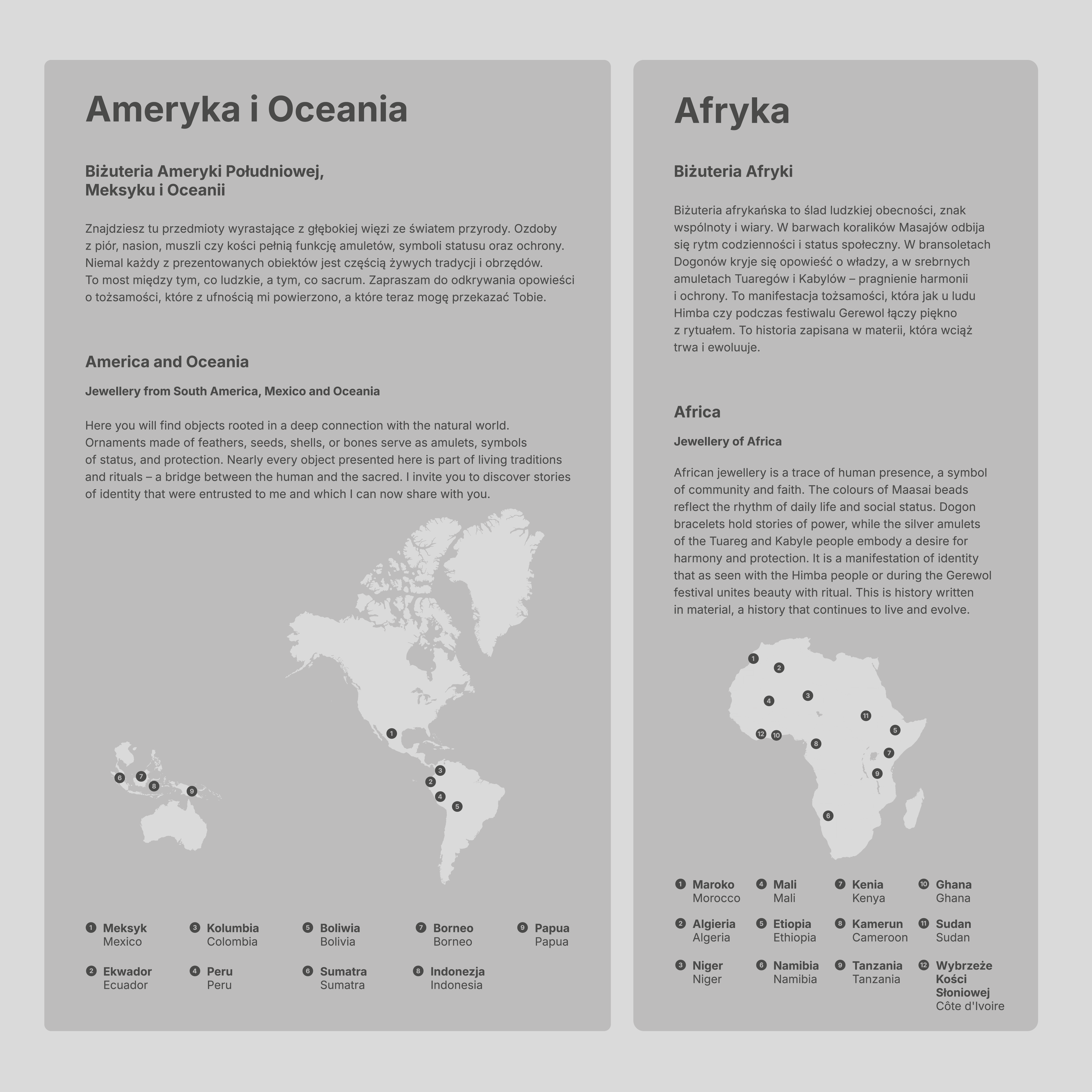
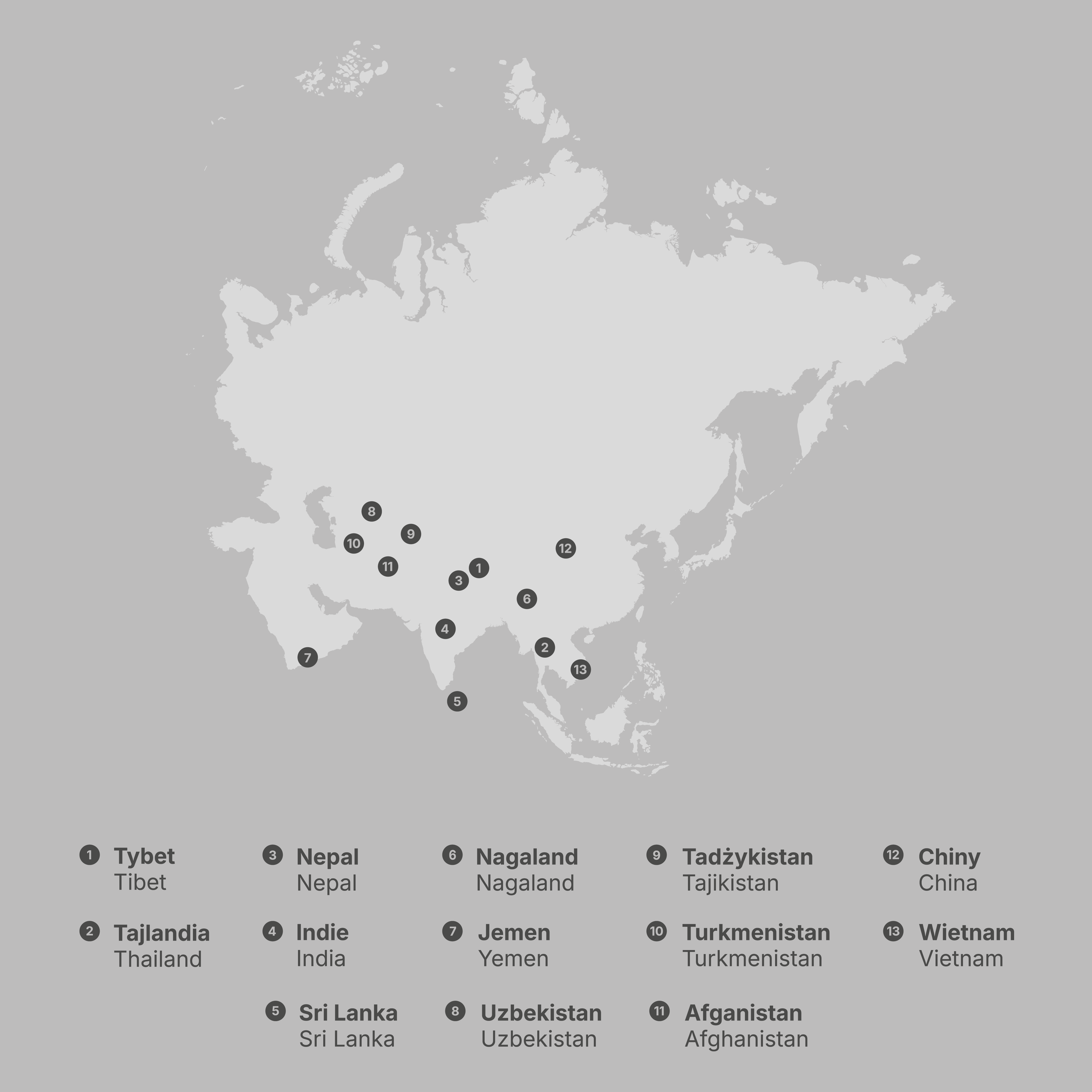
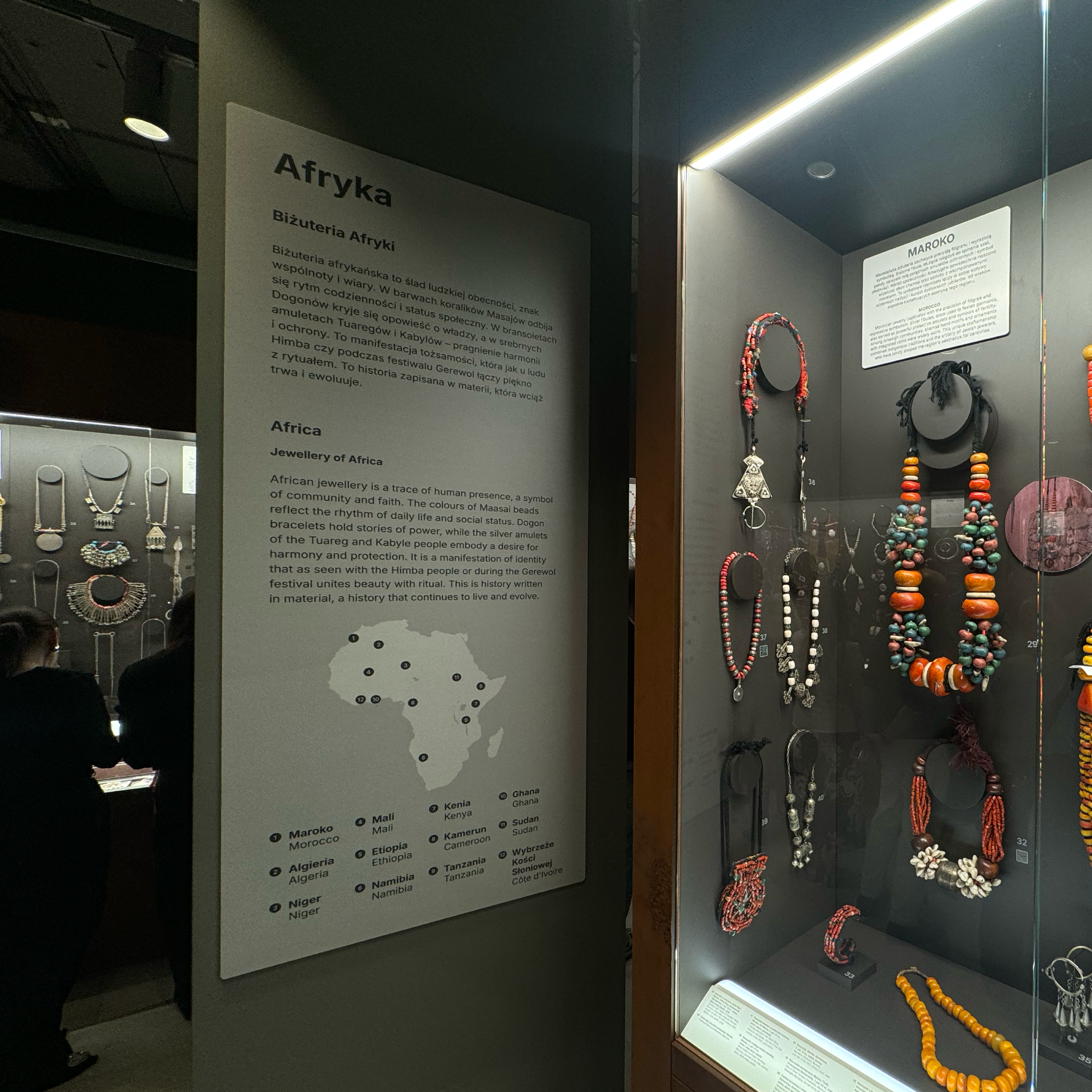
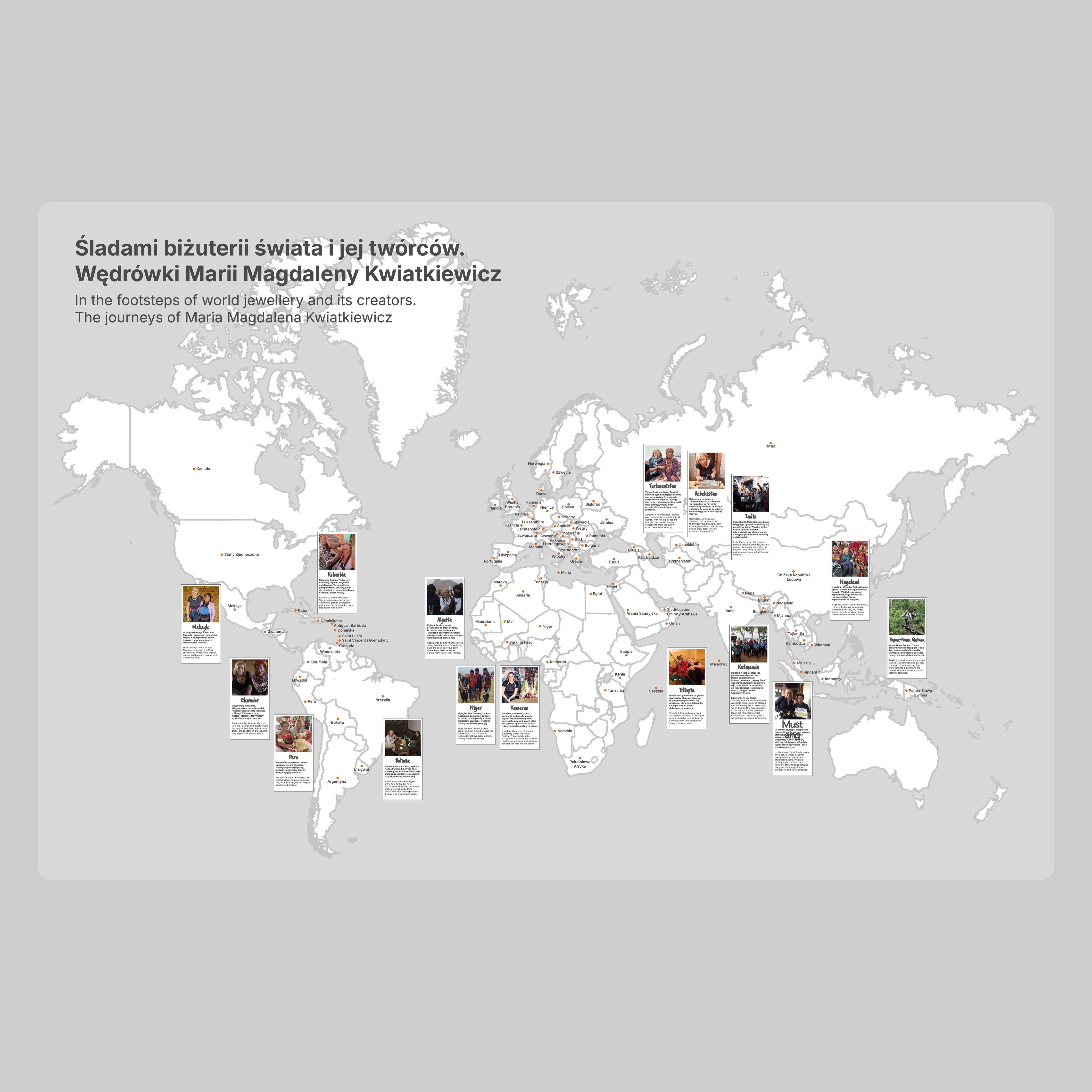
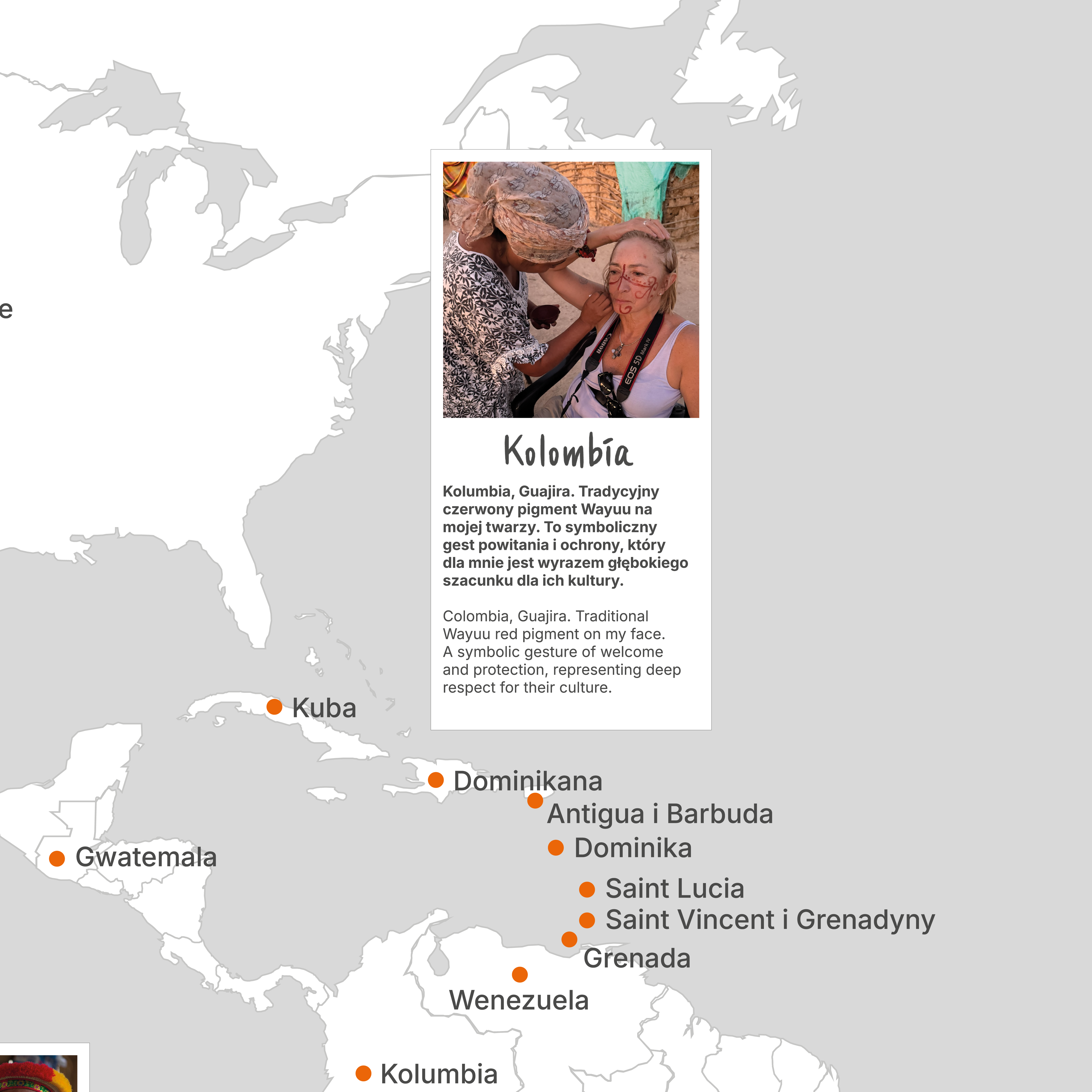
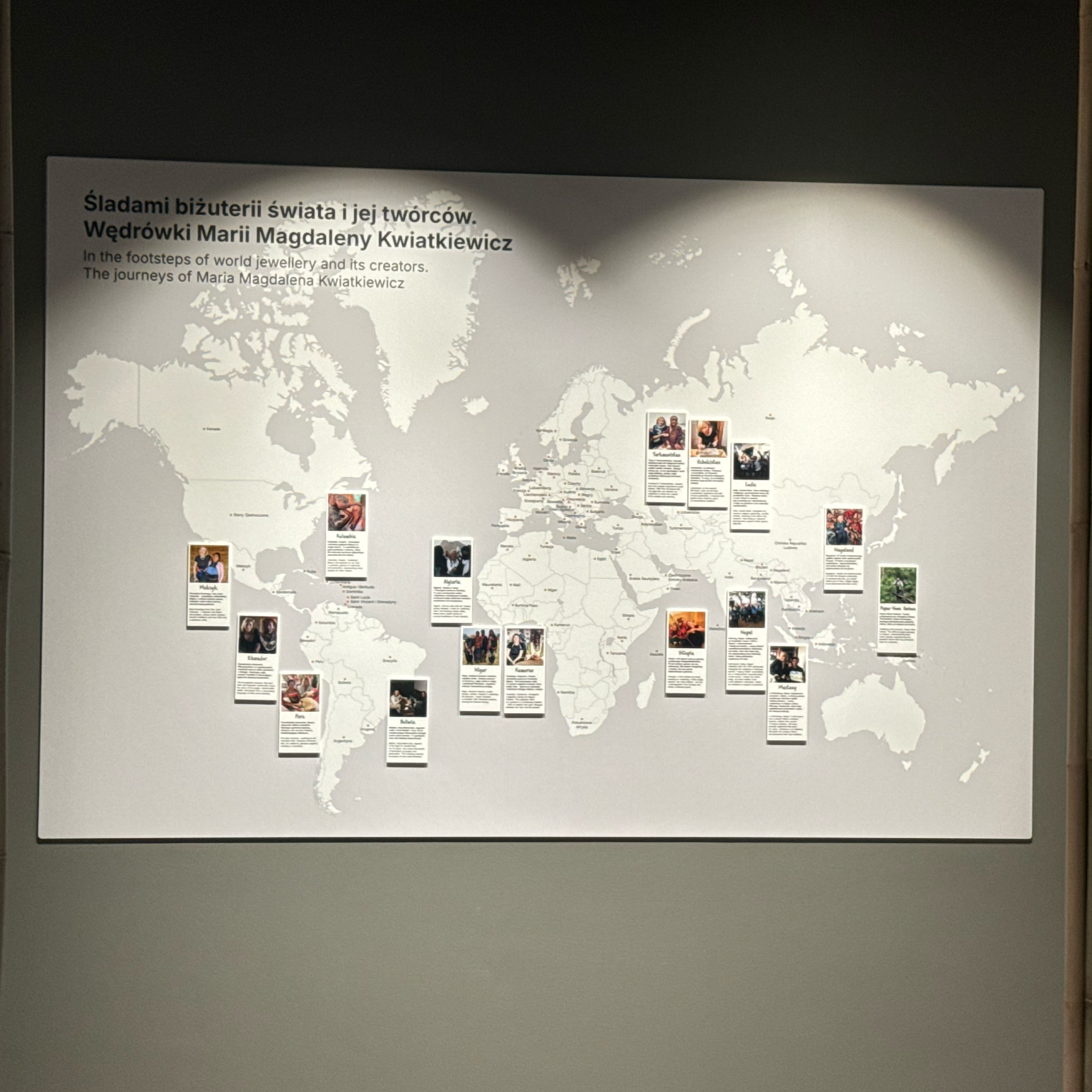
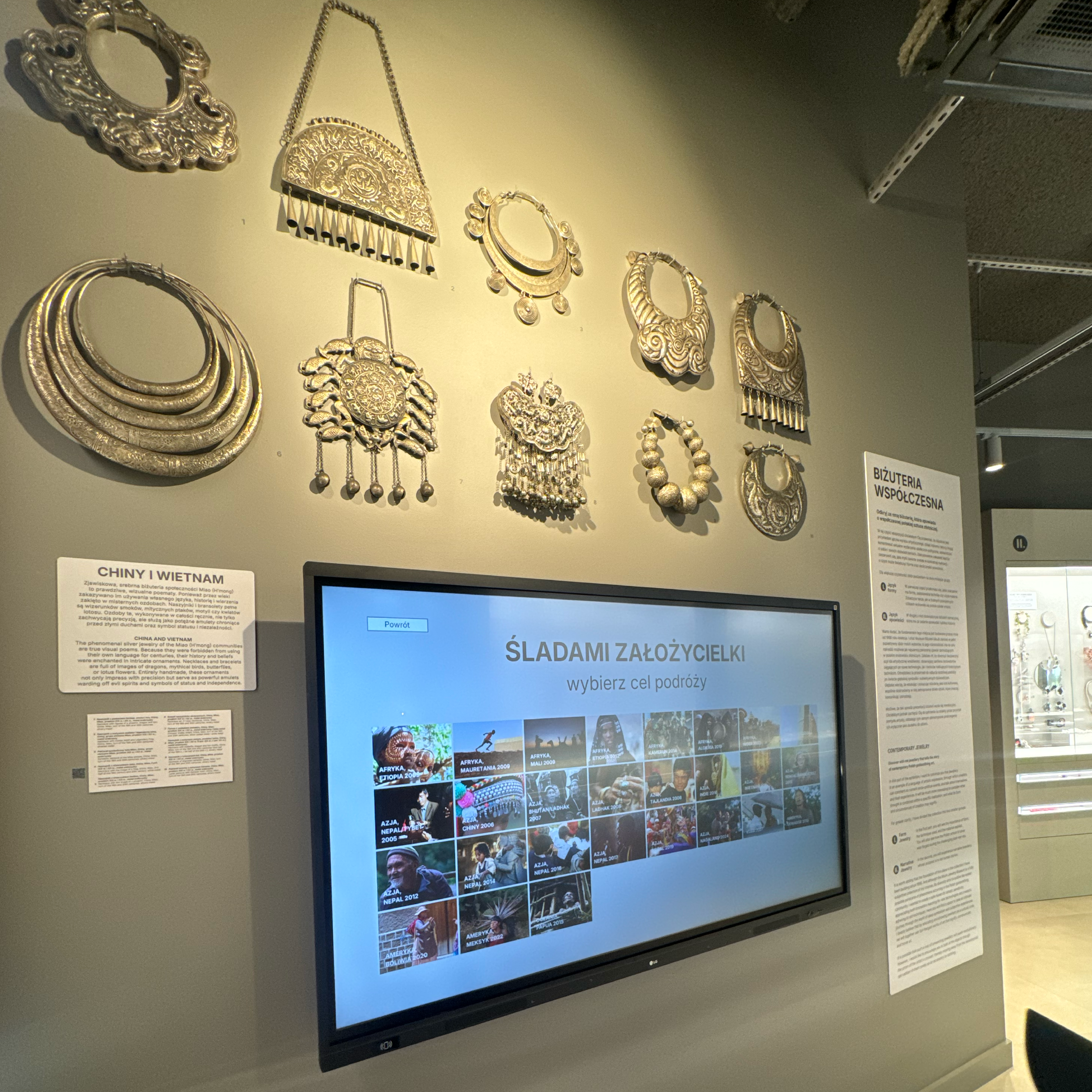
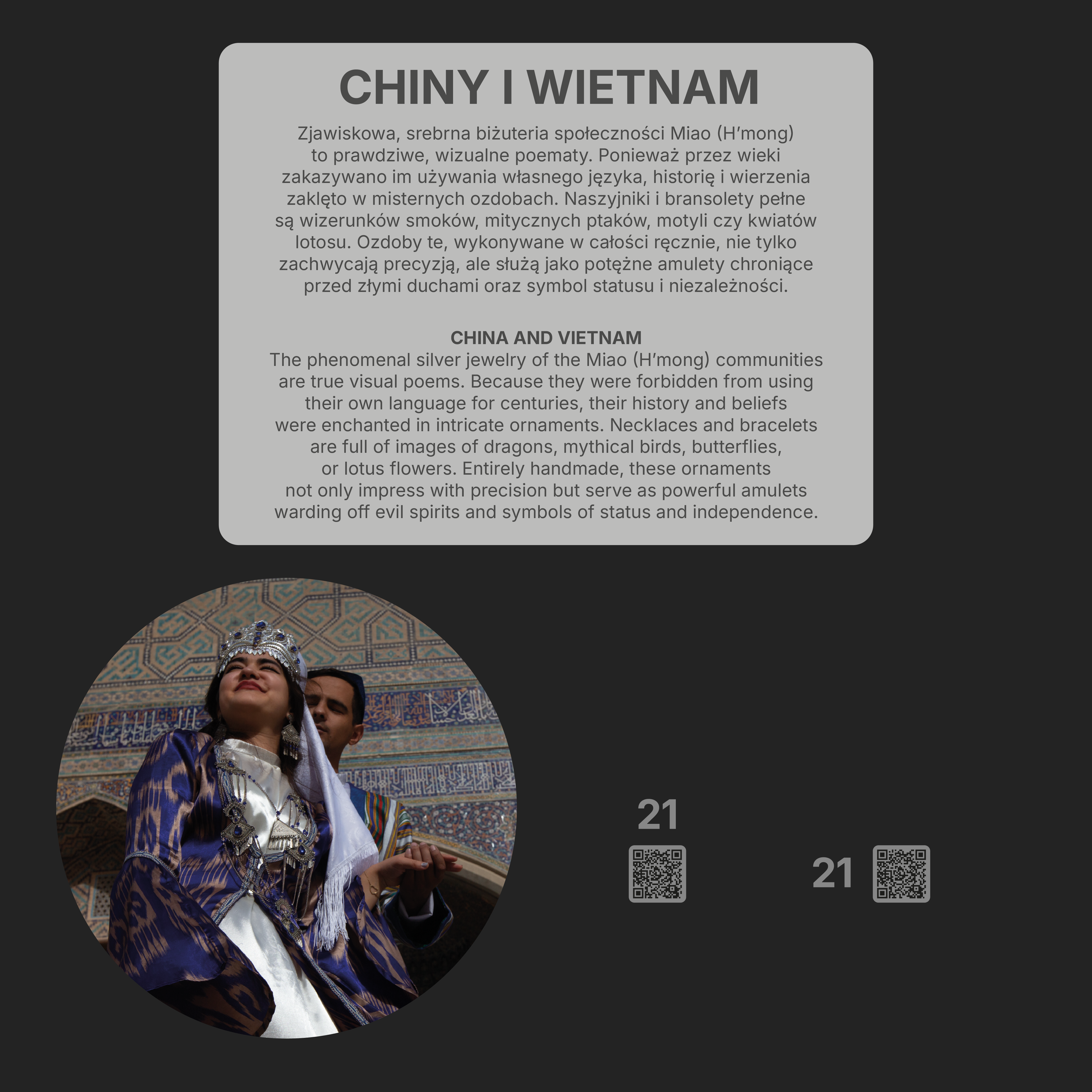
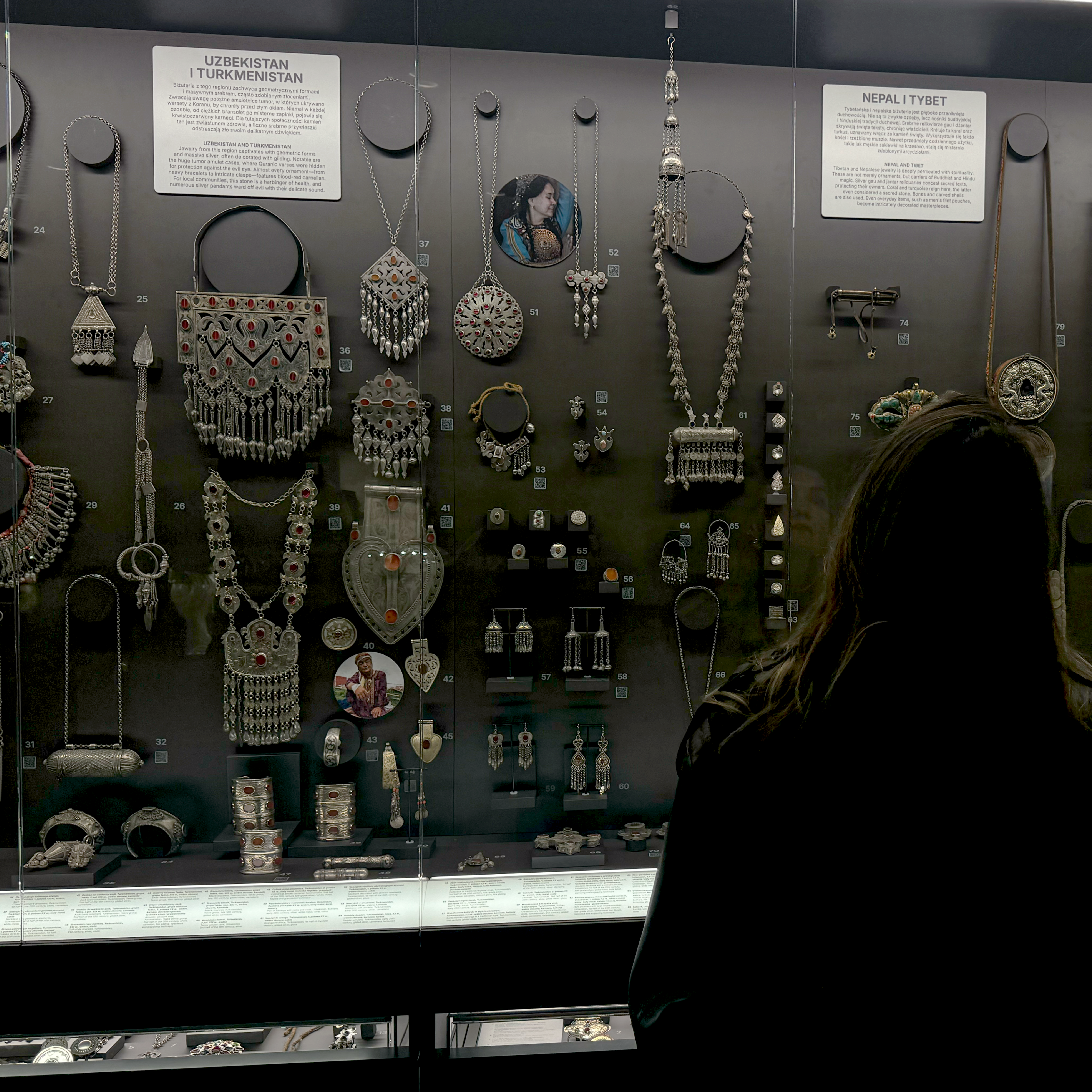
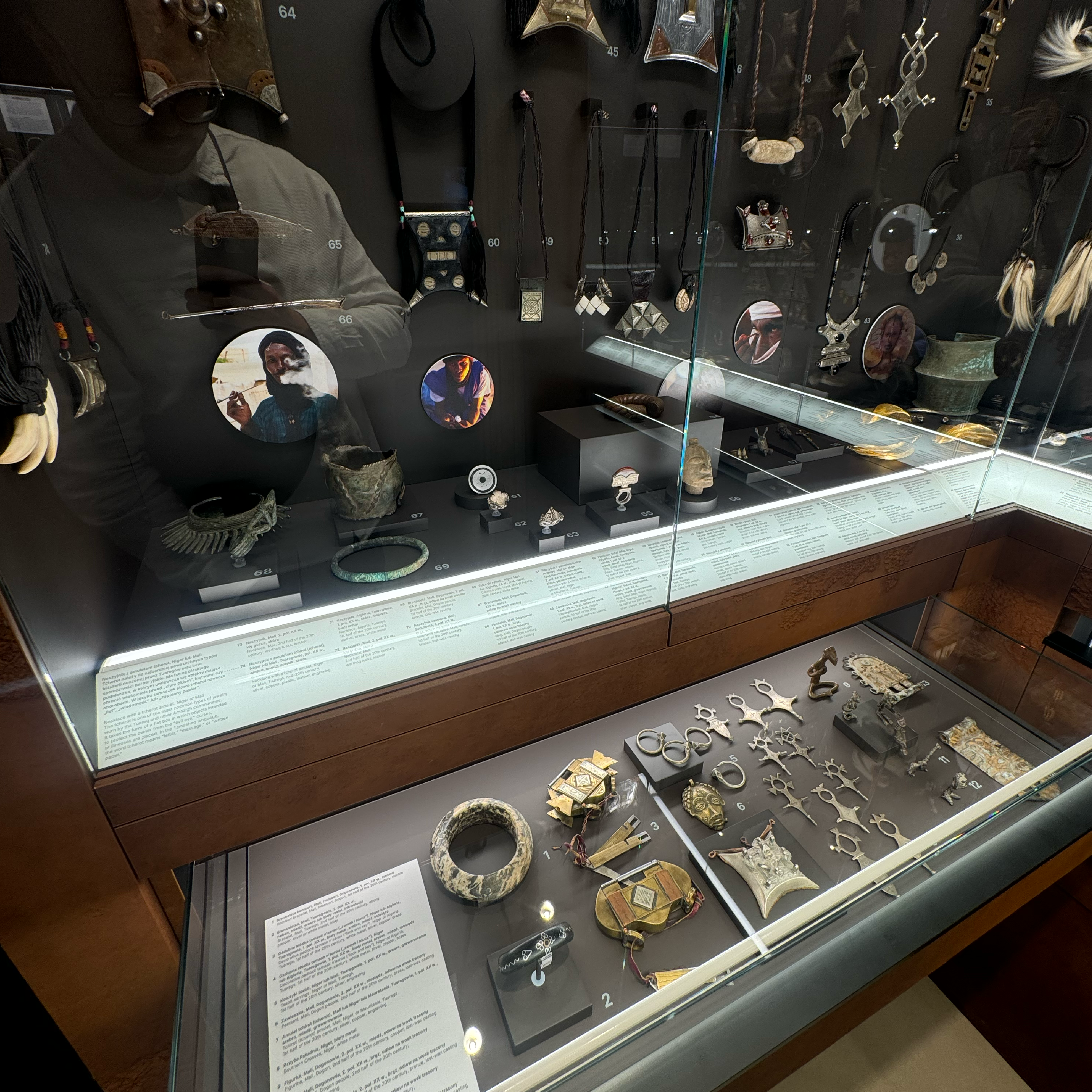
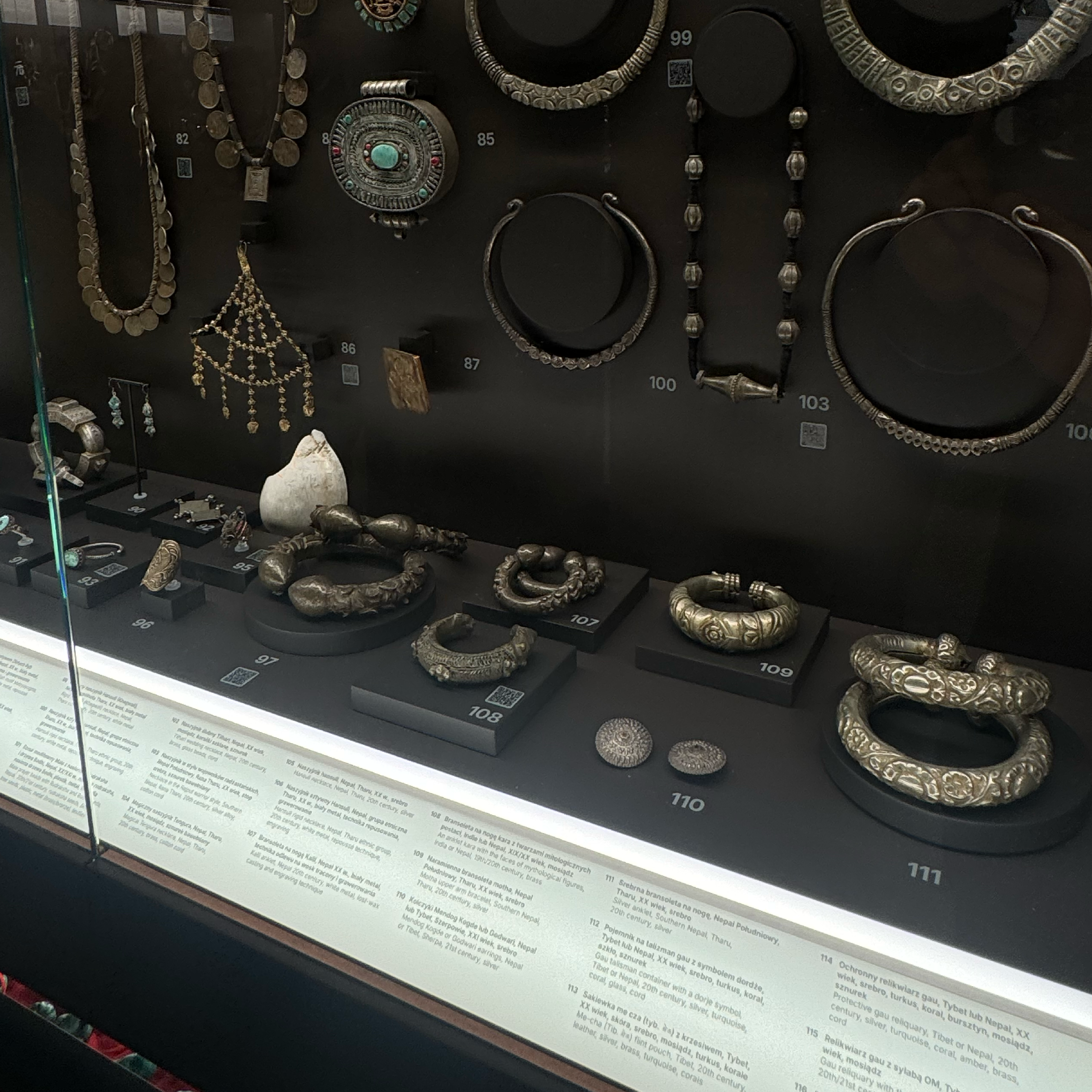
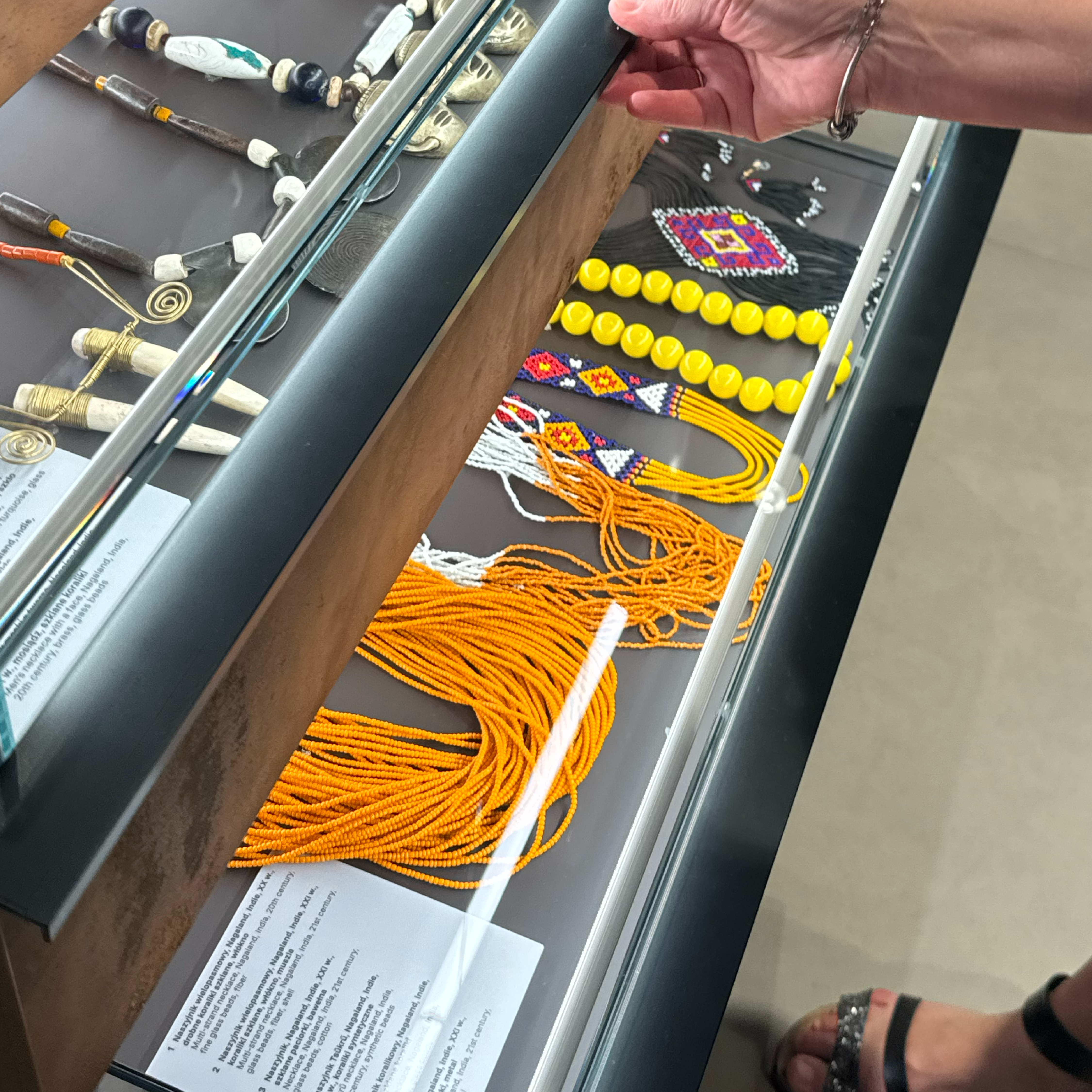
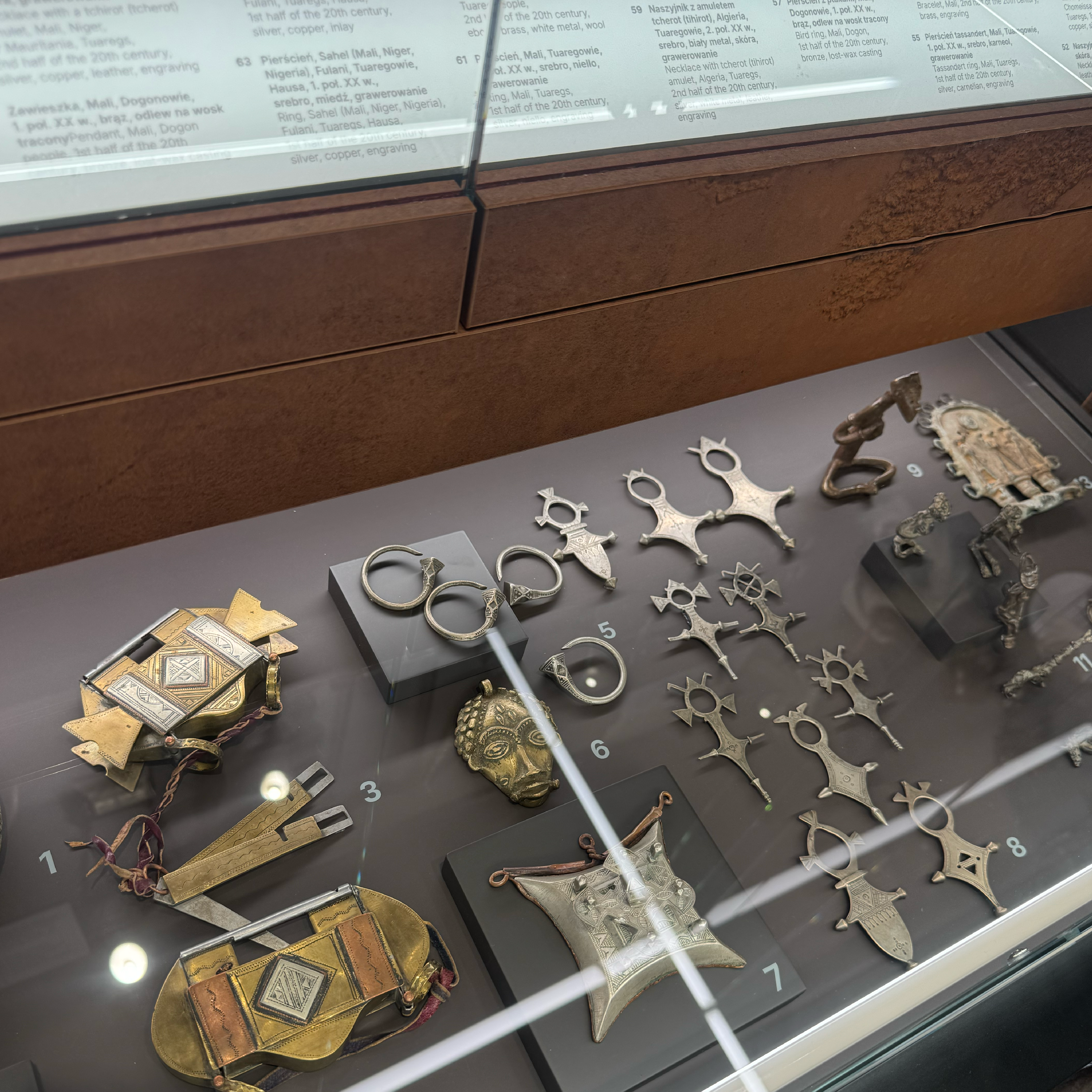
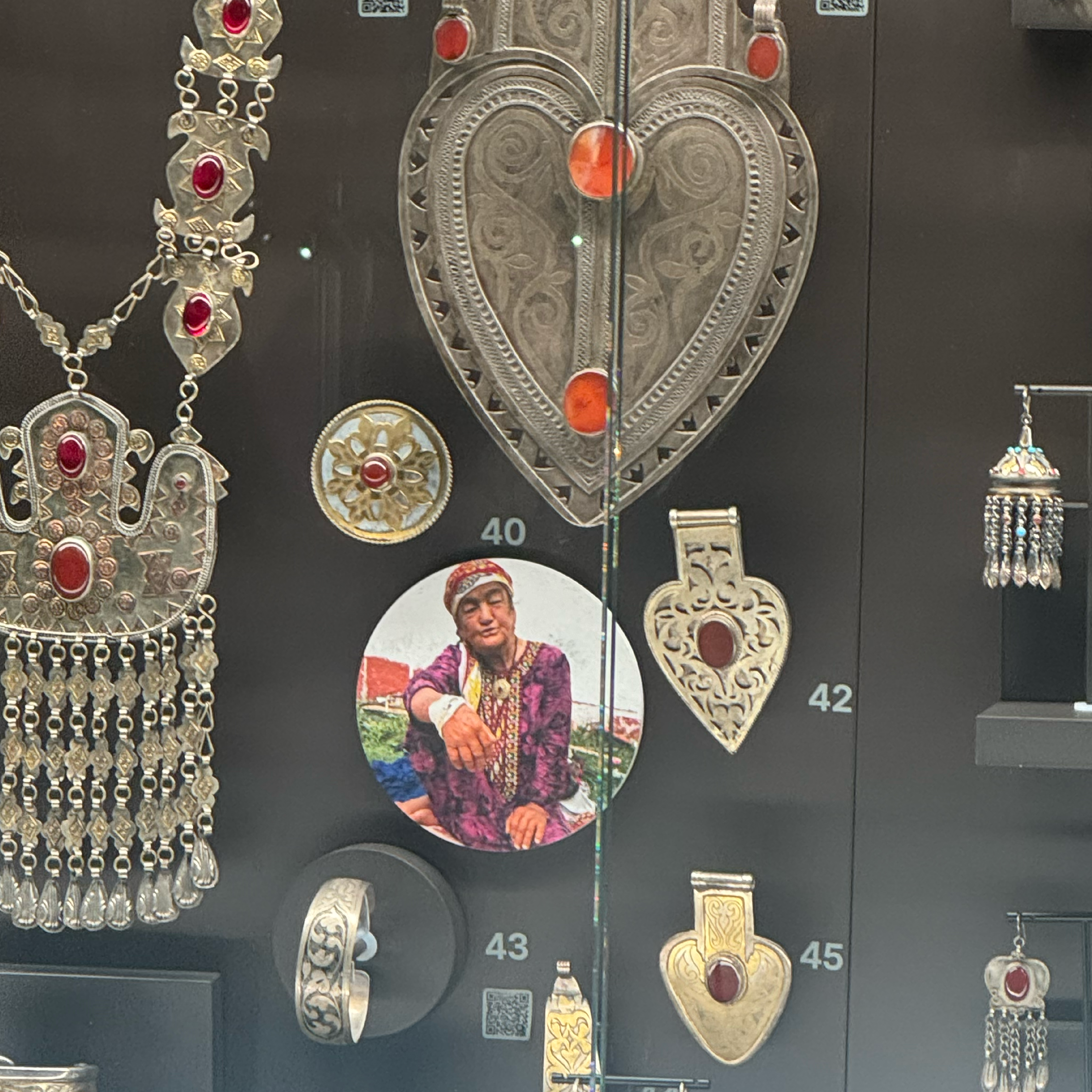
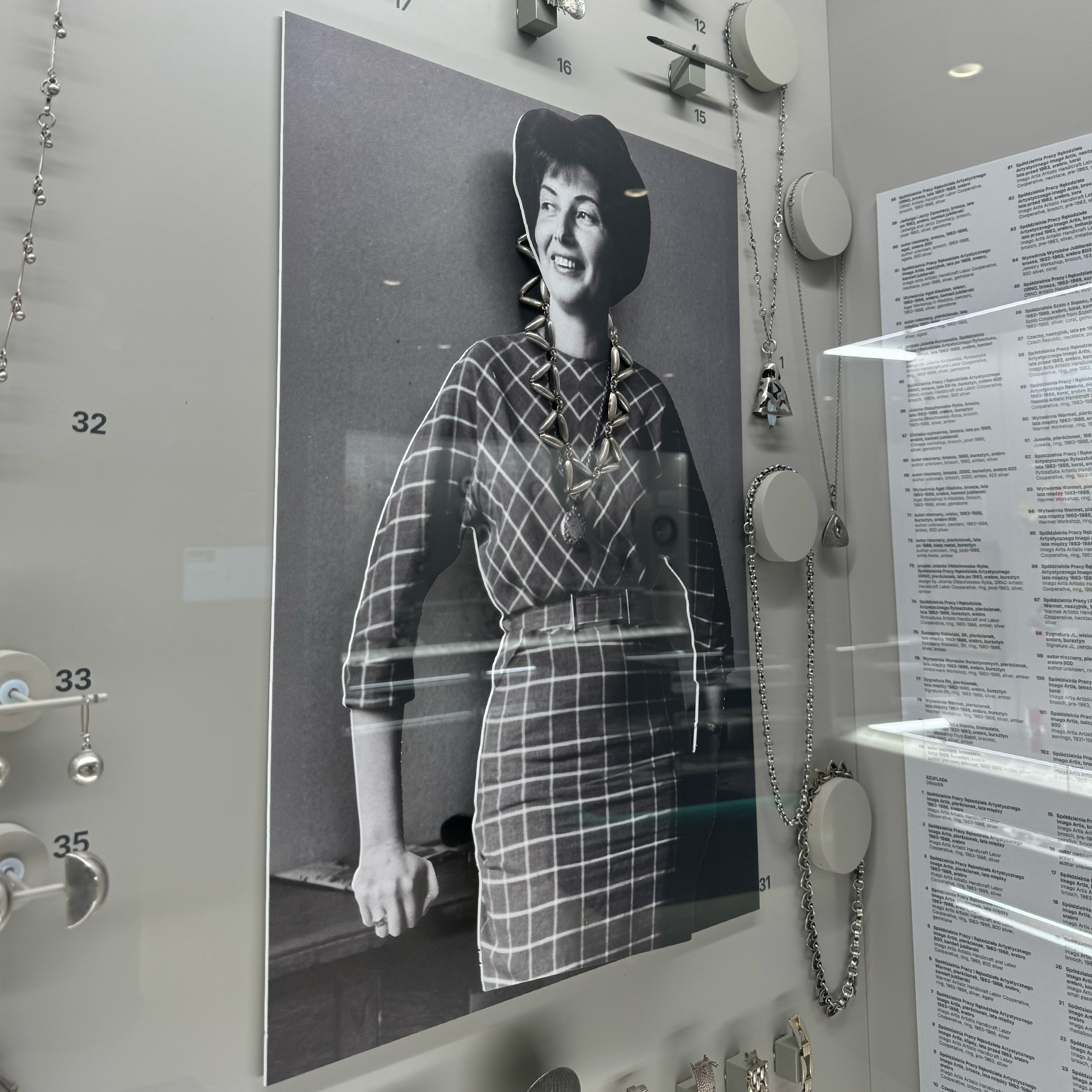
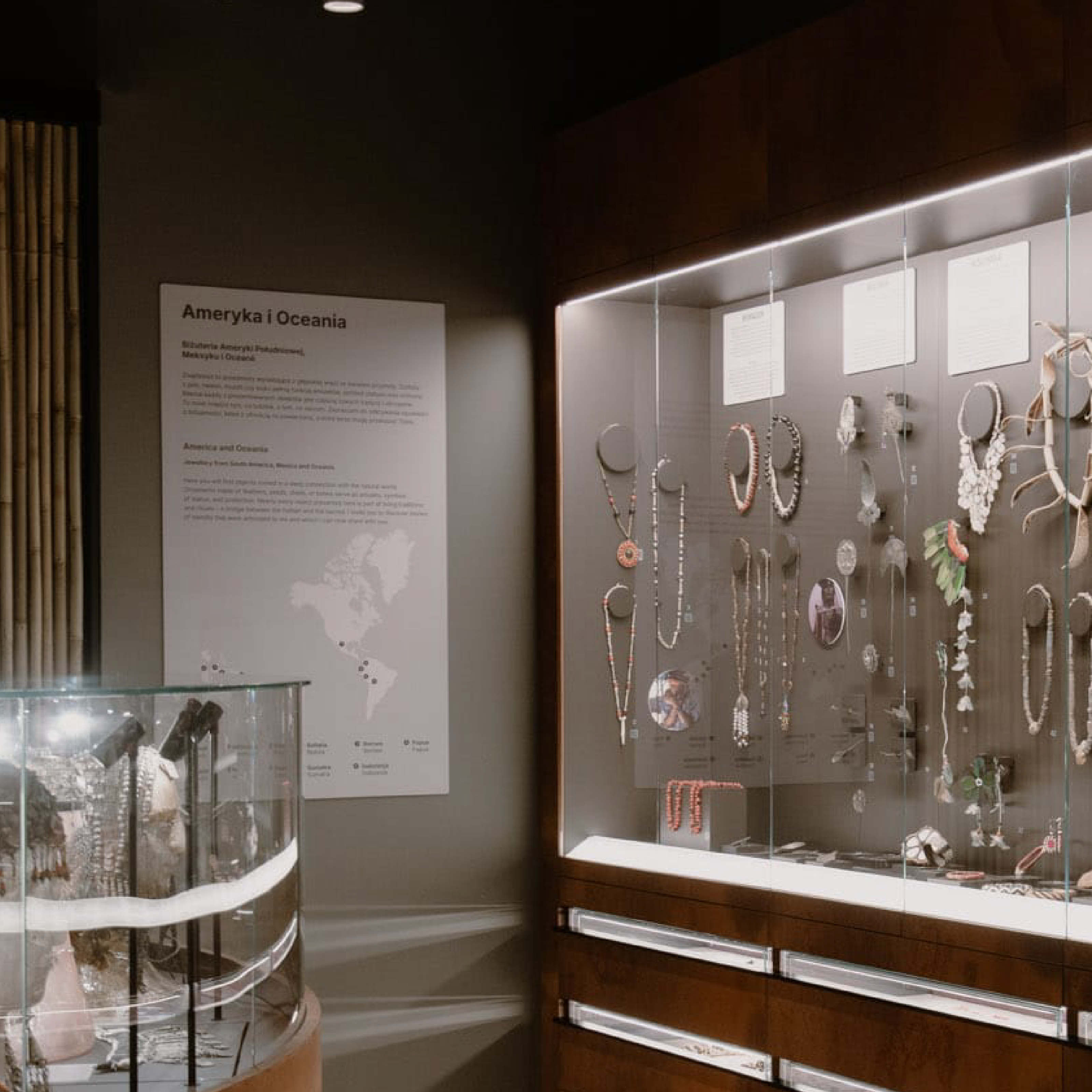
One of the most important exhibition sections is “World Jewellery”, showcasing a collection of ethnic jewellery gathered during the travels of Maria Magdalena Kwiatkiewicz, founder of the YES brand.
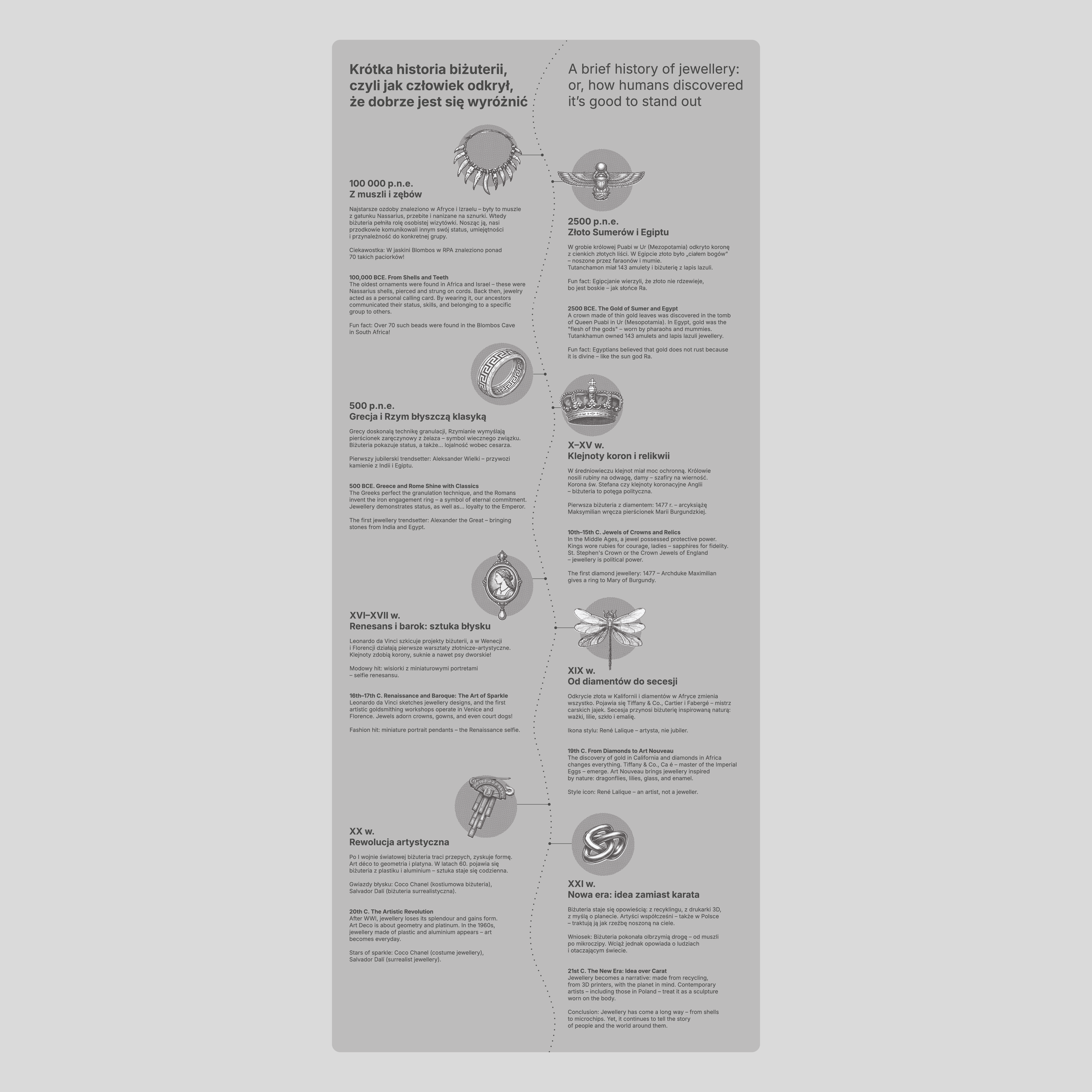
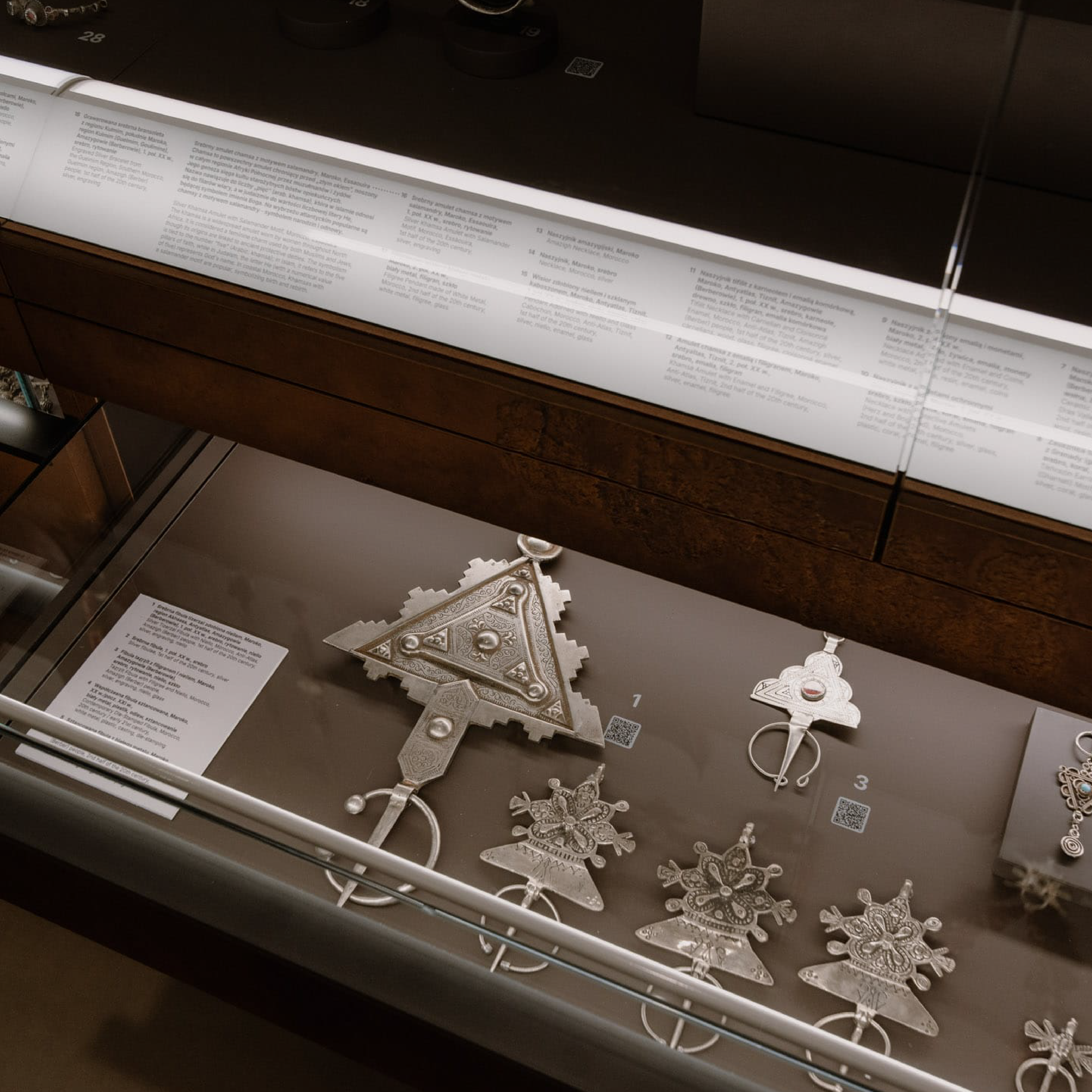
For this part of the exhibition, we developed a comprehensive system of introductory panels, country markers, and educational materials. Each continent received dedicated maps and contextual information explaining the origins of the displayed objects. Individual countries were enriched with short descriptions, photographs, and additional interpretive content.
At the entrance to this section, visitors encounter a large-scale map documenting Maria Magdalena Kwiatkiewicz’s journeys. The map highlights visited locations and is complemented by photographs and stories from the most fascinating expeditions that contributed to building the museum’s collection.
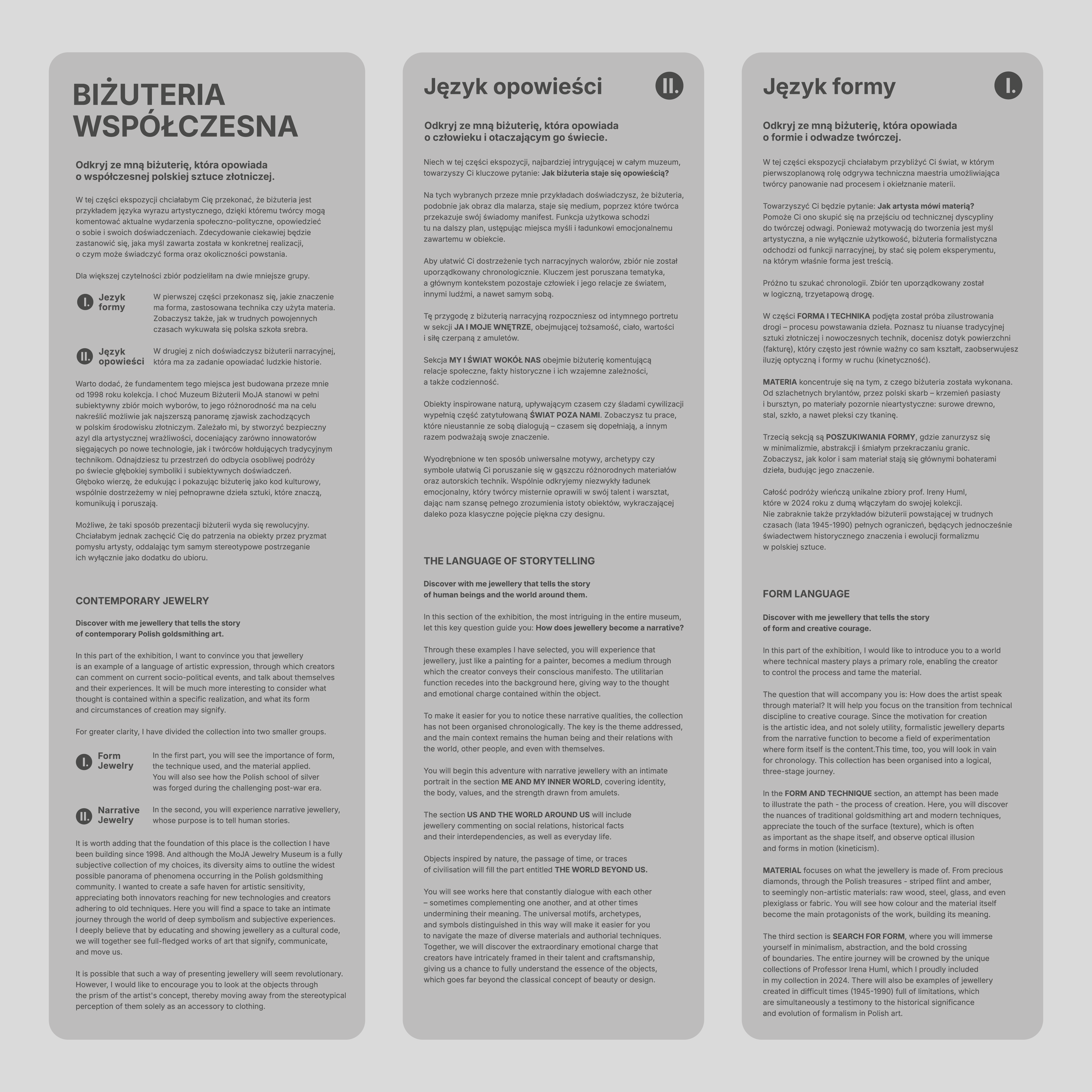
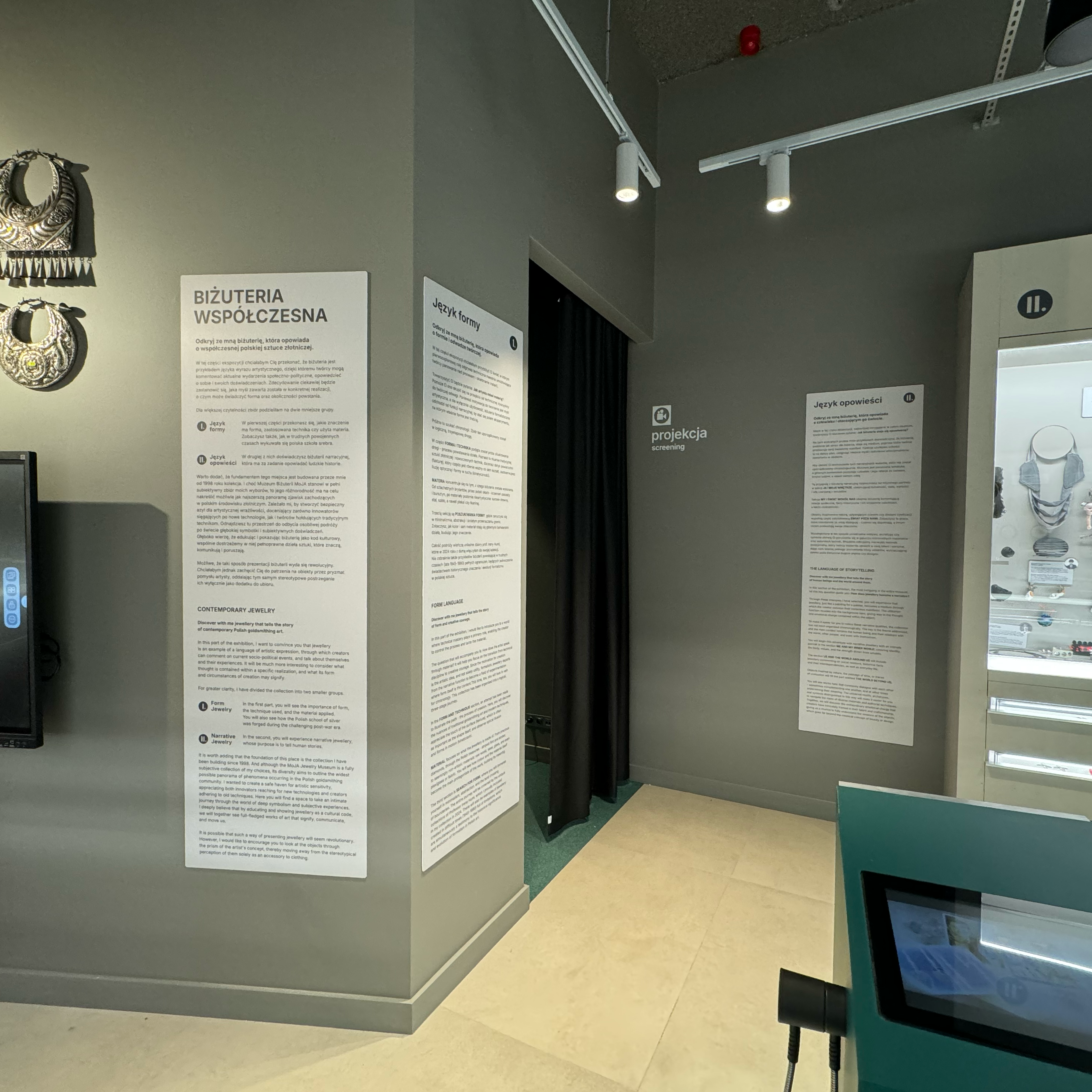
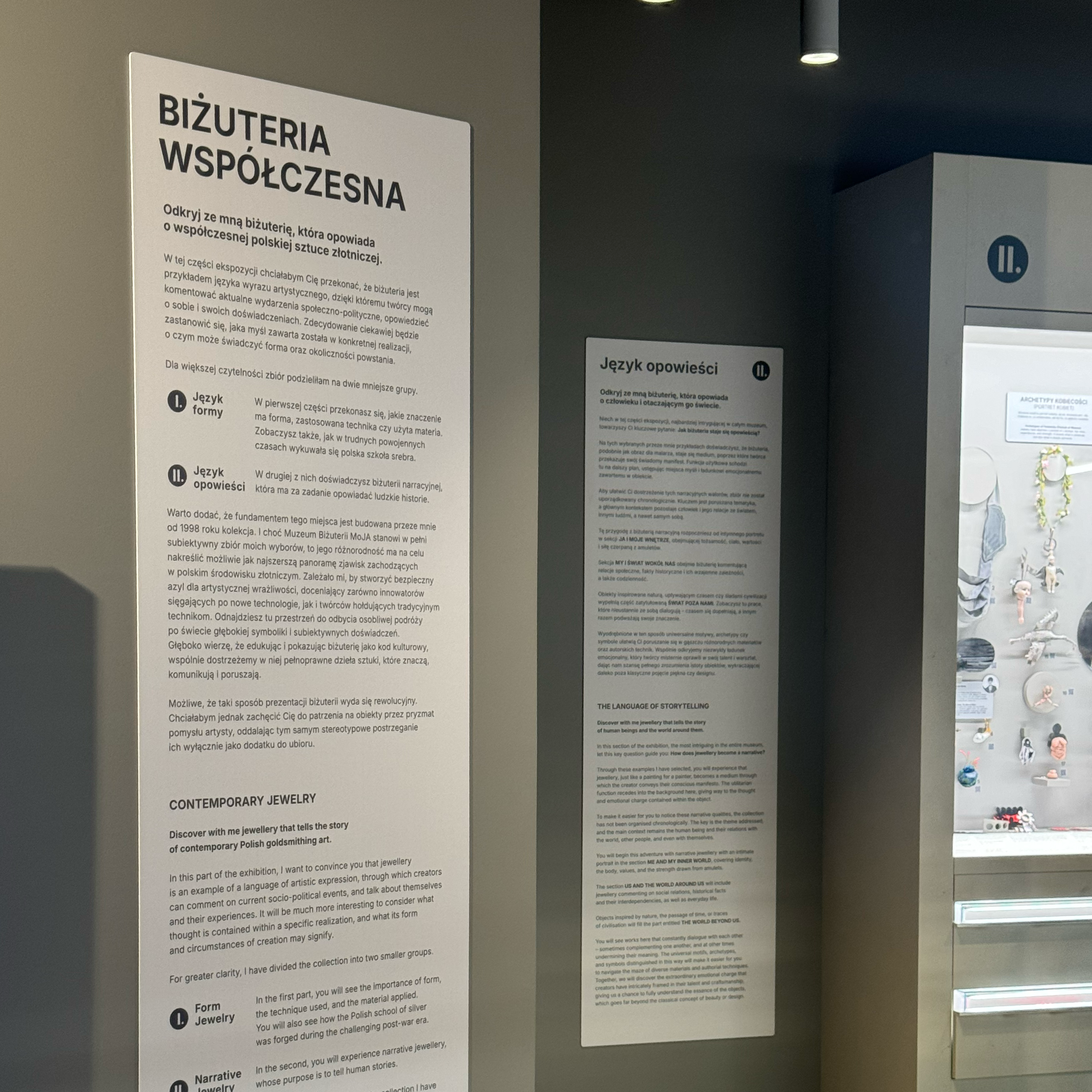
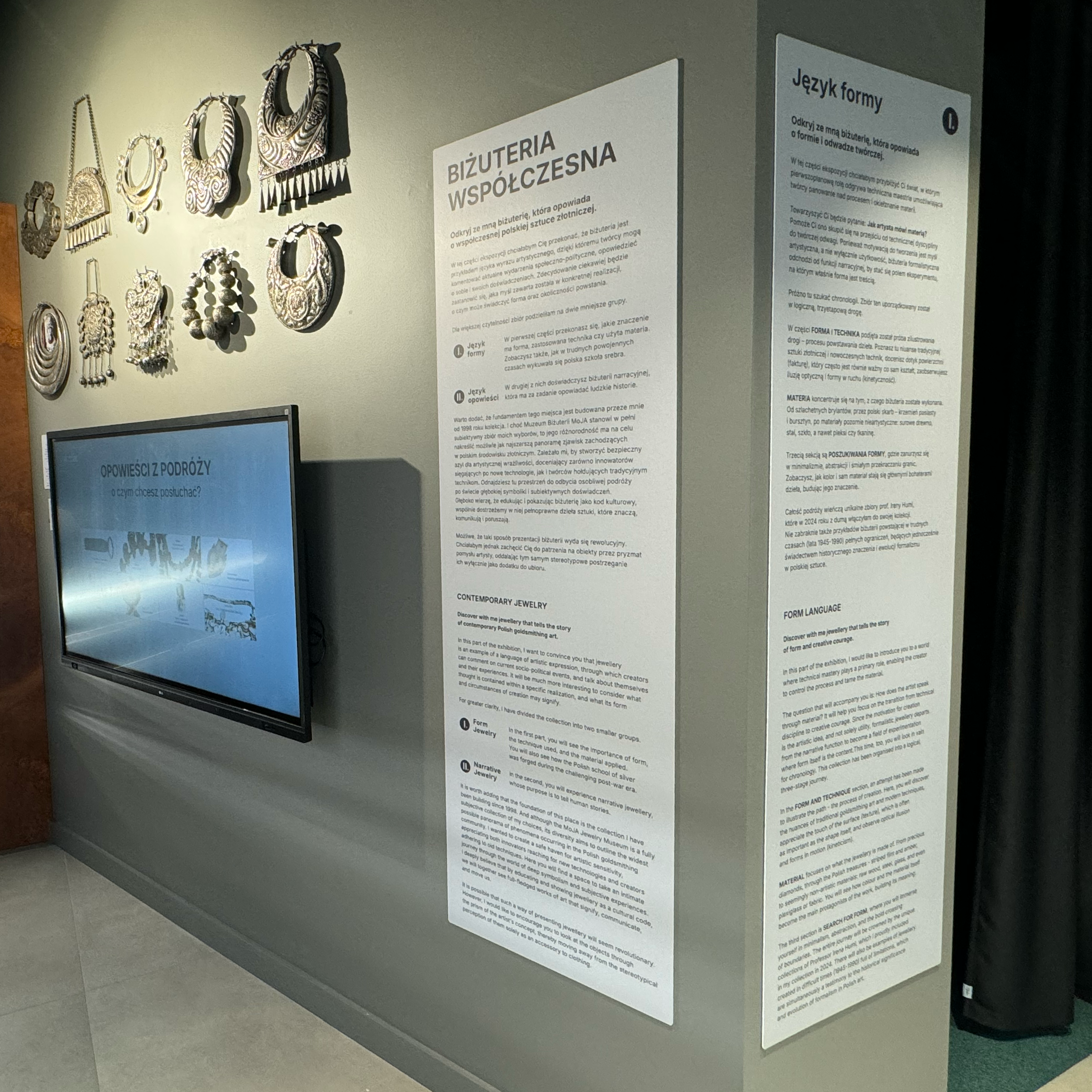
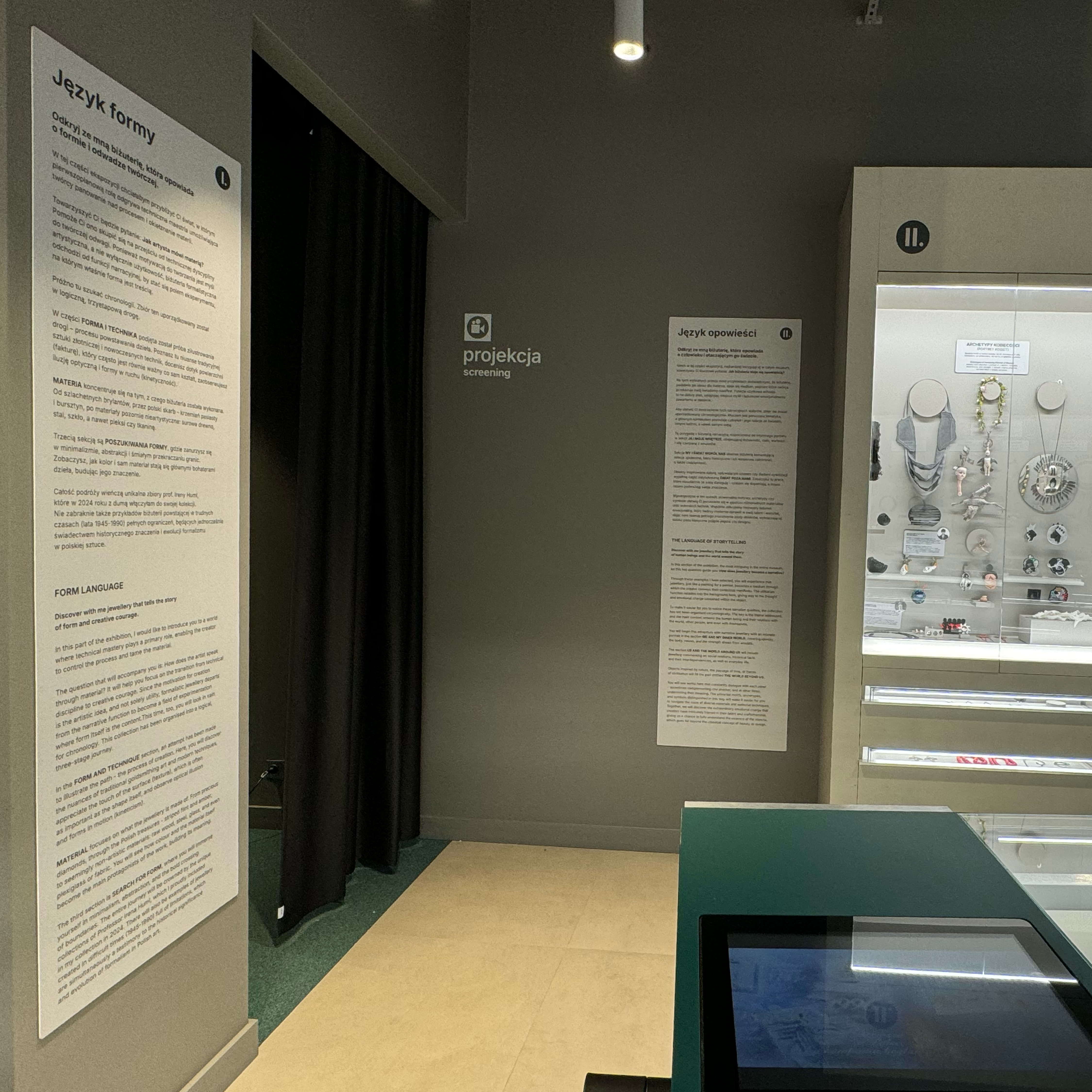
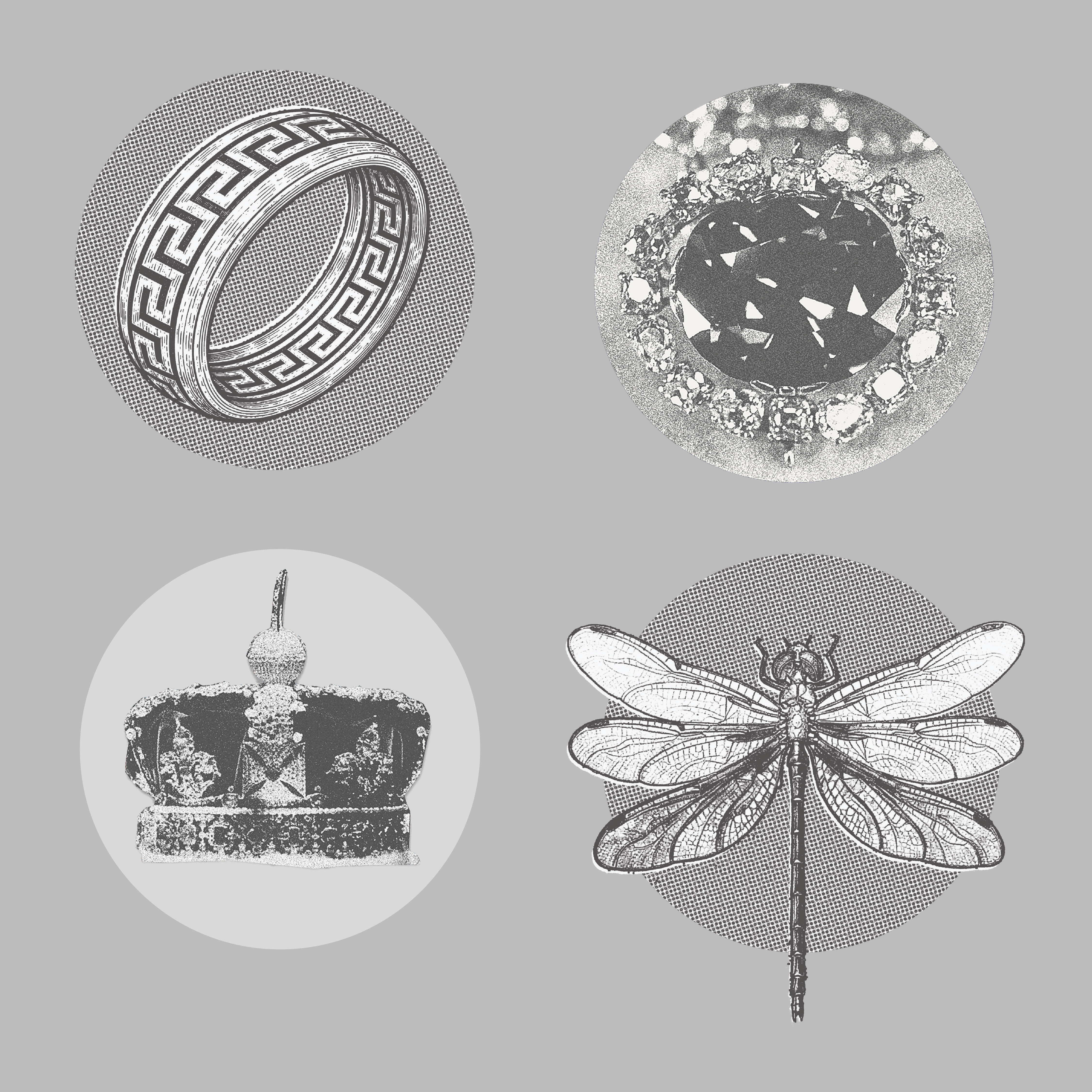
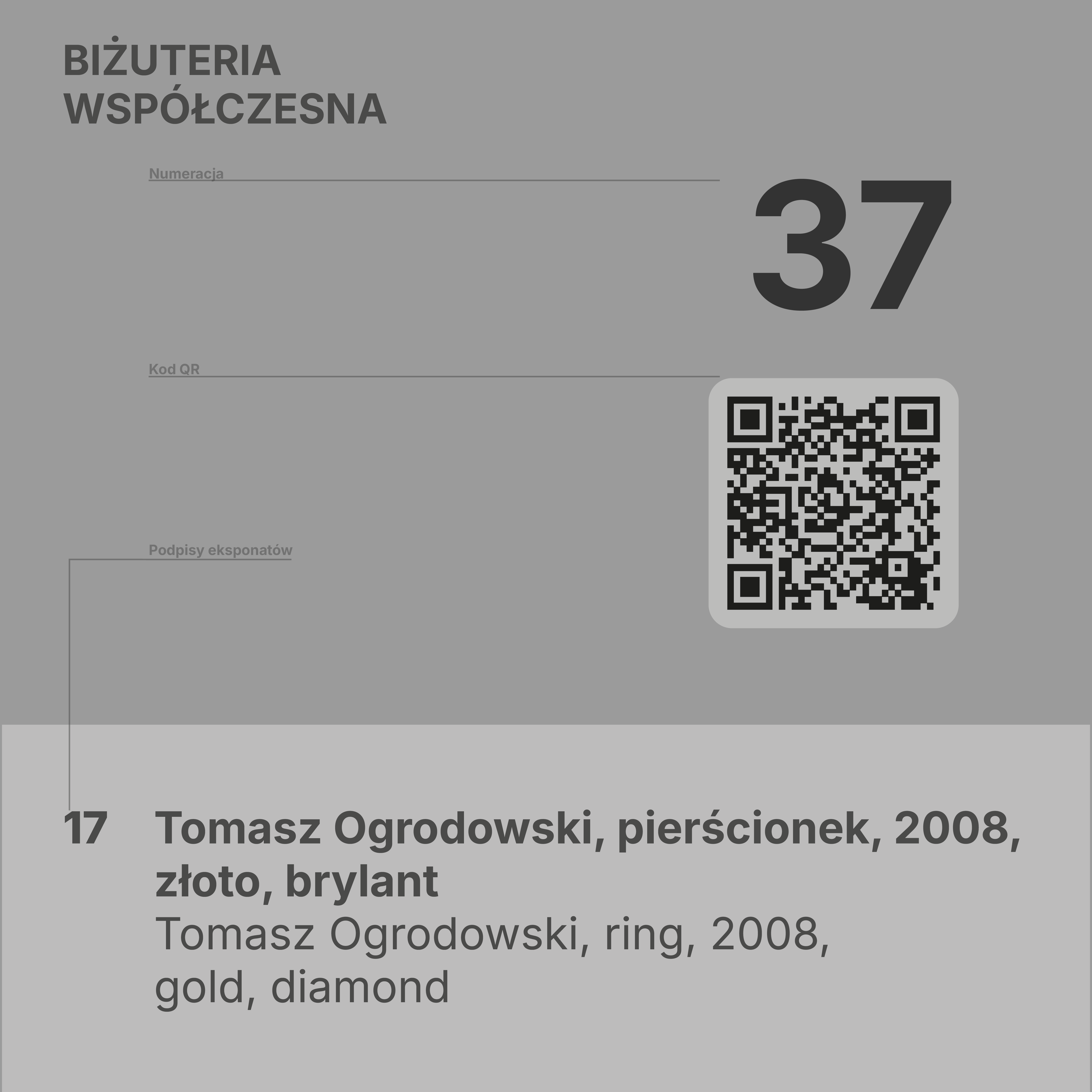
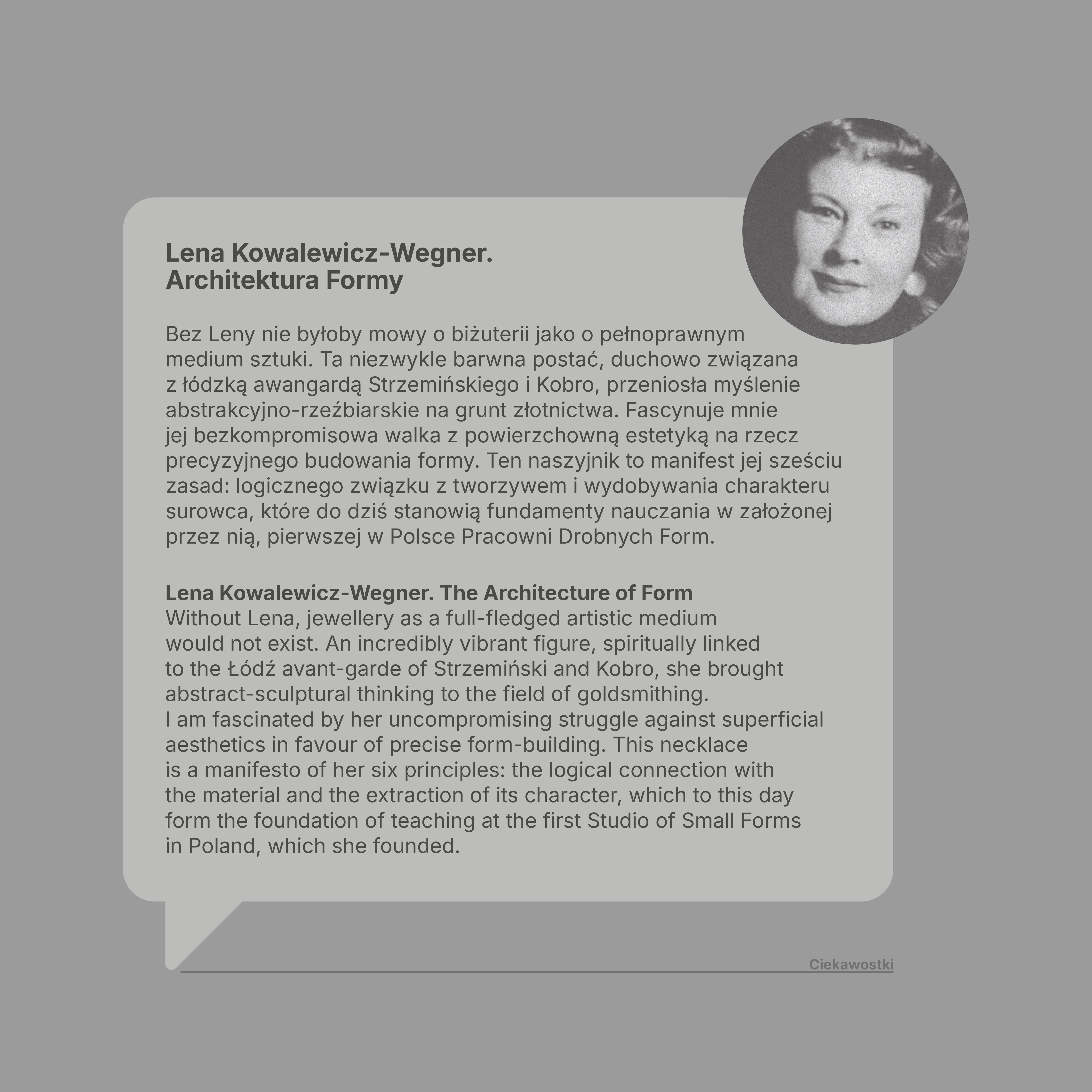
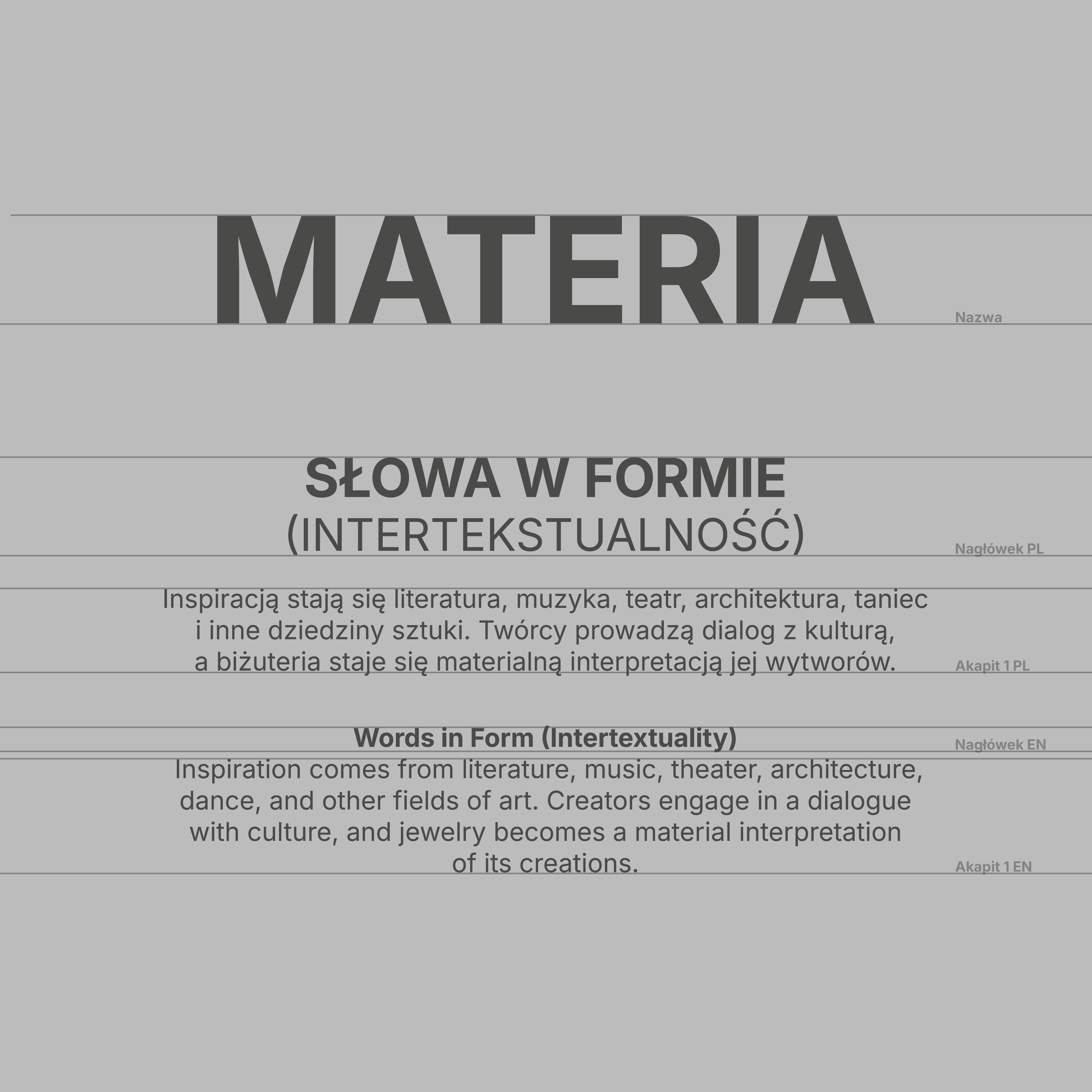
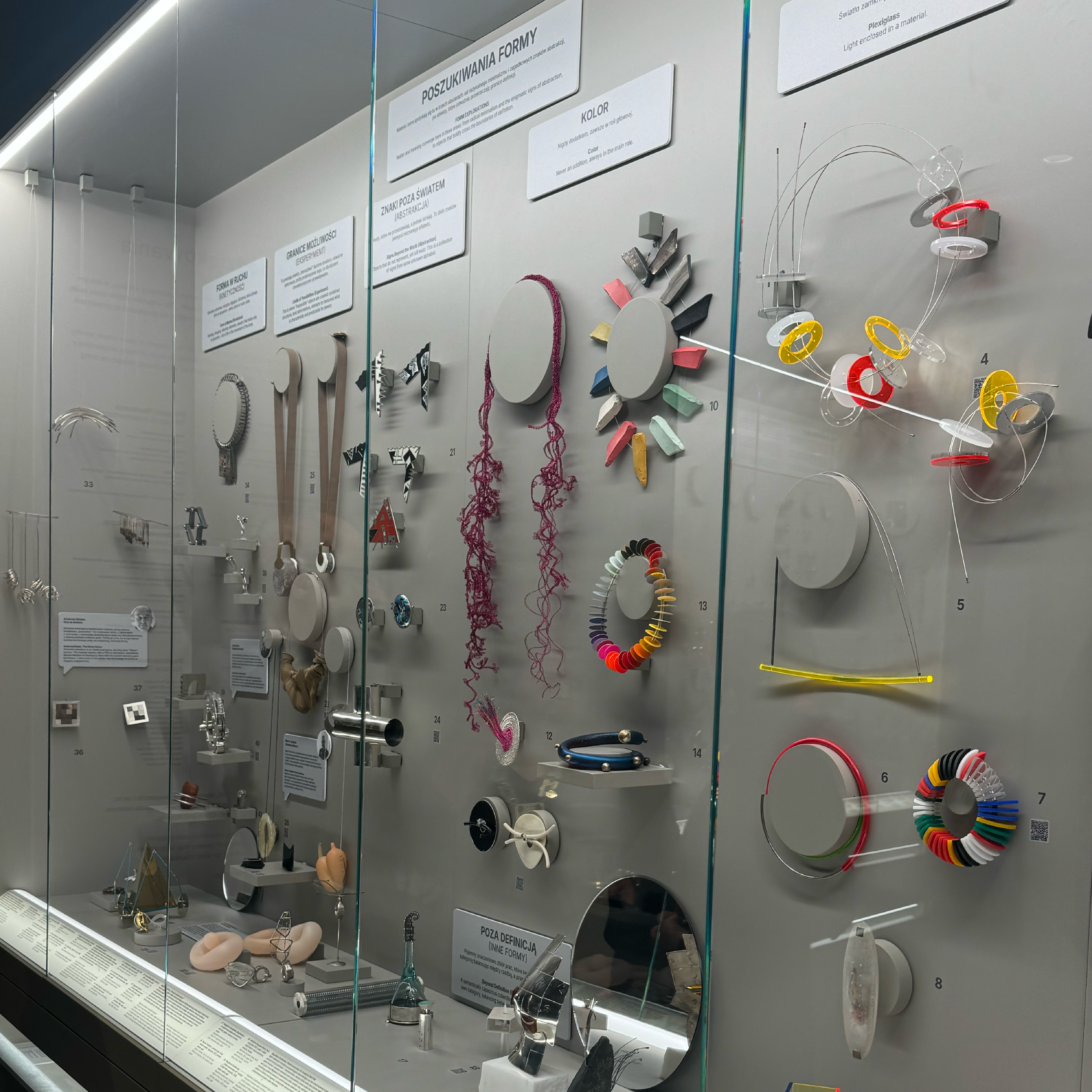
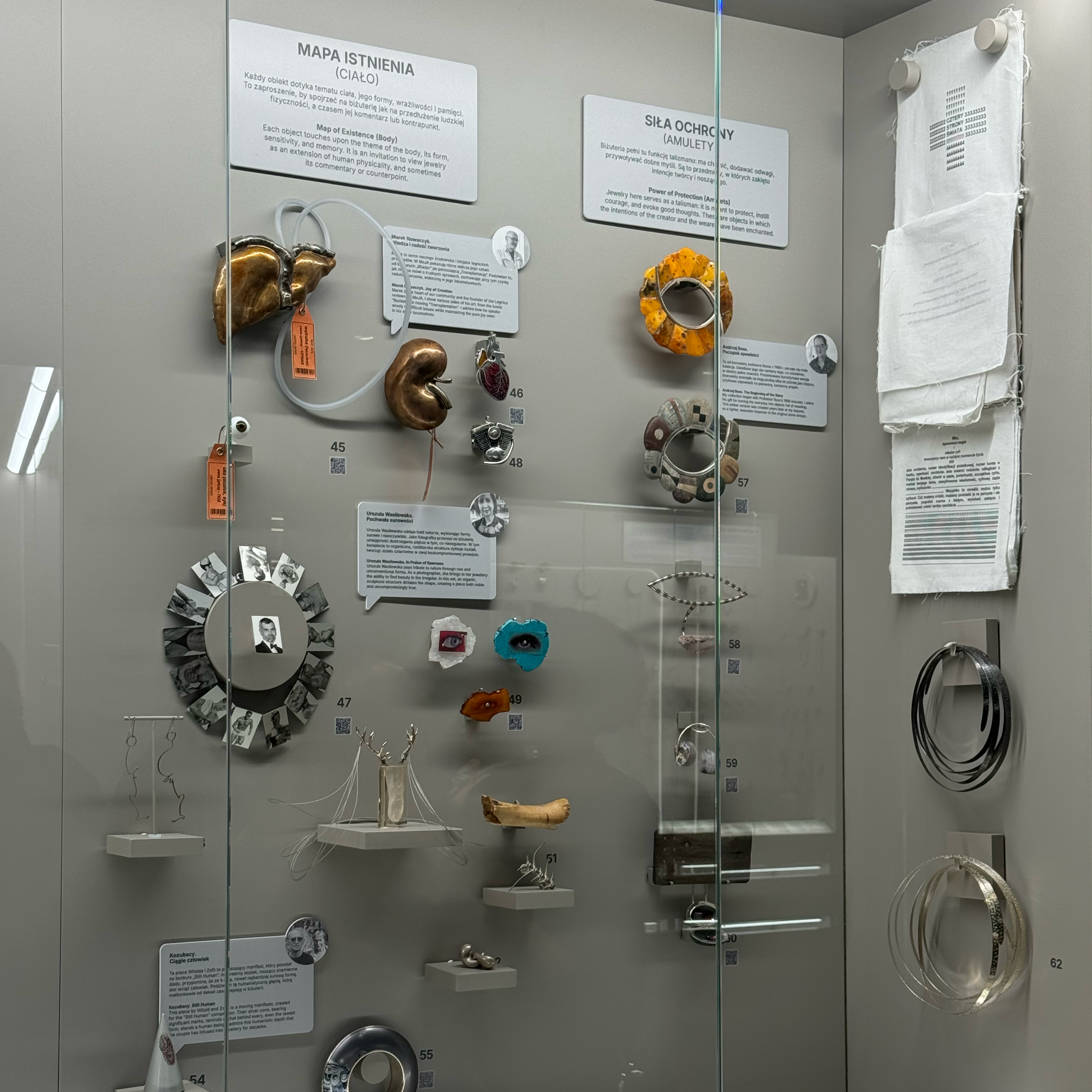
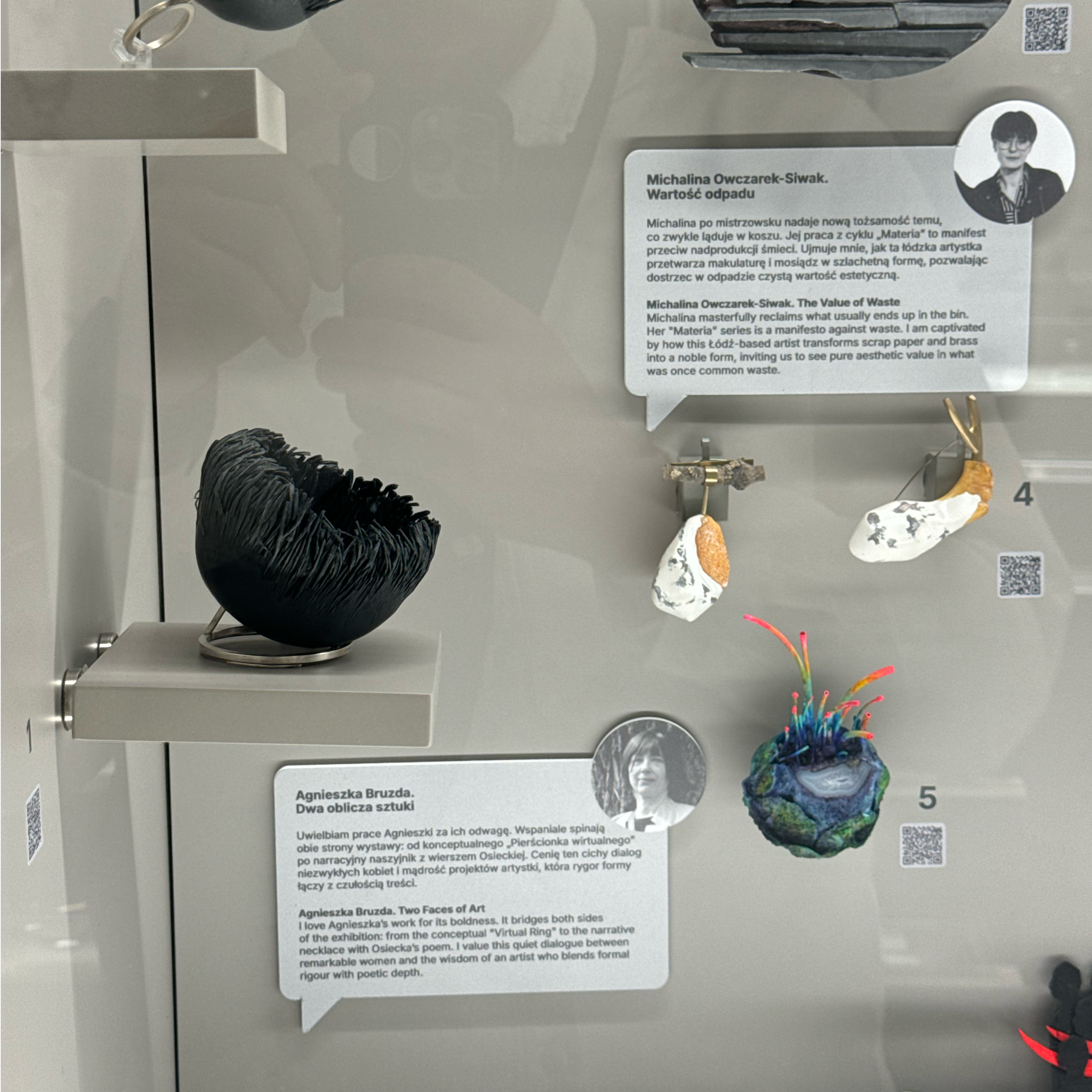
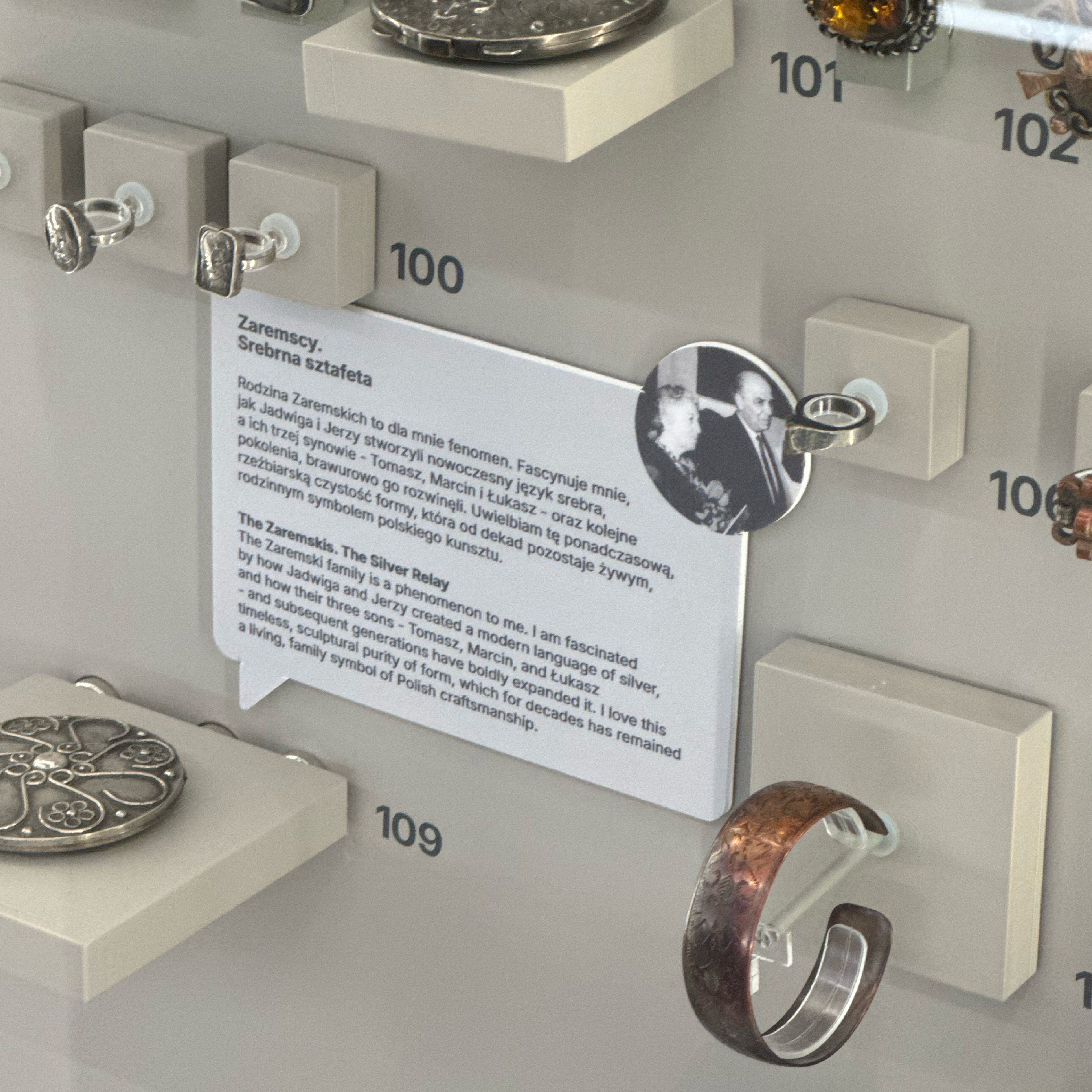
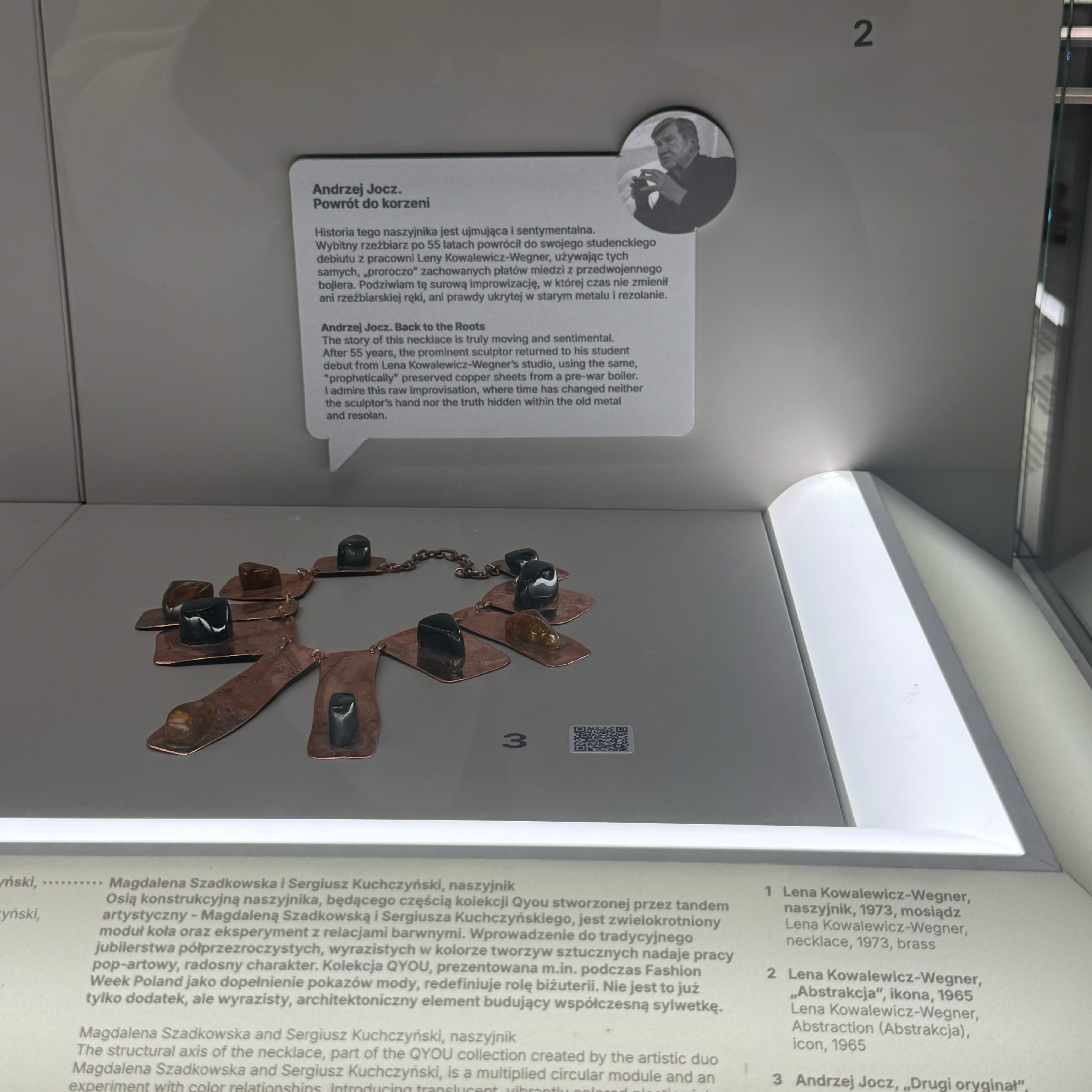
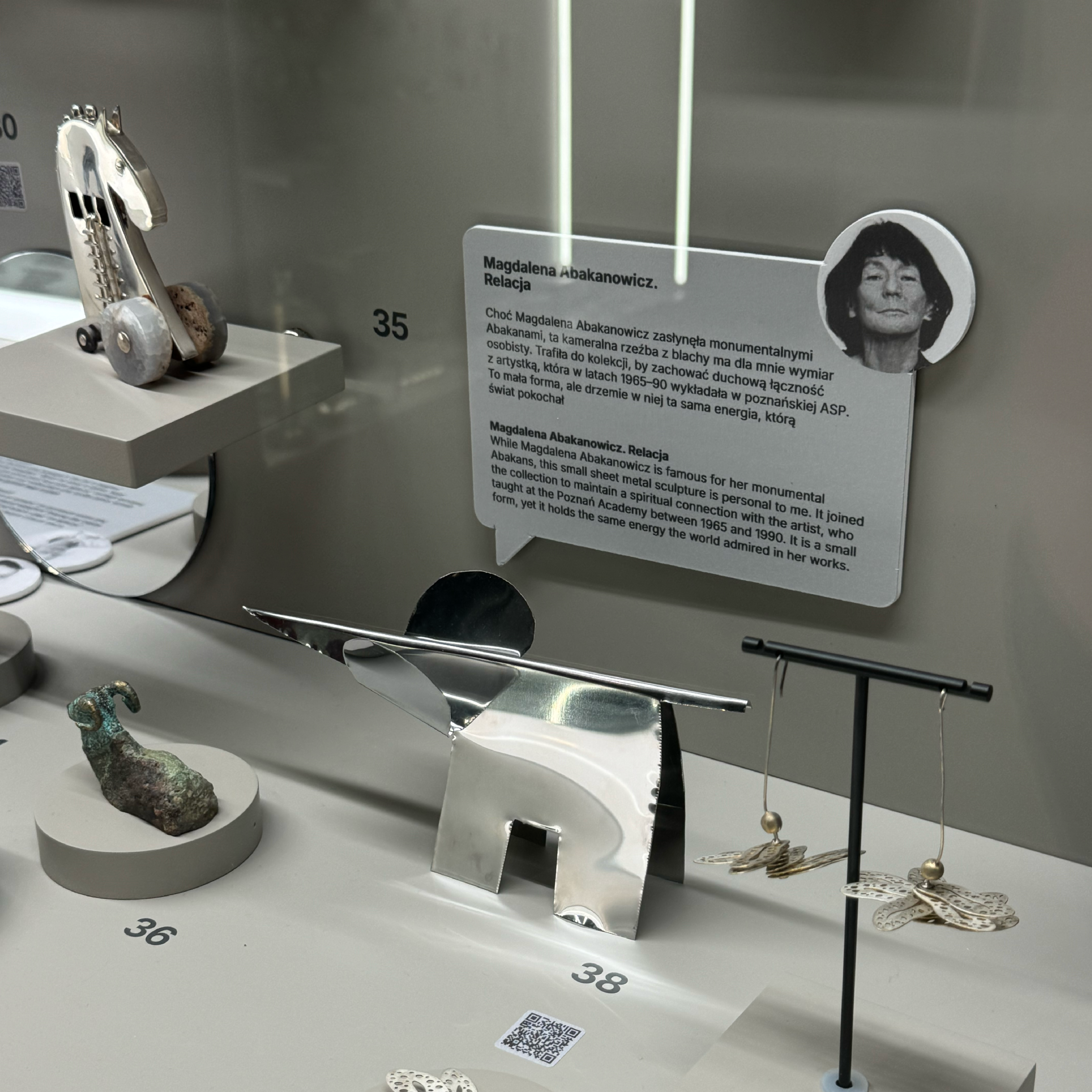
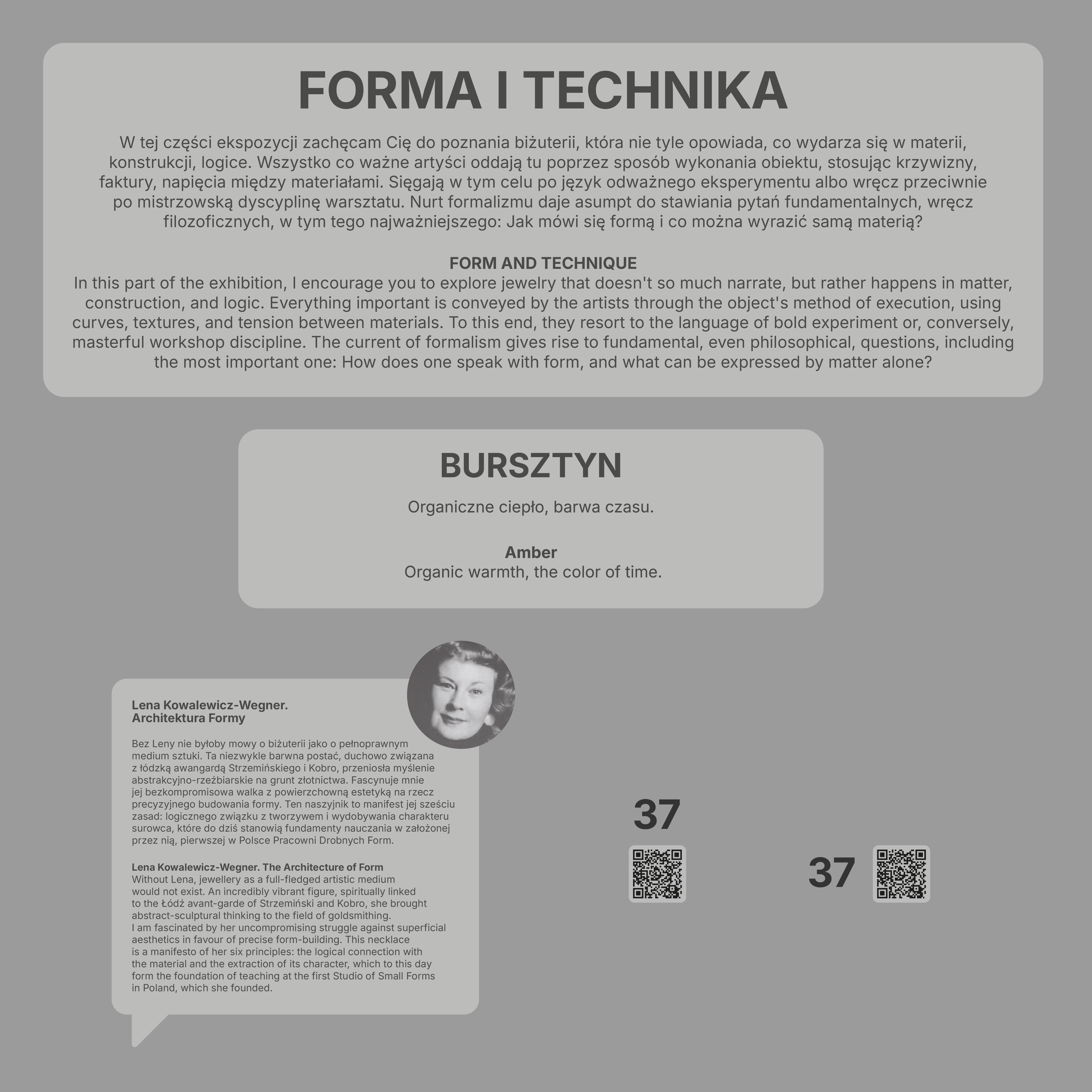
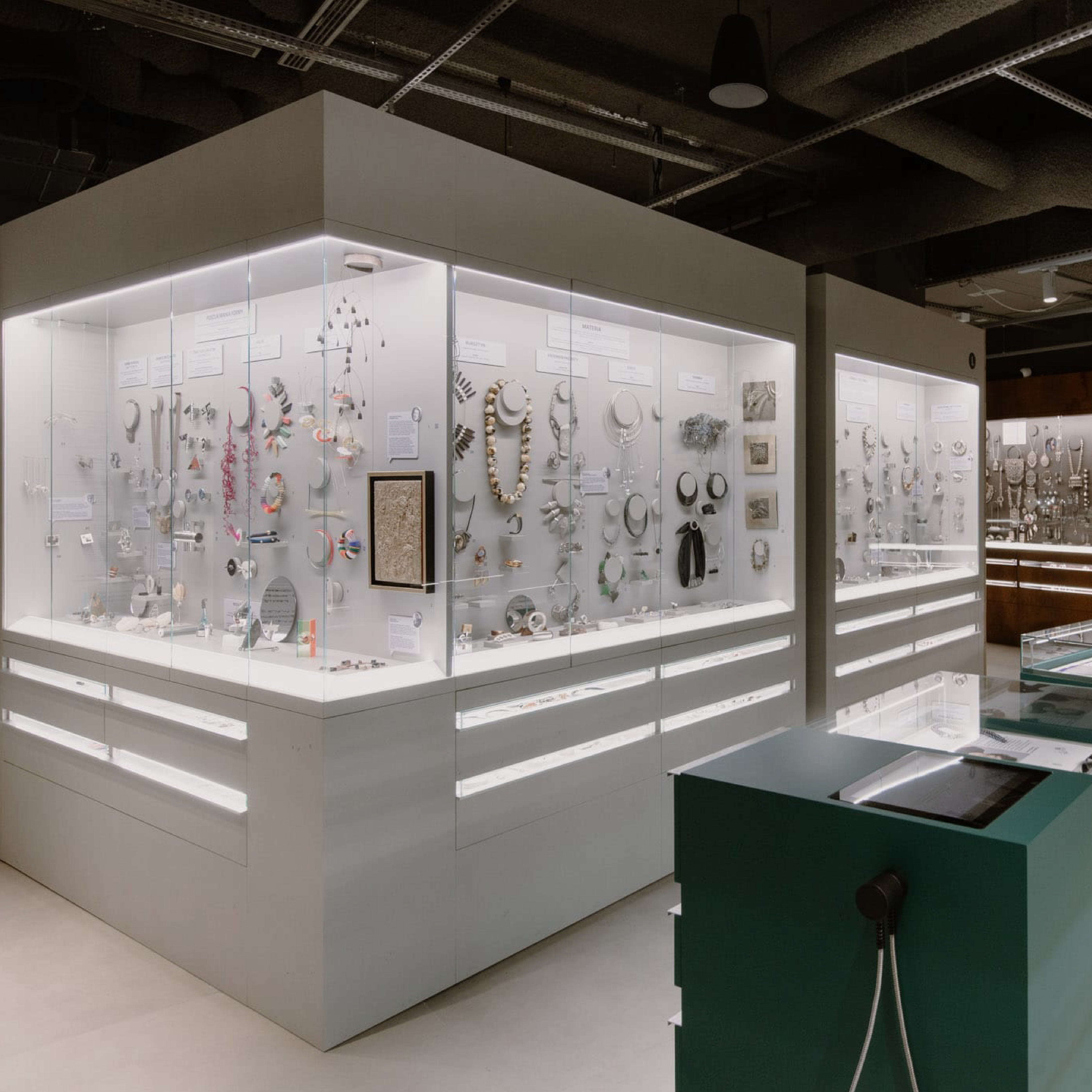
The second major exhibition section is dedicated to contemporary jewellery art and the work of Polish jewellery designers and goldsmiths. The interpretation framework was divided into two main thematic areas: the language of form and the language of narrative.
We developed a system of exhibition panels and object labels that helps visitors understand both the aesthetic and conceptual dimensions of the works on display. Through a carefully structured information hierarchy, visitors can explore the collection from multiple perspectives, discovering not only visual qualities but also the ideas and stories behind each piece.
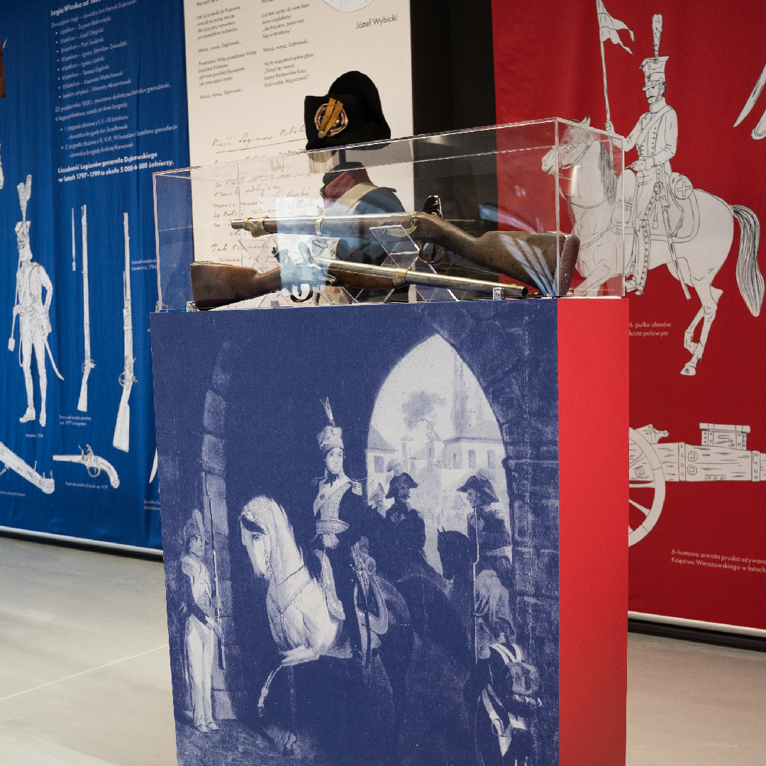
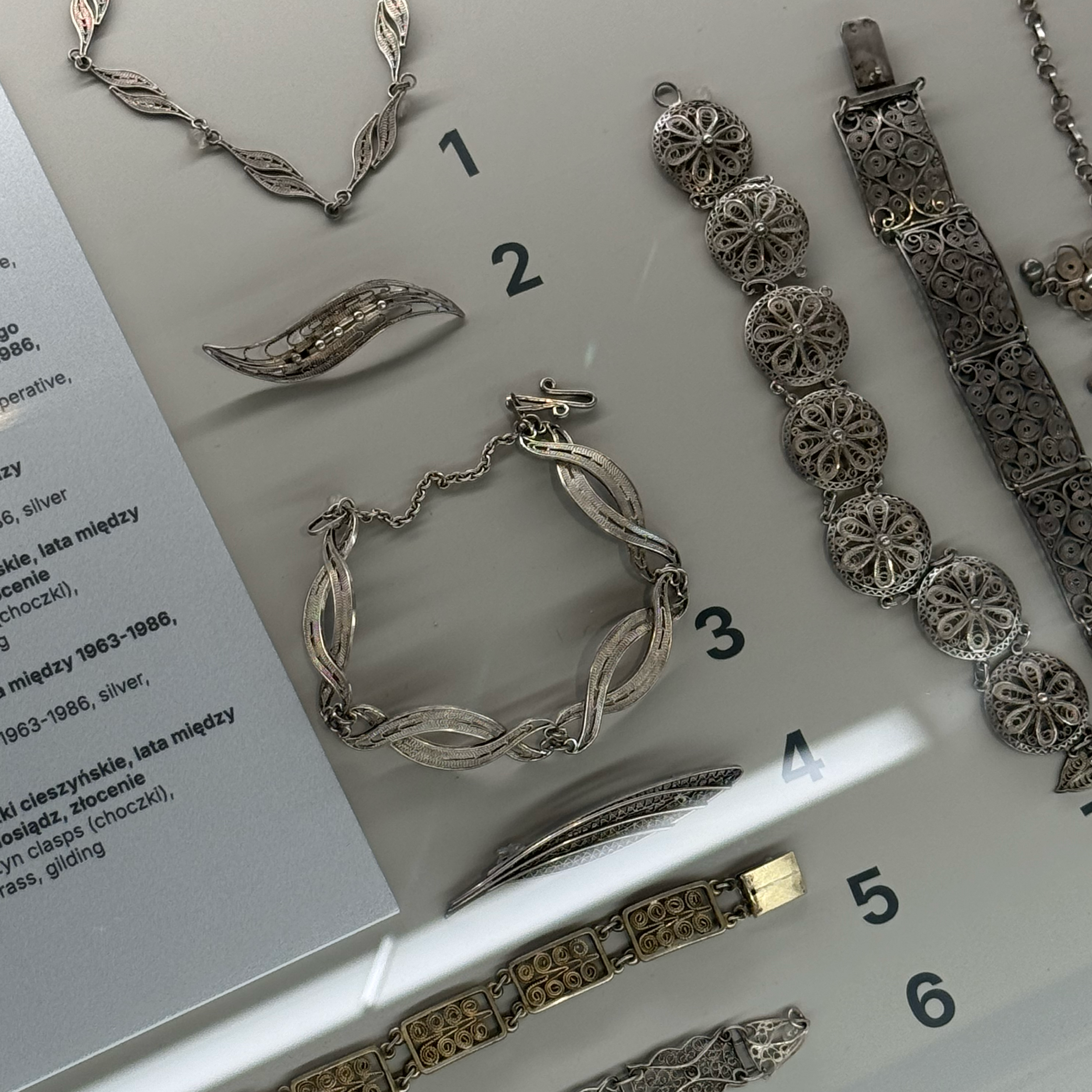
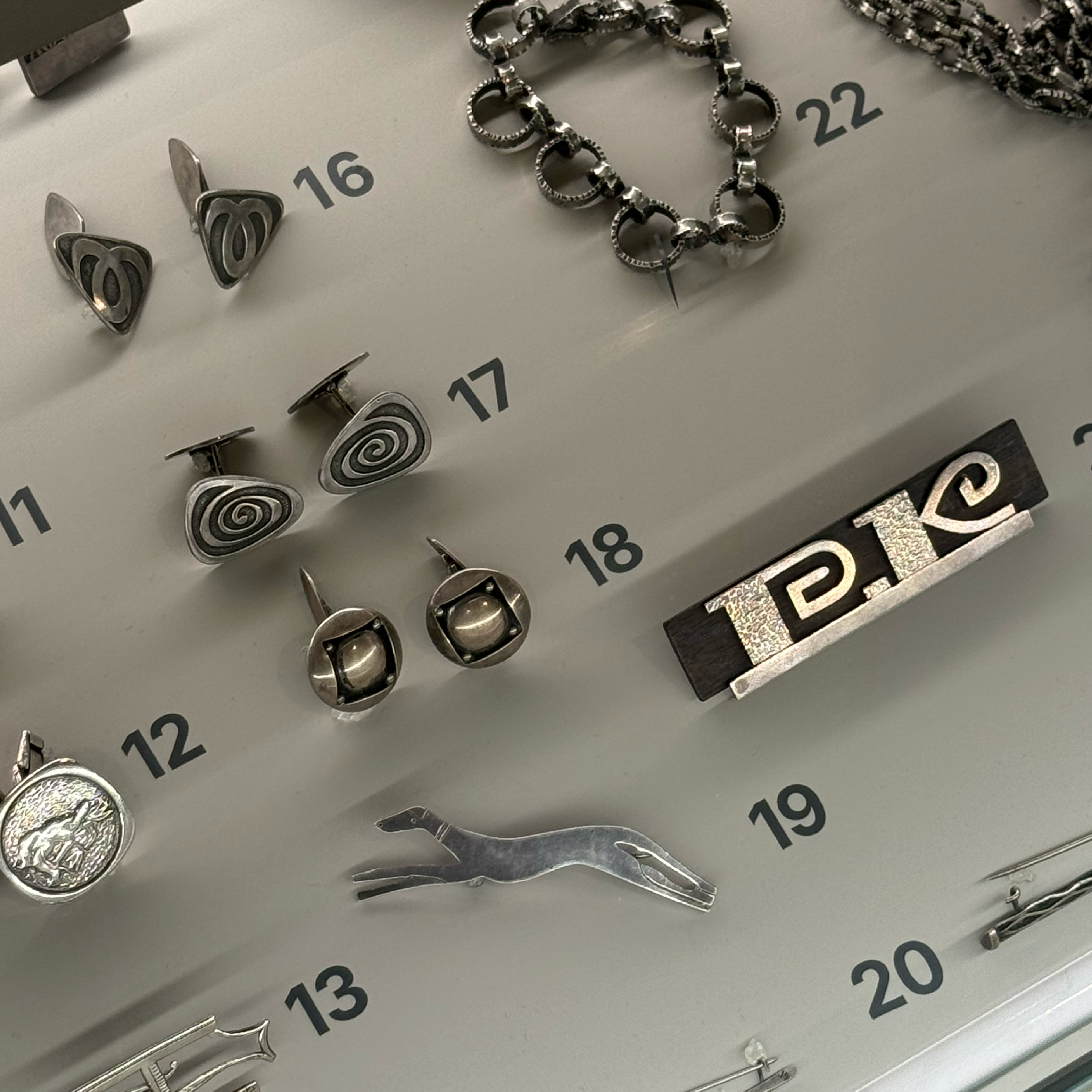
The large number of exhibited objects required the development of precise standards for numbering, object labels, and supplementary interpretive materials. We created a complete identification system including object numbers, QR codes, and bilingual descriptions.
The process involved many hours of design, editorial work, and consultation. The resulting standards enabled efficient management of large volumes of content while ensuring consistency across all materials produced by a multidisciplinary design and curatorial team.


The project was preceded by a multi-stage consultation process involving a broad client-side team. During a series of meetings, we presented and evaluated various design, material, and colour solutions, carefully considering their impact on both visitor experience and production feasibility.
The collaboratively developed information and content presentation system streamlined the design process and enabled the successful implementation of an exhibition containing a substantial amount of interpretive material.
Our involvement extended beyond design development to include the complete production and installation of the museum’s wayfinding system.
The final result is a coherent, functional, and visually refined museum information system that effectively supports visitors in discovering the rich collection of the MoJA Jewellery Museum. Through a carefully structured information hierarchy and a consistently applied visual language, we created a visitor-friendly environment that meets the standards of contemporary museum practice.