Directional information system in a medical facility
For the “Dawn” Prevention Center, we carried out a comprehensive project of visual decoration and directional information system, covering three independent facilities. Each of them has a different function - from support for people struggling with addictions, to prevention activities, to assistance for children with FAS and sensory integration disorders requiring rehabilitation. The complex also offers open space for meetings, workshops and consultations - available to residents, children, youth and NGOs.
Client: Dawn Prevention Center
Scope: audit of space and visual identity, design of directional information based on existing sign book, graphic creations for interiors with different functions, selection of materials, supervision of production and installation of signage
Year: 2024

AUDIT OF SPACE AND VISUAL IDENTITY
The first stage of our work was an analysis of the space and visual identity. Based on the brand book of the “Dawn” Prevention Center, we conducted a detailed interpretation of the visual identity assumptions. In parallel, we identified the needs of the space, taking into account the functions of the various facilities and the needs of users. The work was carried out in close cooperation with the Center's team of employees, which was crucial for the accuracy of the design decisions. We take care of careful communication with the client, treating it as the foundation of an effective and tailored solution.
VISUAL CONCEPT
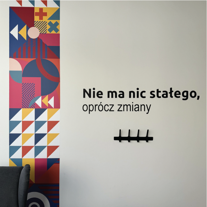
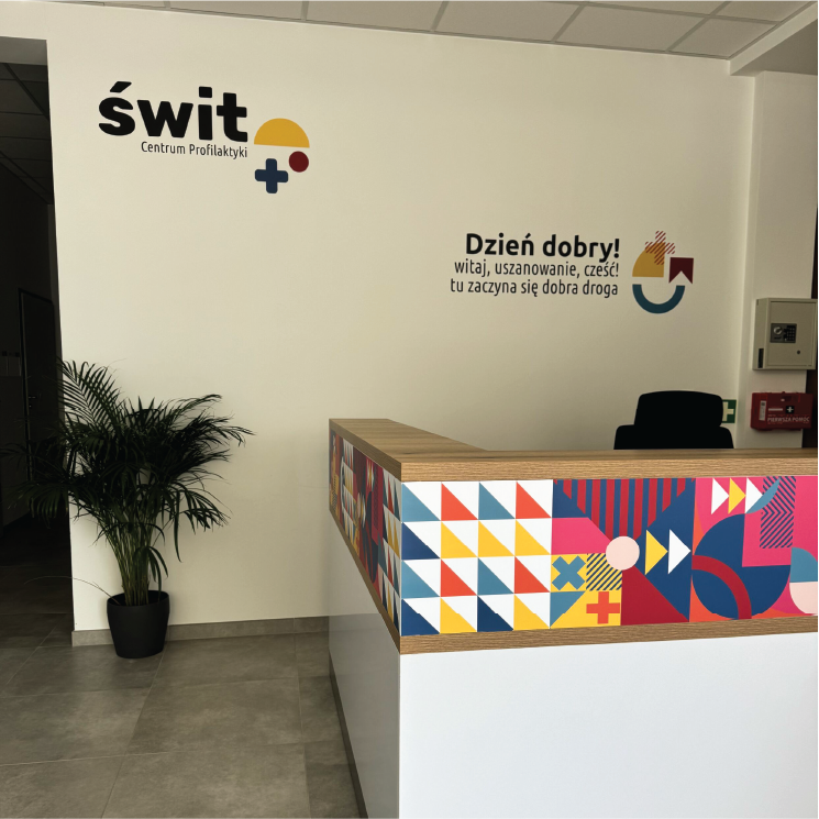
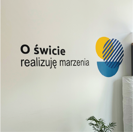
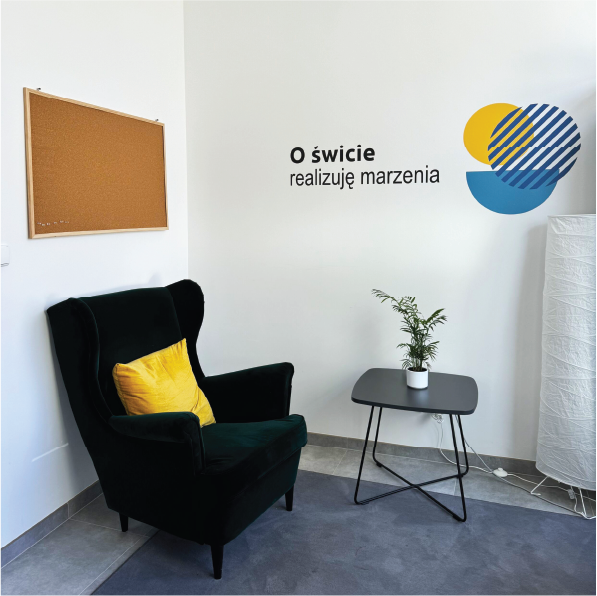
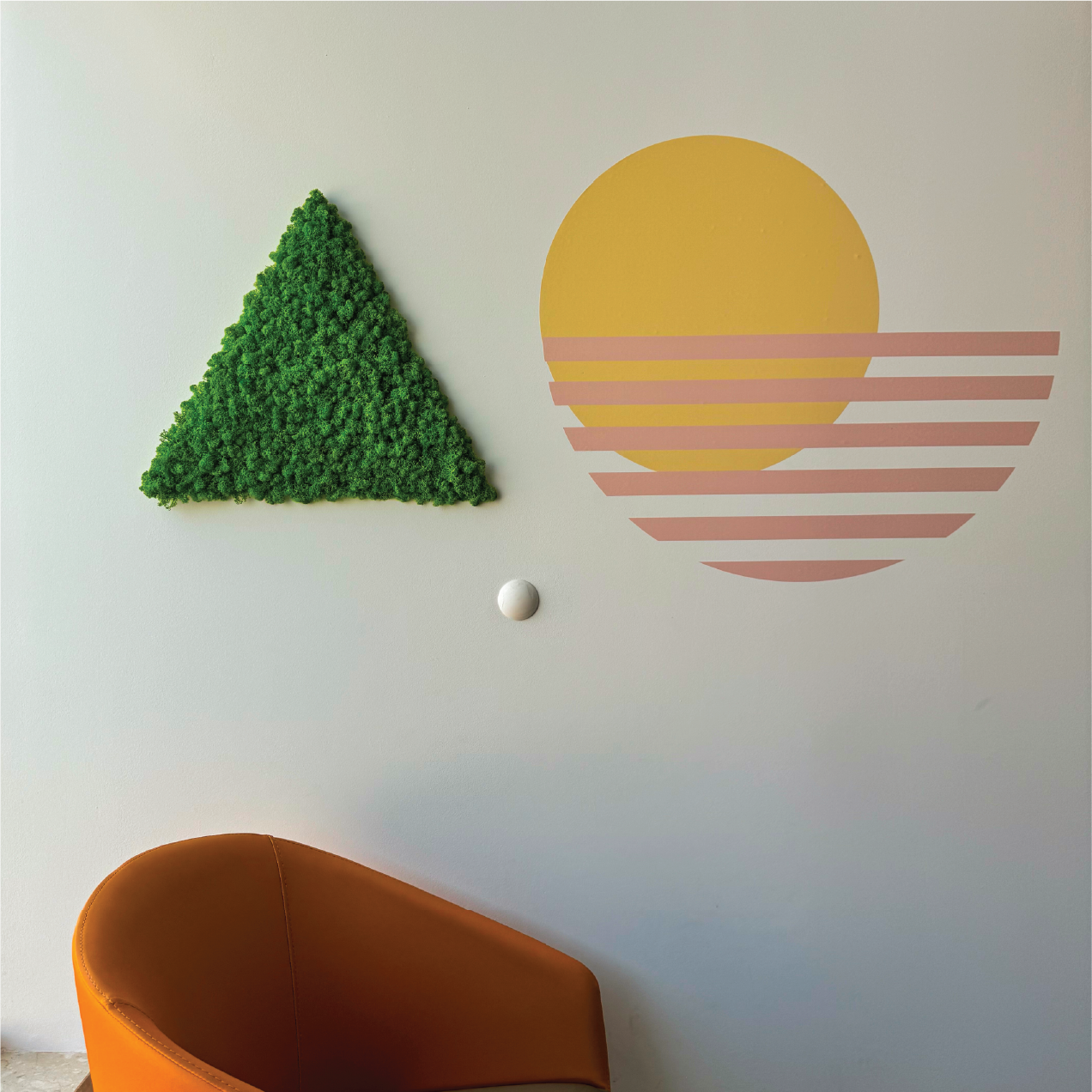
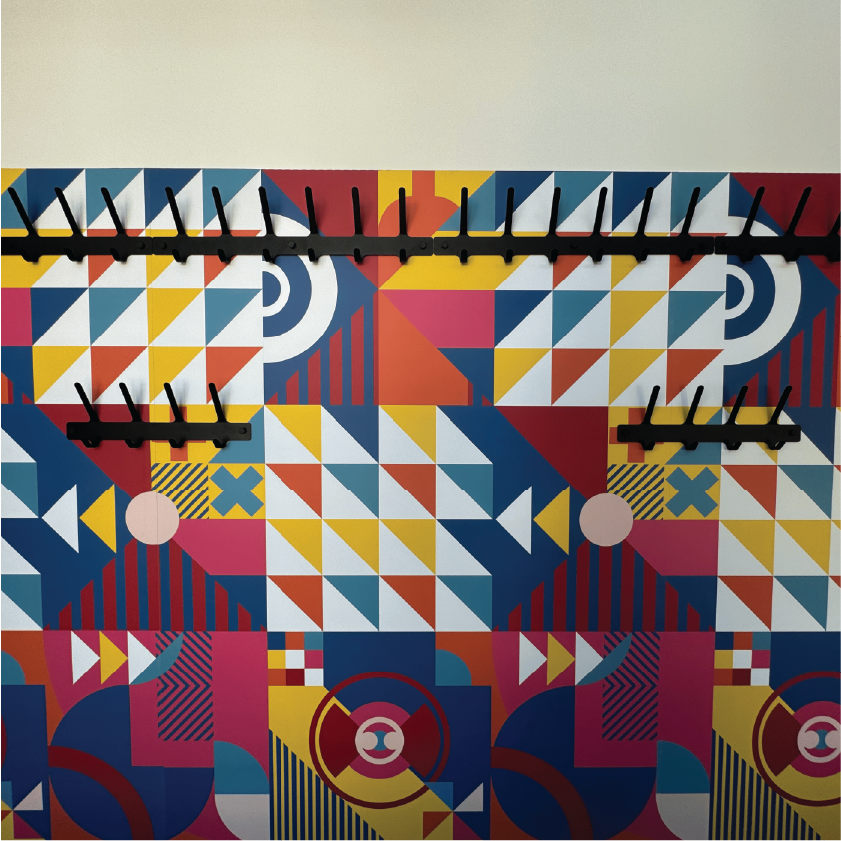
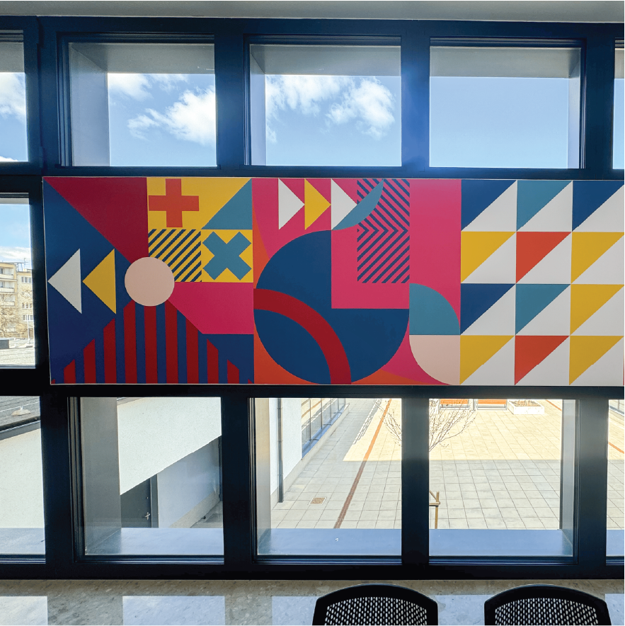
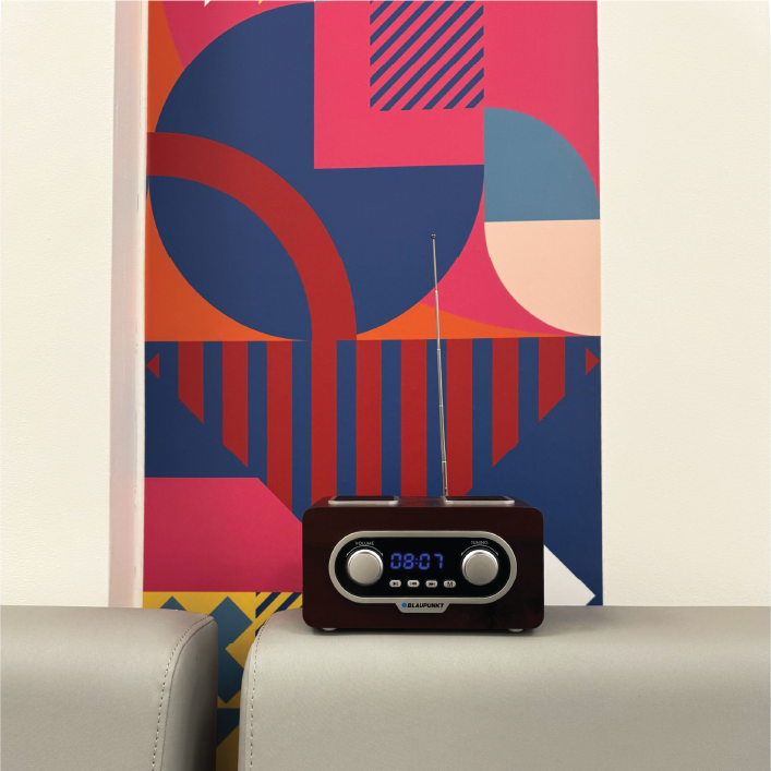
In the next stage, we developed a visual concept for the Center's three outlets: the Children's Zone, the Development Zone and the Education Zone. Based on the brand book, we created graphic solutions consistent with the brand identity, paying attention to colors, typography and iconography. We inserted our proposals for graphic creations harmoniously into the existing spaces. Each point was given two concepts to choose from, which allowed flexible adaptation of the project to the needs and possibilities of implementation. The overall goal was to create a friendly, clear and aesthetically pleasing visual communication system.
DESIGNS FOR OFFICES
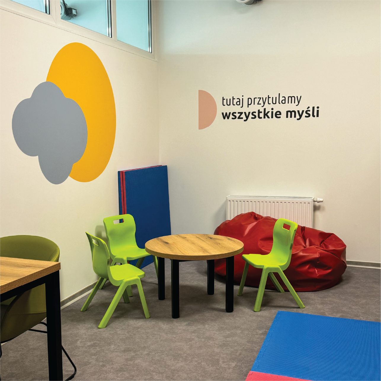
In the therapy rooms and children's waiting room, we designed a subdued wall arrangement, taking into account the needs of young patients. In the therapy spaces, we used delicate graphic elements and subtle lettering, choosing soft colors and a clear, friendly font so as not to distract or overstimulate the children during their sessions. We took a similar approach in the waiting room - the place had to be cozy and comfortable, but at the same time calming and neutral in terms of stimuli. We avoided intense colors and excess decoration, opting for visual tranquility and sensory safety. The design was based on consultation with the Center's team, with concern for the well-being of the youngest users.
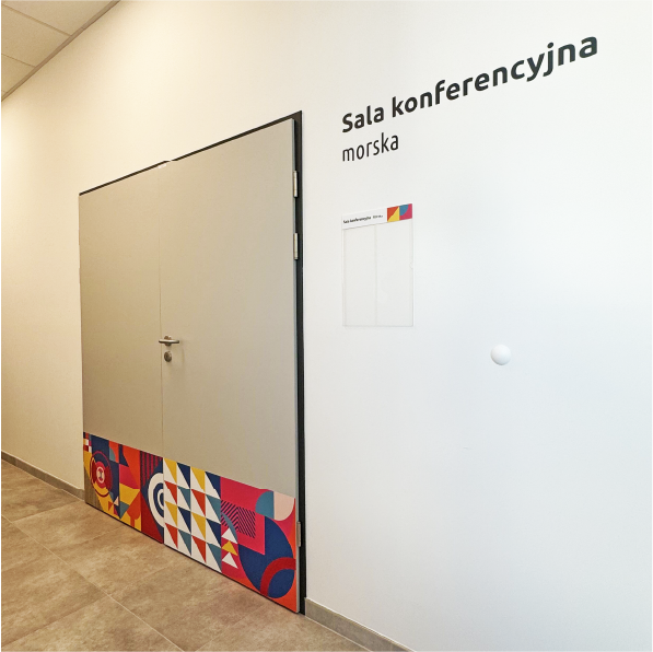
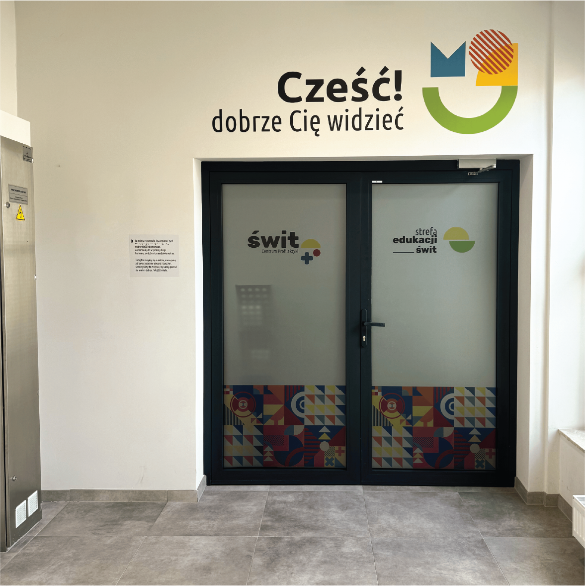

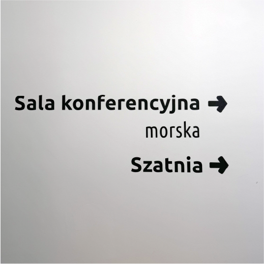
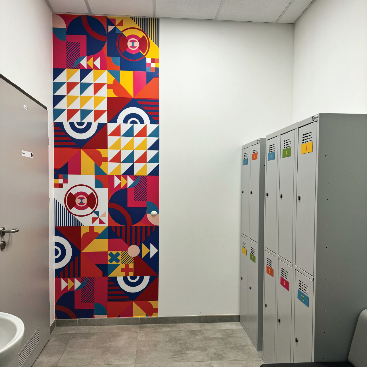
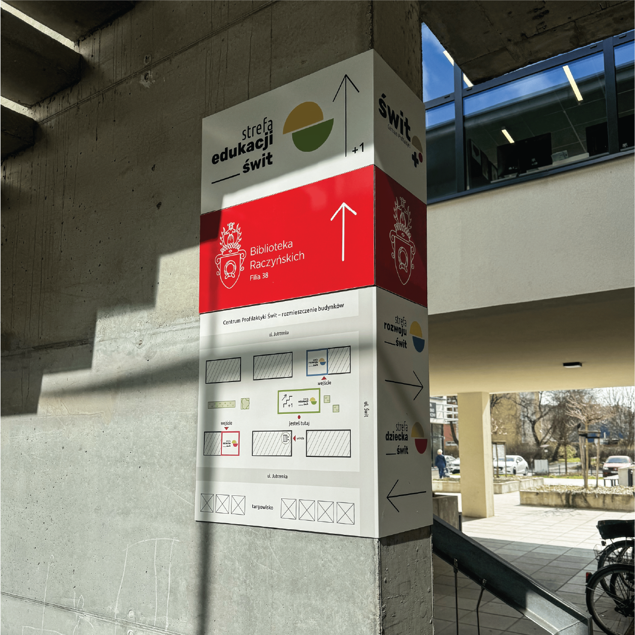
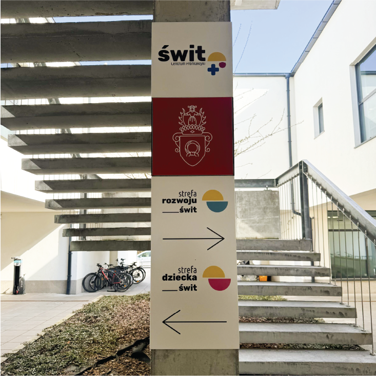
DIRECTIONAL INFORMATION IN THE FACILITY
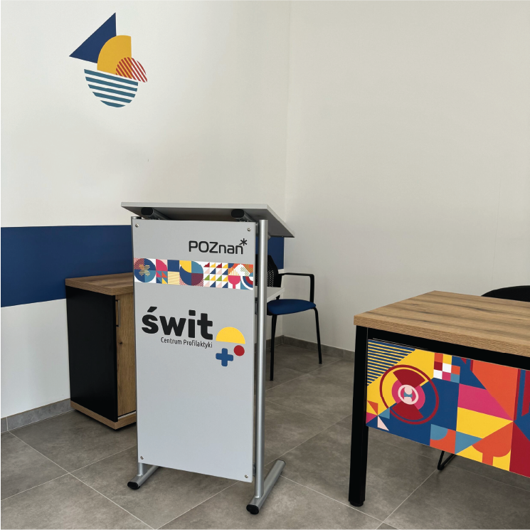
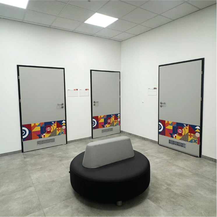
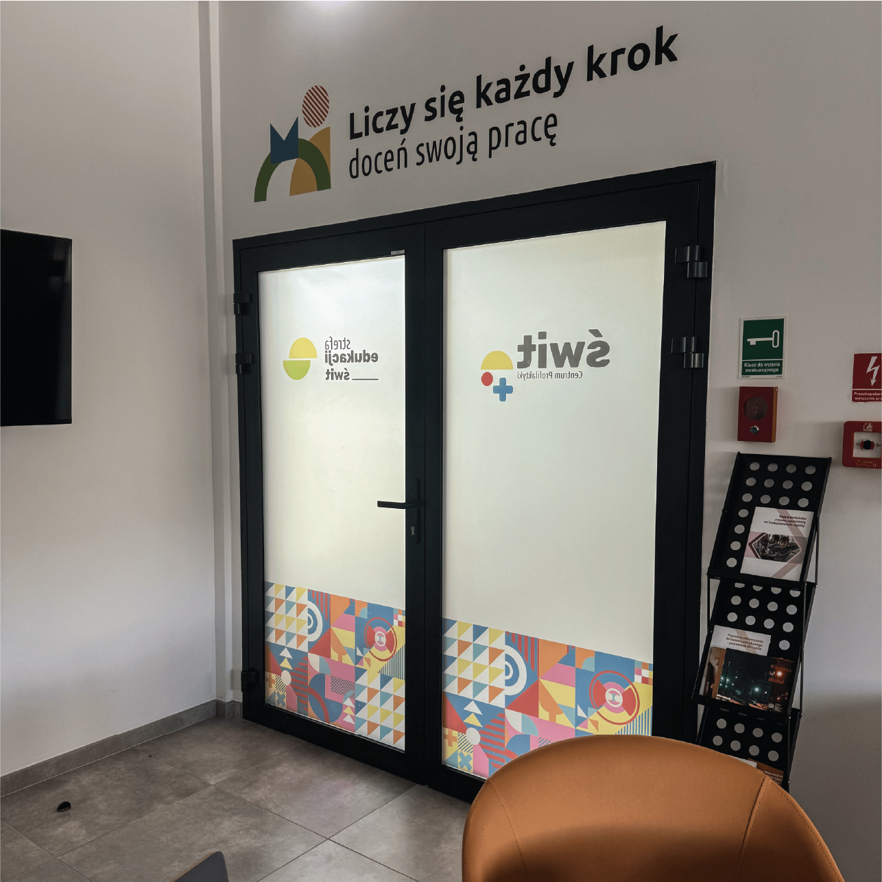
As part of the project, we prepared graphic creations and large-format prints with the author's pattern, which were applied to traffic routes, corridors, waiting rooms, bathrooms and locker rooms. The project also included a system of room signage, including signs with descriptions for the following: toilets, waiting rooms, utility room, service room, and directional signs placed by the elevator. The design was complemented by information frames for the furniture and the arrangement of the kitchen and office space, with attention to visual consistency with the other elements of the identity.
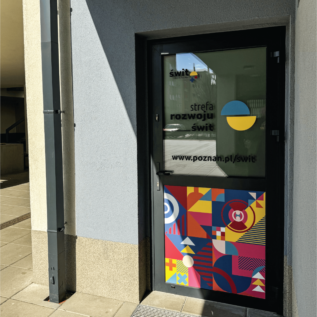
ENTRANCE SIGNAGE DESIGN
As part of the project, we also developed exterior signage elements that support orientation in the space and enhance the Center's recognition. These included signage at the entrances, lettering on the exterior windows using logos and typography consistent with the corporate identity, as well as a main directional sign placed on a pole to make it easier to find the right spot. All elements were designed with legibility, aesthetics and durability in mind, taking into account the character of the surroundings. As a result, the space around the facility became not only more functional, but also visually consistent with the interiors of the Center.
PRODUCTION AND IMPLEMENTATION
Our task was also to supervise the production and installation of all elements of the directional identity, ensuring that the implementation was consistent with the design guidelines. We were responsible for selecting appropriate materials, such as wall and window decals, PVC boards and dibond boards - durable and aesthetically pleasing solutions suited to outdoor conditions. At every stage we worked closely with the contractors, coordinating technical activities and keeping an eye on the quality of workmanship. We supervised the work of the installation team, ensuring the precision of the installation and compliance with the project. As a result, the final result was not only functional, but also aesthetic and durable.


