Graphic creations for a cosmetics brand
Client: Groomen
For the Groomen brand, which specializes in natural cosmetics for men, we prepared the design of the product catalog for four new lines. We created the original illustrations used in the advertising creations, designed the packaging design, and developed the graphic composition, typography and text layout. We took care of every detail necessary for a consistent and effective product launch.
Scope of work: design and preparation for print of product catalog, creative concept for four product lines, rebranding, advertising illustrations
Year: 2024

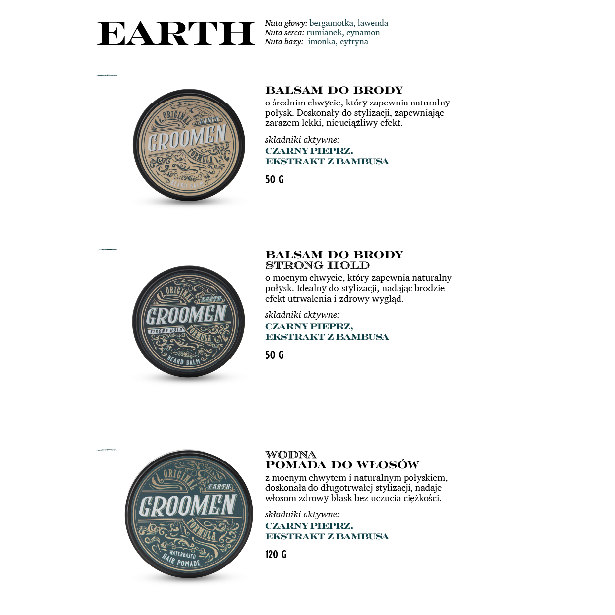
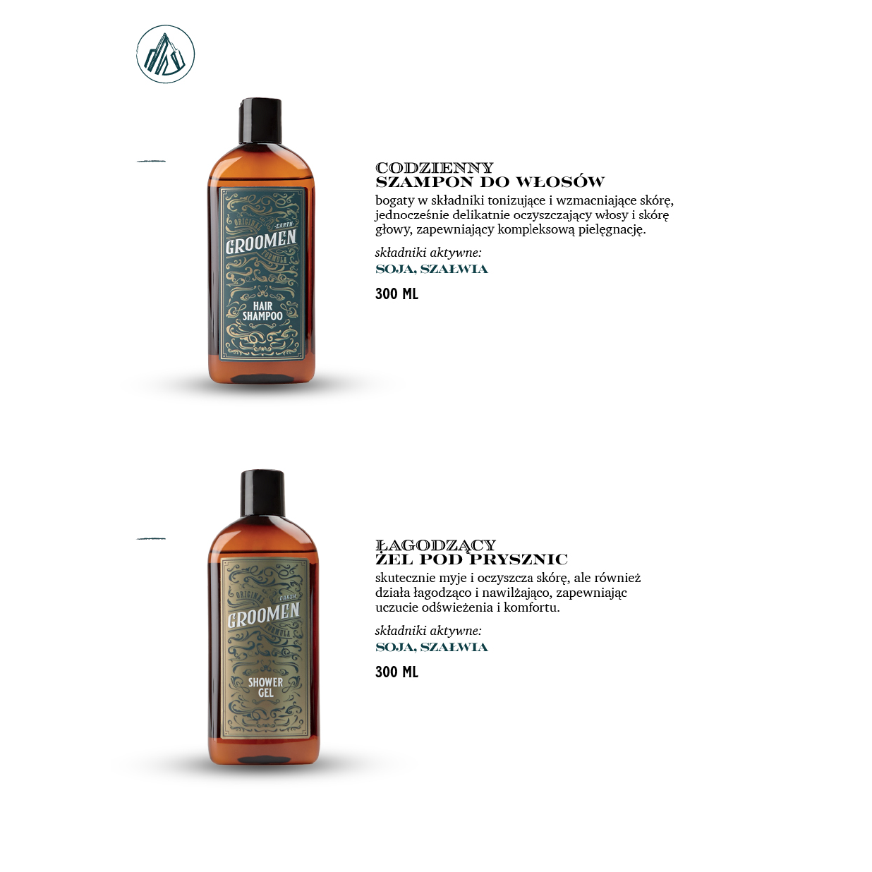
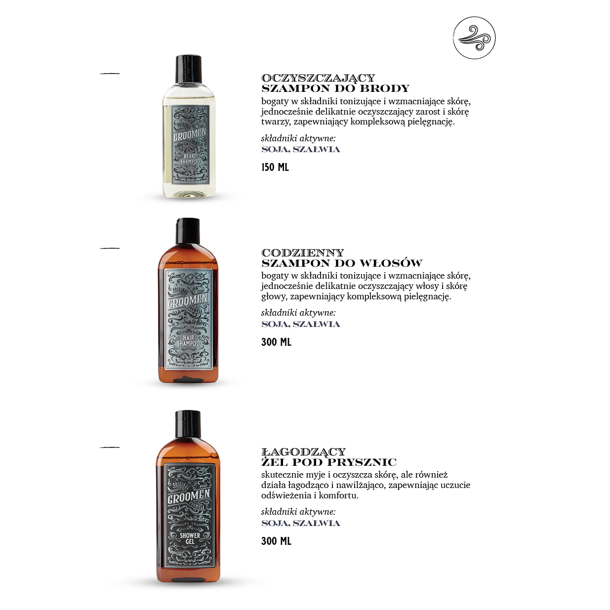
CATALOG DESIGN
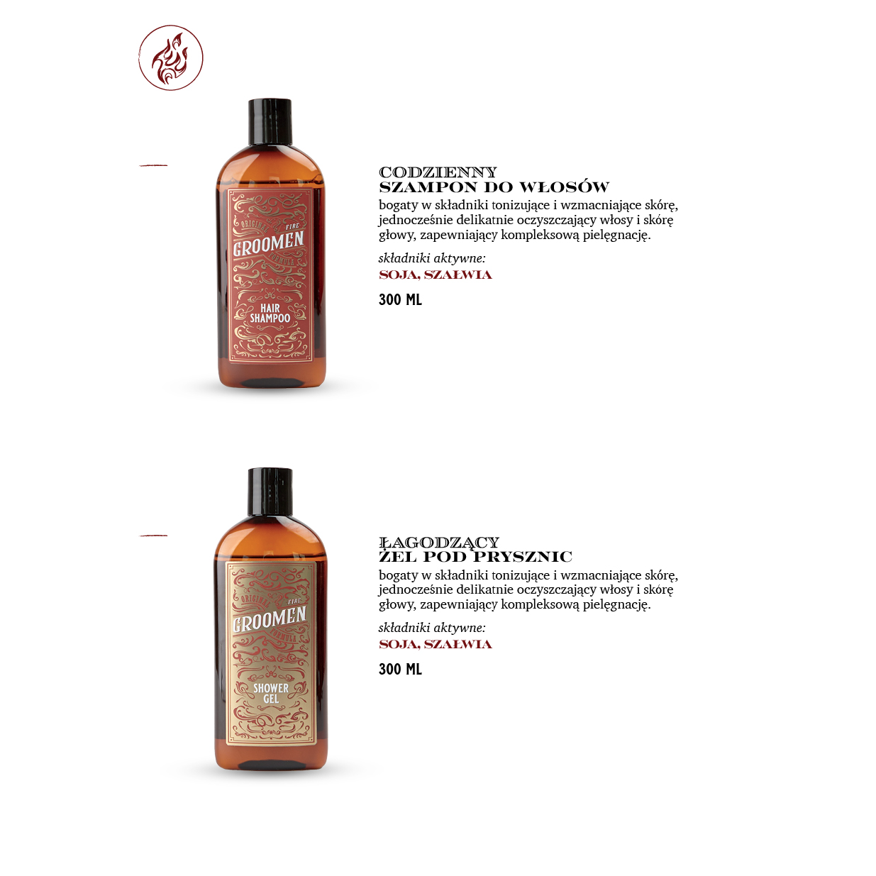
We created a product catalog for the Groomen brand, according to its brand book. The project covered four lines of cosmetics inspired by the elements - water, fire, earth and air. We designed and developed typography in line with the brand's identity, prepared juxtaposition of photographs with product descriptions and coherent graphic composition. The whole creates an aesthetically pleasing, clear and distinctive material to support the brand's marketing communication.


GRAPHIC COMPOSITION
Our goal was to create a modern, clear layout that emphasizes the nature of men's grooming - functionality, simplicity and clarity. On each spread, we took care of a consistent relationship between photography and content, creating thoughtful juxtapositions of packshots with descriptions of products and their properties. The choice of typography, based on the assumptions of the brand's brand book, we extended with additional hierarchies and accents to facilitate the reception of content and differentiate the various sections.
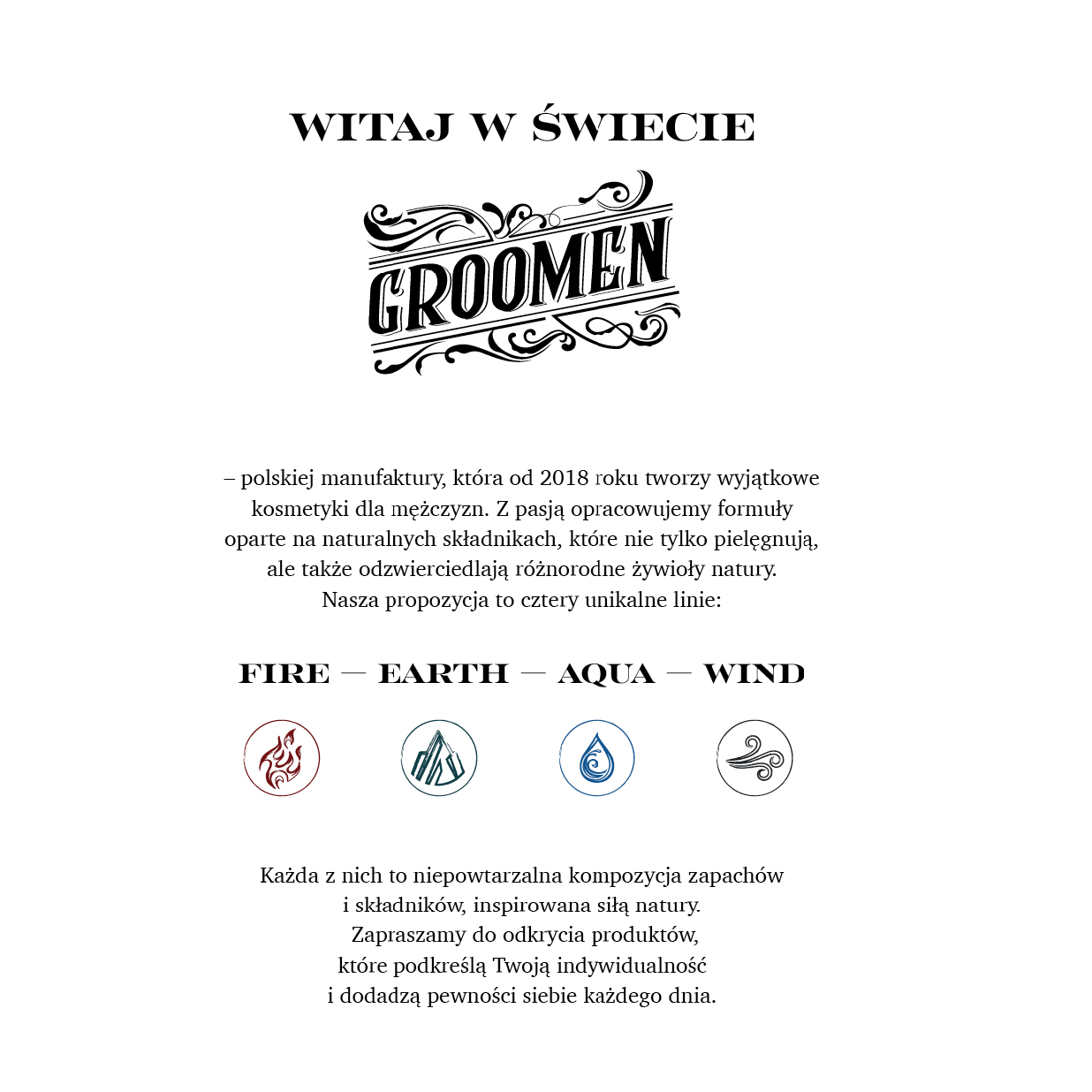
CREATIVE CONCEPT
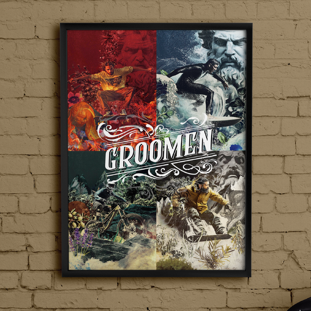
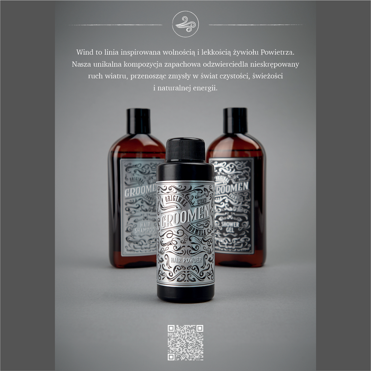
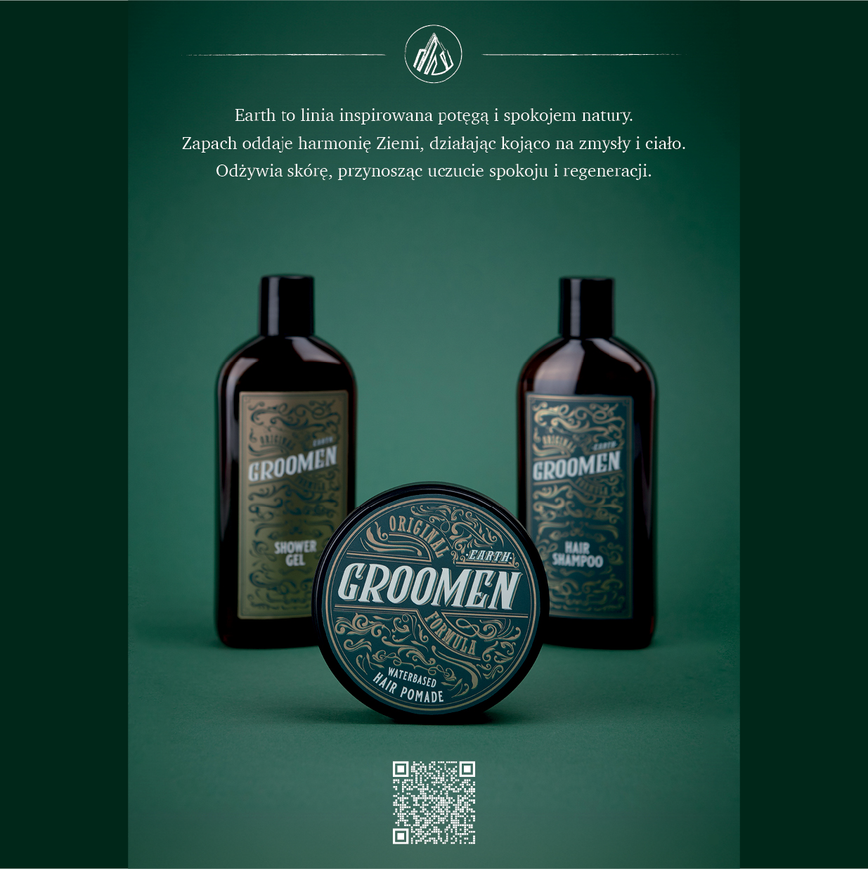
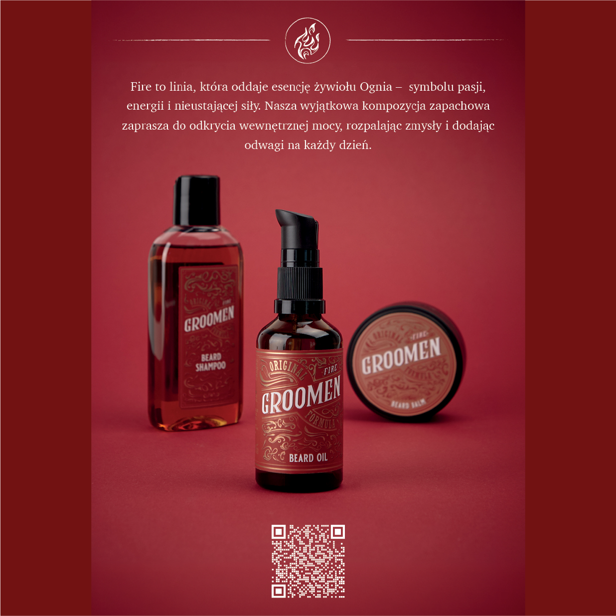
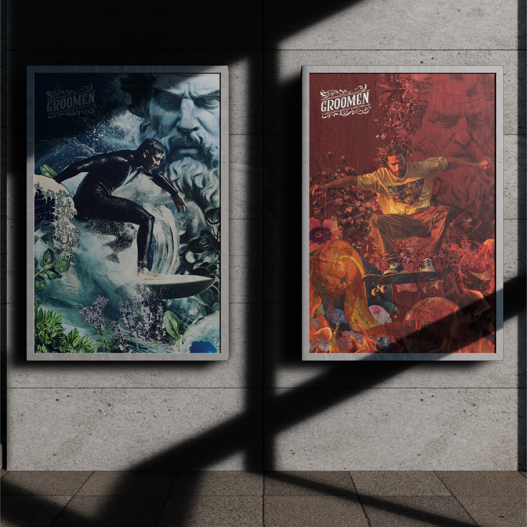
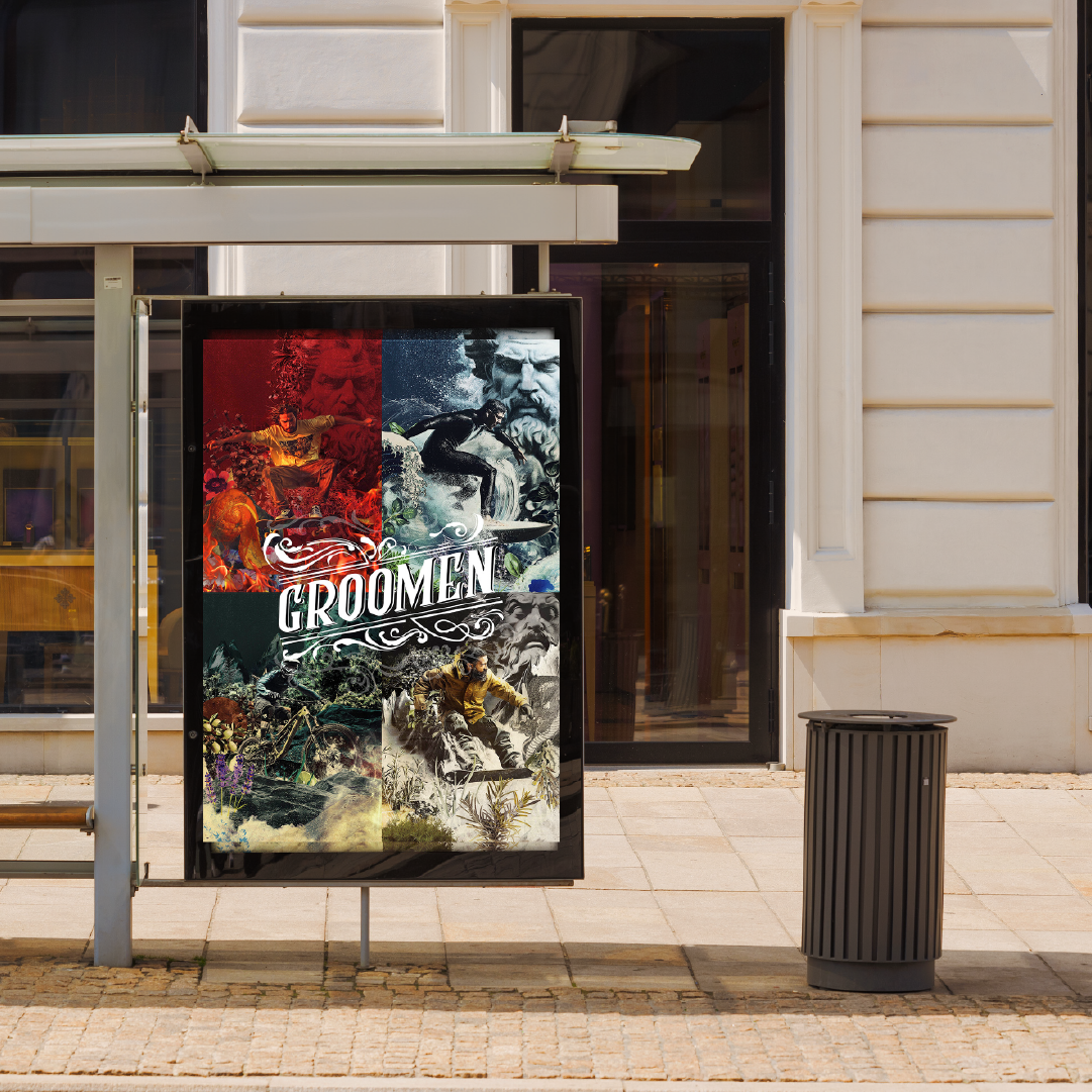
Four lines: EARTH, FIRE, AQUA and WIND represent the four distinct personalities of the Groomen brand, created with different types of men and their grooming needs in mind. We have given each of them a unique visual style that reflects both the nature of the elements and the emotions the brand wants to convey to its audience. Thanks to a consistent approach, the products not only stand out on the shelf, but also create a story-filled narrative - about masculinity, style and a conscious approach to grooming. The design allowed us to build a clear identity for each series, while remaining consistent with the brand's identity as a whole.

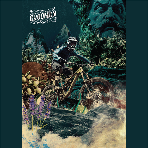
For the EARTH line we created an illustration with a cyclist covering a mountain trail surrounded by wildlife. In the background is a monumental face carved in rock - a symbol of the power of nature and primordial character. Details such as lavender, citrus and herbs visually reflect the scents present in the products. The whole is complemented by an icon designed by us with a motif of mountains and trees, emphasizing the natural, outdoor atmosphere of the series.
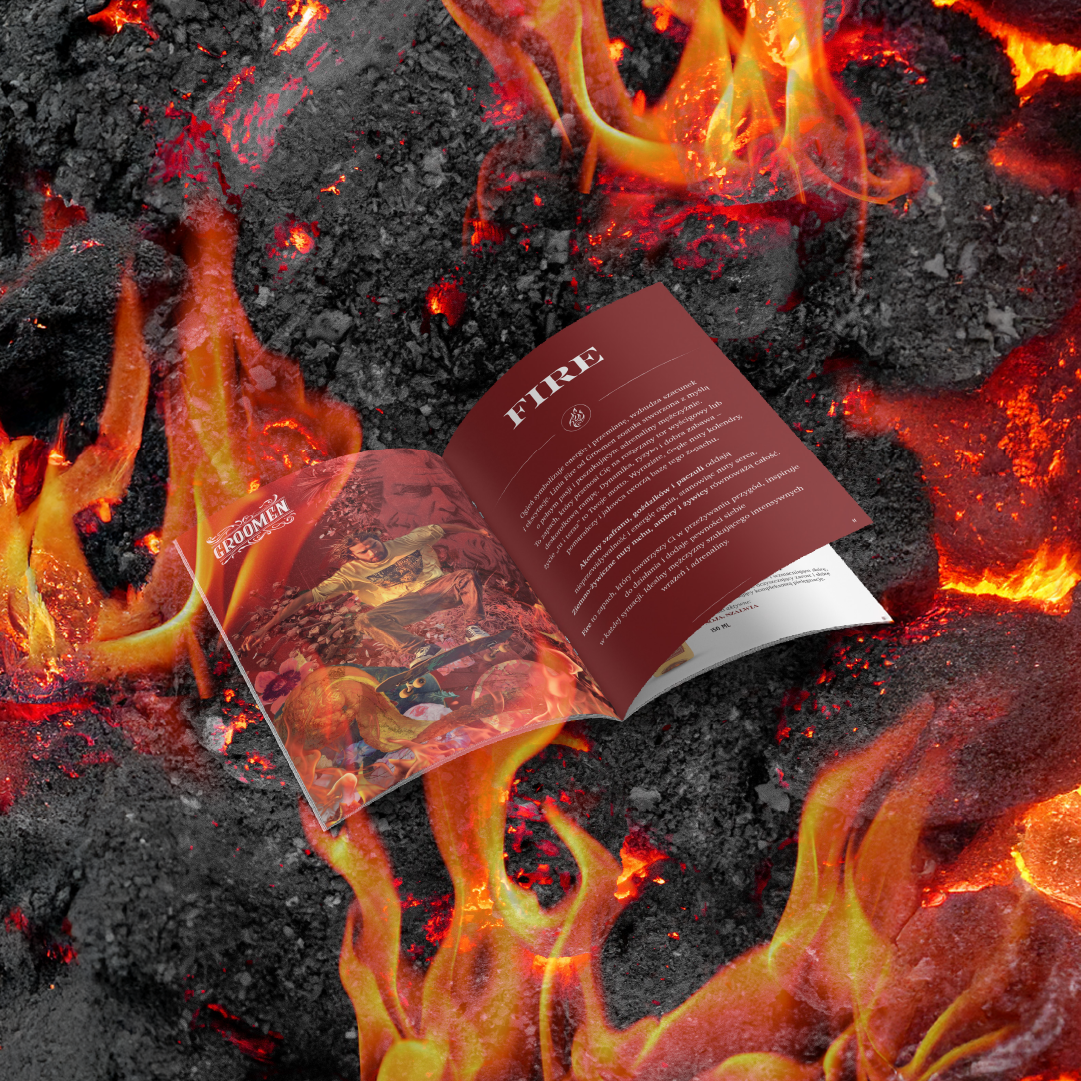
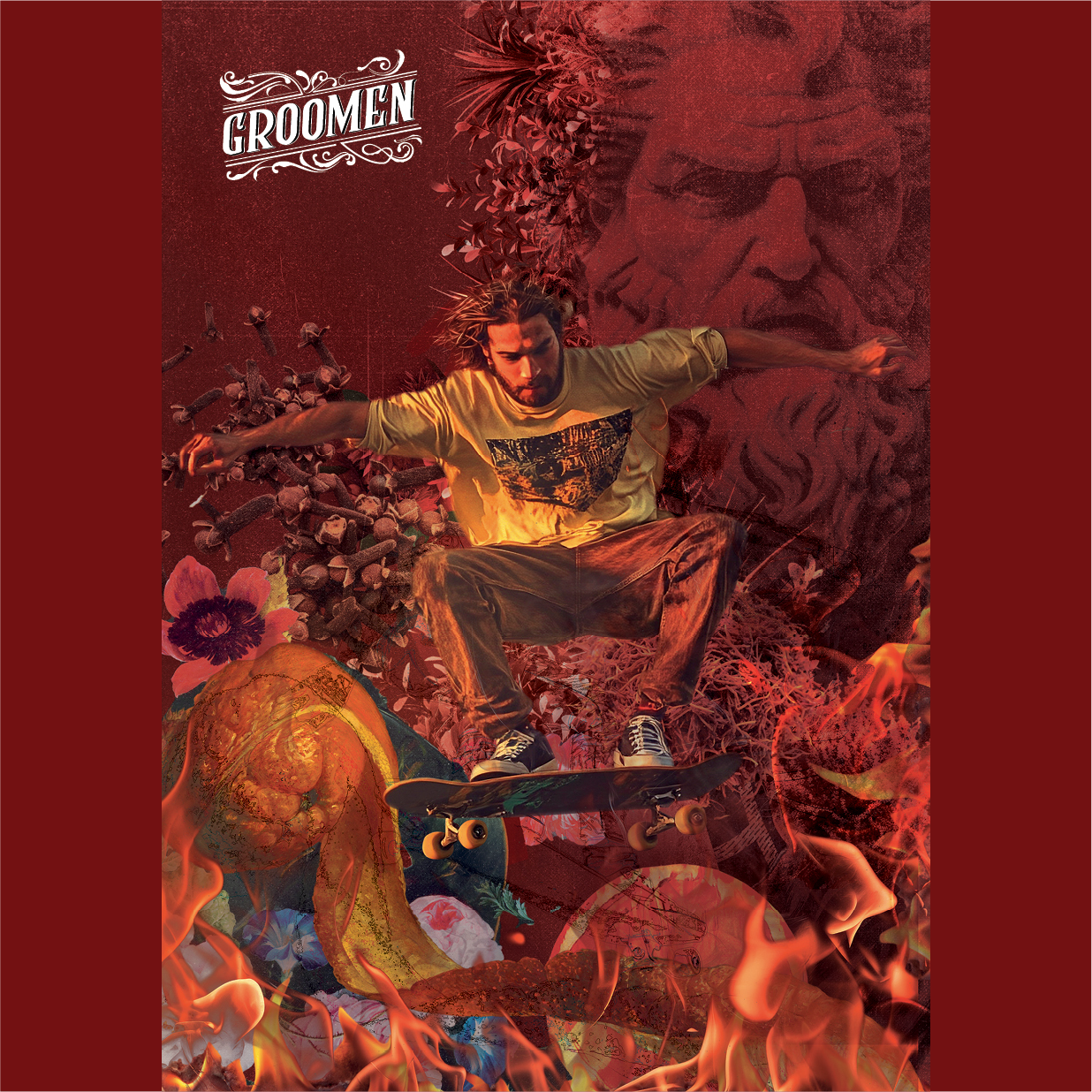
For the FIRE line, we prepared a dynamic illustration with a skateboarder, flames and a warm, saturated color scheme that captures the energy and character of fire. A sculpture of a face was placed in the background as a symbol of strength and transformation. Details like spices, flowers and citrus allude to the fragrance notes of the series. Completing the design is the iconic flame - a minimalist symbol of intensity and passion.
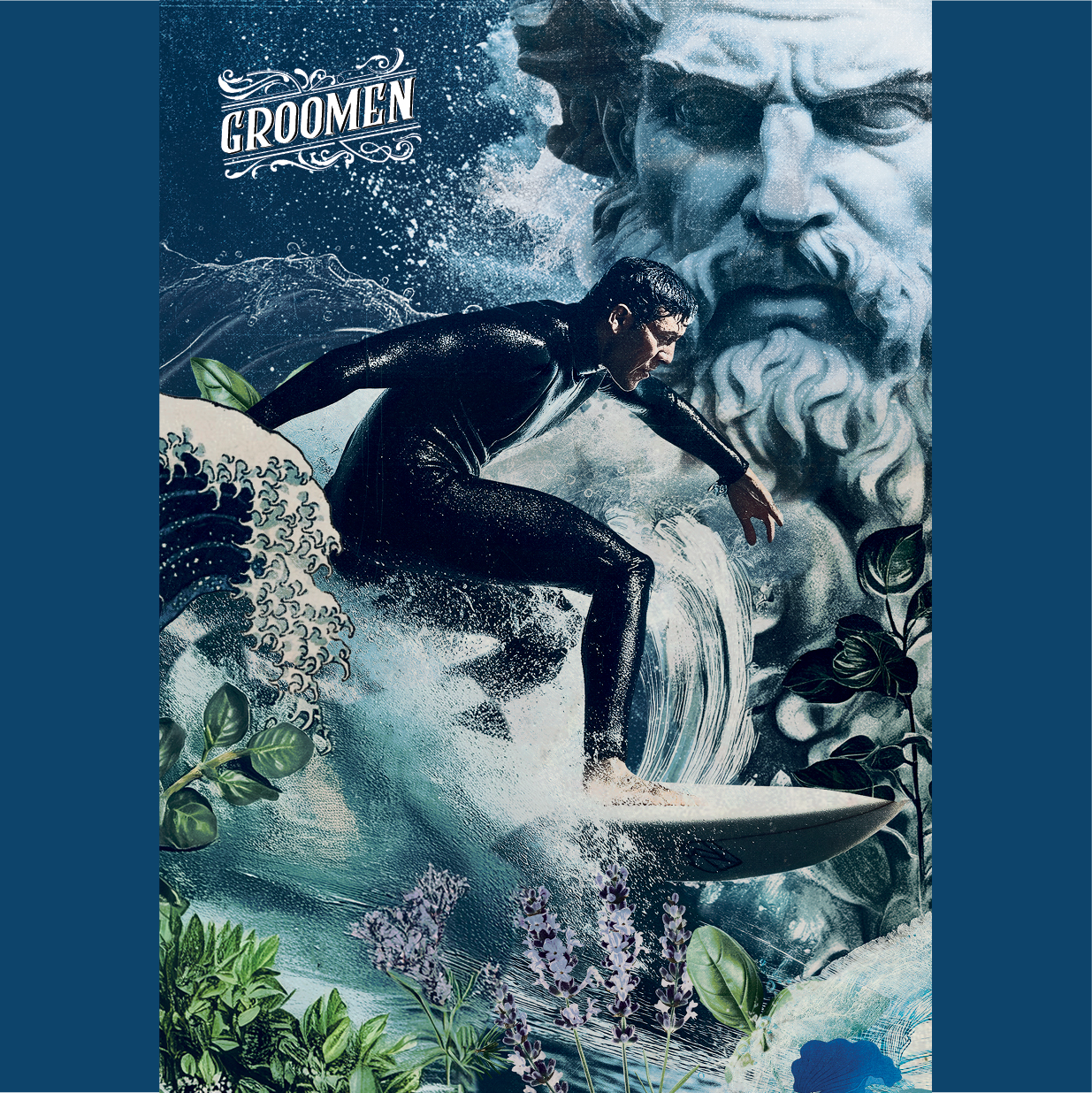
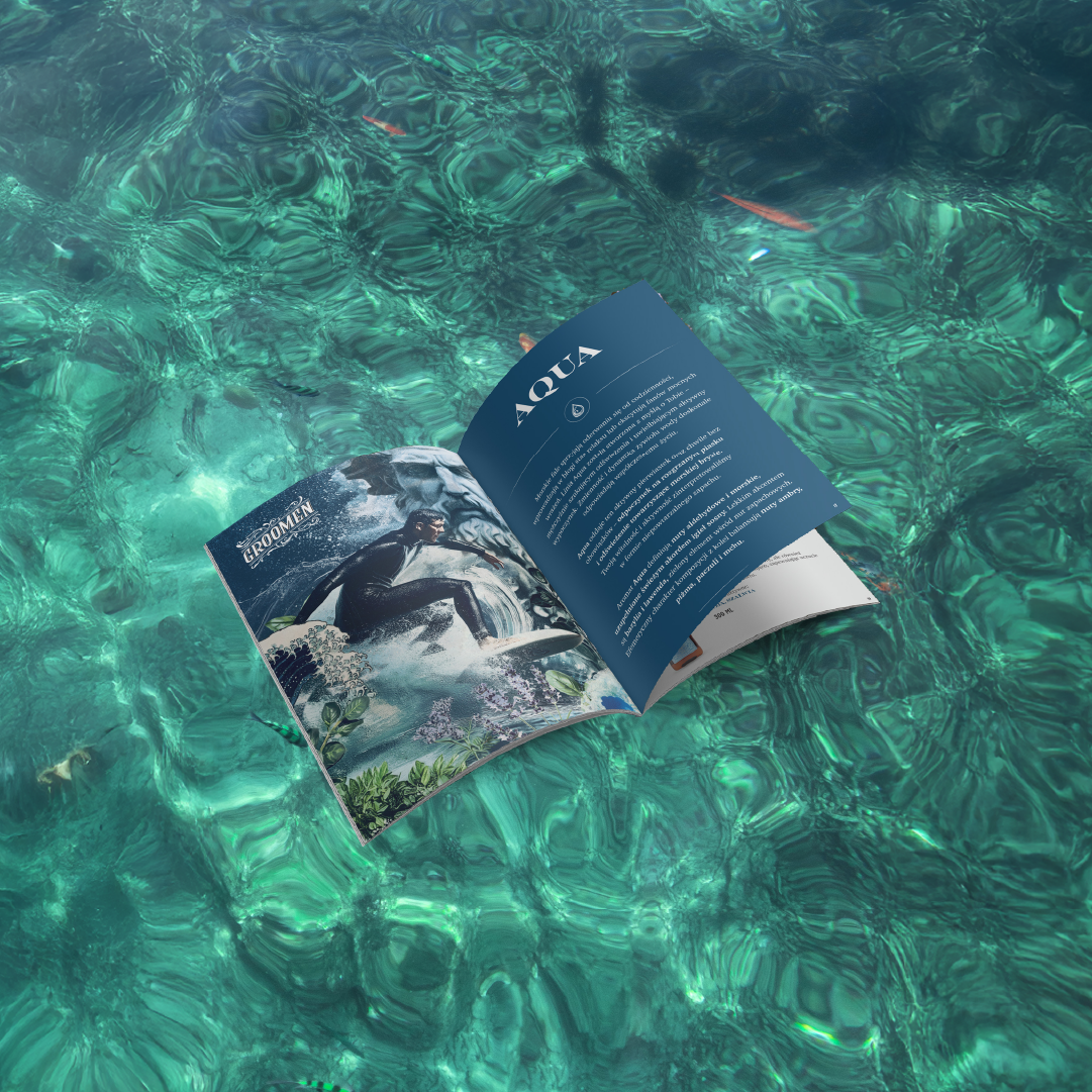
The illustration for the AQUA line depicts a surfer beating a sea wave, surrounded by dynamic water, herbs and flowers. In the background is a sculpture of a face, evoking the elemental force and tranquility of the ocean. Botanical elements, such as lavender, mint and citrus, directly relate to the fresh, aquatic fragrance notes. The line's iconic wave-inspired design complements the cool and light character of the series.
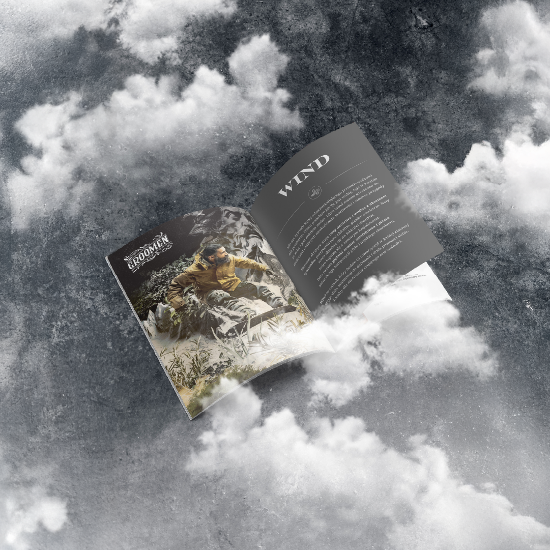
For the WIND line, we created an illustration depicting a snowboarder in motion, captured in a dynamic pose against a background of mountain peaks. The scene is kept in a cool, silver-black color palette, which emphasizes the lightness and freshness of this series. In the background appears a monumental face carved into the rock, as well as motifs of a dragon and a tiger - symbols of strength and independence. Plant details, such as rosemary and lavender, allude to the aromas present in the products. The whole is completed by an icon with a graphic wind symbol, emphasizing the modern and active character of the series.