


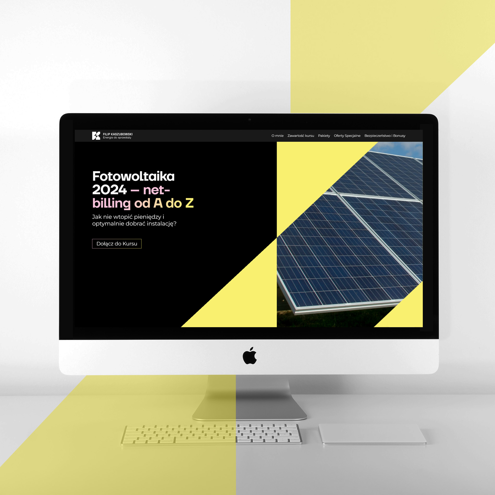
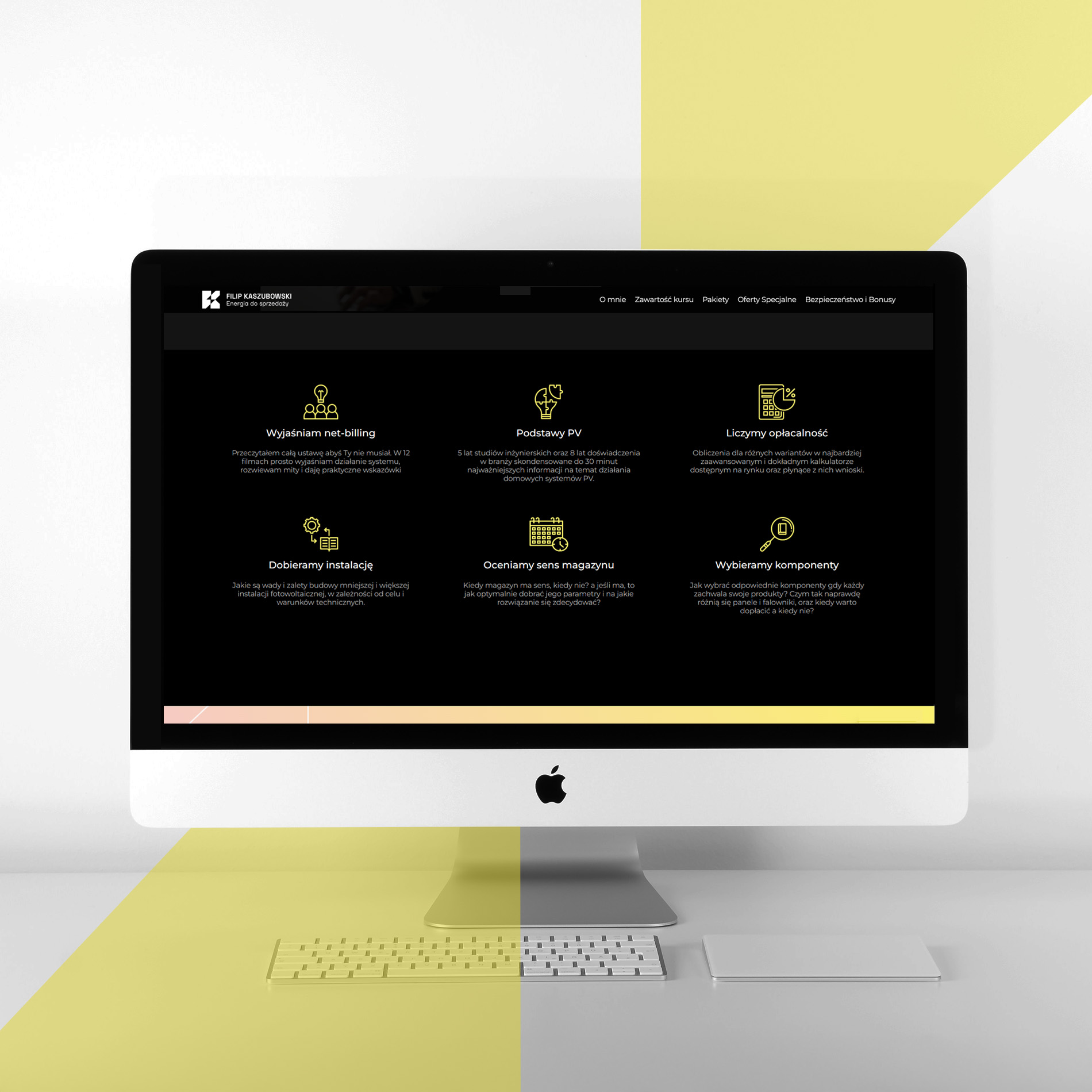
Filip Kaszubowski
Filip Kaszubowski's website was designed with modernity and functionality in mind, acting as a business card on the web and effectively attracting potential customers. The design combines aesthetics with professionalism, taking into account elements of the corporate identity, such as the logo, color scheme and typography, which ensures a consistent brand image. As a result, users immediately feel connected to Filip Kaszubowski's modern and professional image.
The website includes dynamic elements such as project visualizations and animated graphics that attract attention and present the energy sales training offer in an interesting and engaging way. Intuitive navigation allows users to quickly find key information about the courses, making it easier for potential clients to decide whether to work with them.
The site's design is also fully responsive, meaning that it works seamlessly on a variety of devices, providing convenient access to the offer on both computers and mobile devices. As a whole, the site provides a cohesive, functional platform that effectively supports attracting new customers and building a strong online presence for Filip Kaszubowski.


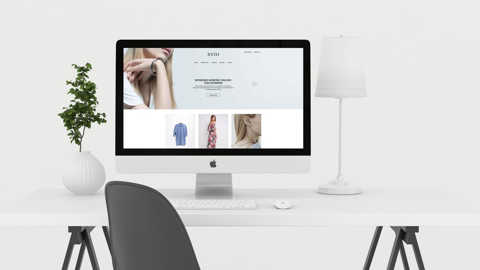
Eduard luque studio
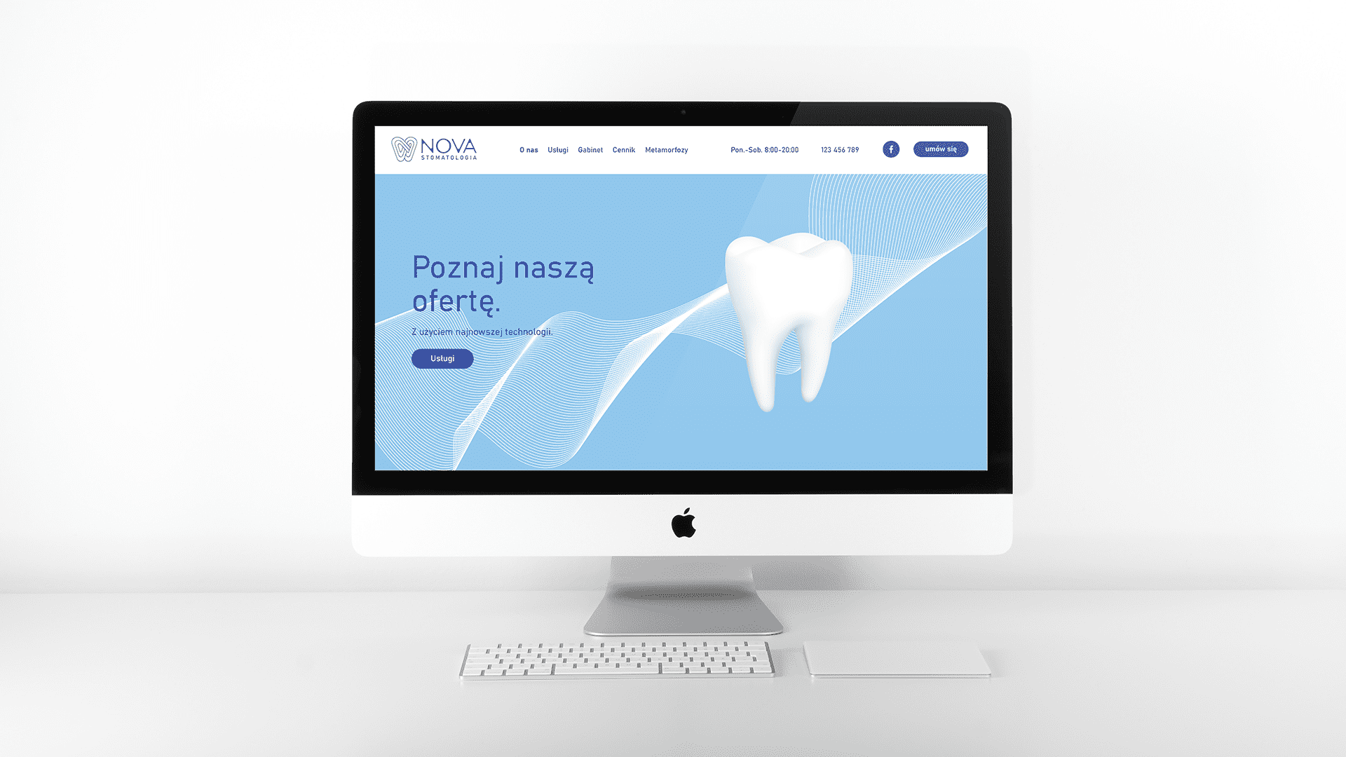
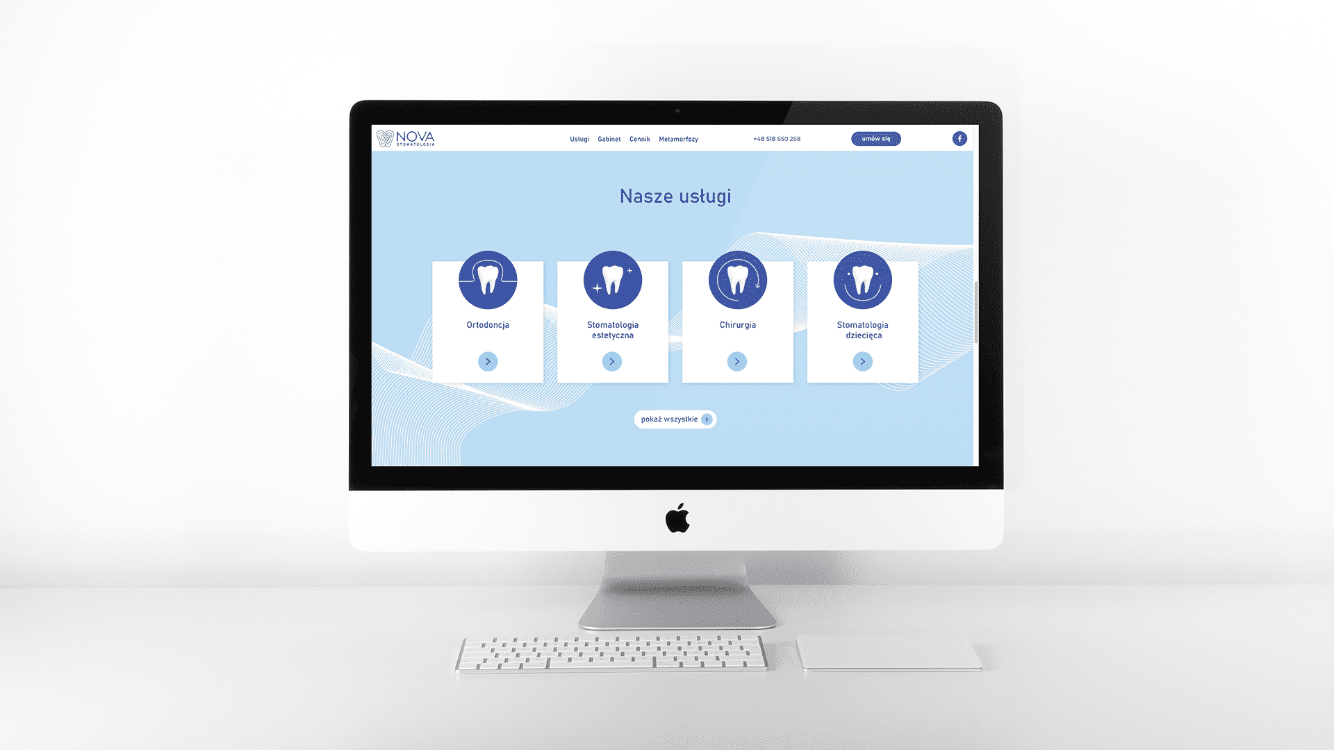
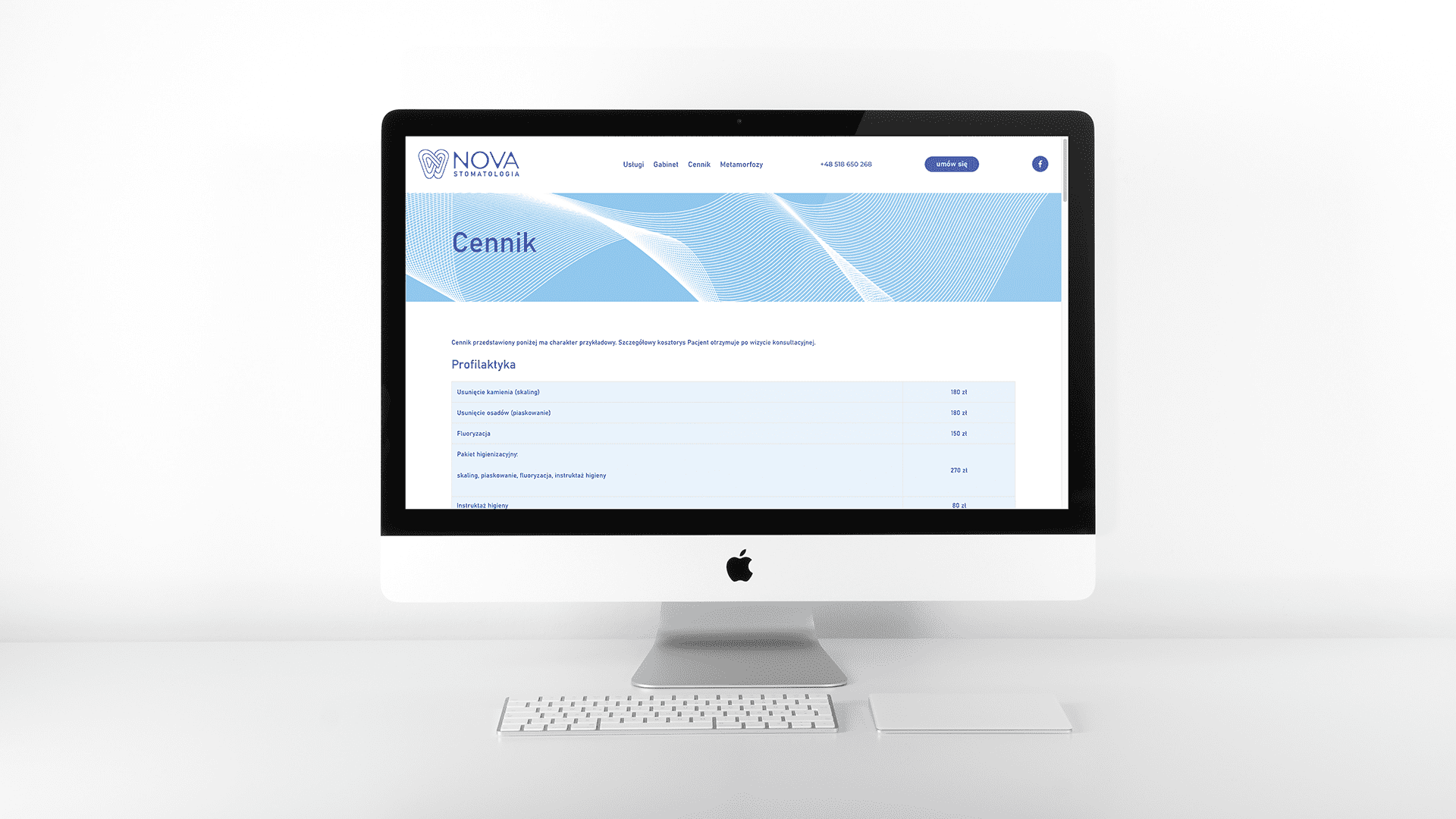
The Luque Studio website, designed by YOS, is a perfect example of the combination of aesthetics, functionality and professionalism that are essential in the architecture industry.
The design was based on the principle of minimalism to make the visual message clear. The site's color scheme was carefully selected to reinforce the impression of professionalism and modernity. Subdued colors, such as shades of gray, white and subtle accents, translate into a sense of class and calm. Bright backgrounds and contrasting elements make it easy to navigate. Simple, elegant fonts ensure that content is easy to read, while emphasizing the professional nature of the studio.
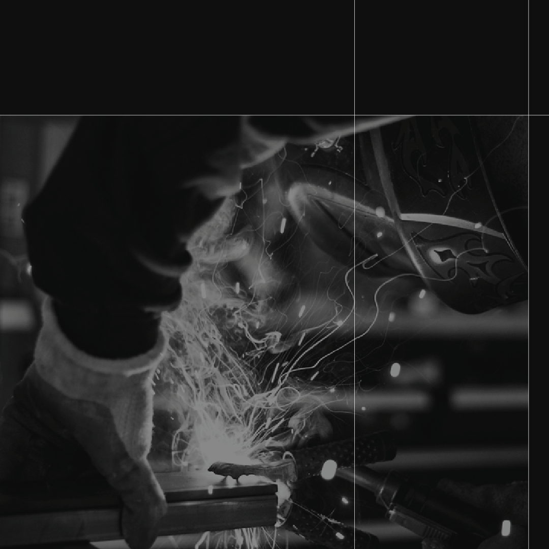
Architecture is first and foremost a visual experience, so the site features high-quality photos and visualizations of projects that immediately draw visitors' eyes to the studio's results.
In line with current trends, the site was designed fully responsive, which means that it automatically adjusts to different screen sizes.
The above decisions make Luque Studio's website a space that effectively communicates the company's values and skills, strengthens the studio's image and attracts potential clients.
Check the project